Introduction to CSS Flexbox
Last Updated :
10 Apr, 2024
CSS Flexbox, short for Flexible Box Layout, offers a streamlined way to design adaptable and visually appealing layouts. It works primarily in one dimension (row or column) to intelligently distribute space among elements within a container.
This results in clean alignment and responsive designs that work seamlessly across different screen sizes – perfect for crafting both smaller components and overall webpage structure.
Features of flexbox:
- A lot of flexibility is given.
- Arrangement & alignment of items.
- Proper spacing
- Order & Sequencing of items.
- Bootstrap 4 is built on top of the flex layout.
Before the Flexbox Model:
- Block: It is used to make sections in web pages.
- Inline: It is used for text.
- Table: It is used for two-dimensional table data.
- Positioned: It is used for the explicit position of an element.
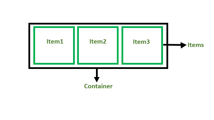
There are 2 main components of the Flexbox:
- Flex Container: The parent “div” which contains various divisions is called a flex container.
- Flex Items: The items inside the container “div” are flex items.
For creating the flexbox, we need to create a flex container along with setting the display property to flex.
HTML
<!DOCTYPE html>
<html>

<head>
    <title>Flexbox Tutorial</title>
    <style>
    .flex-container {
        display: flex;
        background-color: #32a852;
    }

    .flex-container div {
        background-color: #c9d1cb;
        margin: 10px;
        padding: 10px;
    }
    </style>
</head>

<body>
    <h2>GeeksforGeeks</h2>
    <h4> Flexbox</h4>
    <div class="flex-container">
        <div>Item1</div>
        <div>Item2</div>
        <div>Item3</div>
    </div>
</body>

</html>
Output:

Flexbox Axes: While working with Flexbox, we deal with 2 axes:
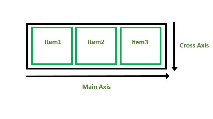
Main Axis:
- By default, the main axis runs from left to right.
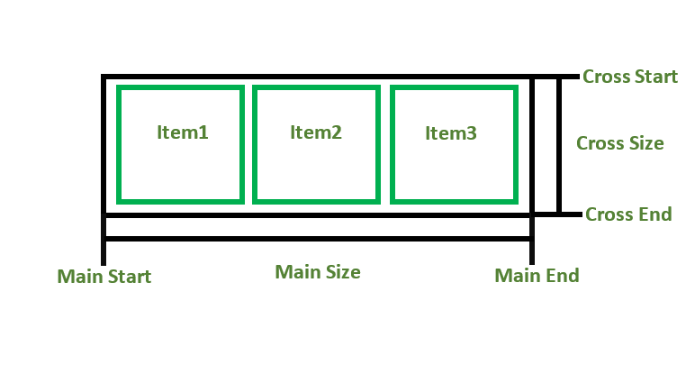
- Main Start: The start of the main axis is called Main Start.
- Main Size: The length between Main Start and Main End is called Main Size.
- Main End: The endpoint is called Main End.
- Main And Cross Axis
left to right:
flex-direction: row;
right to left:
flex-direction: row-reverse;
top to bottom:
flex-direction: column;
bottom to top:
flex-direction: column-reverse;
Cross Axis:
The cross axis will be perpendicular to the main axis.
- By default, Cross Axis runs perpendicular to the Main Axis i.e. from top to bottom.
- Cross Start: The start of the Cross axis is called Cross Start.
- Cross Size: The length between Cross Start and Cross End is called Cross Size.
- Cross End: The endpoint is called Cross End.
Supported Browsers:
- Google Chrome 29.0
- Firefox 22.0
- Microsoft Edge 11.0
- Opera 48.0
- Safari 10.0
Share your thoughts in the comments
Please Login to comment...