Chakra UI Overlay Popover
Last Updated :
05 Feb, 2024
Chakra UI Overaly Popover component creates an interactive and visually appealing pop-up overlay in the React application. We can embed the components in realtime usage like basic conformations, customized content, lazy-loaded components, controlled popovers, etc. In this article, we will create the practical implementation of the Chakra UI Overlay Popover component with proper examples and output.
Prerequisites:
Approach:
We have created the demonstration of the Chakra UI Overlay Popover component. This demonstration consists of various variants of Popover elements and also includes the customized Popover element with custom styling and color applied to it. We can customize the Chakra UI Overlay Popover component by using its various props and styling.
Steps to Create React Application and Installing Module:
Step 1: Create a React application using the following command:
npx create-react-app chakra
Step 2: After creating your project folder(i.e. chakra), move to it by using the following command:
cd chakra
Step 3: After creating the React application, Install the required package using the following command:
npm i @chakra-ui/react @emotion/react@^11 @emotion/styled@^11 framer-motion@^6
Project Structure:
The updated dependencies are in the package.json file.
"dependencies": {
      "@chakra-ui/react": "^2.8.2",
      "@emotion/react": "^11.11.3",
      "@emotion/styled": "^11.11.0",
      "@testing-library/jest-dom": "^5.17.0",
      "@testing-library/react": "^13.4.0",
      "@testing-library/user-event": "^13.5.0",
      "framer-motion": "^6.5.1",
      "react": "^18.2.0",
      "react-dom": "^18.2.0",
      "react-scripts": "5.0.1",
      "web-vitals": "^2.1.4"
}
Example: Below is the practical implementation of the Chakra UI Overlay Popover:
Javascript
import React from "react";
import {
ChakraProvider,
Box,
Button,
VStack,
HStack,
Input,
RadioGroup,
Radio,
Popover,
PopoverTrigger,
PopoverContent,
PopoverHeader,
PopoverArrow,
PopoverCloseButton,
PopoverBody,
PopoverAnchor,
Heading,
} from "@chakra-ui/react";
function App() {
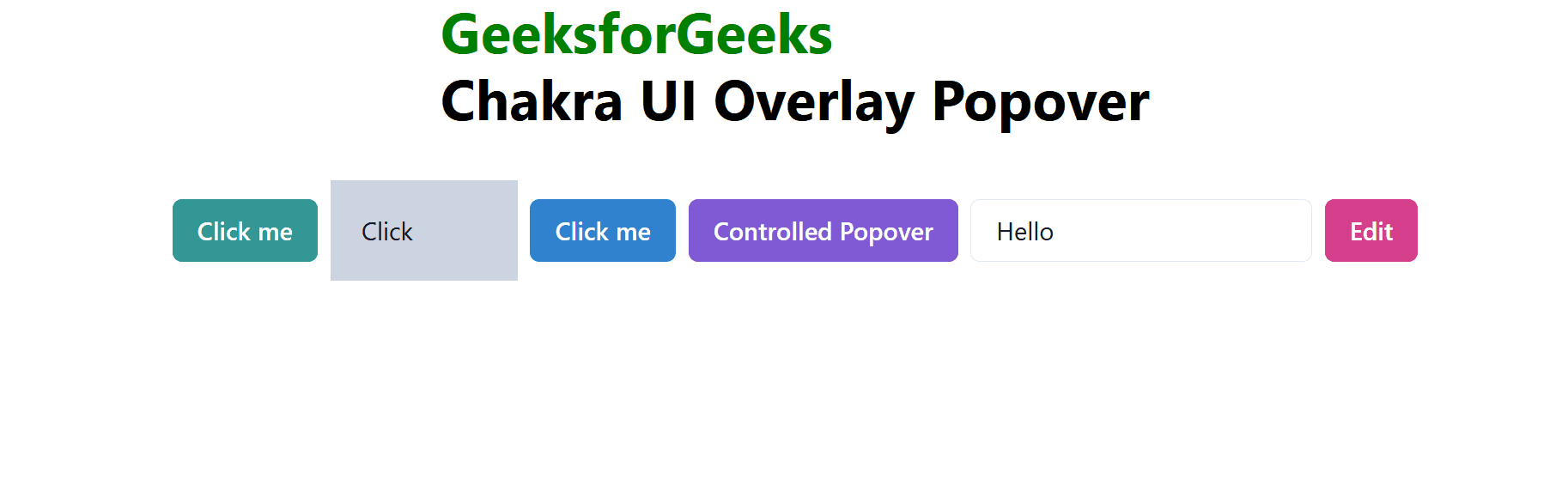
const basicPopover = (
<Popover>
<PopoverTrigger>
<Button colorScheme="teal">Click me</Button>
</PopoverTrigger>
<PopoverContent>
<PopoverArrow />
<PopoverCloseButton />
<PopoverHeader>Confirmation!</PopoverHeader>
<PopoverBody>Do you want to Buy React Course?</PopoverBody>
</PopoverContent>
</Popover>
);
const customizedPopover = (
<Popover>
<PopoverTrigger>
<Box
tabIndex="0"
role="button"
aria-label="Some box"
p={5}
w="120px"
bg="gray.300"
>
Click
</Box>
</PopoverTrigger>
<PopoverContent bg="tomato" color="white">
<PopoverHeader fontWeight="semibold">
Customization
</PopoverHeader>
<PopoverArrow bg="pink.500" />
<PopoverCloseButton bg="purple.500" />
<PopoverBody>Custom Popover</PopoverBody>
</PopoverContent>
</Popover>
);
const lazyPopover = (
<Popover isLazy>
<PopoverTrigger>
<Button colorScheme="blue">Click me</Button>
</PopoverTrigger>
<PopoverContent>
<PopoverHeader fontWeight="semibold">
Lazy Popover
</PopoverHeader>
<PopoverArrow />
<PopoverCloseButton />
<PopoverBody>Hello GeeksforGeeks</PopoverBody>
</PopoverContent>
</Popover>
);
const controlledPopover = (
<Popover>
<PopoverTrigger>
<Button colorScheme="purple">Controlled Popover</Button>
</PopoverTrigger>
<PopoverContent>
<PopoverHeader fontWeight="semibold">
Controlled Content
</PopoverHeader>
<PopoverArrow />
<PopoverCloseButton />
<PopoverBody>Hello GFG.</PopoverBody>
</PopoverContent>
</Popover>
);
const popoverWithAnchor = (
<Popover>
<HStack>
<PopoverAnchor>
<Input
w="auto"
display="inline-flex"
defaultValue="Popover Anchor"
/>
</PopoverAnchor>
<PopoverTrigger>
<Button h="40px" colorScheme="pink">
Edit
</Button>
</PopoverTrigger>
</HStack>
<PopoverContent>
<PopoverHeader>Colors</PopoverHeader>
<PopoverArrow />
<PopoverCloseButton />
<PopoverBody>
<RadioGroup defaultValue="red">
<Radio value="red">Red</Radio>
<Radio value="blue">Blue</Radio>
<Radio value="green">Green</Radio>
</RadioGroup>
</PopoverBody>
</PopoverContent>
</Popover>
);
return (
<ChakraProvider>
<VStack spacing={8} align="center">
<Box>
<Heading as="h1" color="green">
GeeksforGeeks
</Heading>
<Heading as="h3" color="black">
Chakra UI Overlay Popover
</Heading>
</Box>
<HStack>
{basicPopover}
{customizedPopover}
{lazyPopover}
{controlledPopover}
{popoverWithAnchor}
</HStack>
</VStack>
</ChakraProvider>
);
}
export default App;
|
Start your application using the following command:
npm start
Output: Now go to http://localhost:3000 in your browser:
Share your thoughts in the comments
Please Login to comment...