CSS Filter Property
Last Updated :
02 Apr, 2024
CSS filter property is used to set the visual effect of an element. This property is mostly used in image content for adjusting the image rendering, background, border, etc.
Try It:
No Filter
Blured
High Bright
High Contrast
Shadowed
Grayscale
Hued
Inverted
Transparent
Saturated
Sepia
Currently Active Property:
filter: none;
Syntax:
filter: none | blur() | brightness() | contrast() | drop-shadow() |
grayscale() |hue-rotate() | invert() | opacity() | saturate() | sepia() |
url();
Note: More than one filter can be added to the HTML element which is separated by the space.
Example: This example applies two filter functions to the image element in a webpage.
img {
   filter: brightness(20%) blur(20px);
}
The filter property accepts both percentage value & decimal value.
Filter function:
| Filter Function | Description |
|---|
none | It is the default value and it does not apply any effect. |
| blur() | Applies a blur effect to the element. The value parameter specifies the amount of blur. |
initial
| Sets the filter to default value.
|
| brightness(value) | Adjusts the brightness of the element. The value parameter specifies the level of brightness. |
| contrast() | Adjusts the contrast of the element. The value parameter specifies the level of contrast. |
| drop-shadow() | Applies a drop shadow effect to the element. The parameters define the offset, blur radius, and color of the shadow. |
| grayscale() | Converts the element to grayscale. The value parameter specifies the percentage of grayscale to apply. |
hue-rotate() | Rotates the hue of the element. The value parameter specifies the angle of rotation. |
| invert() | Inverts the colors of the element. The value parameter specifies the percentage of inversion. |
| opacity() | Adjusts the opacity of the element. The value parameter specifies the level of opacity. |
| saturate() | Adjusts the saturation of the element. The value parameter specifies the level of saturation. |
| sepia() | Applies a sepia tone to the element. The value parameter specifies the percentage of sepia to apply. |
url() | Allows you to reference an SVG filter defined in an external file using a URL. |
CSS Filter Examples
Example 1: This example describes the filter property with the filter value as none.
HTML
<!DOCTYPE html>
<html>

<head>
    <title>CSS filter property</title>
    <style>
    img {
        filter: none;
    }
    </style>
</head>

<body>
    <div>
        <img src=
"https://media.geeksforgeeks.org/wp-content/uploads/geeksforgeeks-25.png"
             alt="Geeks image">
    </div>
</body>

</html>
Output:

2. Using brightness():
It sets the brightness of the element. If the brightness is 0% then it is completely black and if the brightness is 100% then it is the same as the original. The values greater than 100% result in brighter elements.
Example: This example describes the filter property with the filter value as brightness having 100%.
HTML
<!DOCTYPE html>
<html>

<head>
    <title>CSS filter property</title>
    <style>
    img {
        filter: brightness(10%);
    }
    </style>
</head>

<body>
    <div>
        <img src=
"https://media.geeksforgeeks.org/wp-content/uploads/geeksforgeeks-25.png"
             alt="Geeks image">
    </div>
</body>

</html>
Output:

3. Using grayscale():
It converts the element colors into black and white. The grayscale 0% indicates the original element and 100% indicates the completely grayscale element. It does not accept the negative values.
Example: This example describes the filter property with the filter value as grayscale.
HTML
<!DOCTYPE html>
<html>

<head>
    <title>CSS filter property</title>
    <style>
    img {
        filter: grayscale(70%);
    }
    </style>
</head>

<body>
    <div>
        <img src=
"https://media.geeksforgeeks.org/wp-content/uploads/geeksforgeeks-25.png"
             alt="Geeks image">
    </div>
</body>

</html>
Output:

4. sepia():
It converts the image into the sepia image where 0% represents the original image and 100% represents completely sepia. It does not accept the negative values.
Example: This example describes the filter property with the filter value as sepia.
HTML
<!DOCTYPE html>
<html>

<head>
    <title>CSS filter property</title>
    <style>
    img {
        filter: sepia(50);
    }
    </style>
</head>

<body>
    <div>
        <img src=
"https://media.geeksforgeeks.org/wp-content/uploads/geeksforgeeks-25.png"
             alt="Geeks image">
    </div>
</body>

</html>
Output:

5. Using contrast():
It helps to adjust the contrast of the element. The 0% contrast indicates the complete black element and the 100% contrast indicate the original element.
Example: This example describes the filter property with the filter value as contrast, to adjust the contrast level for the image.
HTML
<!DOCTYPE html>
<html>

<head>
    <title>CSS filter property</title>
    <style>
    img {
        filter: contrast(50);
    }
    </style>
</head>

<body>
    <div>
        <img src=
"https://media.geeksforgeeks.org/wp-content/uploads/geeksforgeeks-25.png"
             alt="Geeks image">
    </div>
</body>

</html>
Output:

6. Using saturate():
It is used to set the saturation of elements. The 0% saturate indicates an element is completely unsaturated and the 100% saturate indicates the original image. The value greater than 100% result is the super-saturated element.
Example: This example describes the filter property with the filter value as saturate for leveling the saturation level of the image.
HTML
<!DOCTYPE html>
<html>

<head>
    <title>CSS filter property</title>
    <style>
    img {
        filter: saturate(50);
    }
    </style>
</head>

<body>
    <div>
        <img src=
"https://media.geeksforgeeks.org/wp-content/uploads/geeksforgeeks-25.png"
             alt="Geeks image">
    </div>
</body>

</html>
Output:

7. Using blur():
It applies the blur effect to the element. If the blur value is not specified then it takes 0 as the default value.
Example: This example describes the filter property with the filter value as a blur for generating the blur image effect.
HTML
<!DOCTYPE html>
<html>

<head>
    <title>CSS filter property</title>
    <style>
    img {
        filter: blur(5px);
    }
    </style>
</head>

<body>
    <div>
        <img src=
"https://media.geeksforgeeks.org/wp-content/uploads/geeksforgeeks-25.png"
             alt="Geeks image">
    </div>
</body>

</html>
Output:

8. Using opacity():
It sets the opacity effect of the image. The 0% opacity indicates the element is completely transparent and if opacity is 100% then it indicates the original image. It doesn’t accept the negative value.
Example: This example describes the filter property where the filter value is set as opacity with 0.5.
HTML
<!DOCTYPE html>
<html>

<head>
    <title>CSS filter property</title>
    <style>
    img {
        filter: opacity(0.5);
    }
    </style>
</head>

<body>
    <div>
        <img src=
"https://media.geeksforgeeks.org/wp-content/uploads/geeksforgeeks-25.png"
             alt="Geeks image">
    </div>
</body>

</html>
Output:

9. Using hue-rotate():
It applies a hue rotation to the image. The value defines the number of degrees around the color circle the image samples will be adjusted. The default value is 0 degrees and it represents the original image.
Example: This example describes the filter property where the hue-rotate is set to 45deg.
HTML
<!DOCTYPE html>
<html>

<head>
    <title>CSS filter property</title>
    <style>
    img {
        filter: hue-rotate(45deg);
    }
    </style>
</head>

<body>
    <div>
        <img src=
"https://media.geeksforgeeks.org/wp-content/uploads/geeksforgeeks-25.png"
             alt="Geeks image">
    </div>
</body>

</html>
Output:

10. Using invert():
It inverts the element. The default value is 0% and it represents the original image. The 100% makes the image completely inverted. It doesn’t accept the negative value.
Example: This example describes the filter property with the filter value as an invert.
HTML
<!DOCTYPE html>
<html>

<head>
    <title>CSS filter property</title>
    <style>
    img {
        filter: invert(50);
    }
    </style>
</head>

<body>
    <div>
        <img src=
"https://media.geeksforgeeks.org/wp-content/uploads/geeksforgeeks-25.png"
             alt="Geeks image">
    </div>
</body>

</html>
Output:

11. drop-shadow():
It applies a drop shadow effect to the element. It accepts h-shadow, v-shadow, blur, spread, and color as values. It is not only applied to images but it can be applied to shapes as it can have the same shape as of original one. The negative values for the h-shadow & v-shadow will shift the shadow to the left of the image.
Example: This example describes the filter property where the drop-shadow effect is applied to the element.
HTML
<!DOCTYPE html>
<html>

<head>
    <title>CSS filter property</title>
    <style>
    img {
        filter: drop-shadow(16px 18px 15px rgba(255, 0, 0, 0.5));
    }
    </style>
</head>

<body>
    <div>
        <img src=
"https://media.geeksforgeeks.org/wp-content/uploads/geeksforgeeks-25.png"
             alt="Geeks image">
    </div>
</body>

</html>
Output:

Example: Here, the drop-shadow is applied for the horizontal shadow for that image.
HTML
<!DOCTYPE html>
<html>

<head>
    <title>Page Title</title>
</head>

<body>
    <div></div>
    <style>
    body {
        background: #F2F2B6;
    }

    div {
        width: 0;
        position: relative;
        margin: 85px 50px;
        border-top: 130px solid #FF6D00;
        border-bottom: 0px solid transparent;
        border-left: 78px solid transparent;
        border-right: 74px solid transparent;
        filter: drop-shadow(19px 0 0 #FD4602);
    }
    </style>
</body>

</html>
Output:
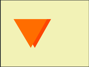
From the output, you can observe that we can get the same shape using drop shadow and if you increase x-offset, it can move toward the right, if you apply y-offset it moves towards the bottom. Similarly, you can design any shape and if you apply the drop shadow property, it generates shadow to that image
12. Using initial:
It sets the filter property to its default value.
Example: This example describes the filter property with the filter value as initial.
HTML
<!DOCTYPE html>
<html>

<head>
    <title>CSS filter property</title>
    <style>
    img {
        filter: initial();
    }
    </style>
</head>

<body>
    <div>
        <img src=
"https://media.geeksforgeeks.org/wp-content/uploads/geeksforgeeks-25.png"
             alt="Geeks image">
    </div>
</body>

</html>
Output:
Supported Browsers: The browsers supported by filter property are listed below:
- Google Chrome 53.0 and above
- Microsoft Edge 12.0 and above
- Firefox 35.0 and above
- Safari 9.1 and above
- Opera 40.0 and above
- Internet Explorer not supported
Share your thoughts in the comments
Please Login to comment...