Chakra UI Form Pin Input
Last Updated :
04 Feb, 2024
Chakra UI provides various components for styling and making the React application more attractive and user-interactive. In the application, we need the functionality of Form Pin Input through which we can validate the OTP or some other authentication technique. In the UI appearance, we can create it through Chakra UI Form Pin Input. In this article, we will see various types of Form Pin Input in Chakra UI with practical implementation in terms of examples and output.
Prerequisites:
Approach:
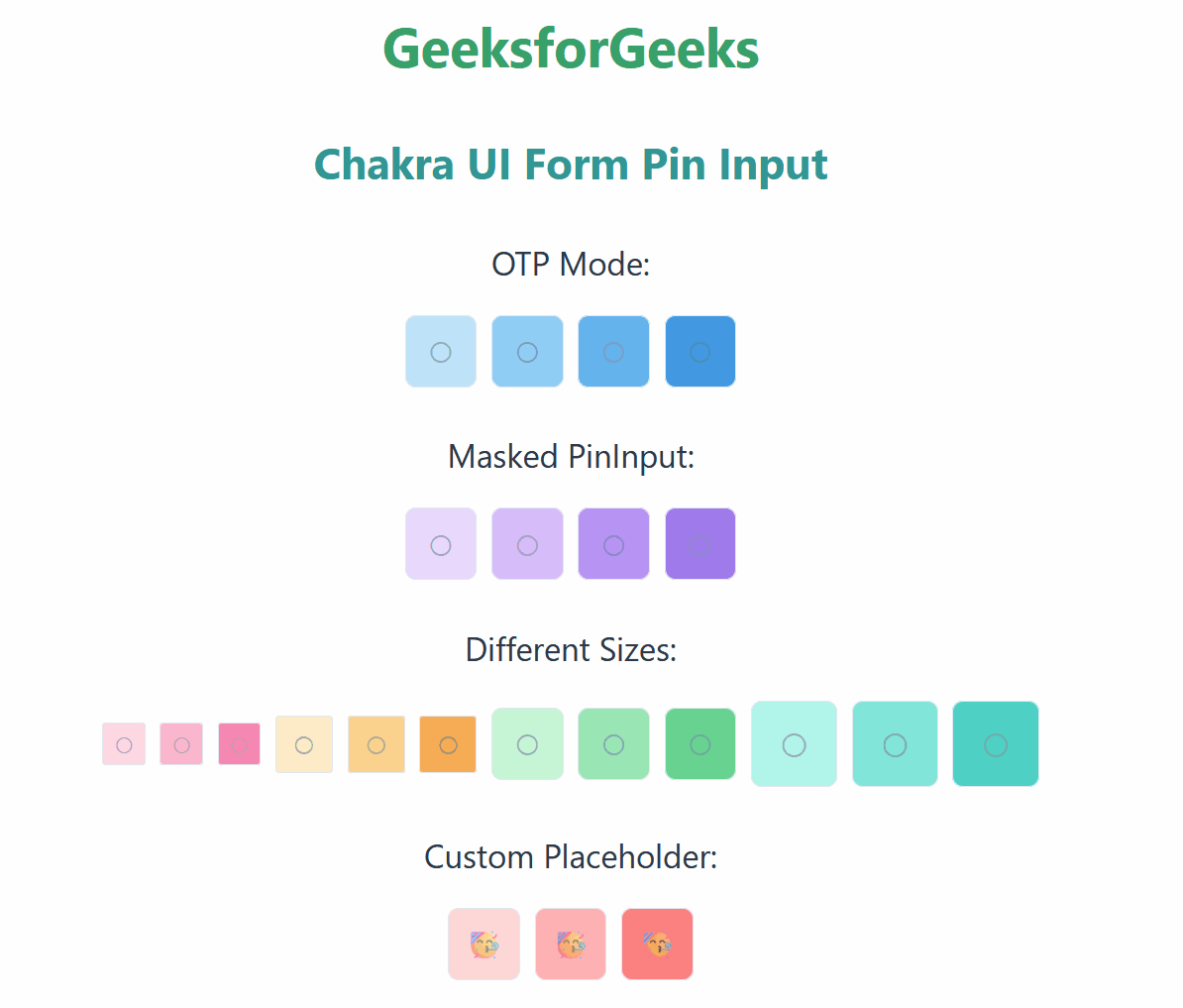
We have created different Form Pin Inputs like OTP Mode (Accepts only Numerical Values), Masked PinInput ( Entered values are not shown), Different Sizes (md, sm, lg), Custom Placehoder (Placeholder like Emoji). Each Pin Input has its own behavior to represent and accept the input from the user.
Steps to Create React Application And Installing Module:
Step 1: Create a React application using the following command:
npx create-react-app chakra
Step 2: After creating your project folder(i.e. chakra), move to it by using the following command:
cd chakra
Step 3: After creating the React application, Install the required package using the following command:
npm i @chakra-ui/react @emotion/react@^11 @emotion/styled@^11 framer-motion@^6
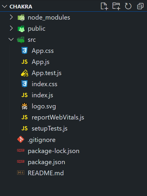
Project Structure:
The updated dependencies are in the package.json file.
"dependencies": {
        "@chakra-ui/react": "^2.8.2",
        "@emotion/react": "^11.11.3",
        "@emotion/styled": "^11.11.0",
        "@testing-library/jest-dom": "^5.17.0",
        "@testing-library/react": "^13.4.0",
        "@testing-library/user-event": "^13.5.0",
        "framer-motion": "^6.5.1",
        "react": "^18.2.0",
        "react-dom": "^18.2.0",
        "react-scripts": "5.0.1",
        "web-vitals": "^2.1.4"
}
Example: Below is the practical implementation of the Chakra UI Form Pin Input.
Javascript
import React from 'react';
import {
ChakraProvider,
CSSReset,
Box,
Center,
VStack,
HStack,
Text,
PinInput,
PinInputField,
} from '@chakra-ui/react';
function App() {
return (
<ChakraProvider>
<CSSReset />
<Box p={8}>
<VStack align="center" spacing={6} mb={9}>
<Center>
<Text as="h1"
fontSize="3xl"
fontWeight="bold"
color="green.500">
GeeksforGeeks
</Text>
</Center>
<Center>
<Text as="h3"
fontSize="2xl"
fontWeight="bold"
color="teal.500">
Chakra UI Form Pin Input
</Text>
</Center>
<VStack spacing={4} width="100%">
<Text fontSize="lg" color="gray.700">
OTP Mode:
</Text>
<HStack>
<PinInput otp>
<PinInputField bg="blue.100" />
<PinInputField bg="blue.200" />
<PinInputField bg="blue.300" />
<PinInputField bg="blue.400" />
</PinInput>
</HStack>
</VStack>
{}
<VStack spacing={4} width="100%">
<Text fontSize="lg" color="gray.700">
Masked PinInput:
</Text>
<HStack>
<PinInput type="alphanumeric" mask>
<PinInputField bg="purple.100" />
<PinInputField bg="purple.200" />
<PinInputField bg="purple.300" />
<PinInputField bg="purple.400" />
</PinInput>
</HStack>
</VStack>
<VStack spacing={4} width="100%">
<Text fontSize="lg" color="gray.700">
Different Sizes:
</Text>
<HStack>
<PinInput size="xs">
<PinInputField bg="pink.100" />
<PinInputField bg="pink.200" />
<PinInputField bg="pink.300" />
</PinInput>
<PinInput size="sm">
<PinInputField bg="orange.100" />
<PinInputField bg="orange.200" />
<PinInputField bg="orange.300" />
</PinInput>
<PinInput size="md">
<PinInputField bg="green.100" />
<PinInputField bg="green.200" />
<PinInputField bg="green.300" />
</PinInput>
<PinInput size="lg">
<PinInputField bg="teal.100" />
<PinInputField bg="teal.200" />
<PinInputField bg="teal.300" />
</PinInput>
</HStack>
</VStack>
<VStack spacing={4} width="100%">
<Text fontSize="lg" color="gray.700">
Custom Placeholder:
</Text>
<HStack>
<PinInput placeholder="????">
<PinInputField bg="red.100" />
<PinInputField bg="red.200" />
<PinInputField bg="red.300" />
</PinInput>
</HStack>
</VStack>
</VStack>
</Box>
</ChakraProvider>
);
}
export default App;
|
Step to run the application: Run the application using the following command:
npm run start
Output: Now go to http://localhost:3000 in your browser:
Share your thoughts in the comments
Please Login to comment...