Chakra UI Flexbox
Last Updated :
30 Jan, 2024
Chakra UI FlexBox is used to create complex layout designs in React. With Chakra UI’s Flex and Box components, users can easily create responsive designs, achieving both versatility and visual appeal without the need for intricate CSS styling. Chakra UI’s integration of Flexbox enhances the efficiency and clarity of React applications.
Prerequisites
Approach:
Using the Flex container, you can arrange boxes either vertically or horizontally. The Box container is then employed to add content, while the Text Container is specifically used for text. Wrapping all Chakra UI components, the ChakraProvider ensures consistent styling throughout the application.
Steps To Create React Application And Installing Module:
Step 1: Create a React application using the following command:
npx create-react-app my-react-app
Step 2: After creating your project folder(i.e. my-react-app), move to it by using the following command:
cd my-react-app
Step 3: After creating the React application, Install the Chakra UI package using the following command:
npm i @chakra-ui/react @emotion/react@^11 @emotion/styled@^11 framer-motion@^6
Project Structure:
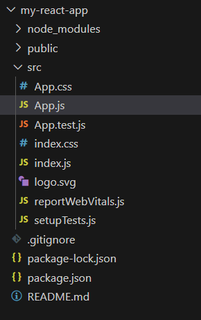
my-react-app
The updated dependencies in the package.json file.
"dependencies": {
    "@chakra-ui/react": "^2.8.2",
    "@emotion/react": "^11.11.3",
    "@emotion/styled": "^11.11.0",
    "@testing-library/jest-dom": "^5.17.0",
    "@testing-library/react": "^13.4.0",
    "@testing-library/user-event": "^13.5.0",
    "framer-motion": "^6.5.1",
    "react": "^18.2.0",
    "react-dom": "^18.2.0",
    "react-scripts": "5.0.1",
    "web-vitals": "^2.1.4"
}
Example: Creating a Flexbox using Flex, Box, Text and ChakraProvider to wrap the entire component. In this example we have used the following components to create a Flexbox:
- Flex Container (outer): The outer Flex component sets up a vertically aligned and justified layout.
- Flex Container (inner): Another nested Flex component inside the outer one.
- Text Component: Displays a heading inside the Flex container with a font size of “xl” and a bottom margin of “4”.
- Box Component (inside the inner Flex): Two Box components, each representing a box with padding, background color, and text color.
- ChakraProvider: The ChakraProvider wraps the entire component, providing Chakra UI’s styling and theming to the application.
Javascript
import React from "react";
import {
Flex, Text,
Box, ChakraProvider
} from "@chakra-ui/react";
import "./App.css";
const App = () => {
return (
<ChakraProvider>
<Flex
direction="column"
align="center"
justify="center"
h="300px"
bg="gray.200"
p="4"
>
<Text fontSize="xl" mb="4">
Chakra UI Flexbox Example
</Text>
<Flex
direction={{
base: "column",
md: "row"
}}
align="center"
justify="space-around"
w="100%"
>
<Box p="4" bg="teal.500"
color="white"
mb={{
base: "4",
md: "0"
}}>
Box 1
</Box>
<Box p="4" bg="blue.500"
color="white">
Box 2
</Box>
</Flex>
</Flex>
</ChakraProvider>
);
};
export default App;
|
Step to Run the application:
- Start using the following command.
npm start
Output:
-768.png)
Share your thoughts in the comments
Please Login to comment...