Chakra UI Form CheckBox
Last Updated :
04 Feb, 2024
Chakra UI’s Form CheckBox offers a flexible and customizable checkbox component for React applications. This component includes various features, including default styling, customizable colors, sizes, and icons. These features make it simple to integrate user-friendly and visually appealing checkboxes into forms. In this article, we will explore all the features and variants of Chakra UI’s Form CheckBox, providing practical examples and live output for better understanding.
Prerequisites:
Approach:
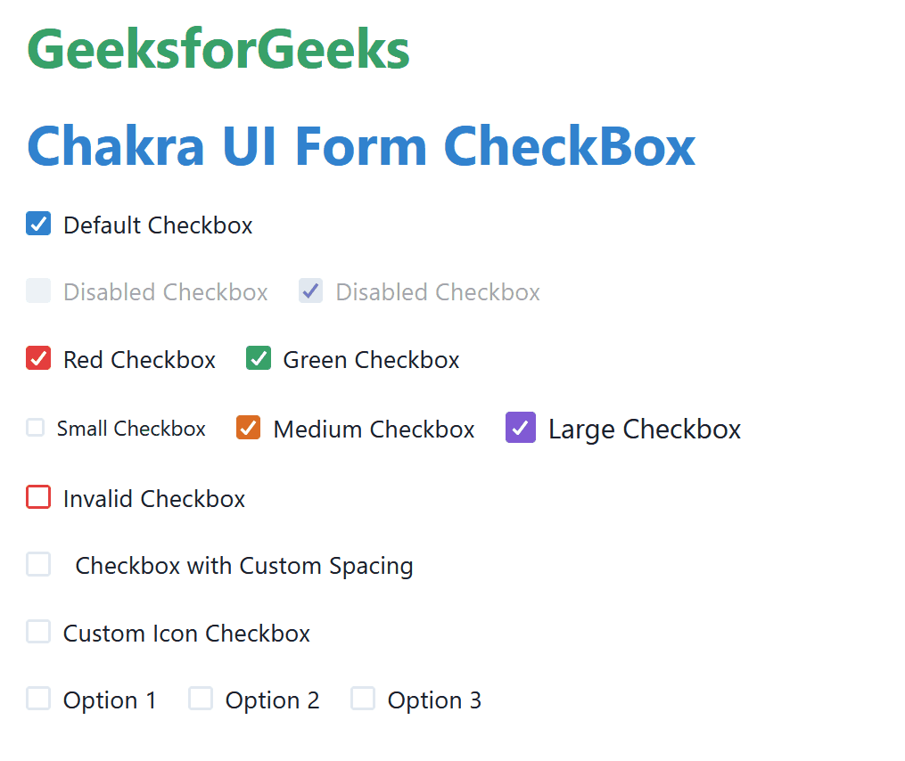
We have created Chakra UI Form CheckBoxes with different variants. These variants include the Default Checkbox, Disabled Checkbox, and Color-based Checkbox. Size-based Checkbox, Custom-Spacing based Checkbox, Icon based Checkbox, Multiple Options based Checkbox. Using this checkbox, we can use this in our application as the input element from the user.
Steps to Create React Application And Installing Module:
Step 1: Create a React application using the following command:
npx create-react-app chakra
Step 2: After creating your project folder(i.e. chakra), move to it by using the following command:
cd chakra
Step 3: After creating the React application, Install the required package using the following command:
npm i @chakra-ui/react @emotion/react@^11 @emotion/styled@^11 framer-motion@^6
Project Structure:
The updated dependencies are in the package.json file:
"dependencies": {
    "@chakra-ui/react": "^2.8.2",
    "@emotion/react": "^11.11.3",
    "@emotion/styled": "^11.11.0",
    "@testing-library/jest-dom": "^5.17.0",
    "@testing-library/react": "^13.4.0",
    "@testing-library/user-event": "^13.5.0",
    "framer-motion": "^6.5.1",
    "react": "^18.2.0",
    "react-dom": "^18.2.0",
    "react-scripts": "5.0.1",
    "web-vitals": "^2.1.4"
 }
Example: Below is the practical implementation of the Chakra UI Form CheckBox:
Javascript
import {
ChakraProvider, Box, Stack,
Checkbox, CheckboxGroup, Heading
}
from '@chakra-ui/react';
import React from 'react';
function App() {
const [check_Items, set_Check_Items] = React.useState([]);
const chckFn = (values) => {
set_Check_Items(values);
};
return (
<ChakraProvider>
<Box p={5}>
<Heading as="h1"
color="green.500" mb={5}>
GeeksforGeeks
</Heading>
<Stack spacing={5}>
<Heading as="h3"
color="blue.500">
Chakra UI Form CheckBox
</Heading>
<Checkbox defaultChecked
colorScheme='blue'>
Default Checkbox
</Checkbox>
<Stack spacing={5}
direction='row'>
<Checkbox isDisabled>
Disabled Checkbox
</Checkbox>
<Checkbox isDisabled
defaultChecked>
Disabled Checkbox
</Checkbox>
</Stack>
<Stack spacing={5}
direction='row'>
<Checkbox colorScheme='red'
defaultChecked>
Red Checkbox
</Checkbox>
<Checkbox colorScheme='green'
defaultChecked>
Green Checkbox
</Checkbox>
</Stack>
<Stack spacing={[1, 5]}
direction={['column', 'row']}>
<Checkbox size='sm'
colorScheme='teal'>
Small Checkbox
</Checkbox>
<Checkbox size='md'
colorScheme='orange' defaultChecked>
Medium Checkbox
</Checkbox>
<Checkbox size='lg'
colorScheme='purple' defaultChecked>
Large Checkbox
</Checkbox>
</Stack>
<Checkbox isInvalid>
Invalid Checkbox
</Checkbox>
<Checkbox spacing='1rem'>
Checkbox with Custom Spacing
</Checkbox>
<Checkbox
icon={<CustomIcon />}
iconColor='cyan.500'
iconSize='1.5rem'
colorScheme='cyan'
>
Custom Icon Checkbox
</Checkbox>
<CheckboxGroup
colorScheme='pink'
defaultValue={['option1', 'option2']}
value={check_Items}
onChange={chckFn}
>
<Stack spacing={[1, 5]}
direction={['column', 'row']}>
<Checkbox value='option1'>Option 1</Checkbox>
<Checkbox value='option2'>Option 2</Checkbox>
<Checkbox value='option3'>Option 3</Checkbox>
</Stack>
</CheckboxGroup>
</Stack>
</Box>
</ChakraProvider>
);
}
function CustomIcon(props) {
const { color, size, ...rest } = props;
return (
<svg fill={color} height={size}
viewBox='0 0 24 24' width={size} {...rest}>
<path d='M0 0h24v24H0V0z' fill='none' />
<path
fill='currentColor'
d='M12 0A12 12 0 1 0 24 12 12.013 12.013 0 0 0 12 0zm0 19a1.5
1.5 0 1 1 1.5-1.5A1.5 1.5 0 0 1 12 19zm1.6-6.08a1 1 0 0 0-.6.917
1 1 0 1 1-2 0 3 3 0 0 1 1.8-2.75A2 2 0 1 0 10 9.255a1 1 0 1 1-2
0 4 4 0 1 1 5.6 3.666Z'
/>
</svg>
);
}
export default App;
|
Step to run the Application:
npm start
Output: Now go to http://localhost:3000 in your browser:
Share your thoughts in the comments
Please Login to comment...