Chakra UI Form Icon Button
Last Updated :
06 Feb, 2024
Chakra UI Form Icon Button is a attractive component provided by Chakra UI for React applications. It allows us to integrate icon buttons into forms, providing a clean and interactive interface. With features such as customizable colors, sizes, and rounded styles, along with support for various icons, it improves the user experience in form interactions. In this article, we will see the practical demonstration of Chakra UI Form Icon Button component by adding various icons in the application.
Prerequisites:
Approach:
- A demonstration of the Chakra UI Form Icon Button is showcased in this React application.
- The interface incorporates IconButton components, each adorned with icons representing desktop, code, database, and file functionalities.
- These IconButton components exhibit dynamic styling, seamlessly adjusting to dark mode.
- Loading functionality has been implemented, temporarily disabling the buttons during loading processes and featuring a loading spinner to simulate asynchronous operations.
Steps to Create React Application And Installing Module:
Step 1: Create a React application using the following command:
npx create-react-app chakra
Step 2: After creating your project folder(i.e. chakra), move to it by using the following command:
cd chakra
Step 3: After creating the React application, Install the required package using the following command:
npm i @chakra-ui/react @emotion/react@^11 @emotion/styled@^11 framer-motion@^6 react-icons
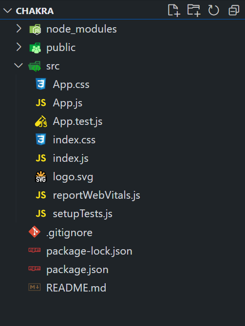
Project Structure:
The updated dependencies are in the package.json file.
"dependencies": {
      "@chakra-ui/react": "^2.8.2",
      "@emotion/react": "^11.11.3",
      "@emotion/styled": "^11.11.0",
      "@testing-library/jest-dom": "^5.17.0",
      "@testing-library/react": "^13.4.0",
      "@testing-library/user-event": "^13.5.0",
      "framer-motion": "^6.5.1",
      "react": "^18.2.0",
      "react-dom": "^18.2.0",
      "react-scripts": "5.0.1",
      "react-icons": "^5.0.1",
      "web-vitals": "^2.1.4"
}
Example: Below is the practical implementation of the Chakra UI Form Icon Button:
Javascript
import React, { useState } from 'react';
import {
ChakraProvider,
CSSReset,
Box,
IconButton,
Spinner,
useColorMode,
Heading,
} from '@chakra-ui/react';
import {
FiMonitor, FiCode,
FiBookOpen, FiDatabase,
FiFileText
}
from 'react-icons/fi';
const App = () => {
const [isLoading, setIsLoading] = useState(false);
const { colorMode } = useColorMode();
const handleButtonClick = () => {
setIsLoading(true);
setTimeout(() => {
setIsLoading(false);
}, 2000);
};
return (
<ChakraProvider>
<CSSReset />
<Box p={4} textAlign="center">
<Heading as="h1" color="green.500" mb={4}>
GeeksforGeeks
</Heading>
<Heading as="h3" mb={4}>
Chakra UI Form Icon Button
</Heading>
<Box d="flex" justifyContent="center"
alignItems="center" flexWrap="wrap">
<IconButton
aria-label='Desktop Icon'
icon={<FiMonitor />}
isActive={colorMode === 'dark'}
isDisabled={isLoading}
isLoading={isLoading}
isRound={true}
spinner={<Spinner size='sm' />}
colorScheme='blue'
size='lg'
onClick={handleButtonClick}
mr={4}
/>
<IconButton
aria-label='Code Icon'
icon={<FiCode />}
colorScheme='green'
size='lg'
isRound={false}
onClick={handleButtonClick}
mr={4}
/>
<IconButton
aria-label='GeeksforGeeks Icon'
icon={<FiBookOpen />}
colorScheme='orange'
size='lg'
isRound={true}
onClick={handleButtonClick}
mr={4}
/>
<IconButton
aria-label='Database Icon'
icon={<FiDatabase />}
colorScheme='teal'
size='lg'
isRound={true}
onClick={handleButtonClick}
mr={4}
/>
<IconButton
aria-label='File Icon'
icon={<FiFileText />}
colorScheme='purple'
size='lg'
isRound={true}
onClick={handleButtonClick}
/>
</Box>
</Box>
</ChakraProvider>
);
};
export default App;
|
Step to run the application:
npm start
Output: Now go to http://localhost:3000 in your browser:

Share your thoughts in the comments
Please Login to comment...