Chakra UI Feedback Circular Progress
Last Updated :
25 Jan, 2024
Chakra UI’s Feedback Circular Progress is a versatile component for displaying progress in web applications, featuring customizable determinate and indeterminate progress indicators. This article demonstrates practical examples of implementing and customizing the Chakra UI Feedback Circular Progress.
Prerequisites:
Approach:
We have three different Feedback Circular Progess Bar. This includes a Determinate Progress Bar, an Indeterminate Progress Bar, and an Increased Thickness Progress Bar. We have added three different buttons which are used to control the progress of the Progress Bar by adjusting the values that are represented using the label property in the Progress Bar.
Steps to Create React Application And Installing Module:
Step 1: Create a React application using the following command:
npx create-react-app chakra
Step 2: After creating your project folder(i.e. chakra), move to it by using the following command:
cd chakra
Step 3: After creating the React application, Install the required package using the following command:
npm i @chakra-ui/react @emotion/react@^11 @emotion/styled@^11 framer-motion@^6
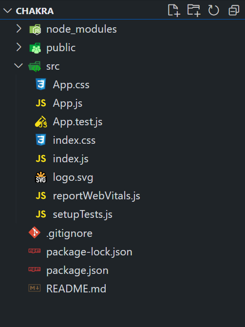
Project Structure:
The updated dependencies are in the package.json file.
"dependencies": {
      "@chakra-ui/react": "^2.8.2",
      "@emotion/react": "^11.11.3",
      "@emotion/styled": "^11.11.0",
      "@testing-library/jest-dom": "^5.17.0",
      "@testing-library/react": "^13.4.0",
      "@testing-library/user-event": "^13.5.0",
      "framer-motion": "^6.5.1",
      "react": "^18.2.0",
      "react-dom": "^18.2.0",
      "react-scripts": "5.0.1",
      "web-vitals": "^2.1.4"
}
Example: Below is the practical implementation of the chakra UI feedback circular progress:
Javascript
import React,
{
useState
} from 'react';
import {
ChakraProvider,
Flex, Button,
Heading
} from '@chakra-ui/react';
import {
CircularProgress,
CircularProgressLabel
} from '@chakra-ui/react';
function App() {
const [progress_val, set_progress_val] = useState(40);
const [fix_progress, set_fix_progress] = useState(false);
const fixProgressFn =
() => {
set_fix_progress(
(prevValue) => !prevValue);
};
const progressValFn =
() => {
set_progress_val(
(prevValue) =>
(prevValue + 10) % 101);
};
const progressValDecFn =
() => {
set_progress_val(
(prevValue) =>
(prevValue - 10 + 100) % 101);
};
return (
<ChakraProvider>
<Flex direction="column"
align="center" justify="center"
minHeight="100vh" p={8}>
<Heading as="h1"
color="green.500" mb={4}>
GeeksforGeeks
</Heading>
<Heading as="h3" mb={1}>
Chakra UI Feedback Circular Progress
</Heading>
<Flex direction="row" justify="center">
<CircularProgress
value={progress_val}
capIsRound
color="teal.400"
size="120px"
thickness={10}
trackColor="teal.100">
<CircularProgressLabel>
{`${progress_val}%`}
</CircularProgressLabel>
</CircularProgress>
<CircularProgress
isIndeterminate={fix_progress}
capIsRound
color="purple.300"
size="120px"
thickness={12}
trackColor="purple.100">
<CircularProgressLabel>
{``}
</CircularProgressLabel>
</CircularProgress>
<CircularProgress
value={60}
capIsRound
color="orange.400"
size="120px"
thickness={16}
trackColor="orange.100">
<CircularProgressLabel>
{`60%`}
</CircularProgressLabel>
</CircularProgress>
</Flex>
<Flex direction="row" justify="center" mt={4}>
<Button onClick={fixProgressFn} m={2}>
Toggle Fixed Progress Bar
</Button>
<Button onClick={progressValFn} m={2}>
Increment Progress Bar
</Button>
<Button onClick={progressValDecFn} m={2}>
Decrement Progress Bar
</Button>
</Flex>
</Flex>
</ChakraProvider>
);
}
export default App;
|
Step to run the application:
npm start
Output: Now go to http://localhost:3000 in your browser:

Share your thoughts in the comments
Please Login to comment...