NCERT Solutions for Class 9 Maths Chapter 14 Statistics is a resourceful article that is developed by the GFG team for the benefit of the students. This article helps students learn the solutions to the problems given in the NCERT textbooks. All of the problems in this chapter’s exercise from the NCERT textbook are covered in the NCERT Solutions for Class 9 Maths. NCERT Solutions Class 9 Chapter 14 Statistics is a vital part of the CBSE Syllabus for the academic year 2023-24.
Chapter 14 Maths Class 9 Statistics teaches about frequency distribution and various ways of representing data. The idea of graphical data representation is explained by utilising a total of four activities that make use of graphs such as frequency polygons, histograms, bar graphs, etc.
Exercises under NCERT Solutions for Class 9 Maths Chapter 14 Statistics: Exercise 14.1
Question 1: Give five examples of data that you can collect from your day-to-day life.
Answer:
1. Number of teachers for each subject in our school.
2. Number of accidents happened during last week obtained from newspapers,
3. Gender ratio of all the states obtained from census data.
4. Average attendance of each student in our class.
5. Chief ministers of all the states obtained from newspaper or election commission.
Question 2: Classify the data in Q.1 above as primary or secondary data.
Answer:
Primary data: When the information was collected by the investigator herself or himself with a definite objective in her or his mind, the data obtained is called primary data.
Primary data: 1, 4.
Secondary data: When the information was gathered from a source which already had the information stored, the data obtained is called secondary data.
Secondary data: 2, 3, 5.
Statistics: Exercise 14.2
Question 1: The blood groups of 30 students of Class VIII are recorded as follows:
A, B, O, O, AB, O, A, O, B, A, O, B, A, O, O,
A, AB, O, A, A, O, O, AB, B, A, O, B, A, B, O.
Represent this data in the form of a frequency distribution table. Which is the most common, and which is the rarest, blood group among these students?
Answer:
Frequency:- No. of students having the same blood group.
Most common blood group (highest frequency blood group) :- O
Rarest blood group (least frequency blood group) :- AB.
Question 2: The distance (in km) of 40 engineers from their residence to their place of work was found as follows:
5 3 10 20 25 11 13 7 12 31
19 10 12 17 18 11 32 17 16 2
7 9 7 8 3 5 12 15 18 3
12 14 2 9 6 15 15 7 6 12
Construct a grouped frequency distribution table with class size 5 for the data given above taking the first interval as 0-5 (5 not included). What main features do you observe from this tabular representation?
Answer:
Grouped frequency distribution table of class size 5:
We observe that, most of the engineers live within 20 kms from their place of work. Only 4 employees out of 40 employees are living in between 20 and 35 kms from their place of work.
Question 3: The relative humidity (in %) of a certain city for a month of 30 days was as follows:
98.1 98.6 99.2 90.3 86.5 95.3 92.9 96.3 94.2 95.1
89.2 92.3 97.1 93.5 92.7 95.1 97.2 93.3 95.2 97.3
96.2 92.1 84.9 90.2 95.7 98.3 97.3 96.1 92.1 89
(i) Construct a grouped frequency distribution table with classes 84 – 86, 86 – 88, etc.
(ii) Which month or season do you think this data is about?
(iii) What is the range of this data?
Answer:
(i) grouped frequency distribution table with classes 84 – 86, 86 – 88, etc….
(ii) In the most of days the humidity is very high, so this data should be from rainy season.
(iii) range of the data = maximum value in the data – minimum value in the data
= 99.2 – 84.9
= 14.3
Question 4: The heights of 50 students, measured to the nearest centimetres, have been found to be as follows:
161 150 154 165 168 161 154 162 150 151
162 164 171 165 158 154 156 172 160 170
153 159 161 170 162 165 166 168 165 164
154 152 153 156 158 162 160 161 173 166
161 159 162 167 168 159 158 153 154 159
(i) Represent the data given above by a grouped frequency distribution table, taking the class intervals as 160 – 165, 165 – 170, etc.
(ii) What can you conclude about their heights from the table?
Answer:
(i) grouped frequency distribution table with classes 160 – 165, 165 – 170, etc…
(ii) from the above table we can tell that height of most of the students (35 students) is less than 165 cms.
Question 5: A study was conducted to find out the concentration of sulphur dioxide in the air in
2020-21 parts per million (ppm) of a certain city. The data obtained for 30 days is as follows:
0.03 0.08 0.08 0.09 0.04 0.17
0.16 0.05 0.02 0.06 0.18 0.20
0.11 0.08 0.12 0.13 0.22 0.07
0.08 0.01 0.10 0.06 0.09 0.18
0.11 0.07 0.05 0.07 0.01 0.04
(i) Make a grouped frequency distribution table for this data with class intervals as 0.00 – 0.04, 0.04 – 0.08, and so on.
(ii) For how many days, was the concentration of sulphur dioxide more than 0.11 parts per million?
Answer:
(i) grouped frequency distribution table with classes 0.00 – 0.04, 0.04 – 0.08, etc..
(ii) concentration of sulphur dioxide was more than 0.11 parts per million for 8 days. ((2 + 4 + 2) days).
Question 6: Three coins were tossed 30 times simultaneously. Each time the number of heads occurring was noted down as follows:
0 1 2 2 1 2 3 1 3 0
1 3 1 1 2 2 0 1 2 1
3 0 0 1 1 2 3 2 2 0
Prepare a frequency distribution table for the data given above
Answer:
Frequency distribution table:
Question 7: The value of π upto 50 decimal places is given below:
3.14159265358979323846264338327950288419716939937510
(i) Make a frequency distribution of the digits from 0 to 9 after the decimal point.
(ii) What are the most and the least frequently occurring digits?
Answer:
(i) frequency distribution table:-
(ii) most frequently occurring digits : 3 & 9 (both occurred 8 times)
least frequently occurring digits : 0 (occurred only twice).
Question 8: Thirty children were asked about the number of hours they watched TV programmes in the previous week. The results were found as follows:
1 6 2 3 5 12 5 8 4 8
10 3 4 12 2 8 15 1 17 6
3 2 8 5 9 6 8 7 14 12
(i) Make a grouped frequency distribution table for this data, taking class width 5 and one of the class intervals as 5 – 10.
(ii) How many children watched television for 15 or more hours a week?
Answer:
(i) grouped frequency distribution table with class width 5 :
(ii) from the above table, we can tell that only 2 children watched television for 15 or more hours a week.
Question 9: A company manufactures car batteries of a particular type. The lives (in years) of 40 such batteries were recorded as follows:
2.6 3.0 3.7 3.2 2.2 4.1 3.5 4.5
3.5 2.3 3.2 3.4 3.8 3.2 4.6 3.7
2.5 4.4 3.4 3.3 2.9 3.0 4.3 2.8
3.5 3.2 3.9 3.2 3.2 3.1 3.7 3.4
4.6 3.8 3.2 2.6 3.5 4.2 2.9 3.6
Construct a grouped frequency distribution table for this data, using class intervals of size 0.5 starting from the interval 2 – 2.5.
Answer:
Grouped frequency distribution table with class intervals of size 0.5 starting from the interval 2 – 2.5:
Statistics: Exercise 14.3
Question 1. A survey conducted by an organization for the cause of illness and death among the women between the ages 15–44 (in years) worldwide, found the following figures (in %):
| S.No. |
Causes |
Female fatality rate (%) |
| 1. |
Reproductive health conditions |
31.8 |
| 2. |
Neuropsychiatric conditions |
25.4 |
| 3. |
Injuries |
12.4 |
| 4. |
Cardiovascular conditions |
4.3 |
| 5. |
Respiratory conditions |
4.1 |
| 6. |
Other causes |
22.0 |
(i) Represent the information given above graphically.
(ii) Which condition is the major cause of women’s ill health and death worldwide?
(iii) Try to find out, with the help of your teacher, any two factors which play a major role in the cause in (ii) above being the major cause.
Answer:
(i) The information given in the question can be represented graphically as:
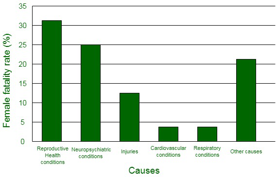
(ii) It can be observed from the graph that the reproductive health conditions is the major cause of women’s ill health and death worldwide.
(iii) Two factors which play a major role in the cause in (ii) above being the major cause are:
- Lack of proper care and understanding.
- Lack of medical facilities.
Question 2. The following data on the number of girls (to the nearest ten) per thousand boys in different sections of Indian society is given below:
| S.No. |
Section |
Number of girls per thousand boys |
| 1. |
Scheduled Caste (SC) |
940 |
| 2. |
Scheduled Tribe (ST) |
970 |
| 3. |
Non SC/ST |
920 |
| 4. |
Backward districts |
950 |
| 5. |
Non-backward districts |
920 |
| 6. |
Rural |
930 |
| 7. |
Urban |
910 |
(i) Represent the information above by a bar graph.
(ii) In the classroom discuss what conclusions can be arrived at from the graph.
Answer:
(i) The information given in the question can be represented graphically as:
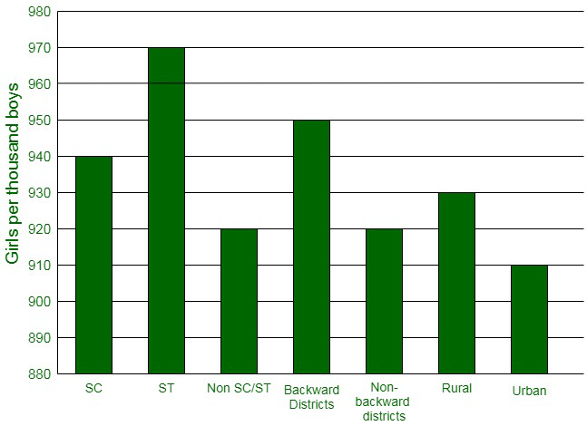
(ii) The following conclusions can be made from the graph,
- The maximum number of girls per thousand boys is present in the section ST.
- The backward districts and rural areas have more number of girls per thousand boys than non-backward districts and urban areas.
Question 3. Given below are the seats won by different political parties in the polling outcome of a state assembly elections:
| Political party |
A |
B |
C |
D |
E |
F |
| Seats won |
75 |
55 |
37 |
29 |
10 |
37 |
(i) Draw a bar graph to represent the polling results.
(ii) Which political party won the maximum number of seats?
Answer:
(i) The bar graph representing the polling results is given below:
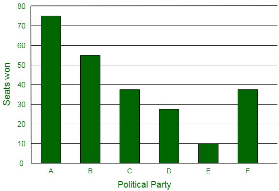
(ii) It can be easily visualized that Party A won the maximum number of seats.
Question 4. The length of 40 leaves of a plant are measured correct to one millimeter, and the obtained data is represented in the following table:
| S.No. |
Length (in mm) |
Number of leaves |
| 1. |
118 – 126 |
3 |
| 2. |
127 – 135 |
5 |
| 3. |
136 – 144 |
9 |
| 4. |
145 – 153 |
12 |
| 5. |
154 – 162 |
5 |
| 6. |
163 – 171 |
4 |
| 7. |
172 – 180 |
2 |
(i) Draw a histogram to represent the given data. [Hint: First make the class intervals continuous]
(ii) Is there any other suitable graphical representation for the same data?
(iii) Is it correct to conclude that the maximum number of leaves are 153 mm long? Why?
Answer:
(i) The data given in the question is represented in discontinuous class interval. In order to make it in a continuous class interval., we subtract ½ = 0.5 from lower limit and add 0.5 to the upper limit. Then, the table becomes:
| S.No. |
Length (in mm) |
Number of leaves |
| 1. |
117.5 – 126.5 |
3 |
| 2. |
126.5 – 135.5 |
5 |
| 3. |
135.5 – 144.5 |
9 |
| 4. |
144.5 – 153.5 |
12 |
| 5. |
153.5 – 162.5 |
5 |
| 6. |
162.5 – 171.5 |
4 |
| 7. |
171.5 – 180.5 |
2 |
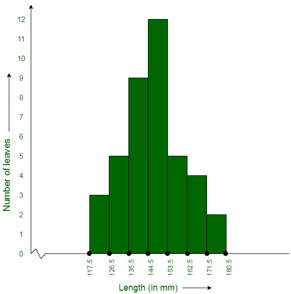
(ii) Yes, the data given in the question can also be represented in the form of a frequency polygon.
No, we cannot conclude that the maximum number of leaves are 153 mm long because the maximum number of leaves are lying in-between the length of 144.5 – 153.5
Question 5. The following table gives the life times of 400 neon lamps:
| Life Time (in hours) |
Number of lamps |
| 300 – 400 |
14 |
| 400 – 500 |
56 |
| 500 – 600 |
60 |
| 600 – 700 |
86 |
| 700 – 800 |
74 |
| 800 – 900 |
62 |
| 900 – 1000 |
48 |
(i) Represent the given information with the help of a histogram.
(ii) How many lamps have a lifetime of more than 700 hours?
Answer:
(i) The histogram representation of the given data is given below:
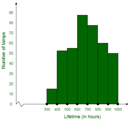
(ii) The total number of lamps having a lifetime of more than 700 hours = 74+62+48
= 184
Question 6. The following table gives the distribution of students of two sections according to the marks obtained by them:
|
Section A
|
Section B
|
|
Marks
|
Frequency
|
Marks
|
Frequency
|
|
0 – 10
|
3
|
0 – 10
|
5
|
|
10 – 20
|
9
|
10 – 20
|
19
|
|
20 – 30
|
17
|
20 – 30
|
15
|
|
30 – 40
|
12
|
30 – 40
|
10
|
|
40 – 50
|
9
|
40 – 50
|
1
|
Represent the marks of the students of both the sections on the same graph by two frequency polygons. From the two polygons compare the performance of the two sections.
Answer:
The class-marks = (lower limit + upper limit)/2
Section A:
| Marks |
Class-marks |
Frequency |
| 0-10 |
5 |
3 |
| 10-20 |
15 |
9 |
| 20-30 |
25 |
17 |
| 30-40 |
35 |
12 |
| 40-50 |
45 |
9 |
Section B:
| Marks |
Class-marks |
Frequency |
| 0-10 |
5 |
5 |
| 10-20 |
15 |
19 |
| 20-30 |
25 |
15 |
| 30-40 |
35 |
10 |
| 40-50 |
45 |
1 |
Representing these data on a graph using two frequency polygons we get,
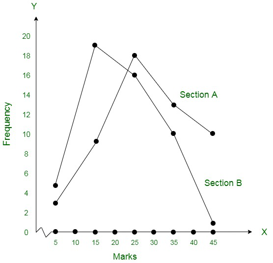
Conclusively, the students of Section A performed better than Section B.
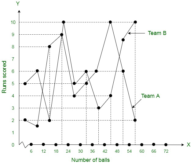
Question 7. The runs scored by two teams A and B on the first 60 balls in a cricket match are given below:
|
Number of balls
|
Team A
|
Team B
|
|
1 – 6
|
2
|
5
|
|
7 – 12
|
1
|
6
|
|
13 – 18
|
8
|
2
|
|
19 – 24
|
9
|
10
|
|
25 – 30
|
4
|
5
|
|
31 – 36
|
5
|
6
|
|
37 – 42
|
6
|
3
|
|
43 – 48
|
10
|
4
|
|
49 – 54
|
6
|
8
|
|
55 – 60
|
2
|
10
|
Represent the data of both the teams on the same graph by frequency polygons.
[Hint: First make the class intervals continuous.]
Answer:
The data given in the question is represented in discontinuous class interval. In order to make it in continuous class interval, we subtract ½ = 0.5 = 0.5 from lower limit and add 0.5 to the upper limit. Then the table becomes:
| Number of balls |
Team A |
Team B |
| 0.5-6.5 |
2 |
5 |
| 6.5-12.5 |
1 |
6 |
| 12.5-18.5 |
8 |
2 |
| 18.5-24.5 |
9 |
10 |
| 24.5-30.5 |
4 |
5 |
| 30.5-36.5 |
5 |
6 |
| 36.5-42.5 |
6 |
3 |
| 42.5-48.5 |
10 |
4 |
| 48.5-54.5 |
6 |
8 |
| 54.5-60.5 |
2 |
10 |
The data of both the teams are represented on the graph below by frequency polygons.
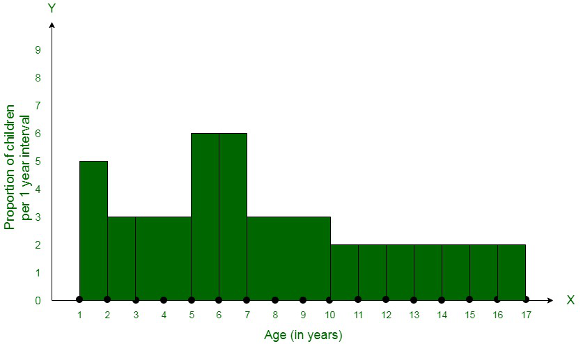
Question 8. A random survey of the number of children of various age groups playing in a park was found as follows:
| Age (in years) |
Number of children
|
|
1 – 2
|
5
|
|
2 – 3
|
3
|
|
3 – 5
|
6
|
|
5 – 7
|
12
|
|
7 – 10
|
9
|
|
10 – 15
|
10
|
|
15 – 17
|
4
|
Draw a histogram to represent the data above.
Answer:
The width of the class intervals in the given data is varying in nature.
Also,
The area of rectangle is proportional to the frequencies in the histogram.
Now, the proportion of the children per year can be calculated as given in the table below.
|
Age
(in years)
|
Number of children (frequency) |
Width of class |
Length of rectangle |
| 1-2 |
5 |
1 |
(5/1)×1 = 5 |
| 2-3 |
3 |
1 |
(3/1)×1 = 3 |
| 3-5 |
6 |
2 |
(6/2)×1 = 3 |
| 5-7 |
12 |
2 |
(12/2)×1 = 6 |
| 7-10 |
9 |
3 |
(9/3)×1 = 3 |
| 10-15 |
10 |
5 |
(10/5)×1 = 2 |
| 15-17 |
4 |
2 |
(4/2)×1 = 2 |
Let us assume,
x-axis = the age of children
y-axis = proportion of children per 1 year interval
Question 9. 100 surnames were randomly picked up from a local telephone directory and a frequency distribution of the number of letters in the English alphabet in the surnames was found as follows:
|
Number of letters
|
Number of surnames
|
|
1 – 4
|
6
|
|
4 – 6
|
30
|
|
6 – 8
|
44
|
|
8 – 12
|
16
|
|
12 – 20
|
4
|
(i) Draw a histogram to depict the given information.
(ii) Write the class interval in which the maximum number of surnames lie.
Answer:
(i) The width of the class intervals in the given data is varying in nature.
Also,
The area of rectangle is proportional to the frequencies in the histogram.
Now, the proportion of the children per year can be calculated as given in the table below.
| Number of letters |
Number of surnames |
Width of class |
Length of rectangle |
| 1-4 |
6 |
3 |
(6/3)×2 = 4 |
| 4-6 |
30 |
2 |
(30/2)×2 = 30 |
| 6-8 |
44 |
2 |
(44/2)×2 = 44 |
| 8-12 |
16 |
4 |
(16/4)×2 = 8 |
| 12-20 |
4 |
8 |
(4/8)×2 = 1 |
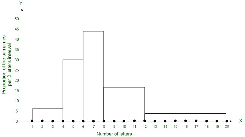
(ii) 6-8 is the class interval in which the maximum number of surnames lie.
Statistics: Exercise 14.4
Question 1. The following number of goals were scored by a team in a series of 10 matches:
2, 3, 4, 5, 0, 1, 3, 3, 4, 3
Find the mean, median, and mode of these scores
Answer:
Mean = Sum of all the elements/total number of elements
Mean = (2 + 3 + 4 + 5 + 0 + 1 + 3 + 3 + 4 + 3) / 10
Mean = 2.8
Now calculating Median:
Arranging the given data in ascending order, we get,
0, 1, 2, 3, 3, 3, 3 4, 4, 5
Median = (3 + 3) / 2 = 3
For mode, we will count the element occurring the maximum number of times.
Hence, the mode is 3.
Question 2. In a mathematics test given to 15 students, the following marks (out of 100) are recorded:
41, 39, 48, 52, 46, 62, 54, 40, 96, 52, 98, 40, 42, 52, 60
Find the mean, median, and mode of this data.
Answer:
Mean = Sum of all the elements/total number of elements.
Mean = (41 + 39 + 48 + 52 + 46 + 62 + 54 + 40 + 96 + 52 + 98 + 40 + 42 + 50 + 60) / 15
Mean = 54.8
Now we have to find the median:
Arranging the given data in ascending order, we get,
39, 40, 40, 41, 42, 46, 48, 52, 52, 52, 54, 60, 62, 96, 98
Here the number of elements is n = 15
Thus, the middle element is the median = 52
Mode = Element 52 occurs 3 times, which is the maximum number of times.
Hence, Mode = 52
Question 3. The following observations have been arranged in ascending order. If the median of the data is 63, find the value of x.
29, 32, 48, 50, x, x + 2, 72, 78, 84, 95
Answer:
Here, the data is already in ascending order.
Since n = 10 (an even number)
∴ Median is the average of the middlemost two elements.
Since median = 63 as given in the question
∴ (x + x + 2) / 2 = 63
∴ x = 63 – 1 = 62
Hence, the value x is 62.
Question 4. Find the mode of 14, 25, 14, 28, 18, 17, 18, 14, 23, 22, 14, 18.
Answer:
When we arrange the data in ascending order, we get,
14, 14, 14, 14, 17, 18, 18, 18, 22, 23, 25, 28.
Since data 14 is occurring the maximum number of times.
Hence, the required mode of the given data = 14
Question 5. Find the mean salary of 60 workers of a factory from the following table:
Answer:
Calculation table based on the given data:
Mean = (305000)/60 = 5083.33.
Thus, the required mean salary = ₹ 5083.33
Question 6. Give one example of a situation in which
(i) The mean is an appropriate measure of central tendency.
(ii) The mean is not an appropriate measure of central tendency but the median is an appropriate measure of central tendency.
Answer:
(i) Mean height of family members where all are of approximately the same height. The entries in this case will be close to each other. Therefore, the mean will be calculated as an appropriate measure of central tendency.
(ii) Median weight of a pen, a book, a Cotton Pack, a matchbox, and a Table.
Benefits of Referring To NCERT Solutions For Class 9 Maths Chapter 14
Key Advantages of GeeksforGeeks NCERT Class 9 Maths Chapter 4 Solutions:
- Expertly Crafted: Our solutions are created by subject experts, using language suitable for students in this age group.
- Step-by-Step Clarity: Each solution is presented in a clear, step-by-step manner, making it easy for students to grasp the concepts.
- Aligned with NCERT: Our solutions strictly adhere to the latest NCERT guidelines, ensuring accuracy.
- Concise and Self-Explanatory: The content is kept concise and self-explanatory, making learning efficient.
- Visual Aids: Some solutions are accompanied by images to enhance understanding.
- Handy Study Tool: It serves as an excellent revision resource during exam preparation.
- Skill Enhancement: Regular practice with these solutions helps students improve their problem-solving and time-management skills.
Important Points to Remember
- NCERT solutions are developed by the GfG team, with a focus on students’ benefit and for all the chapters of class 9 including Statistics.
- All the solutions here are comprehensive and step-by-step so that students can solve all the problems with ease.
- These solutions are very accurate and comprehensive, which can help students prepare for any academic as well as competitive exam.
Also Check:
FAQs on NCERT Solutions for Class 9 Maths Chapter 14-Statistics
1. Why is it important to learn statistics?
Students can understand numerical data, recognise patterns and trends, and derive meaningful conclusions from data with the use of statistics. It offers methods and tools for compiling data into summaries and graphical representations, including measurements of central tendency and dispersion.
2. What topics are covered in NCERT Solutions for Chapter 14 Statistics?
NCERT Solutions for Class 9 Maths Chapter 14-Statistics includes frequency distribution and concept of graphical representation of data, using various graphs like Frequency polygons, Histograms, Bar graphs, etc.
3. How can NCERT Solutions for Class 9 Maths Chapter 14 Statistics help me?
NCERT Solutions for Class 9 Maths Chapter 14-Statistics can help you solve the NCERT exercise without any limitations. If you are stuck on a problem, you can find its solution in these solutions and free yourself from the frustration of being stuck on some question.
4. How many exercises are there in Class 9 Maths Chapter 14 Statistics?
There are 4 exercises in the Class 9 Maths Chapter 14-Statistics which covers all the important topics and sub-topics.
5. Where can I find NCERT Solutions for Class 9 Maths Chapter 14 Statistics?
You can find these NCERT Solutions in this article created by our team of experts at GeeksforGeeks.
6. What are Grouped and Ungrpued Data?
Grouped Data vs. Ungrouped Data
Grouped Data: Grouped data refers to raw data organized into various classes or categories.
Ungrouped Data: Ungrouped data is the raw, unprocessed data in its original form, with no classification into groups or categories.
Share your thoughts in the comments
Please Login to comment...