The process of collecting the data and analyzing that data in large quantity is known as statistics. It is a branch of mathematics trading with the collection, analysis, interpretation, and presentation of numeral facts and figures.
It is a numerical statement that helps us to collect and analyze the data in large quantity the statistics are based on two of its concepts:
- Statistical Data
- Statistical Science
Statistics must be expressed numerically and should be collected systematically.
Data Representation
The word data refers to constituting people, things, events, ideas. It can be a title, an integer, or anycast. After collecting data the investigator has to condense them in tabular form to study their salient features. Such an arrangement is known as the presentation of data.
It refers to the process of condensing the collected data in a tabular form or graphically. This arrangement of data is known as Data Representation.
The row can be placed in different orders like it can be presented in ascending orders, descending order, or can be presented in alphabetical order.
Example: Let the marks obtained by 10 students of class V in a class test, out of 50 according to their roll numbers, be:
39, 44, 49, 40, 22, 10, 45, 38, 15, 50
The data in the given form is known as raw data. The above given data can be placed in the serial order as shown below:
| Roll No. |
Marks |
| 1 |
39 |
| 2 |
44 |
| 3 |
49 |
| 4 |
40 |
| 5 |
22 |
| 6 |
10 |
| 7 |
45 |
| 8 |
38 |
| 9 |
14 |
| 10 |
50 |
Now, if you want to analyse the standard of achievement of the students. If you arrange them in ascending or descending order, it will give you a better picture.
Ascending order:
10, 15, 22, 38, 39, 40, 44. 45, 49, 50
Descending order:
50, 49, 45, 44, 40, 39, 38, 22, 15, 10
When the row is placed in ascending or descending order is known as arrayed data.
Types of Graphical Data Representation
Bar Chart
Bar chart helps us to represent the collected data visually. The collected data can be visualized horizontally or vertically in a bar chart like amounts and frequency. It can be grouped or single. It helps us in comparing different items. By looking at all the bars, it is easy to say which types in a group of data influence the other.
Now let us understand bar chart by taking this example
Let the marks obtained by 5 students of class V in a class test, out of 10 according to their names, be:
7,8,4,9,6
The data in the given form is known as raw data. The above given data can be placed in the bar chart as shown below:
| Name |
Marks |
| Akshay |
7 |
| Maya |
8 |
| Dhanvi |
4 |
| Jaslen |
9 |
| Muskan |
6 |

Histogram
A histogram is the graphical representation of data. It is similar to the appearance of a bar graph but there is a lot of difference between histogram and bar graph because a bar graph helps to measure the frequency of categorical data. A categorical data means it is based on two or more categories like gender, months, etc. Whereas histogram is used for quantitative data.
For example:

Line Graph
The graph which uses lines and points to present the change in time is known as a line graph. Line graphs can be based on the number of animals left on earth, the increasing population of the world day by day, or the increasing or decreasing the number of bitcoins day by day, etc. The line graphs tell us about the changes occurring across the world over time. In a line graph, we can tell about two or more types of changes occurring around the world.
For Example:

Pie Chart
Pie chart is a type of graph that involves a structural graphic representation of numerical proportion. It can be replaced in most cases by other plots like a bar chart, box plot, dot plot, etc. As per the research, it is shown that it is difficult to compare the different sections of a given pie chart, or if it is to compare data across different pie charts.
For example:

Frequency Distribution Table
A frequency distribution table is a chart that helps us to summarise the value and the frequency of the chart. This frequency distribution table has two columns, The first column consist of the list of the various outcome in the data, While the second column list the frequency of each outcome of the data. By putting this kind of data into a table it helps us to make it easier to understand and analyze the data.
For Example: To create a frequency distribution table, we would first need to list all the outcomes in the data. In this example, the results are 0 runs, 1 run, 2 runs, and 3 runs. We would list these numerals in numerical ranking in the foremost queue. Subsequently, we ought to calculate how many times per result happened. They scored 0 runs in the 1st, 4th, 7th, and 8th innings, 1 run in the 2nd, 5th, and the 9th innings, 2 runs in the 6th inning, and 3 runs in the 3rd inning. We set the frequency of each result in the double queue. You can notice that the table is a vastly more useful method to show this data.
Baseball Team Runs Per Inning
| Number of Runs |
Frequency |
| 0 |
4 |
| 1 |
3 |
| 2 |
1 |
| 3 |
1 |
Sample Questions
Question 1: Considering the school fee submission of 10 students of class 10th is given below:
| Student |
Fee |
| Muskan |
Paid |
| Kritika |
Not paid |
| Anmol |
Not paid |
| Raghav |
Paid |
| Nitin |
Paid |
| Dhanvi |
Paid |
| Jasleen |
Paid |
| Manas |
Not paid |
| Anshul |
Not paid |
| Sahil |
Paid |
Solution:
In order to draw the bar graph for the data above, we prepare the frequency table as given below.
| Fee submission |
No. of Students |
| Paid |
6 |
| Not paid |
4 |
Now we have to represent the data by using the bar graph. It can be drawn by following the steps given below:
Step 1: firstly we have to draw the two axis of the graph X-axis and the Y-axis.
The varieties of the data must be put on the X-axis (the horizontal line) and the frequencies of the data must be put on the Y-axis (the vertical line) of the graph.
Step 2: After drawing both the axis now we have to give the numeric scale to the Y-axis (the vertical line) of the graph
It should be started from zero and ends up with the highest value of the data.
Step 3: After the decision of the range at the Y-axis now we have to give it a suitable difference of the numeric scale.
Like it can be 0,1,2,3…….or 0,10,20,30 either we can give it a numeric scale like 0,20,40,60…
Step 4: Now on the X-axis we have to label it appropriately.
Step 5: Now we have to draw the bars according to the data but we have to keep in mind that all the bars should be of the same length and there should be the same distance between each graph

Question 2: Watch the subsequent pie chart that denotes the money spent by Megha at the funfair. The suggested colour indicates the quantity paid for each variety. The total value of the data is 15 and the amount paid on each variety is diagnosed as follows:
Chocolates – 3
Wafers – 3
Toys – 2
Rides – 7

To convert this into pie chart percentage, we apply the formula:
(Frequency/Total Frequency) × 100
Let us convert the above data into a percentage:
Amount paid on rides: (7/15) × 100 = 47%
Amount paid on toys: (2/15) × 100 = 13%
Amount paid on wafers: (3/15) × 100 = 20%
Amount paid on chocolates: (3/15) × 100 = 20 %
Question 3: The line graph given below shows how Devdas’s height changes as he grows.
Given below is a line graph showing the height changes in Devdas’s as he grows. Observe the graph and answer the questions below.
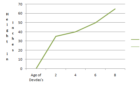
(i) What was the height of Devdas’s at 8 years?
Answer: 65 inches
(ii) What was the height of Devdas’s at 6 years?
Answer: 50 inches
(iii) What was the height of Devdas’s at 2 years?
Answer: 35 inches
(iv) How much has Devdas’s grown from 2 to 8 years?
Answer: 30 inches
(v) When was Devdas’s 35 inches tall?
Answer: 2 years.
Like Article
Suggest improvement
Share your thoughts in the comments
Please Login to comment...