Before jumping into the term “Data Visualization”, let’s have a brief discussion on the term “Data Science” because these two terms are interrelated. But how? Let’s understand. So, in simple terms, “Data Science is the science of analyzing raw data using statistics and machine learning techniques to conclude that information“. But do you know what is Data Science Pipeline? First, we will understand the basics of Data Visualization & will see why is it important before moving to the Data Science Pipeline.
What is Data Visualization?
Data visualization is the graphical representation of information and data in a pictorial or graphical format (Visualization of Data could be: charts, graphs, and maps). Data visualization tools provide an accessible way to see and understand trends, patterns in data, and outliers. Data visualization tools and technologies are essential to analyzing massive amounts of information and making data-driven decisions. The concept of using pictures is to understand data that has been used for centuries. General types of data visualization are Charts, Tables, Graphs, Maps, and Dashboards.
Categories of Data Visualization
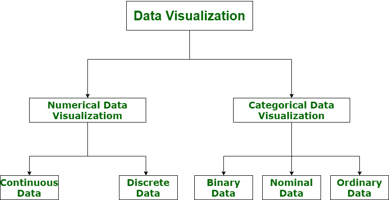
Performing accurate visualization of data is very critical to market research where both numerical and categorical data can be visualized, which helps increase the impact of insights and also helps in reducing the risk of analysis paralysis. So, data visualization is categorized into the following categories:
Data Visualization Categories
- Numerical Data
- Categorical Data
Let’s understand the visualization of data via a diagram with its all categories.
To read more on this refer to: Categories of Data Visualization
Why is Data Visualization Important?
Let’s take an example. Suppose you compile visualization data of the company’s profits from 2013 to 2023 and create a line chart. It would be very easy to see the line going constantly up with a drop in just 2018. So you can observe in a second that the company has had continuous profits in all the years except a loss in 2018. It would not be that easy to get this information so fast from a data table. This is just one demonstration of the usefulness of data visualization. Let’s see some more reasons why visualization of data is so important.
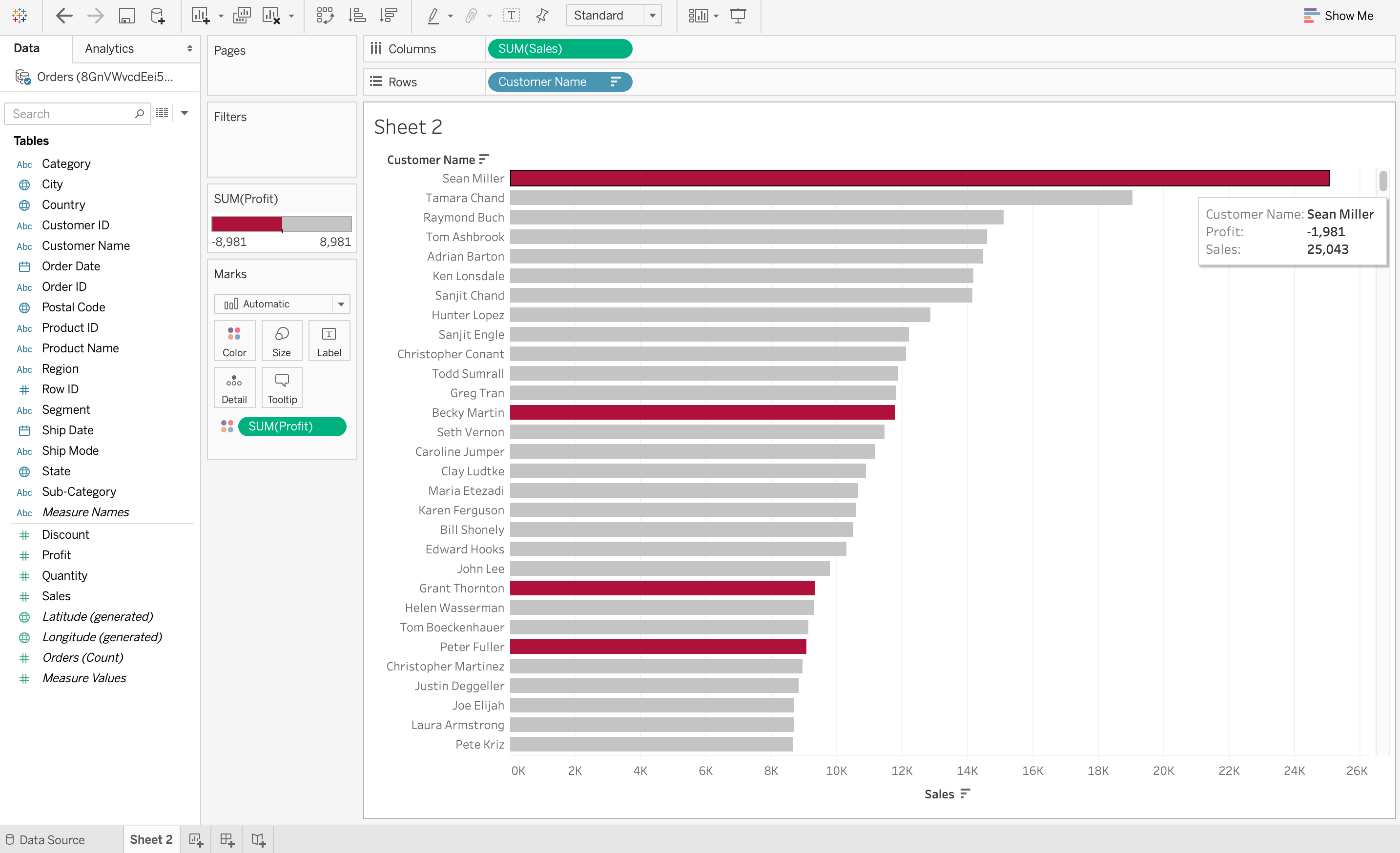
1. Data Visualization Discovers the Trends in Data
The most important thing that data visualization does is discover the trends in data. After all, it is much easier to observe data trends when all the data is laid out in front of you in a visual form as compared to data in a table. For example, the screenshot below on Tableau demonstrates the sum of sales made by each customer in descending order. However, the color red denotes loss while grey denotes profits. So it is very easy to observe from this visualization that even though some customers may have huge sales, they are still at a loss. This would be very difficult to observe from a table.
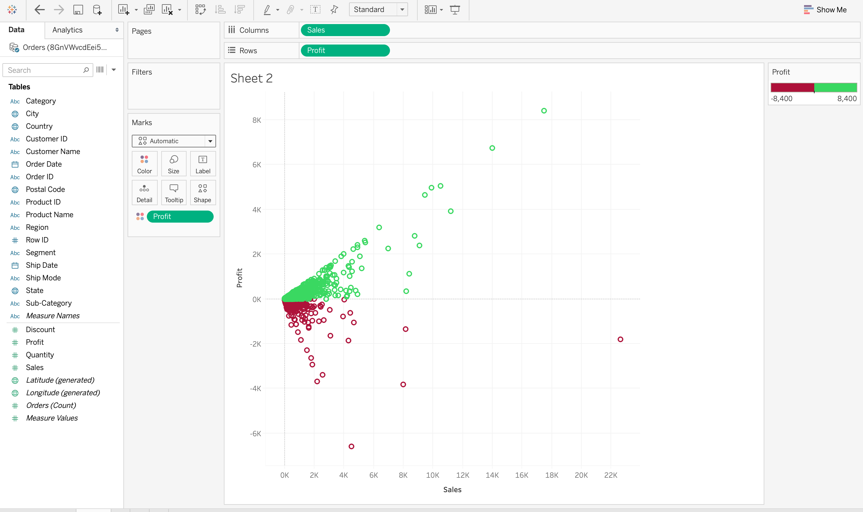
2. Data Visualization Provides a Perspective on the Data
Visualizing Data provides a perspective on data by showing its meaning in the larger scheme of things. It demonstrates how particular data references stand concerning the overall data picture. In the data visualization below, the data between sales and profit provides a data perspective concerning these two measures. It also demonstrates that there are very few sales above 12K and higher sales do not necessarily mean a higher profit.
3. Data Visualization Puts the Data into the Correct Context
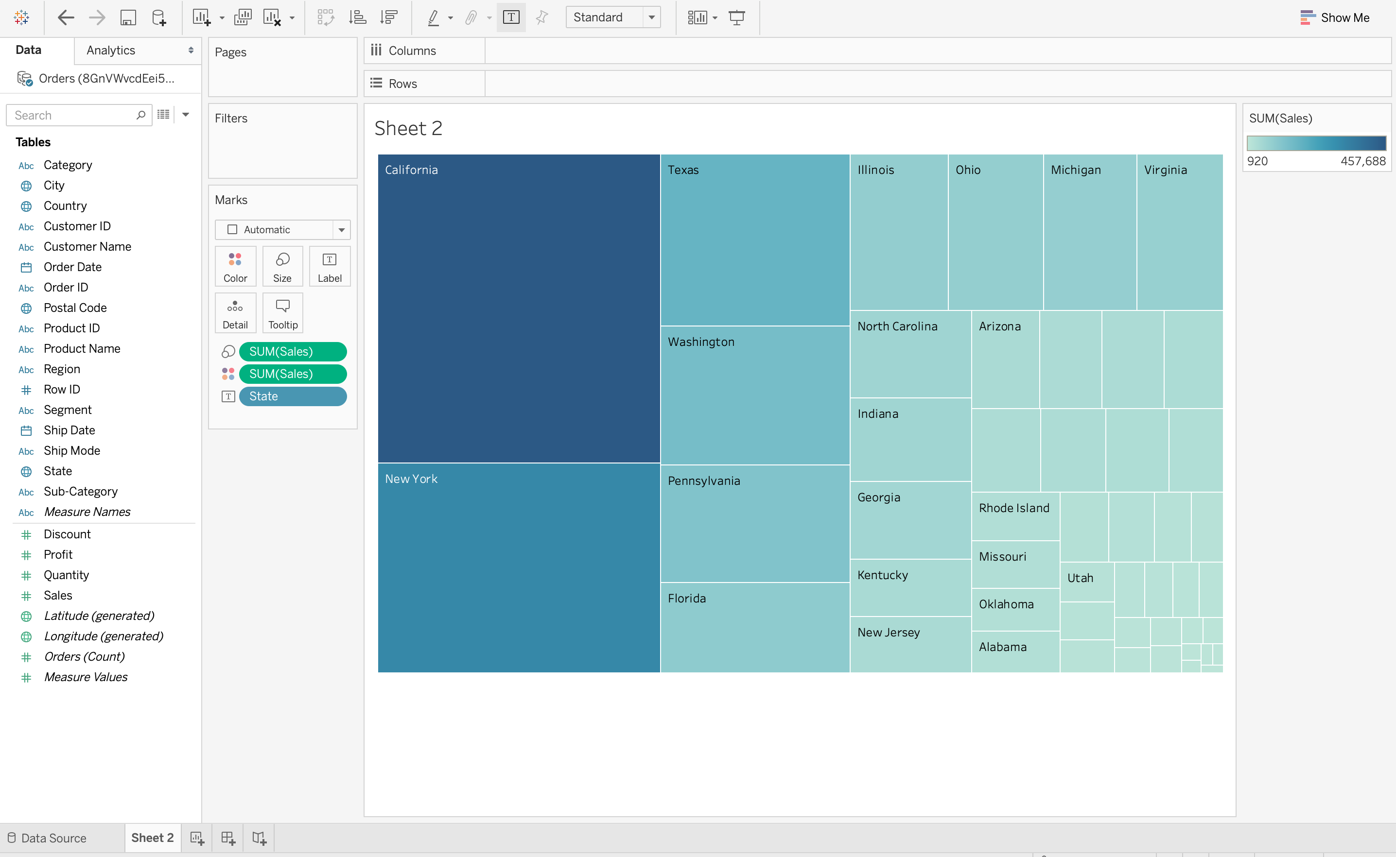
It isn’t easy to understand the context of the data with data visualization. Since context provides the whole circumstances of the data, it is very difficult to grasp by just reading numbers in a table. In the below data visualization on Tableau, a TreeMap is used to demonstrate the number of sales in each region of the United States. It is very easy to understand from this data visualization that California has the largest number of sales out of the total number since the rectangle for California is the largest. But this information is not easy to understand outside of context without visualizing data.
4. Data Visualization Saves Time
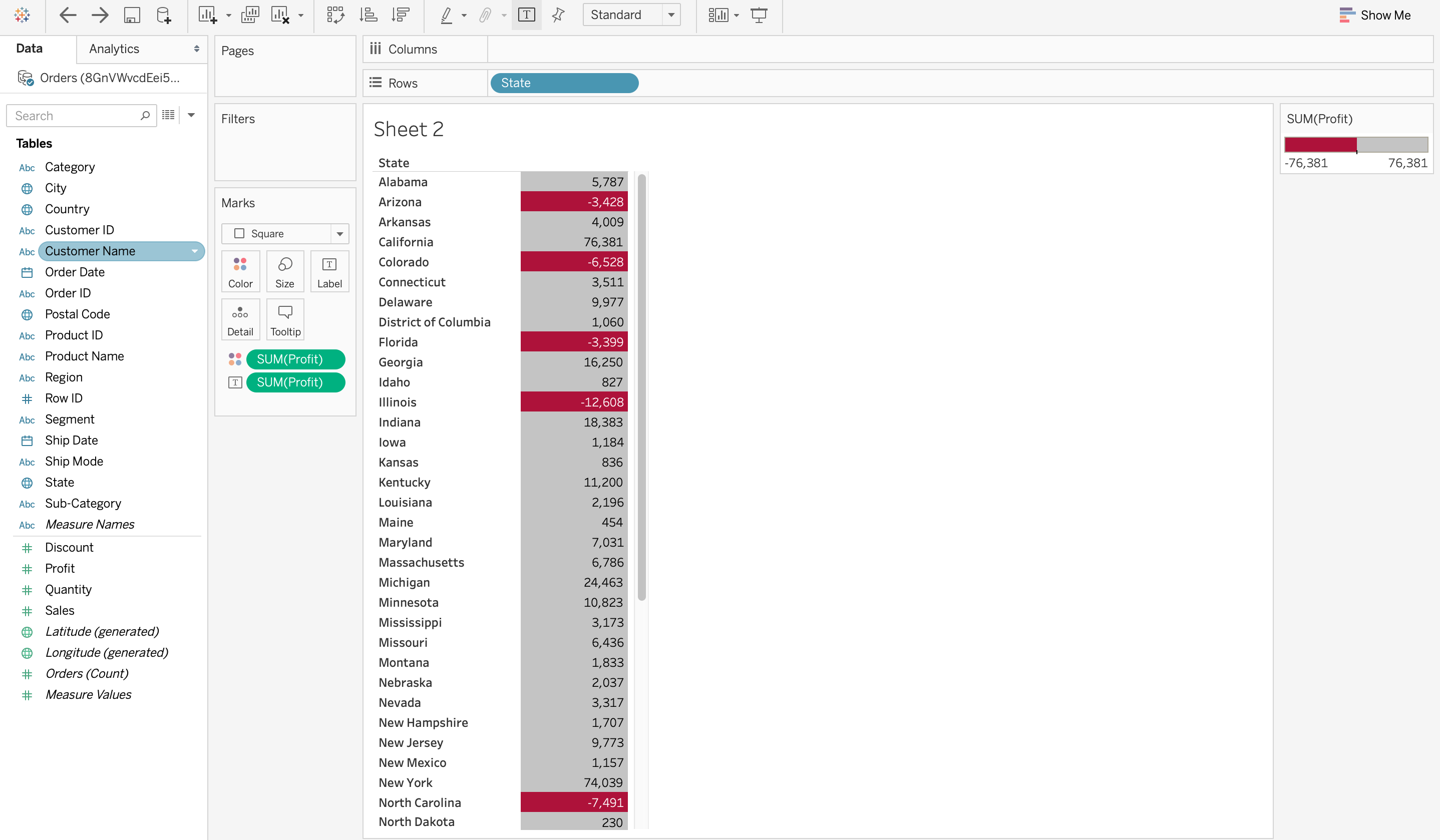
It is definitely faster to gather some insights from the data using data visualization rather than just studying a chart. In the screenshot below on Tableau, it is very easy to identify the states that have suffered a net loss rather than a profit. This is because all the cells with a loss are coloured red using a heat map, so it is obvious states have suffered a loss. Compare this to a normal table where you would need to check each cell to see if it has a negative value to determine a loss. Visualizing Data can save a lot of time in this situation!
5. Data Visualization Tells a Data Story
Data visualization is also a medium to tell a data story to the viewers. The visualization can be used to present the data facts in an easy-to-understand form while telling a story and leading the viewers to an inevitable conclusion. This data story, like any other type of story, should have a good beginning, a basic plot, and an ending that it is leading towards. For example, if a data analyst has to craft a data visualization for company executives detailing the profits of various products, then the data story can start with the profits and losses of multiple products and move on to recommendations on how to tackle the losses.
To find out more points please refer to this article: Why is Data Visualization so Important?
Now, that we have understood the basics of Data Visualization, along with its importance, now will be discussing the Advantages, Disadvantages and Data Science Pipeline (along with the diagram) which will help you to understand how data is compiled through various checkpoints.
What is Data Science?
Data Science is a field that focuses on extracting insights using different techniques for Statistics, Mathematics, Computer Science, etc. The objective of data science is to provide valuable insight to understand patterns and take efficient decisions.
You can also refer to this to learn more about Data Science: What is Data Science?
Data Science Pipeline
In simple words, a pipeline in data science is “a set of actions which changes the raw (and confusing) data from various sources (surveys, feedback, list of purchases, votes, etc.), to an understandable format so that we can store it and use it for analysis.”
The Pipeline in Data Science also represents numerous stages that go through will processing data, they include the following list:
- Fetching/Obtaining the Data
- Scrubbing/Cleaning the Data
- Examining Data
- Identifying Errors
- Identifying Missing Values
- Identifying Corrupt Records
- Cleaning of Data
- Replace or fill in missing values/errors
- Exploratory Data Analysis or EDA
- Modeling the Data
- Interpreting the Data
- Revision

The picture below also explains how raw data undergoes different stages within a pipeline:

Let’s now discuss some of the Advantages & Disadvantages of Data Visualization.
Advantages of Data Visualization
1. Better Agreement: In business, for numerous periods, it happens that we need to look at the exhibitions of two components or two situations. A conventional methodology is to experience the massive information of both circumstances and afterward examine it. This will take a great deal of time.
2. A Superior Method: It can tackle the difficulty of placing the information of both perspectives into the pictorial structure. This will unquestionably give a superior comprehension of the circumstances. For instance, Google patterns assist us with understanding information identified with top ventures or inquiries in pictorial or graphical structures.
3. Simple Sharing of Data: With the representation of the information, organizations present another arrangement of correspondence. Rather than sharing cumbersome information, sharing the visual data will draw in and pass on across the data which is more absorbable.
4. Deals Investigation: With the assistance of information representation, a salesman can, without much of a stretch, comprehend the business chart of items. With information perception instruments like warmth maps, he will have the option to comprehend the causes that are pushing the business numbers up just as the reasons that are debasing the business numbers. Information representation helps in understanding the patterns and different variables like sorts of clients keen on purchasing, rehash clients, the impact of topography, and so forth.
5. Discovering Relations Between Occasions: A business is influenced by a lot of elements. Finding a relationship between these elements or occasions encourages chiefs to comprehend the issues identified with their business. For instance, the online business market is anything but another thing today. Each time during certain happy seasons, like Christmas or Thanksgiving, the diagrams of online organizations go up. Along these lines, state if an online organization is doing a normal $1 million business in a specific quarter and the business ascends straightaway, at that point they can rapidly discover the occasions compared to it.
6. Investigating Openings and Patterns: With the huge loads of information present, business chiefs can discover the profundity of information regarding the patterns and openings around them. Utilizing information representation, the specialists can discover examples of the conduct of their clients, subsequently preparing them to investigate patterns and open doors for business.
Disadvantages of Data Visualization
- Can be time-consuming: Creating visualizations can be a time-consuming process, especially when dealing with large and complex datasets. This can slow down the machine learning workflow and reduce productivity.
- Can be misleading: While data visualization can help identify patterns and relationships in data, it can also be misleading if not done correctly. Visualizations can create the impression of patterns or trends that may not exist, leading to incorrect conclusions and poor decision-making.
- Can be difficult to interpret: Some types of visualizations, such as those that involve 3D or interactive elements, can be difficult to interpret and understand. This can lead to confusion and misinterpretation of the data.
- May not be suitable for all types of data: Certain types of data, such as text or audio data, may not lend themselves well to visualization. In these cases, alternative methods of analysis may be more appropriate.
- May not be accessible to all users: Some users may have visual impairments or other disabilities that make it difficult or impossible for them to interpret visualizations. In these cases, alternative methods of presenting data may be necessary to ensure accessibility.
Data Visualization Tools
The following are the 10 best Data Visualization Tools
- Tableau
- Looker
- Zoho Analytics
- Sisense
- IBM Cognos Analytics
- Qlik Sense
- Domo
- Microsoft Power BI
- Klipfolio
- SAP Analytics Cloud
To find out more about these tools please refer to this article: Best Data Visualization Tools
Top Data Visualization Libraries Available in Python, R, and Javascript
The following are the top Data Visualization Libraries
To find out more about these libraries please refer to this article: Top Libraries for Data Visualization
Frequently Asked Questions on Data Visualization
What are the key benefits of Data Visualization?
Consider these five advantages of data visualization:
- Visualized Data Is Processed Faster. …
- Data Visualization Dashboards Support Visual Learners. …
- Data visualization tools show insights that may be missed in traditional reports.
- Data visualization gives actionable items.
- Data visualization increases productivity and sales.
Why is Data Visualization?
Data visualization helps to tell stories by curating data into a form easier to understand, highlighting the trends and outliers. A good visualization tells a story, removing the noise from data and highlighting useful information.
What are the different types of Data Visualization?
Common categorization of Data Visualisation is given below –
- Charts
- Tables
- Graphs
- Maps
- Infographics
- Dashboards
What are Data Visualization tools?
There are lots of tools to visualize your data. Most of them are javascript libraries because the power of modern web browsers allows you to create magnificent visuals with some imagination.
Share your thoughts in the comments
Please Login to comment...