Interactive Data Visualization with Plotly Express in R
Last Updated :
25 Sep, 2023
Data Visualization in R is the process of representing data so that it is easy to understand and interpret. Various packages are present in the R Programming Language for data visualization.
Plotly’s R graphing library makes interactive, publication-quality graphs. Plotly can be used to make various interactive graphs such as scatter, line, bar, histogram, heatmaps, and many more. It is based on the Plotly.js JavaScript library which is used for making interactive graphical visualization.
Plotly supports a wide range of features including animation, legends, and tooltips.
Installation
To make interactive data visualization you first need to install R and R studio on your machine and then can install Plotly by running the below command in R studio
install.packages("plotly")
Now we can use the Plotly package in r using the below code
library(plotly)
Creating a basic scatter plot using the iris data set and plot_ly function:
R
install.packages("plotly")
library(plotly)
variable <- plot_ly(iris, x=~Petal.Length, y=~Petal.Width)
variable
|
Output:

Interactive Data Visualization with Plotly Express in R
- We first installed the plotly package
- Then we used it using the library function
- Then we plotted a scatter plot using plot_ly function
- In plot_ly function we specified the iris dataset and the x and y axis
- Then we printed the plot
Scatter Plot
In scatter plot shows variation of one variable with respect to another variable. We plot one variable on the x-axis and another on y-axis. The relationship between the two variables is showed with a dot. We can change the dot size, color to show the relationship between the variables.
For plotting scatter plot we are going to use the mtcars dataset. We are going to map the mpg property on the xaxis and disp property on the yaxis.
R
library(plotly)
graph <- mtcars %>%
plot_ly(x=~mpg, y=~disp, type="scatter", color=~cyl) %>%
layout(
title="Miles per gallon vs Displacement",
xaxis=list(
title = "Miles per gallon",
range = c(0,50)
),
yaxis=list(
title = "Displacement",
range=c(0,500)
)
)
graph
|
Output:

- First we used pipe operator to pass the mtcars data set to plot_ly function
- Then we defined the x and y axis.
- Notice we did not specify the plot to be scattered, but plot_ly itself identifies that the best plot for the given information is scatter plot.
The points are colored based on the cyl attribute present in mtcars dataset.
R
install.packages("gapminder")
library(gapminder)
animatedscatter <- gapminder %>%
plot_ly(x=~log(gdpPercap), y=~lifeExp, frame=~year, color=~year, type="scatter") %>%
layout(
title=list(
text="Fuel Efficiency",
font = list(color = "black"),
title_pad = 100),margin = list(t = 50),
paper_bgcolor='rgb(128,128,128)',
plot_bgcolor = 'rgb(128,128,128)',
xaxis=list(
title = "log(GdpPerCapita)",
color="black",
linecolor="black"
),
yaxis=list(
title = "LifeExp",
color="black",
linecolor="black"
)
)
animatedscatter
|
Output:
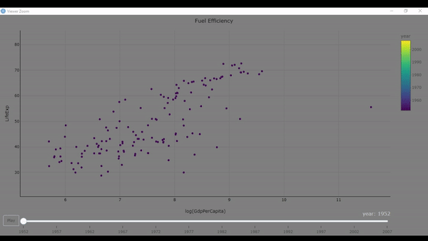
in the above code we used the gapminder dataset to draw animated scatter plot. The above code showed the life expentency and gdp per capita for all the years.
- First we install the gapminder package
- then we loaded it in our project
- used the plot_ly function to specify the x,y axis and frame. The frame specify that we want different scatter plot for each year.
- The color of the dot will change for each year.
Line Plot
Line plot is similar to scatter plot but in this we add connect the two dots together to form a line. We can draw multiple lines with different color to show relation between the x and different y axis.
For drawing the line plot we are going to use the economics dataset. We are to plot the date on the x-axis and then see how unemploy rate changes with the date using line plot.
R
library(plotly)
graph <- economics %>%
plot_ly(x=~date) %>%
add_trace(y=~unemploy/400, type="scatter", mode="lines")
graph
|
Output:

- first imported the plotly library
- Then passed the economics data to the plot_ly function
- We also mapped the x-axis to the date attribute
- Then we used the add_trace function to specify the y-axis, the type of plot and the mode
Multiline Plot:
We can also add multiple lines to the same plot using the add_trace function. The line plot created will be of different color for each different y attribute we specify in the add_trace function.
R
library(plotly)
plot <- economics %>%
plot_ly(x=~date) %>%
add_trace(y=~unemploy/400, type="scatter", mode="lines", name="unemployed") %>%
add_trace(y=~uempmed, type="scatter", mode="lines", name="unemployment rate") %>%
layout(
title=list(
text="date vs (unemployed and unemployment rate)",
font = list(color = "white"),
title_pad = 100
),
margin = list(
t = 50
),
paper_bgcolor='rgb(0,0,0)',
plot_bgcolor = 'rgb(0,0,0)',
legend = list(
bgcolor = "white",
font=list(
family="sans-serif",
color="red"
)
),
xaxis=list(
title = "Date",
rangeslider = list(type="date"),
color = "white",
linecolor="white",
tickangle = -45,
margin(
t=10,
)
),
yaxis=list(
title = "unemployed and unemployment rate",
color = "white",
linecolor="white",
tickangle = -45,
title_standoff=10
)
)
plot
|
Output:
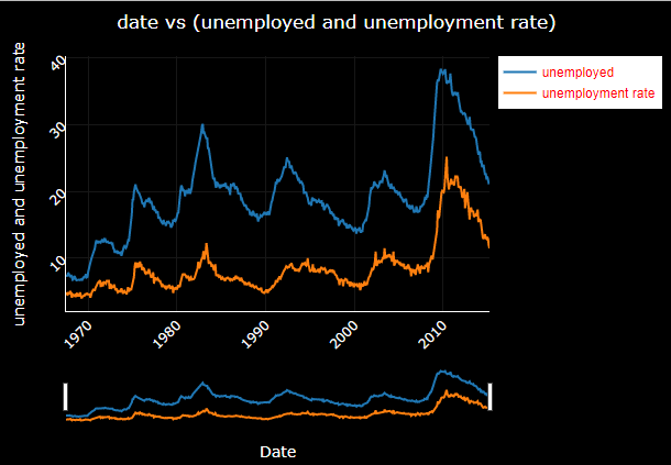
Interactive Data Visualization with Plotly Express in R
- Here it shows passed the economics data to the plot_ly function and mapped the x axis to attribute date
- Then we used the add_trace function to specify the y attribute, the type and mode of the plot and the name to give to this specified plot
- Then we added another add_trace function to add another line in the graph. The type and mode property is same as the first add_trace function but this line will have a different name.
- Then we added the labels to the graph.
Box Plot:
Box plot is used to see the distribution of data for a variety of classes. A box plot display 5 infomation about a class min, first quartile, median, second quartile and max. The box is drawn by connecting the first and second quartile of the data.
R
library(plotly)
boxplot <- mtcars %>%
plot_ly(x=~factor(cyl), y=~mpg) %>%
add_trace(type="scatter", name="scatter") %>%
add_boxplot(name="Boxplot") %>%
layout(
title="Fuel Efficiency"
)
boxplot
|
Output:

Interactive Data Visualization with Plotly Express in R
- first passed the mtcars dataset to the plot_ly function
- in plot_ly function we mapped the x axis to the cyl attribute, here factor is used for drawing the dox and dot plot for different number of cylinders, then we mapped the y-axis with mpg attribute.
- We then specified the plot to be scattered using the add_trace function.
- add_boxplot function is used to draw the boxplot.
- layout is used to label the graph.
Now we can plot multiple boxplot using boxmode grouping function.
R
fig <- plot_ly(diamonds, x = ~cut, y = ~price, color = ~clarity, type = "box") %>%
layout(boxmode = "group", title="CUT vs PRICE")
fig
|
Output:
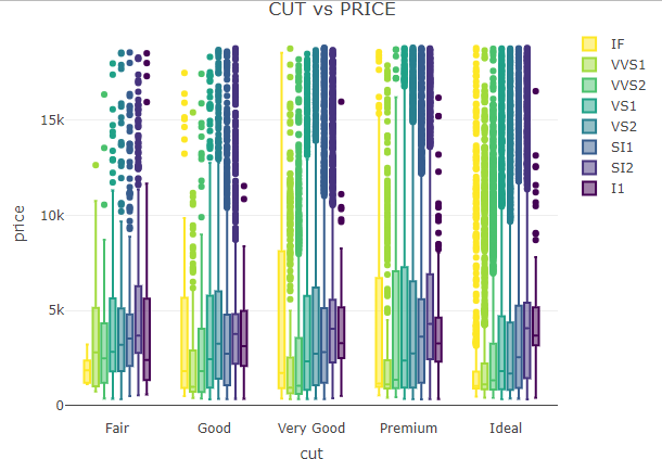
Interactive Data Visualization with Plotly Express in R
We will now draw box plot using the diamonds dataset. Diamond dataset contains information such as price and other attributes for almost 54,000 diamonds. We will draw a box plot plot for each cut of the diamond vs its price.
- we passed the diamonds dataset to the plotly function
- we then mapped the x-axis to cut and y-axis to price
- the color attribute creates a new box plot for each clarity type
- then we specified the type of plot to be box
- boxmode attribute is set to group, which will create seperate box plot for each colour.
3d Scatter Plot
In 3d plot we map x, y and z axis to three different attributes of the dataset. We are going to consider the iris dataset. We will map the Sepal.Length to x axis, Sepal.Width to y-axis and Petal.Length to the z axis. Even if we do not specify the type of plot to be scatter3d the plot_ly function automatically assumes it to be a scatter 3d plot.
R
plot_ly(data=iris,x=~Sepal.Length,
y=~Petal.Length,
z=~Sepal.Width,
color=~Species)
|
Output:

Interactive Data Visualization with Plotly Express in R
Heatmap:
A heatmap is a two-dimensional graphical representation of data where the individual values that are contained in a matrix are represented as colors.
R
library(plotly)
data(iris)
cor_matrix <- cor(iris[, 1:4])
heatmap <- plot_ly(
x = colnames(cor_matrix),
y = colnames(cor_matrix),
z = cor_matrix,
type = "heatmap",
colorscale = "Viridis"
)
layout(heatmap, title = "Correlation Heatmap of Iris Dataset")
print(heatmap)
|
Output:

Interactive Data Visualization with Plotly Express in R
- First we calculate the correlation matrix of the numerical attributes (columns 1 to 4) using the
cor function.
- Then create a heatmap using the
plot_ly function. We specify the x and y axes as column names, the z values as the correlation matrix, the type as “heatmap,” and the colorscale as “Viridis” (you can choose other color scales as well).
- We customize the layout of the heatmap by setting the title using the
layout function.
- We display the heatmap using the
print function.
Share your thoughts in the comments
Please Login to comment...