Animated Data Visualization using Plotly Express
Last Updated :
22 Jun, 2020
Data Visualization is a big thing in the data science industry and displaying the proper statistics to a business or governments can help them immeasurably in improving their services. It is very painful to understand data from different times from multiple charts and make any sense of it. That is where the need for animated data visualizations lie. In this, article we are going to use Plotly Express for plotting and animating the data and datasets from Gapminder. We are going to look at different types of animation provided by Plotly Express.
Installation
Make sure your have Python 3 installed in your computer. Install Plotly which is going to be used for animating the data. To install it, type the below command in the terminal.
pip install plotly
Use Jupyter Notebooks or Google Colab is you don’t want to install the module locally on your computer.
Importing modules and dataset
We need to import Plotly Express and world data from Gapminder.
import plotly.express as px

gapminder = px.data.gapminder()
Example: Let’s print the top few rows of this database
Python3
import plotly.express as px
gapminder = px.data.gapminder()
gapminder.head(15)
|
Output:
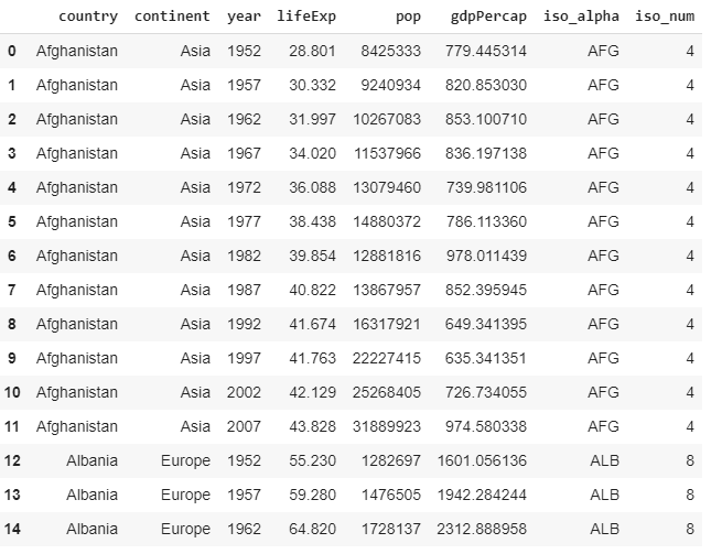
Data from Gapminder
Now we have obtained data from almost all countries in the world from 1952 to 2007 with fields like life expectancy, GDP per capita and population.
Life Expectancy Choropleth
A choropleth is a map that uses differences in color in defined areas about a common property in order to visualize data as an aggregate summary of a region(in this case, a country). Plotly Express makes it easy to plot choropleths. The below code shows how to take information from gapminder. Set the parameter to which you want to color the choropleth to. Here we wanted the choropleth to shade regions on the basis of life expectancy(lifeExp). hover_name shows the set data when hovered over. animation_frame refers to the parameter on which the animation should be done(mostly, this parameter is the time series data).
Example:
Python3
import plotly.express as px
gapminder = px.data.gapminder()
gapminder.head(15)
fig = px.choropleth(gapminder,
locations ="iso_alpha",
color ="lifeExp",
hover_name ="country",
color_continuous_scale = px.colors.sequential.Plasma,
scope ="world",
animation_frame ="year")
fig.show()
|
Output:
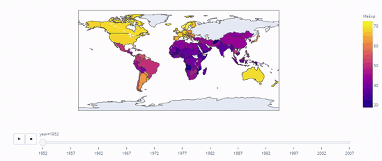
Life Expectancy in Countries from 1952 to 2007
scope refers to the area of scope of the choropleth. For example, if we type scope=”asia”, the following is displayed:
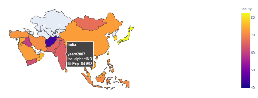
Life Expectancy in Asia
Population Bar Graph
Now let’s make an animated bar graph using the same dataset using population as our primary data in this instance. Let the x of the data be the continent and y be population and when hovered over the names of the countries should be shown. So let’s set hover to ‘country’. It is important to specify range as it helps in understanding the scale of the data we are working on. The parameter on which the animation is done is, of course, the year.
Example:
Python3
import plotly.express as px
gapminder = px.data.gapminder()
gapminder.head(15)
fig = px.bar(gapminder,
x ="continent",
y ="pop",
color ='lifeExp',
animation_frame ='year',
hover_name ='country',
range_y =[0, 4000000000])
fig.show()
|
Output:
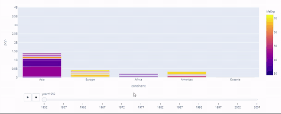
Population
GDP Per Capita vs Life Expectancy Density Contour
The relationship between the life expectancy and GDP per capita across time is an important component for governmental or national data statistics. Governments can(and have) used this for establishing correlation between the two and this thus explains why the increase in life expectancy has also increased the GDP per capita. The approach can be visualized using a density contour plot and a histogram.
Example:
Python3
import plotly.express as px
gapminder = px.data.gapminder()
gapminder.head(15)
fig = px.density_contour(gapminder,
x ="gdpPercap",
y ="lifeExp",
color ="continent",
marginal_y ="histogram",
animation_frame ='year',
animation_group ='country',
range_y =[25, 100])
fig.show()
|
Output:
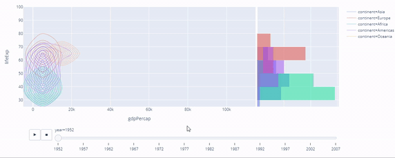
Correlation between life expectancy and GDP per capita
GDP Per Capita vs Life Expectancy Scatter Plot
The same approach can be used for a different kind of plot, that is, the scatter plot. The below code shows how it is done. facet_col is used to split our plot into sub-plots of continent data like shown below.
Python3
import plotly.express as px
gapminder = px.data.gapminder()
gapminder.head(15)
fig = px.scatter(
gapminder,
x ="gdpPercap",
y ="lifeExp",
animation_frame ="year",
animation_group ="country",
size ="pop",
color ="continent",
hover_name ="country",
facet_col ="continent",
size_max = 45,
range_y =[25, 90]
)
fig.show()
|
Output:
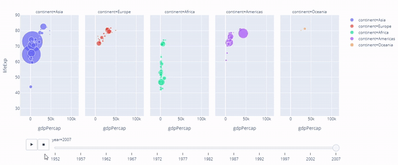
Correlation between life expectancy and GDP per capita
Conclusion
Thus, in this article, we have learnt to code the following using Plotly Express and Python.
- Animated Choropleth
- Animated Bar Graph
- Animated Density Contour Plot
- Animated Scatter Plot
The same knowledge can be extended for more complex datasets, for generating animated visualizations and can be used with forecasting models to animate forecasted data.
Share your thoughts in the comments
Please Login to comment...