Multivariate Data Visualization with R
Last Updated :
20 Jun, 2023
A method for visualizing data with numerous variables is called multivariate data visualization with R. In this method, graphs and charts are made to show how the various factors relate to one another. The programming language R, which is frequently used for data visualization, provides a number of tools for the visualization of multivariate data.
- Scatterplots: In multivariate data visualization, scatterplots can be used to visualize the relationship between multiple variables by coloring the points or adding shapes or sizes.
- Line Graphs: In multivariate data visualization, Line graphs can be used to compare the trends of two variables or to show the trends of several variables across time.
- Bar Charts: In multivariate data visualization, By stacking or grouping the bars, bar charts can be used to compare the values of several category variables.
- Heatmaps: Heatmaps are a type of plot used to display the relationship between multiple variables. Heatmaps use colors to represent the values of the variables, and rows and columns represent the different variables.
- Boxplots: In multivariate data visualization, the distributions of a continuous variable over various categories can be compared using boxplots.
- Correlation Matrix: In multivariate data visualization, to see the connections between variables, a heatmap or other graphical display can be used to visualize a correlation matrix.
Overall, Multivariate data visualization’s primary objective is to find patterns and relationships in the data and effectively communicate these findings.
Scatterplot Matrix
It is possible to see the pairwise correlations between various variables using a scatterplot matrix. Using the “pairs()” function in R Programming Language, this may be generated. Here is an illustration utilizing the integrated iris dataset.
R
library(datasets)
data(iris)
pairs(iris[, 1:5],
col = as.integer(iris$Species),
pch = 18)
|
Output:
.png)
Scatter plot matrix for multivariate data visualizations
The scatterplots in this illustration are colored according to species, and each point is represented by the same symbol.
Correlation Matrix Heatmap
The pairwise correlations between several variables are shown visually using a correlation matrix heatmap. The “ggcorrplot()” function from the “ggcorrplot” package in R can be used to construct this. Here is an illustration utilizing the integrated “mtcars” dataset:
R
library(ggcorrplot)
data(mtcars)
corr_matrix <- cor(mtcars)
ggcorrplot(corr_matrix, hc.order = TRUE,
type = "lower",
colors = c("#6D9EC1",
"yellow", "#E46726"))
|
Output:
.png)
Correlation heatmap for multivariate data visualizations
In this illustration, the correlation matrix is displayed as a heatmap, with orange denoting positive correlations and blue denoting negative correlations. With the use of hierarchical clustering, the variables are also arranged.
Parallel Coordinate Plot
To see the link between several variables and spot patterns or outliers, utilize a parallel coordinate graphic. Using the “ggparcoord()” function from the “GGally” package in R, this may be generated. Here is an illustration utilizing the integrated “mtcars” dataset:
R
library(GGally)
data(mtcars)
ggparcoord(mtcars, columns = 1:4,
groupColumn = "cyl",
alphaLines = 1.0)
|
Output:
.png)
Parallel Coordinate Plot for multivariate data visualizations
In this example, the parallel coordinate plot is categorized according to the number of cylinders, and the same variable is used to color the lines.
Bubble Chart
The size of the points in a bubble chart, a type of scatterplot, represents a third variable. By doing so, it is possible to simultaneously visualize the relationship between two continuous variables and a categorical variable. A bubble chart can be made in R using the ggplot2 package.
R
library(ggplot2)
ggplot(data = mtcars, aes(x = mpg,
y = wt, size = hp,
color = gear)) +
geom_point() +
scale_size(range = c(1, 5)) +
labs(title = "Bubble chart",
x = "Miles_per_gallon",
y = "Weights") +
theme_bw()
|
Output:
.png)
Bubble Chart for multivariate data visualizations
The “mpg” variable is plotted on the x-axis, the weight variable is plotted on the y-axis, the “hp” variable is used to size the bubbles, and the gear variable is used to color the bubbles in this case’s bubble chart of the “mtcars” dataset. The “labs()” function adds a title and axis labels to the plot, while the “scale_size()” function modifies the bubbles’ size range. The plot theme is transformed into a black-and-white color scheme using the “theme_bw()” method.
Bubble Chart
For developing multivariate visualizations in R, the Lattice package is an effective resource. It offers a high-level interface for developing a variety of visualizations and is built on top of the grid graphics system. This is also most widely used for Multivariate data visualization. A few illustrations of multivariate visualizations made with the Lattice program are provided below:
R
library(lattice)
data(mtcars)
xyplot(mpg ~ wt | factor(cyl), data=mtcars,
main="Bubble Diagram for Weight and MPG",
xlab="Weight (1000 lbs)", ylab="Miles per Gallon",
alpha=0.8, col=rainbow(nlevels(factor(mtcars$cyl))),
scales=list(cex=1.5, x=list(alternating=1)),
par.settings=list(superpose.symbol=list(pch=16),
layout.heights=list(bottom.padding=4)))
|
Output:
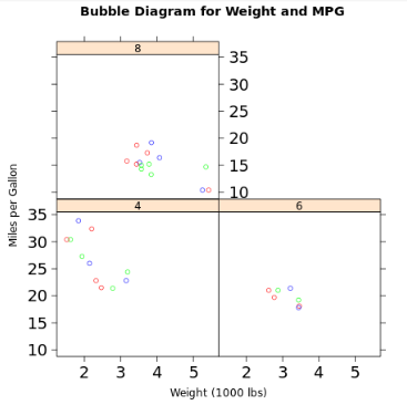
Bubble Chart for multivariate data visualizations using Lattice
Using the “xyplot()” function from the Lattice package, the following code will generate a bubble chart showing the weight and MPG of the “mtcars” dataset. By the number of cylinders in the engine, the bubbles are divided into groups. The bubbles’ transparency can be adjusted with the alpha argument, and their colors can be changed using the “col” option. The layout and style of the chart can be modified using the “scales” and “par.settings” parameters.
Conclusion
The main distinctions that make Lattice better and more popular for multivariate data visualization include the trellis graphics system, flexibility, ease of use, extensive collection of graph kinds, and support for conditional graphics as clearly shown.
Lattice’s popularity for multivariate data visualization can also be attributed to its open-source nature, a rich documentation, active user community, compatibility with other R packages, and capacity for handling big datasets. Overall, We may produce visualizations that clearly illustrate the relationships and patterns in our data by mapping variables to various plot aesthetic features.
Share your thoughts in the comments
Please Login to comment...