Highcharter is an R package that provides an interface to Highcharts, a popular JavaScript charting library. Highcharts is built on top of jQuery and provides a wide range of chart types, including line charts, bar charts, scatter plots, and more. It is highly customizable and supports a wide range of options for styling and interactivity.
In R Programming Langauge Highcharter allows users to create interactive and customizable data visualizations using Highcharts. It provides a set of R functions that map to the corresponding Highcharts API functions, allowing users to create and configure charts using R syntax.
One of the key benefits of Highcharter is its ability to create interactive charts that allow users to explore their data in real time. Highcharts supports a wide range of interactivity options, including zooming, panning, and tooltip display, which allows users to dig deeper into their data and identify patterns and trends.
In addition to interactivity, Highcharter also provides a wide range of customization options for fine-tuning the appearance and behavior of charts. This includes options for styling chart elements such as axes, legends, and titles, as well as options for configuring animation and data labels.
Some of the key features of Highcharter include:
- Customizability: Highcharter provides a wide range of options to customize the appearance of charts, including colors, fonts, labels, and tooltips. Users can also customize the chart layout and add various elements, such as legends, titles, and annotations.
- Interactivity: Highcharter charts are highly interactive, allowing users to zoom in and out, hover over data points to view details, and select specific data points to highlight or filter. Users can also add custom JavaScript functions to handle user interactions.
- Easy integration: Highcharter can be easily integrated with other R packages, such as dplyr, tidyr, and ggplot2, making it easy to work with data and create complex visualizations.
- Compatibility: Highcharter supports a wide range of chart types and data formats, including CSV, JSON, and SQL databases. It also supports various languages, such as English, Spanish, French, and German.
- Responsive design: Highcharter charts are designed to be responsive and can be easily resized to fit different screen sizes, making them suitable for use in web applications and mobile devices.
Overall, Highcharter provides a powerful and flexible tool for creating high-quality and interactive charts in R.
Here are a few examples of how Highcharter can be used to create different types of charts:
Line Chart:
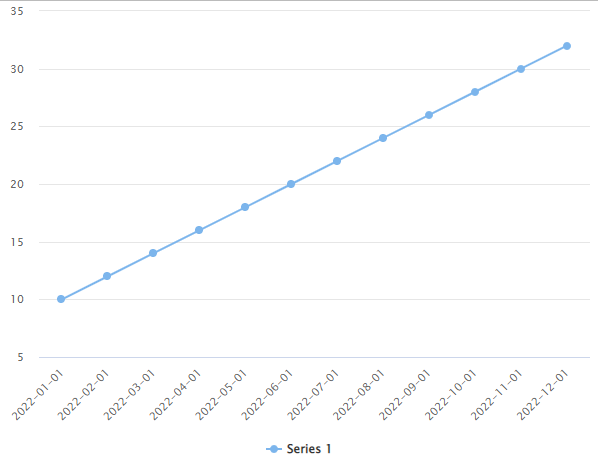
A line chart is a great way to visualize trends over time. With Highcharter, you can create a line chart using the hc_line() function, which takes a data frame as input and maps the x and y columns to the chart’s x and y axes. Here’s an example:
R
library(highcharter)
data <- data.frame(
date = seq(as.Date("2022/01/01"), by = "month", length.out = 12),
sales = c(10, 12, 14, 16, 18, 20, 22, 24, 26, 28, 30, 32)
)
highchart() %>%
hc_xAxis(categories = data$date) %>%
hc_add_series(data$sales, type = "line")
|
Output:
Data Visualization with Highcharter in R
In this example, we create a data frame with two columns, date and sales, and use highchart() to create a chart object. We map the date column to the x-axis using hc_xAxis(), and then add a line series to the chart using hc_add_series(). The type = “line” argument specifies that we want to create a line chart.
Bubble Chart:
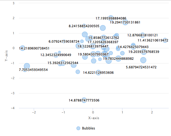
A bubble chart is a great way to visualize three variables at once, where the size of the bubble represents the third variable. With Highcharter, you can create a bubble chart using the hc_bubble() function. Here’s an example:
R
library(highcharter)
data <- data.frame(
x = rnorm(50),
y = rnorm(50),
z = runif(50, min = 5, max = 20)
)
highchart() %>%
hc_add_series(data = data, type = "bubble",
name = "Bubbles",
maxSize = 20,
dataLabels = list(enabled = TRUE, format = "{point.z}")) %>%
hc_xAxis(title = list(text = "X-axis")) %>%
hc_yAxis(title = list(text = "Y-axis"))
|
Output:
Data Visualization with Highcharter in R
In this example, we create a data frame with three columns, x, y, and z, and use hc_bubble() to create a bubble chart. We customize the chart by specifying the name of the series, the maximum size of the bubbles, and enabling data labels that display the value of the third variable. We also customize the x and y axes by adding titles to them.
Bar Chart:
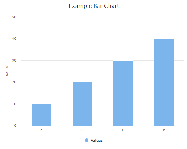
A bar chart is a great way to compare values across categories. With Highcharter, you can create a bar chart using the hc_column() function, which takes a data frame as input and maps the x and y columns to the chart’s x and y axes. Here’s an example:
R
data <- data.frame(
category = c("A", "B", "C", "D"),
value = c(10, 20, 30, 40)
)
highchart() %>%
hc_chart(type = "column") %>%
hc_title(text = "Example Bar Chart") %>%
hc_xAxis(categories = data$category) %>%
hc_yAxis(title = list(text = "Value")) %>%
hc_add_series(data = data$value, name = "Values")
|
Output:
Data Visualization with Highcharter in R
In this example, we first create a data frame with two columns (category and value) representing the categories and values we want to plot. Then, we create a basic column chart using the hc_chart(type = “column”) function and add a title to the chart with hc_title(). We specify the x-axis categories using hc_xAxis(categories = data$category) and add a y-axis title with hc_yAxis(title = list(text = “Value”)). Finally, we add a series to the chart with hc_add_series(data = data$value, name = “Values”), specifying the data we want to plot and the series name.
You can customize the chart further by adding colors, labels, and other options. The highcharter package has extensive documentation with many examples that you can explore to learn more.
Heat map:
R
library(highcharter)
set.seed(123)
mat <- matrix(rnorm(100), ncol = 10)
highchart() %>%
hc_add_series(data = mat, type = "heatmap") %>%
hc_colorAxis(stops = color_stops(10, colors = c("#FFFFCC", "#800026"))) %>%
hc_tooltip(pointFormat = "Value: {point.value:.2f}") %>%
hc_xAxis(categories = colnames(mat), title = list(text = "X-Axis")) %>%
hc_yAxis(categories = rownames(mat), title = list(text = "Y-Axis"), reversed = TRUE) %>%
hc_chart(title = list(text = "Heatmap Title"))
|
Output
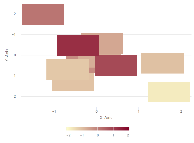
In this code, we use hc_add_series() to create a heatmap, and directly provide the mat matrix as the data argument. We set the color scale and tooltip format using hc_colorAxis() and hc_tooltip(), and add x and y axis titles using hc_xAxis() and hc_yAxis().
We set the x categories using colnames(mat) and the y categories using rownames(mat), and reverse the y axis using the reversed argument. Finally, we add a chart title using hc_chart().
Conclusion:
highcharter is a powerful and flexible package for creating interactive and customizable visualizations in R using the Highcharts JavaScript library. It provides a wide range of chart types, including basic charts like bar charts and line charts, as well as more complex types like heat maps, 3D charts, and network graphs.
highcharter is relatively easy to use, with a consistent syntax and intuitive functions for adding and customizing chart elements. It also includes a variety of options for styling and formatting charts, including color palettes, themes, and annotations.
Overall, highcharter is a great choice for creating interactive and engaging visualizations in R, whether for data exploration, presentation, or publication. With its extensive documentation and active development community, it is a reliable and well-supported tool for data visualization.
Share your thoughts in the comments
Please Login to comment...