Graphical Data Analysis (GDA) is a powerful tool that helps us to visualize and explore complex data sets. R is a popular programming language for GDA as it has a wide range of built-in functions for producing high-quality visualizations. In this article, we will explore some of the most commonly used GDA techniques in the R Programming Language.
For the data visualization, we will be using the mtcars dataset which is a built-in dataset in R that contains measurements on 11 different attributes for 32 different cars.
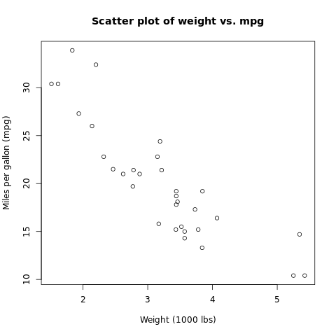
Scatter Plot
A scatter plot is a type of graph that displays the relationship between two variables. It is useful for identifying trends, patterns, and outliers in data sets.
R
plot(mtcars$wt, mtcars$mpg,
xlab = "Weight (1000 lbs)",
ylab = "Miles per gallon (mpg)",
main = "Scatter plot of weight vs. mpg")
|
Output:
Scatter plot for Graphical Data Analysis
This creates a scatter plot of the weight of cars in the mtcars data set vs their fuel efficiency, measured in miles per gallon (mpg). The xlab, ylab, and main arguments specify the labels for the x and y axes and the main title, respectively.
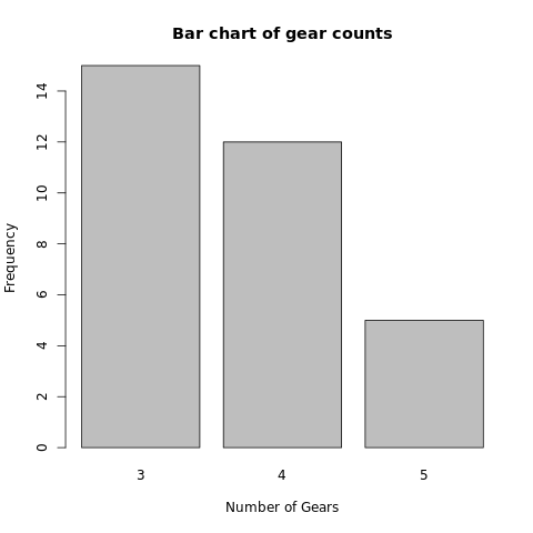
Bar Chart
A bar chart is a type of graph that displays the distribution of a categorical variable. It is useful for comparing the frequencies or proportions of different categories.
R
barplot(table(mtcars$gear),
xlab = "Number of Gears",
ylab = "Frequency",
main = "Bar chart of gear counts")
|
Output:
Bar plot for Graphical Data Analysis
This creates a bar chart of the number of gears in the mtcars data set. The table function is used to generate a frequency table of the gear counts, which is then passed to the barplot function. The xlab, ylab, and main arguments specify the labels for the x and y axes and the main title, respectively.
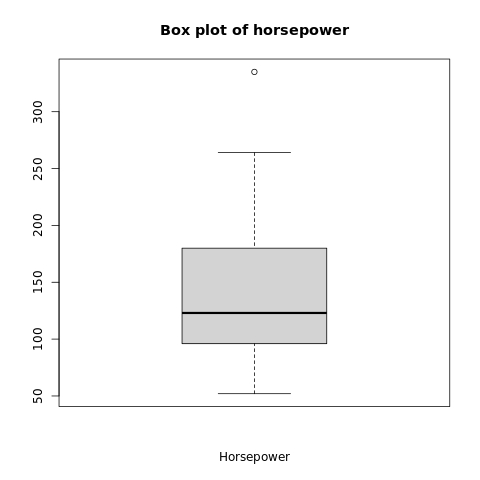
Box Plots
A box plot is a type of graph that displays the distribution of a numerical variable. It is useful for identifying the median, quartiles, and outliers in data sets.
R
boxplot(mtcars$hp,
xlab = "Horsepower",
main = "Box plot of horsepower")
|
Output:
Box plot for Graphical Data Analysis
This creates a box plot of the horsepower variable in the mtcars data set. The xlab and main arguments specify the labels for the x-axis and the main title, respectively.
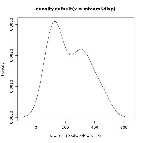
Density Plots
A density plot is a type of graph that displays the distribution of a numerical variable as a smooth curve. It is useful for identifying the shape, spread, and skewness of data sets.
R
plot(density(mtcars$disp))
|
Output:
Density plot for Graphical Data Analysis
This creates a density plot of the displacement variable in the mtcars data set.
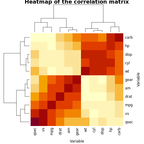
Heatmaps
A heatmap is a type of graph that displays the intensity of a numerical variable in a matrix format. It is useful for identifying patterns and correlations in large data sets.
R
corr_matrix <- cor(mtcars)
heatmap(corr_matrix,
xlab = "Variable",
ylab = "Variable",
main = "Heatmap of the correlation matrix")
|
Output:
Heatmaps for Graphical Data Analysis
This creates a heatmap of the correlation matrix for the mtcars data set. The cor function is used to calculate the correlation coefficients between each pair of variables in the data set. The xlab, ylab, and main arguments specify the labels for the x and y axes and the main title, respectively.
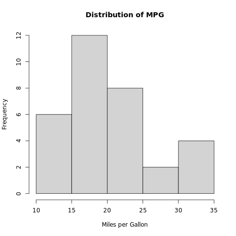
Histogram
A histogram is a type of graph that represents the distribution of continuous data. It breaks down the data into intervals or bins and counts the number of values that fall within each bin.
R
data(mtcars)
hist(mtcars$mpg, breaks = 5,
main = "Distribution of MPG",
xlab = "Miles per Gallon",
ylab = "Frequency")
|
Output:
Histogram for Graphical Data Analysis
In this example, we use the hist() function to create a histogram of the “mpg” variable in the mtcars dataset. The breaks argument specifies the number of bins to use, and the main, xlab, and ylab arguments are used to add a title and axis labels to the plot.
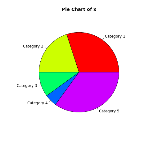
Pie Chart
Pie charts are used to visualize the relative proportions or percentages of different categories in a dataset. In a pie chart, each category is represented by a slice of the pie, with the size of each slice proportional to the percentage of observations in that category.
R
x <- c(30, 20, 10, 5, 35)
pie(x, labels = c("Category 1", "Category 2",
"Category 3", "Category 4",
"Category 5"),
main = "Pie Chart of x",
col = rainbow(length(x)))
|
Output:
PieChart for Graphical Data Analysis
In this example, we use the pie() function to create a pie chart of the “Species” variable in the iris dataset. The table() function is used to count the number of observations in each category, and the main argument is used to add a title to the plot.
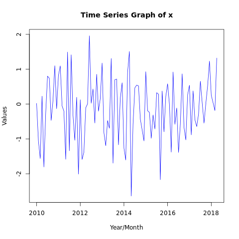
Time Series Graphs
Time series graphs are used to visualize the changes in a variable over time. They can reveal trends, seasonality, and other patterns in the data.
R
x <- ts(rnorm(100),
start = c(2010, 1),
frequency = 12)
plot(x, type = "l",
main = "Time Series Graph of x",
xlab = "Year/Month",
ylab = "Values", col = "blue")
|
Output:
TimeSeries Graph for Graphical Data Analysis
In this example, we use the plot() function to create a time series plot of dataset x. The main, xlab, and ylab arguments are used to add a title and axis labels to the plot.
Stepped line graph
Stepped line graphs are similar to line graphs, but the line only changes direction at the points where the data changes. They are often used to visualize data that is measured at discrete intervals.
R
x <- c(1, 2, 3, 4,
5, 4, 3, 2, 1)
plot(x, type = "s",
main = "Stepped Line Graph of x",
xlab = "Index",
ylab = "Values",
col = "blue",
lwd = 2, lend = "round")
|
Output:
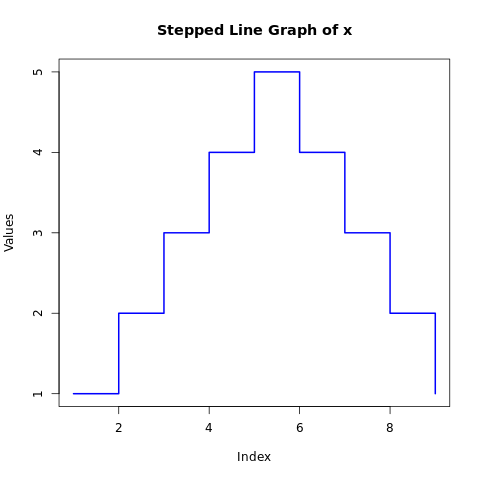
Stepped Line Graph for Graphical Data Analysis
In this example, we use the plot() function to create a stepped line graph of the “deaths” dataset. The type argument is set to “S” to specify a stepped line graph, and the main, xlab, and ylab arguments are used to add a title and axis labels to the plot.
Pairs Function
The pairs() function in R is a useful tool for visualizing relationships between multiple variables in a dataset. It creates a matrix of scatterplots, where each variable is plotted against every other variable. Here is an example of using the pairs() function with some of these arguments:
R
data(mtcars)
x <- mtcars[, 1:6]
pairs(x, main = "Matrix of Scatter Plots of mtcars",
col = "blue")
|
Output:
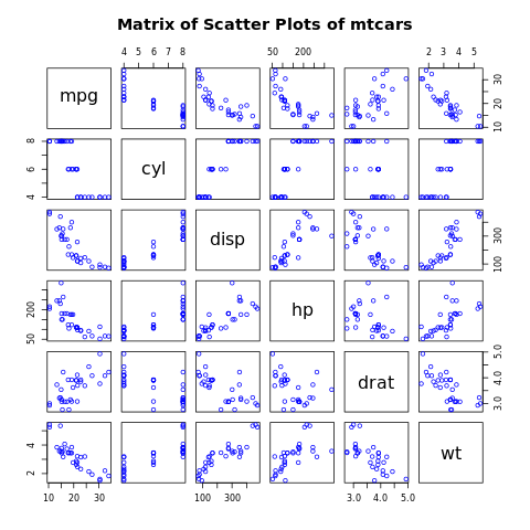
Pairs Plot for Graphical Data Analysis
In this example, we use the pairs() function to create a scatterplot matrix of the variables, setting the title and color for each point with the main and col arguments, respectively.
Conclusion
In this article, we have explored some of the most commonly used GDA techniques in R and provided examples of the syntax used to produce these visualizations. With R, we can produce high-quality visualizations that help us to better understand our data and make more informed decisions. As we become more proficient with R, we can explore more advanced techniques and create even more sophisticated visualizations.
Share your thoughts in the comments
Please Login to comment...