Exploratory Data Analysis or EDA is a statistical approach or technique for analyzing data sets to summarize their important and main characteristics generally by using some visual aids. The EDA approach can be used to gather knowledge about the following aspects of data.
- Main characteristics or features of the data.
- The variables and their relationships.
- Finding out the important variables that can be used in our problem.
EDA is an iterative approach that includes:
- Generating questions about our data
- Searching for the answers by using visualization, transformation, and modeling of our data.
- Using the lessons that we learn to refine our set of questions or to generate a new set of questions.
Exploratory Data Analysis in R
In R Programming Language, we are going to perform EDA under two broad classifications:
- Descriptive Statistics, which includes mean, median, mode, inter-quartile range, and so on.
- Graphical Methods, which includes histogram, density estimation, box plots, and so on.
Before we start working with EDA, we must perform the data inspection properly. Here in our analysis, we will be using the loafercreek from the soilDB package in R. We are going to inspect our data in order to find all the typos and blatant errors. Further EDA can be used to determine and identify the outliers and perform the required statistical analysis. For performing the EDA, we will have to install and load the following packages:
- “aqp” package
- “ggplot2” package
- “soilDB” package
We can install these packages from the R console using the install.packages() command and load them into our R Script by using the library() command. We will now see how to inspect our data and remove the typos and blatant errors.
Data Inspection for Exploratory Analysis in R
To ensure that we are dealing with the right information we need a clear view of your data at every stage of the transformation process. Data Inspection is the act of viewing data for verification and debugging purposes, before, during, or after a translation. Now let’s see how to inspect and remove the errors and typos from the data.
R
# Data Inspection in EDA
# loading the required packages
library(aqp)
library(soilDB)

# Load from the loafercreek dataset
data("loafercreek")

# Construct generalized horizon designations
n <- c("A", "BAt", "Bt1", "Bt2", "Cr", "R")

# REGEX rules
p <- c("A", "BA|AB", "Bt|Bw", "Bt3|Bt4|2B|C",
        "Cr", "R")

# Compute genhz labels and
# add to loafercreek dataset
loafercreek$genhz <- generalize.hz(
  loafercreek$hzname,
  n, p)

# Extract the horizon table
h <- horizons(loafercreek)

# Examine the matching of pairing of
# the genhz label to the hznames
table(h$genhz, h$hzname)

vars <- c("genhz", "clay", "total_frags_pct",
           "phfield", "effclass")
summary(h[, vars])

sort(unique(h$hzname))
Output:
           2BC 2BCt 2Bt1 2Bt2 2Bt3 2Bt4 2Bt5 2CB 2CBt 2Cr 2Crt 2R  A A1 A2 AB
  A          0    0    0    0    0    0    0   0    0   0    0  0 97  7  7  0
  BAt        0    0    0    0    0    0    0   0    0   0    0  0  0  0  0  1
  Bt1        0    0    0    0    0    0    0   0    0   0    0  0  0  0  0  0
  Bt2        1    1    3    8    8    6    1   1    1   0    0  0  0  0  0  0
  Cr         0    0    0    0    0    0    0   0    0   4    2  0  0  0  0  0
  R          0    0    0    0    0    0    0   0    0   0    0  6  0  0  0  0
  not-used   0    0    0    0    0    0    0   0    0   0    0  0  0  0  0  0

           ABt Ad Ap  B BA BAt BC BCt Bt Bt1 Bt2 Bt3 Bt4 Bw Bw1 Bw2 Bw3  C
  A          0  1  1  0  0   0  0   0  0   0   0   0   0  0   0   0   0  0
  BAt        0  0  0  0 31   8  0   0  0   0   0   0   0  0   0   0   0  0
  Bt1        2  0  0  0  0   0  0   0  8  93  88   0   0 10   2   2   1  0
  Bt2        0  0  0  0  0   0  4  16  0   0   0  47   8  0   0   0   0  6
  Cr         0  0  0  0  0   0  0   0  0   0   0   0   0  0   0   0   0  0
  R          0  0  0  0  0   0  0   0  0   0   0   0   0  0   0   0   0  0
  not-used   0  0  0  1  0   0  0   0  0   0   0   0   0  0   0   0   0  0

           CBt Cd Cr Cr/R Crt H1 Oi  R Rt
  A          0  0  0    0   0  0  0  0  0
  BAt        0  0  0    0   0  0  0  0  0
  Bt1        0  0  0    0   0  0  0  0  0
  Bt2        6  1  0    0   0  0  0  0  0
  Cr         0  0 49    0  20  0  0  0  0
  R          0  0  0    1   0  0  0 40  1
  not-used   0  0  0    0   0  1 24  0  0

      genhz          clay       total_frags_pct    phfield
 A       :113   Min.   :10.00   Min.   : 0.00   Min.   :4.90
 BAt     : 40   1st Qu.:18.00   1st Qu.: 0.00   1st Qu.:6.00
 Bt1     :206   Median :22.00   Median : 5.00   Median :6.30
 Bt2     :118   Mean   :23.63   Mean   :13.88   Mean   :6.18
 Cr      : 75   3rd Qu.:28.00   3rd Qu.:20.00   3rd Qu.:6.50
 R       : 48   Max.   :60.00   Max.   :95.00   Max.   :7.00
 not-used: 26   NA's   :167                     NA's   :381
   effclass
 Length:626
 Class :character
 Mode  :character

 [1] "2BC"  "2BCt" "2Bt1" "2Bt2" "2Bt3" "2Bt4" "2Bt5" "2CB"  "2CBt" "2Cr"
[11] "2Crt" "2R"   "A"    "A1"   "A2"   "AB"   "ABt"  "Ad"   "Ap"   "B"
[21] "BA"   "BAt"  "BC"   "BCt"  "Bt"   "Bt1"  "Bt2"  "Bt3"  "Bt4"  "Bw"
[31] "Bw1"  "Bw2"  "Bw3"  "C"    "CBt"  "Cd"   "Cr"   "Cr/R" "Crt"  "H1"
[41] "Oi"   "R"    "Rt"
Now proceed with the EDA.
Descriptive Statistics Exploratory Data Analysis in R
For Descriptive Statistics in order to perform EDA in R, we will divide all the functions into the following categories:
- Measures of central tendency
- Measures of dispersion
- Correlation
We will try to determine the mid-point values using the functions under the Measures of Central tendency. Under this section, we will be calculating the mean, median, mode, and frequencies.
The measures of central tendency
R
# first remove missing values
# and create a new vector
clay <- na.exclude(h$clay)

mean(clay)
median(clay)
sort(table(round(h$clay)),
     decreasing = TRUE)[1]
table(h$genhz)
# append the table with
# row and column sums
addmargins(table(h$genhz,
                 h$texcl))
Output:
mean(clay)
[1] 23.62767
median(clay)
[1] 22

25
42

       A      BAt      Bt1      Bt2       Cr        R not-used
     113       40      206      118       75       48       26

             c  cl   l scl sic sicl sil  sl Sum
  A          0   0  78   0   0    0  27   6 111
  BAt        0   2  31   0   0    1   4   1  39
  Bt1        2  44 127   4   1    5  20   1 204
  Bt2       16  54  29   5   1    3   5   0 113
  Cr         1   0   0   0   0    0   0   0   1
  R          0   0   0   0   0    0   0   0   0
  not-used   0   1   0   0   0    0   0   0   1
  Sum       19 101 265   9   2    9  56   8 469
Calculate the proportions
R
# relative to the rows, margin = 1
# calculates for rows, margin = 2 calculates
# for columns, margin = NULL calculates
# for total observations
round(prop.table(table(h$genhz, h$texture_class),
                 margin = 1) * 100)
knitr::kable(addmargins(table(h$genhz, h$texcl)))

aggregate(clay ~ genhz, data = h, mean)
aggregate(clay ~ genhz, data = h, median)
aggregate(clay ~ genhz, data = h, summary)
Output:
|         |  c|  cl|   l| scl| sic| sicl| sil| sl| Sum|
|:--------|--:|---:|---:|---:|---:|----:|---:|--:|---:|
|A        |  0|   0|  78|   0|   0|    0|  27|  6| 111|
|BAt      |  0|   2|  31|   0|   0|    1|   4|  1|  39|
|Bt1      |  2|  44| 127|   4|   1|    5|  20|  1| 204|
|Bt2      | 16|  54|  29|   5|   1|    3|   5|  0| 113|
|Cr       |  1|   0|   0|   0|   0|    0|   0|  0|   1|
|R        |  0|   0|   0|   0|   0|    0|   0|  0|   0|
|not-used |  0|   1|   0|   0|   0|    0|   0|  0|   1|
|Sum      | 19| 101| 265|   9|   2|    9|  56|  8| 469|

  genhz     clay
1     A 16.23832
2   BAt 19.49730
3   Bt1 24.03166
4   Bt2 31.20783
5    Cr 15.00000

  genhz clay
1     A   16
2   BAt   19
3   Bt1   24
4   Bt2   30
5    Cr   15

  genhz clay.Min. clay.1st Qu. clay.Median clay.Mean clay.3rd Qu. clay.Max.
1     A  10.00000     14.00000    16.00000  16.23832     18.00000  25.00000
2   BAt  14.00000     17.00000    19.00000  19.49730     20.00000  28.00000
3   Bt1  12.00000     20.00000    24.00000  24.03166     27.00000  51.40000
4   Bt2  10.00000     26.00000    30.00000  31.20783     35.00000  60.00000
5    Cr  15.00000     15.00000    15.00000  15.00000     15.00000  15.00000
Now we will see the functions under Measures of Dispersion. In this category, we are going to determine the spread values around the mid-point. Here we are going to calculate the variance, standard deviation, range, inter-quartile range, coefficient of variance, and quartiles.
The measures of Dispersion
R
# first remove missing values
# and create a new vector
clay <- na.exclude(h$clay)
var(h$clay, na.rm=TRUE)
sd(h$clay, na.rm = TRUE)
cv <- sd(clay) / mean(clay) * 100
cv
quantile(clay)
range(clay)
IQR(clay)
Output:
var(h$clay, na.rm=TRUE)
[1] 64.89187

sd(h$clay, na.rm = TRUE)
[1] 8.055549

cv
[1] 34.03087

quantile(clay)
  0%  25%  50%  75% 100%
  10   18   22   28   60

range(clay)
[1] 10 60

IQR(clay)
[1] 10
Now we will work on Correlation. In this part, all the calculated correlation coefficient values of all variables in tabulated as the Correlation Matrix. This gives us a quantitative measure in order to guide our decision-making process.
We shall now see the correlation in this example.
R
# Compute the middle horizon depth
h$hzdepm <- (h$hzdepb + h$hzdept) / 2
vars <- c("hzdepm", "clay", "sand",
          "total_frags_pct", "phfield")
round(cor(h[, vars], use = "complete.obs"), 2)
Output:
                hzdepm  clay  sand total_frags_pct phfield
hzdepm            1.00  0.59 -0.08            0.50   -0.03
clay              0.59  1.00 -0.17            0.28    0.13
sand             -0.08 -0.17  1.00           -0.05    0.12
total_frags_pct   0.50  0.28 -0.05            1.00   -0.16
phfield          -0.03  0.13  0.12           -0.16    1.00
Hence, the above three classifications deal with the Descriptive statistics part of EDA. Now we shall move on to the Graphical Method of representing EDA.
Graphical Method in Exploratory Data Analysis in R
Since we have already checked our data for missing values, blatant errors, and typos, we can now examine our data graphically in order to perform EDA. We will see the graphical representation under the following categories:
- Distributions
- Scatter and Line plot
Under the Distribution, we shall examine our data using the bar plot, Histogram, Density curve, box plots, and QQplot.
We shall see how distribution graphs can be used to examine data in EDA in this example.
R
# Load necessary libraries
library(ggplot2)
library(aqp)
library(soilDB)

# Load from the loafercreek dataset
data("loafercreek")

# Construct generalized horizon designations
n <- c("A", "BAt", "Bt1", "Bt2", "Cr", "R")

# REGEX rules
p <- c("A", "BA|AB", "Bt|Bw", "Bt3|Bt4|2B|C",
       "Cr", "R")

# Compute genhz labels and add
# to loafercreek dataset
loafercreek$genhz <- generalize.hz(
  loafercreek$hzname, n, p)

# Extract the horizon table
h <- horizons(loafercreek)

# Examine the matching of pairing
# of the genhz label to the hznames
table(h$genhz, h$hzname)

vars <- c("genhz", "clay", "total_frags_pct",
          "phfield", "effclass")
summary(h[, vars])

# Clean up hzname for better plotting
h$hzname <- ifelse(h$hzname == "BT", "Bt", h$hzname)

# Bar plot with color
ggplot(h, aes(x = reorder(texcl, clay), fill = texcl)) +
  geom_bar() +
  labs(title = "Bar Plot of Texture Class",
       x = "Texture Class",
       y = "Count") +
  theme_minimal() +
  theme(legend.position = "none")
Output:
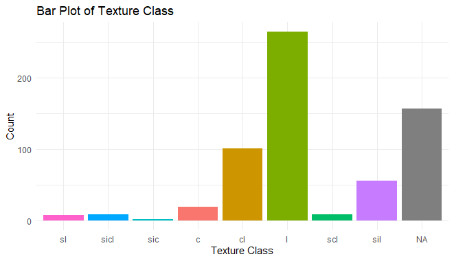
Exploratory Data Analysis in R Programming
Histogram with customized bins and color
R
# Histogram with customized bins and color
ggplot(h, aes(x = clay, fill = texcl)) +
  geom_histogram(bins = 30, color = "white", alpha = 0.7) +
  labs(title = "Histogram of Clay Content",
       x = "Clay Content (%)",
       y = "Frequency") +
  theme_minimal()
Output:

Exploratory Data Analysis in R Programming
Density curve with fill color
R
# Density curve with fill color
ggplot(h, aes(x = clay, fill = texcl)) +
  geom_density(alpha = 0.7) +
  labs(title = "Density Curve of Clay Content",
       x = "Clay Content (%)",
       y = "Density") +
  theme_minimal()
Output:

Exploratory Data Analysis in R Programming
Box plot with color and jitter
R
# Box plot with color and jitter
ggplot(h, aes(x = genhz, y = clay, fill = texcl)) +
  geom_boxplot(show.legend = FALSE) +
  geom_jitter(position = position_jitter(0.2), alpha = 0.7, color = "gray") +
  labs(title = "Box Plot of Clay Content by Generalized Horizon",
       x = "Generalized Horizon",
       y = "Clay Content (%)") +
  theme_minimal() +
  theme(axis.text.x = element_text(angle = 45, hjust = 1))
Output:
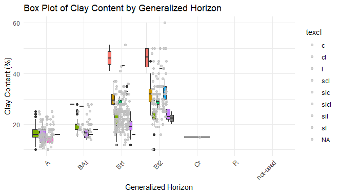
Exploratory Data Analysis in R Programming
QQ Plot for Clay
R
# QQ Plot for Clay
ggplot(h, aes(sample = clay)) +
  geom_qq_line(color = "blue") +
  geom_qq(color = "red", alpha = 0.7) +
  labs(title = "QQ Plot for Clay Content",
       x = "Theoretical Quantiles",
       y = "Sample Quantiles") +
  theme_minimal()
Output:
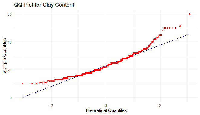
Exploratory Data Analysis in R Programming
Now we will move on to the Scatter and Line plot. In this category, we are going to see two types of plotting,- scatter plot and line plot. Plotting points of one interval or ratio variable against variable are known as a scatter plot.
We shall now see how to use scatter plot to examine our data.
R
# Extract the horizon table
h <- horizons(loafercreek)

# Scatter plot
ggplot(h, aes(x = total_frags_pct, y = clay, color = texcl)) +
  geom_point(alpha = 0.7, size = 3) +
  labs(title = "Scatter Plot of Total Fragments vs Clay Content",
       x = "Total Fragments (%)",
       y = "Clay Content (%)",
       color = "Texture Class") +
  theme_minimal()
Output:

Exploratory Data Analysis in R Programming
Conclusion
Exploratory Data Analysis (EDA) is a crucial phase in the data analysis process that empowers data scientists and analysts to gain insights into their datasets. In R programming, the combination of powerful libraries such as ggplot2, aqp, and others facilitates the creation of visually appealing and informative visualizations for EDA.
Like Article
Suggest improvement
Share your thoughts in the comments
Please Login to comment...