Interactive Charts using Plotly in R
Last Updated :
26 Mar, 2024
R Programming Language is a powerful tool for data analysis and visualization. Interactive plots with R can be particularly useful for exploring and presenting data, but creating them can be challenging. The Shiny package provides a framework for creating web-based applications with R, including interactive plots. However, Shiny can be complex and time-consuming to set up, and it may not be suitable for all situations.
Interactive plots with R
An alternative to using Shiny for creating interactive plots is to use the Plotly and Leaflet packages in combination with HTML widgets. These packages allow you to create interactive plots with R visualizations directly from R code, without the need for a separate web application framework. In this way, you can quickly create interactive plots with r that can be easily shared and embedded in web pages.
- This article will focus on using the leaflet package to create interactive maps and the Plotly package to create interactive plots with r without using Shiny or the HTML widgets package.
- First, we need to install and load the required packages. We will be using the plotly and leaflet packages for our examples. These packages provide powerful tools for creating interactive plots in the R Programming Language.
# Install packages
install.packages("plotly")
install.packages("leaflet")
# Load packages
library(plotly)
library(leaflet)
Interactive scatter plot using Plotly
The plotly package provides an easy way to create interactive plots with R. We will use the iris dataset and data frame for our example.
R
# Load iris dataset
data(iris)

# Create a scatter plot
plot <- plot_ly(data = iris, x = ~Sepal.Length,
                y = ~Petal.Length,
                type = "scatter",
                mode = "markers")

# Add color and size to markers
plot <- plot %>% add_markers(color = ~Species,
                             size = ~Sepal.Width * 2)

# Add labels and title
plot <- plot %>% layout(xaxis = list(title = "Sepal Length"),
                        yaxis = list(title = "Petal Length"),
                        title = "Iris Dataset")

# Display the plot
plot
Output:
.png)
In this code, we create a scatter plot using the plot_ly() function, specifying the iris dataset, the x-axis (Sepal.Length) and y-axis (Petal.Length) variables, and the type of plot (scatter) with mode = “markers”. We also add color and size to the markers using the add_markers() function.
Finally, we add labels and a title to the plot using the layout() function and display the plot using the plot object.
Interactive line plots with R
R
library(plotly)

# Create a sample dataset
df <- data.frame(
  x = c(1:10),
  y = c(3, 1, 2, 4, 6, 8, 7, 9, 10, 5)
)

# Create the plotly plot
plot_ly(data = df, x = ~x, y = ~y,
        type = 'scatter', mode = 'lines')

# Render the plot as an HTML widget
htmlwidgets::saveWidget(as_widget(plot_ly(data = df,
                                          x = ~x, y = ~y,
                                          type = 'scatter',
                                          mode = 'lines')),
                        file = "plot.html")
Output:
.png)
This code creates an interactive plots with r using the plotly package in R. It first creates a dataset with x and y values, then creates the plot using plot_ly() function and specifies the data and plot type. The resulting plot can be interacted with by zooming, hovering over the points to see their values, and selecting specific points to display only those points. Finally, the plot is saved as an HTML widget using the saveWidget() function, which can be embedded into a website or viewed in a web browser.
Interactive 3D Scatter Plot
R
# Sample data for 3D scatter plot
scatter3d_data <- data.frame(
  X = rnorm(100),
  Y = rnorm(100),
  Z = rnorm(100),
  Group = rep(c("Group A", "Group B"), each = 50)
)

# Create an interactive 3D scatter plot
scatter3d_chart <- plot_ly(scatter3d_data, x = ~X, y = ~Y, z = ~Z, color = ~Group,
                           type = 'scatter3d', mode = 'markers') %>%
  layout(title = "Interactive 3D Scatter Plot",
         scene = list(xaxis = list(title = "X-axis"),
                      yaxis = list(title = "Y-axis"),
                      zaxis = list(title = "Z-axis")))

# Display the interactive 3D scatter plot
scatter3d_chart
Output:
.png)
Interactive Surface Plot
R
# Sample data for surface plot
surface_data <- data.frame(
  X = seq(-5, 5, length.out = 50),
  Y = seq(-5, 5, length.out = 50)
)

surface_data$Z <- outer(surface_data$X, surface_data$Y,
                        function(x, y) sin(sqrt(x^2 + y^2)) / (sqrt(x^2 + y^2)))

# Create an interactive surface plot
surface_plot <- plot_ly(z = ~surface_data$Z, type = "surface") %>%
  layout(title = "Interactive Surface Plot",
         scene = list(xaxis = list(title = "X-axis"),
                      yaxis = list(title = "Y-axis"),
                      zaxis = list(title = "Z-axis")))

# Display the interactive surface plot
surface_plot
Output:
.png)
Interactive map using Leaflet
The leaflet package provides an easy way to create interactive maps in R. We will use the mtcars dataset for our example.
R
library(leaflet)

# Load mtcars dataset
data(mtcars)

# Create a map
map <- leaflet(mtcars) %>%
        addTiles() %>%
        leaflet::setView(lng = -93.65,
                         lat = 42.03,
                         zoom = 10)

# Add markers to the map
map <- map %>% addMarkers(lng = ~wt,
                          lat = ~mpg,
                          popup = ~paste0("Car Name: ",
                                          rownames(mtcars)))

# Display the map
map
Output:
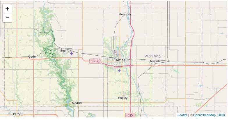
In this code, we create a map using the leaflet() function, specifying the mtcars dataset and adding tiles using the addTiles() function. We also set the initial view of the map using the setView() function.
- Next, we add markers to the map using the addMarkers() function, specifying the longitude (wt) and latitude (mpg) variables and adding a popup with the car name using “popup = ~paste0(“Car Name: “, rownames(mtcars))”. Finally, we display the map using the map object.
Conclusion
In conclusion, we have demonstrated how to generate interactive plots with R using HTMLwidgets. We used built-in datasets in R, specifically the iris and mtcars datasets, to create an interactive scatter plot using Plotly and an interactive map using leaflet.
Share your thoughts in the comments
Please Login to comment...