Data is information, often in the form of numbers, text, or multimedia, that is collected and stored for analysis. It can come from various sources, such as business transactions, social media, or scientific experiments. In the context of a data analyst, their role involves extracting meaningful insights from this vast pool of data.
In the 21st century, data holds immense value, making data analysis a lucrative career choice. If you’re considering a career in data analysis but are worried about interview questions, you’ve come to the right place. This article presents the top 85 data analyst interview questions and answers to help you prepare for your interview. Let’s dive into these questions to equip you for success in the interview process

Data Analyst Interview Questions
What is Data Analyst?
Data analysts is a person that uses statistical methods, programming, and visualization tools to analyze and interpret data, helping organizations make informed decisions. They clean, process, and organize data to identify trends, patterns, and anomalies, contributing crucial insights that drive strategic and operational decision-making within businesses and other sectors.
Data Analyst Interview Questions for Freshers
Here we have mentioned the top questions that are more likely to be asked by the interviewer during the interview process of experienced data analysts as well as beginner analyst job profiles.
1. What do you mean by Data Analysis?
Data analysis is a multidisciplinary field of data science, in which data is analyzed using mathematical, statistical, and computer science with domain expertise to discover useful information or patterns from the data. It involves gathering, cleaning, transforming, and organizing data to draw conclusions, forecast, and make informed decisions. The purpose of data analysis is to turn raw data into actionable knowledge that may be used to guide decisions, solve issues, or reveal hidden trends.
2. How do data analysts differ from data scientists?
Data analysts and Data Scientists can be recognized by their responsibilities, skill sets, and areas of expertise. Sometimes the roles of data analysts and data scientists may conflict or not be clear.
Data analysts are responsible for collecting, cleaning, and analyzing data to help businesses make better decisions. They typically use statistical analysis and visualization tools to identify trends and patterns in data. Data analysts may also develop reports and dashboards to communicate their findings to stakeholders.
Data scientists are responsible for creating and implementing machine learning and statistical models on data. These models are used to make predictions, automate jobs, and enhance business processes. Data scientists are also well-versed in programming languages and software engineering.
|
| Excel, SQL, Python, R, Tableau, PowerBI | Machine Learning, Statistical Modeling, Docker, Software Engineering |
| Data Collection, Web Scrapping, Data Cleaning, Data Visualization, Explanatory Data Analysis, Reports Development and Presentations | Database Management, Predictive Analysis and prescriptive analysis, Machine Learning model building and Deployment, Task automation, Work for Business Improvements Process. |
| Entry Label | Seniors Label |
3. How Data analysis is similar to Business Intelligence?
Data analysis and Business intelligence are both closely related fields, Both use data and make analysis to make better and more effective decisions. However, there are some key differences between the two.
- Data analysis involves data gathering, inspecting, cleaning, transforming and finding relevant information, So, that it can be used for the decision-making process.
- Business Intelligence(BI) also makes data analysis to find insights as per the business requirements. It generally uses statistical and Data visualization tools popularly known as BI tools to present the data in user-friendly views like reports, dashboards, charts and graphs.
The similarities and differences between the Data Analysis and Business Intelligence are as follows:
|
| Both use data to make better decisions. | Data analysis is more technical, while BI is more strategic. |
| Both involve collecting, cleaning, and transforming data. | Data analysis focuses on finding patterns and insights in data, while BI focuses on providing relevant information |
| Both use visualization tools to communicate findings. | Data analysis is often used to provide specific answers, whereas business intelligence (BI) is used to help broader decision-making. |
4. What are the different tools mainly used for data analysis?
There are different tools used for data analysis. each has some strengths and weaknesses. Some of the most commonly used tools for data analysis are as follows:
- Spreadsheet Software: Spreadsheet Software is used for a variety of data analysis tasks, such as sorting, filtering, and summarizing data. It also has several built-in functions for performing statistical analysis. The top 3 mostly used Spreadsheet Software are as follows:
- Database Management Systems (DBMS): DBMSs, or database management systems, are crucial resources for data analysis. It offers a secure and efficient way to manage, store, and organize massive amounts of data.
- MySQL
- PostgreSQL
- Microsoft SQL Server
- Oracle Database
- Statistical Software: There are many statistical software used for Data analysis, Each with its strengths and weaknesses. Some of the most popular software used for data analysis are as follows:
- SAS: Widely used in various industries for statistical analysis and data management.
- SPSS: A software suite used for statistical analysis in social science research.
- Stata: A tool commonly used for managing, analyzing, and graphing data in various fields.SPSS:
- Programming Language: In data analysis, programming languages are used for deep and customized analysis according to mathematical and statistical concepts. For Data analysis, two programming languages are highly popular:
- R: R is a free and open-source programming language widely popular for data analysis. It has good visualizations and environments mainly designed for statistical analysis and data visualization. It has a wide variety of packages for performing different data analysis tasks.
- Python: Python is also a free and open-source programming language used for Data analysis. Nowadays, It is becoming widely popular among researchers. Along with data analysis, It is used for Machine Learning, Artificial Intelligence, and web development.
5. What is Data Wrangling?
Data Wrangling is very much related concepts to Data Preprocessing. It’s also known as Data munging. It involves the process of cleaning, transforming, and organizing the raw, messy or unstructured data into a usable format. The main goal of data wrangling is to improve the quality and structure of the dataset. So, that it can be used for analysis, model building, and other data-driven tasks.
Data wrangling can be a complicated and time-consuming process, but it is critical for businesses that want to make data-driven choices. Businesses can obtain significant insights about their products, services, and bottom line by taking the effort to wrangle their data.
Some of the most common tasks involved in data wrangling are as follows:
- Data Cleaning: Identify and remove the errors, inconsistencies, and missing values from the dataset.
- Data Transformation: Transformed the structure, format, or values of data as per the requirements of the analysis. that may include scaling & normalization, encoding categorical values.
- Data Integration: Combined two or more datasets, if that is scattered from multiple sources, and need of consolidated analysis.
- Data Restructuring: Reorganize the data to make it more suitable for analysis. In this case, data are reshaped to different formats or new variables are created by aggregating the features at different levels.
- Data Enrichment: Data are enriched by adding additional relevant information, this may be external data or combined aggregation of two or more features.
- Quality Assurance: In this case, we ensure that the data meets certain quality standards and is fit for analysis.
6. What is the difference between descriptive and predictive analysis?
Descriptive and predictive analysis are the two different ways to analyze the data.
- Descriptive Analysis: Descriptive analysis is used to describe questions like “What has happened in the past?” and “What are the key characteristics of the data?”. Its main goal is to identify the patterns, trends, and relationships within the data. It uses statistical measures, visualizations, and exploratory data analysis techniques to gain insight into the dataset.
The key characteristics of descriptive analysis are as follows:- Historical Perspective: Descriptive analysis is concerned with understanding past data and events.
- Summary Statistics: It often involves calculating basic statistical measures like mean, median, mode, standard deviation, and percentiles.
- Visualizations: Graphs, charts, histograms, and other visual representations are used to illustrate data patterns.
- Patterns and Trends: Descriptive analysis helps identify recurring patterns and trends within the data.
- Exploration: It’s used for initial data exploration and hypothesis generation.
- Predictive Analysis: Predictive Analysis, on the other hand, uses past data and applies statistical and machine learning models to identify patterns and relationships and make predictions about future events. Its primary goal is to predict or forecast what is likely to happen in future.
The key characteristics of predictive analysis are as follows:- Future Projection: Predictive analysis is used to forecast and predict future events.
- Model Building: It involves developing and training models using historical data to predict outcomes.
- Validation and Testing: Predictive models are validated and tested using unseen data to assess their accuracy.
- Feature Selection: Identifying relevant features (variables) that influence the predicted outcome is crucial.
- Decision Making: Predictive analysis supports decision-making by providing insights into potential outcomes.
7. What is univariate, bivariate, and multivariate analysis?
Univariate, Bivariate and multivariate are the three different levels of data analysis that are used to understand the data.
- Univariate analysis: Univariate analysis analyzes one variable at a time. Its main purpose is to understand the distribution, measures of central tendency (mean, median, and mode), measures of dispersion (range, variance, and standard deviation), and graphical methods such as histograms and box plots. It does not deal with the courses or relationships from the other variables of the dataset.
Common techniques used in univariate analysis include histograms, bar charts, pie charts, box plots, and summary statistics. - Bivariate analysis: Bivariate analysis involves the analysis of the relationship between the two variables. Its primary goal is to understand how one variable is related to the other variables. It reveals, Are there any correlations between the two variables, if yes then how strong the correlations is? It can also be used to predict the value of one variable from the value of another variable based on the found relationship between the two.
Common techniques used in bivariate analysis include scatter plots, correlation analysis, contingency tables, and cross-tabulations. - Multivariate analysis: Multivariate analysis is used to analyze the relationship between three or more variables simultaneously. Its primary goal is to understand the relationship among the multiple variables. It is used to identify the patterns, clusters, and dependencies among the several variables.
Common techniques used in multivariate analysis include principal component analysis (PCA), factor analysis, cluster analysis, and regression analysis involving multiple predictor variables.
8. Name some of the most popular data analysis and visualization tools used for data analysis.
Some of the most popular data analysis and visualization tools are as follows:
- Tableau: Tableau is a powerful data visualization application that enables users to generate interactive dashboards and visualizations from a wide range of data sources. It is a popular choice for businesses of all sizes since it is simple to use and can be adjusted to match any organization’s demands.
- Power BI: Microsoft’s Power BI is another well-known data visualization tool. Power BI’s versatility and connectivity with other Microsoft products make it a popular data analysis and visualization tool in both individual and enterprise contexts.
- Qlik Sense: Qlik Sense is a data visualization tool that is well-known for its speed and performance. It enables users to generate interactive dashboards and visualizations from several data sources, and it can be used to examine enormous datasets.
- SAS: A software suite used for advanced analytics, multivariate analysis, and business intelligence.
- IBM SPSS: A statistical software for data analysis and reporting.
- Google Data Studio: Google Data Studio is a free web-based data visualization application that allows users to create customized dashboards and simple reports. It aggregates data from up to 12 different sources, including Google Analytics, into an easy-to-modify, easy-to-share, and easy-to-read report.
9. What are the steps you would take to analyze a dataset?
Data analysis involves a series of steps that transform raw data into relevant insights, conclusions, and actionable suggestions. While the specific approach will vary based on the context and aims of the study, here is an approximate outline of the processes commonly followed in data analysis:
- Problem Definition or Objective: Make sure that the problem or question you’re attempting to answer is stated clearly. Understand the analysis’s aims and objectives to direct your strategy.
- Data Collection: Collate relevant data from various sources. This might include surveys, tests, databases, web scraping, and other techniques. Make sure the data is representative and accurate.ALso
- Data Preprocessing or Data Cleaning: Raw data often has errors, missing values, and inconsistencies. In Data Preprocessing and Cleaning, we redefine the column’s names or values, standardize the formats, and deal with the missing values.
- Exploratory Data Analysis (EDA): EDA is a crucial step in Data analysis. In EDA, we apply various graphical and statistical approaches to systematically analyze and summarize the main characteristics, patterns, and relationships within a dataset. The primary objective behind the EDA is to get a better knowledge of the data’s structure, identify probable abnormalities or outliers, and offer initial insights that can guide further analysis.
- Data Visualizations: Data visualizations play a very important role in data analysis. It provides visual representation of complicated information and patterns in the data which enhances the understanding of data and helps in identifying the trends or patterns within a data. It enables effective communication of insights to various stakeholders.
10. What is data cleaning?
Data cleaning is the process of identifying the removing misleading or inaccurate records from the datasets. The primary objective of Data cleaning is to improve the quality of the data so that it can be used for analysis and predictive model-building tasks. It is the next process after the data collection and loading.
In Data cleaning, we fix a range of issues that are as follows:
- Inconsistencies: Sometimes data stored are inconsistent due to variations in formats, columns_name, data types, or values naming conventions. Which creates difficulties while aggregating and comparing. Before going for further analysis, we correct all these inconsistencies and formatting issues.
- Duplicate entries: Duplicate records may biased analysis results, resulting in exaggerated counts or incorrect statistical summaries. So, we also remove it.
- Missing Values: Some data points may be missing. Before going further either we remove the entire rows or columns or we fill the missing values with probable items.
- Outlier: Outliers are data points that drastically differ from the average which may result in machine error when collecting the dataset. if it is not handled properly, it can bias results even though it can offer useful insights. So, we first detect the outlier and then remove it.
11. What is the importance of exploratory data analysis (EDA) in data analysis?
Exploratory data analysis (EDA) is the process of investigating and understanding the data through graphical and statistical techniques. It is one of the crucial parts of data analysis that helps to identify the patterns and trends in the data as well as help in understanding the relationship between variables.
EDA is a non-parametric approach in data analysis, which means it does take any assumptions about the dataset. EDA is important for a number of reasons that are as follows:
- With EDA we can get a deep understanding of patterns, distributions, nature of data and relationship with another variable in the dataset.
- With EDA we can analyze the quality of the dataset by making univariate analyses like the mean, median, mode, quartile range, distribution plot etc and identify the patterns and trends of single rows of the dataset.
- With EDA we can also get the relationship between the two or more variables by making bivariate or multivariate analyses like regression, correlations, covariance, scatter plot, line plot etc.
- With EDA we can find out the most influential feature of the dataset using correlations, covariance, and various bivariate or multivariate plotting.
- With EDA we can also identify the outliers using Box plots and remove them further using a statistical approach.
EDA provides the groundwork for the entire data analysis process. It enables analysts to make more informed judgments about data processing, hypothesis testing, modelling, and interpretation, resulting in more accurate and relevant insights.
12. What is Time Series analysis?
Time Series analysis is a statistical technique used to analyze and interpret data points collected at specific time intervals. Time series data is the data points recorded sequentially over time. The data points can be numerical, categorical, or both. The objective of time series analysis is to understand the underlying patterns, trends and behaviours in the data as well as to make forecasts about future values.
The key components of Time Series analysis are as follows:
- Trend: The data’s long-term movement or direction over time. Trends can be upward, downward, or flat.
- Seasonality: Patterns that repeat at regular intervals, such as daily, monthly, or yearly cycles.
- Cyclical Patterns: Longer-term trends that are not as regular as seasonality, and are frequently associated with economic or business cycles.
- Irregular Fluctuations: Unpredictable and random data fluctuations that cannot be explained by trends, seasonality, or cycles.
- Auto-correlations: The link between a data point and its prior values. It quantifies the degree of dependence between observations at different time points.
Time series analysis approaches include a variety of techniques including Descriptive analysis to identify trends, patterns, and irregularities, smoothing techniques like moving averages or exponential smoothing to reduce noise and highlight underlying trends, Decompositions to separate the time series data into its individual components and forecasting technique like ARIMA, SARIMA, and Regression technique to predict the future values based on the trends.
13. What is Feature Engineering?
Feature engineering is the process of selecting, transforming, and creating features from raw data in order to build more effective and accurate machine learning models. The primary goal of feature engineering is to identify the most relevant features or create the relevant features by combining two or more features using some mathematical operations from the raw data so that it can be effectively utilized for getting predictive analysis by machine learning model.
The following are the key elements of feature engineering:
- Feature Selection: In this case we identify the most relevant features from the dataset based on the correlation with the target variables.
- Create new feature: In this case, we generate the new features by aggregating or transforming the existing features in such a way that it can be helpful to capture the patterns or trends which is not revealed by the original features.
- Transformation: In this case, we modify or scale the features so, that it can helpful in building the machine learning model. Some of the common transformations method are Min-Max Scaling, Z-Score Normalization, and log transformations etc.
- Feature encoding: Generally ML algorithms only process the numerical data, so, that we need to encode categorical features into the numerical vector. Some of the popular encoding technique are One-Hot-Encoding, Ordinal label encoding etc.
14. What is data normalization, and why is it important?
Data normalization is the process of transforming numerical data into standardised range. The objective of data normalization is scale the different features (variables) of a dataset onto a common scale, which make it easier to compare, analyze, and model the data. This is particularly important when features have different units, scales, or ranges because if we doesn’t normalize then each feature has different-different impact which can affect the performance of various machine learning algorithms and statistical analyses.
Common normalization techniques are as follows:
- Min-Max Scaling: Scales the data to a range between 0 and 1 using the formula:
(x – min) / (max – min) - Z-Score Normalization (Standardization): Scales data to have a mean of 0 and a standard deviation of 1 using the formula:
(x – mean) / standard_deviation - Robust Scaling: Scales data by removing the median and scaling to the interquartile range(IQR) to handle outliers using the formula:
(X – Median) / IQR - Unit Vector Scaling: Scales each data point to have a Euclidean norm (length) (||X||) of 1 using the formula:
X / ||X||
15. What are the main libraries you would use for data analysis in Python?
For data analysis in Python, many great libraries are used due to their versatility, functionality, and ease of use. Some of the most common libraries are as follows:
- NumPy: A core Python library for numerical computations. It supports arrays, matrices, and a variety of mathematical functions, making it a building block for many other data analysis libraries.
- Pandas: A well-known data manipulation and analysis library. It provides data structures (like as DataFrames) that make to easily manipulate, filter, aggregate, and transform data. Pandas is required when working with structured data.
- SciPy: SciPy is a scientific computing library. It offers a wide range of statistical, mathematical, and scientific computing functions.
- Matplotlib: Matplotlib is a library for plotting and visualization. It provides a wide range of plotting functions, making it easy to create beautiful and informative visualizations.
- Seaborn: Seaborn is a library for statistical data visualization. It builds on top of Matplotlib and provides a more user-friendly interface for creating statistical plots.
- Scikit-learn: A powerful machine learning library. It includes classification, regression, clustering, dimensionality reduction, and model evaluation tools. Scikit-learn is well-known for its consistent API and simplicity of use.
- Statsmodels: A statistical model estimation and interpretation library. It covers a wide range of statistical models, such as linear models and time series analysis.
16. What’s the difference between structured and unstructured data?
Structured and unstructured data depend on the format in which the data is stored. Structured data is information that has been structured in a certain format, such as a table or spreadsheet. This facilitates searching, sorting, and analyzing. Unstructured data is information that is not arranged in a certain format. This makes searching, sorting, and analyzing more complex.
The differences between the structured and unstructured data are as follows:
|
| Schema (structure of data) is often rigid and organized into rows and columns | No predefined relationships between data elements. |
| Excellent for searching, reporting, and querying | Difficult to search |
| Simple to quantify and process using standard database functions. | No fixed format, making it more challenging to organize and analyze. |
| Relational databases | Data lakes |
| Customer records, product inventories, financial data | Text documents, images, audio, video |
17. How can pandas be used for data analysis?
Pandas is one of the most widely used Python libraries for data analysis. It has powerful tools and data structure which is very helpful in analyzing and processing data. Some of the most useful functions of pandas which are used for various tasks involved in data analysis are as follows:
- Data loading functions: Pandas provides different functions to read the dataset from the different-different formats like read_csv, read_excel, and read_sql functions are used to read the dataset from CSV, Excel, and SQL datasets respectively in a pandas DataFrame.
- Data Exploration: Pandas provides functions like head, tail, and sample to rapidly inspect the data after it has been imported. In order to learn more about the different data types, missing values, and summary statistics, use pandas .info and .describe functions.
- Data Cleaning: Pandas offers functions for dealing with missing values (fillna), duplicate rows (drop_duplicates), and incorrect data types (astype) before analysis.
- Data Transformation: Pandas may be used to modify and transform data. It is simple to do actions like selecting columns, filtering rows (loc, iloc), and adding new ones. Custom transformations are feasible using the apply and map functions.
- Data Aggregation: With the help of pandas, we can group the data using groupby function, and also apply aggregation tasks like sum, mean, count, etc., on specify columns.
- Time Series Analysis: Pandas offers robust support for time series data. We can easily conduct date-based computations using functions like resample, shift etc.
- Merging and Joining: Data from different sources can be combined using Pandas merge and join functions.
18. What is the difference between pandas Series and pandas DataFrames?
In pandas, Both Series and Dataframes are the fundamental data structures for handling and analyzing tabular data. However, they have distinct characteristics and use cases.
A series in pandas is a one-dimensional labelled array that can hold data of various types like integer, float, string etc. It is similar to a NumPy array, except it has an index that may be used to access the data. The index can be any type of object, such as a string, a number, or a datetime.
A pandas DataFrame is a two-dimensional labelled data structure resembling a table or a spreadsheet. It consists of rows and columns, where each column can have a different data type. A DataFrame may be thought of as a collection of Series, where each column is a Series with the same index.
The key differences between the pandas Series and Dataframes are as follows:
|
| A one-dimensional labelled array that can hold data of various types like (integer, float, string, etc.) | A two-dimensional labelled data structure that resembles a table or a spreadsheet. |
| Similar to the single vector or column in a spreadsheet | Similar to a spreadsheet, which can have multiple vectors or columns as well as. |
| Best suited for working with single-feature data | The versatility and handling of the multiple features make it suitable for tasks like data analysis. |
| Each element of the Series is associated with its label known as the index | DataFrames can be assumed as a collection of multiple Series, where each column shares the same index. |
19. What is One-Hot-Encoding?
One-hot encoding is a technique used for converting categorical data into a format that machine learning algorithms can understand. Categorical data is data that is categorized into different groups, such as colors, nations, or zip codes. Because machine learning algorithms often require numerical input, categorical data is represented as a sequence of binary values using one-hot encoding.
To one-hot encode a categorical variable, we generate a new binary variable for each potential value of the category variable. For example, if the category variable is “color” and the potential values are “red,” “green,” and “blue,” then three additional binary variables are created: “color_red,” “color_green,” and “color_blue.” Each of these binary variables would have a value of 1 if the matching category value was present and 0 if it was not.
20. What is a boxplot and how it’s useful in data science?
A boxplot is a graphic representation of data that shows the distribution of the data. It is a standardized method of the distribution of a data set based on its five-number summary of data points: the minimum, first quartile [Q1], median, third quartile [Q3], and maximum.
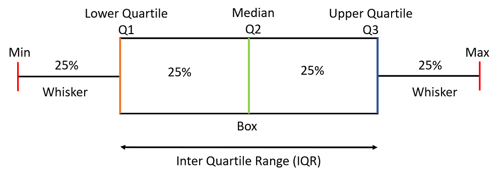
Boxplot
Boxplot is used for detection the outliers in the dataset by visualizing the distribution of data.
Statistics Interview Questions and Answers for Data Analyst
21. What is the difference between descriptive and inferential statistics?
Descriptive statistics and inferential statistics are the two main branches of statistics
- Descriptive Statistics: Descriptive statistics is the branch of statistics, which is used to summarize and describe the main characteristics of a dataset. It provides a clear and concise summary of the data’s central tendency, variability, and distribution. Descriptive statistics help to understand the basic properties of data, identifying patterns and structure of the dataset without making any generalizations beyond the observed data. Descriptive statistics compute measures of central tendency and dispersion and also create graphical representations of data, such as histograms, bar charts, and pie charts to gain insight into a dataset.
Descriptive statistics is used to answer the following questions:- What is the mean salary of a data analyst?
- What is the range of income of data analysts?
- What is the distribution of monthly incomes of data analysts?
- Inferential Statistics: Inferential statistics is the branch of statistics, that is used to conclude, make predictions, and generalize findings from a sample to a larger population. It makes inferences and hypotheses about the entire population based on the information gained from a representative sample. Inferential statistics use hypothesis testing, confidence intervals, and regression analysis to make inferences about a population.
Inferential statistics is used to answer the following questions:- Is there any difference in the monthly income of the Data analyst and the Data Scientist?
- Is there any relationship between income and education level?
- Can we predict someone’s salary based on their experience?
22. What are measures of central tendency?
Measures of central tendency are the statistical measures that represent the centre of the data set. It reveals where the majority of the data points generally cluster. The three most common measures of central tendency are:
- Mean: The mean, also known as the average, is calculated by adding up all the values in a dataset and then dividing by the total number of values. It is sensitive to outliers since a single extreme number can have a large impact on the mean.
Mean = (Sum of all values) / (Total number of values) - Median: The median is the middle value in a data set when it is arranged in ascending or descending order. If there is an even number of values, the median is the average of the two middle values.
- Mode: The mode is the value that appears most frequently in a dataset. A dataset can have no mode (if all values are unique) or multiple modes (if multiple values have the same highest frequency). The mode is useful for categorical data and discrete distributions.
23. What are the Measures of dispersion?
Measures of dispersion, also known as measures of variability or spread, indicate how much the values in a dataset deviate from the central tendency. They help in quantifying how far the data points vary from the average value.
Some of the common Measures of dispersion are as follows:
- Range: The range is the difference between the highest and lowest values in a data set. It gives an idea of how much the data spreads from the minimum to the maximum.
- Variance: The variance is the average of the squared deviations of each data point from the mean. It is a measure of how spread out the data is around the mean.
[Tex]\text{Variance}( \sigma^2) = \frac{\sum(X-\mu)^2}{N}
[/Tex] - Standard Deviation: The standard deviation is the square root of the variance. It is a measure of how spread out the data is around the mean, but it is expressed in the same units as the data itself.
- Mean Absolute Deviation (MAD): MAD is the average of the absolute differences between each data point and the mean. Unlike variance, it doesn’t involve squaring the differences, making it less sensitive to extreme values. it is less sensitive to outliers than the variance or standard deviation.
- Percentiles: Percentiles are statistical values that measure the relative positions of values within a dataset. Which is computed by arranging the dataset in descending order from least to the largest and then dividing it into 100 equal parts. In other words, a percentile tells you what percentage of data points are below or equal to a specific value. Percentiles are often used to understand the distribution of data and to identify values that are above or below a certain threshold within a dataset.
- Interquartile Range (IQR): The interquartile range (IQR) is the range of values ranging from the 25th percentile (first quartile) to the 75th percentile (third quartile). It measures the spread of the middle 50% of the data and is less affected by outliers.
- Coefficient of Variation (CV): The coefficient of variation (CV) is a measure of relative variability, It is the ratio of the standard deviation to the mean, expressed as a percentage. It’s used to compare the relative variability between datasets with different units or scales.
24. What is a probability distribution?
A probability distribution is a mathematical function that estimates the probability of different possible outcomes or events occurring in a random experiment or process. It is a mathematical representation of random phenomena in terms of sample space and event probability, which helps us understand the relative possibility of each outcome occurring.
There are two main types of probability distributions:
- Discrete Probability Distribution: In a discrete probability distribution, the random variable can only take on distinct, separate values. Each value is associated with a probability. Examples of discrete probability distributions include the binomial distribution, the Poisson distribution, and the hypergeometric distribution.
- Continuous Probability Distribution: In a continuous probability distribution, the random variable can take any value within a certain range. These distributions are described by probability density functions (PDFs). Examples of continuous probability distributions include the normal distribution, the exponential distribution, and the uniform distribution.
25. What are normal distributions?
A normal distribution, also known as a Gaussian distribution, is a specific type of probability distribution with a symmetric, bell-shaped curve. The data in a normal distribution clustered around a central value i.e mean, and the majority of the data falls within one standard deviation of the mean. The curve gradually tapers off towards both tails, showing that extreme values are becoming
distribution having a mean equal to 0 and standard deviation equal to 1 is known as standard normal distribution and Z-scores are used to measure how many standard deviations a particular data point is from the mean in standard normal distribution.
Normal distributions are a fundamental concept that supports many statistical approaches and helps researchers understand the behaviour of data and variables in a variety of scenarios.
26. What is the central limit theorem?
The Central Limit Theorem (CLT) is a fundamental concept in statistics that states that, under certain conditions, the distribution of sample means approaches a normal distribution as sample size rises, regardless of the the original population distribution. In other words, even if the population distribution is not normal, when the sample size is high enough, the distribution of sample means will tend to be normal.
The Central Limit Theorem has three main assumptions:
- The samples must be independent. This means that the outcome of one sample cannot affect the outcome of another sample.
- The samples must be random. This means that each sample must be drawn from the population in a way that gives all members of the population an equal chance of being selected.
- The sample size must be large enough. The CLT typically applies when the sample size is greater than 30.
27. What are the null hypothesis and alternative hypotheses?
In statistics, the null and alternate hypotheses are two mutually exclusive statements regarding a population parameter. A hypothesis test analyzes sample data to determine whether to accept or reject the null hypothesis. Both null and alternate hypotheses represent the opposing statements or claims about a population or a phenomenon under investigation.
- Null Hypothesis ([Tex]H_0
[/Tex]): The null hypothesis is a statement regarding the status quo representing no difference or effect after the phenomena unless there is strong evidence to the contrary.
- Alternate Hypothesis ([Tex]H_a \text{ or } H_1
[/Tex]): The alternate hypothesis is a statement that disregards the status quo means supports the difference or effect. The researcher tries to prove the hypothesis.
28. What is a p-value, and what does it mean?
A p-value, which stands for “probability value,” is a statistical metric used in hypothesis testing to measure the strength of evidence against a null hypothesis. When the null hypothesis is considered to be true, it measures the chance of receiving observed outcomes (or more extreme results). In layman’s words, the p-value determines whether the findings of a study or experiment are statistically significant or if they might have happened by chance.
The p-value is a number between 0 and 1, which is frequently stated as a decimal or percentage. If the null hypothesis is true, it indicates the probability of observing the data (or more extreme data).
29. What is the significance level?
The significance level, often denoted as α (alpha), is a critical parameter in hypothesis testing and statistical analysis. It defines the threshold for determining whether the results of a statistical test are statistically significant. In other words, it sets the standard for deciding when to reject the null hypothesis (H0) in favor of the alternative hypothesis (Ha).
If the p-value is less than the significance level, we reject the null hypothesis and conclude that there is a statistically significant difference between the groups.
- If p-value ≤ α: Reject the null hypothesis. This indicates that the results are statistically significant, and there is evidence to support the alternative hypothesis.
- If p-value > α: Fail to reject the null hypothesis. This means that the results are not statistically significant, and there is insufficient evidence to support the alternative hypothesis.
The choice of a significance level involves a trade-off between Type I and Type II errors. A lower significance level (e.g., α = 0.01) decreases the risk of Type I errors while increasing the chance of Type II errors (failure to identify a real impact). A higher significance level (e.g., = 0.10), on the other hand, increases the probability of Type I errors while decreasing the chance of Type II errors.
30. Describe Type I and Type II errors in hypothesis testing.
In hypothesis testing, When deciding between the null hypothesis (H0) and the alternative hypothesis (Ha), two types of errors may occur. These errors are known as Type I and Type II errors, and they are important considerations in statistical analysis.
- Type I error (False Positive, α): Type I error occurs when the null hypothesis is rejected when it is true. This is also referred as a false positive. The probability of committing a Type I error is denoted by α (alpha) and is also known as the significance level. A lower significance level (e.g., = 0.05) reduces the chance of Type I mistakes while increasing the risk of Type II errors.
For example, a Type I error would occur if we estimated that a new medicine was successful when it was not.- Type I Error (False Positive, α): Rejecting a true null hypothesis.
- Type II Error (False Negative, β): Type II error occurs when a researcher fails to reject the null hypothesis when it is actually false. This is also referred as a false negative. The probability of committing a Type II error is denoted by β (beta)
For example, a Type II error would occur if we estimated that a new medicine was not effective when it is actually effective.- Type II Error (False Negative, β): Failing to reject a false null hypothesis.
31. What is a confidence interval, and how does it is related to point estimates?
The confidence interval is a statistical concept used to estimates the uncertainty associated with estimating a population parameter (such as a population mean or proportion) from a sample. It is a range of values that is likely to contain the true value of a population parameter along with a level of confidence in that statement.
- Point estimate: A point estimate is a single that is used to estimate the population parameter based on a sample. For example, the sample mean (x̄) is a point estimate of the population mean (μ). The point estimate is typically the sample mean or the sample proportion.
- Confidence interval: A confidence interval, on the other hand, is a range of values built around a point estimate to account for the uncertainty in the estimate. It is typically expressed as an interval with an associated confidence level (e.g., 95% confidence interval). The degree of confidence or confidence level shows the probability that the interval contains the true population parameter.
The relationship between point estimates and confidence intervals can be summarized as follows:
- A point estimate provides a single value as the best guess for a population parameter based on sample data.
- A confidence interval provides a range of values around the point estimate, indicating the range of likely values for the population parameter.
- The confidence level associated with the interval reflects the level of confidence that the true parameter value falls within the interval.
For example, A 95% confidence interval indicates that you are 95% confident that the real population parameter falls inside the interval. A 95% confidence interval for the population mean (μ) can be expressed as :
[Tex](\bar{x} – \text{Margin of error}, \bar{x} + \text{Margin of error})
[/Tex]
where x̄ is the point estimate (sample mean), and the margin of error is calculated using the standard deviation of the sample and the confidence level.
32. What is ANOVA in Statistics?
ANOVA, or Analysis of Variance, is a statistical technique used for analyzing and comparing the means of two or more groups or populations to determine whether there are statistically significant differences between them or not. It is a parametric statistical test which means that, it assumes the data is normally distributed and the variances of the groups are identical. It helps researchers in determining the impact of one or more categorical independent variables (factors) on a continuous dependent variable.
ANOVA works by partitioning the total variance in the data into two components:
- Between-group variance: It analyzes the difference in means between the different groups or treatment levels being compared.
- Within-group variance: It analyzes the variance within each individual group or treatment level.
Depending on the investigation’s design and the number of independent variables, ANOVA has numerous varieties:
- One-Way ANOVA: Compares the means of three or more independent groups or levels of a single categorical variable. For Example: One-way ANOVA can be used to compare the average age of employees among the three different teams in a company.
- Two-Way ANOVA: Compare the means of two or more independent groups while taking into account the impact of a two independent categorical variables (factors) . For example, Two-way ANOVA can be to compare the average age of employees among the three different teams in a company, while also taking into account the gender of the employees.
- Multivariate Analysis of Variance (MANOVA): Compare the means of multiple dependent variables. For example, MANOVA can be used to compare the average age, average salary, and average experience of employees among the three different teams in a company.
33. What is a correlation?
Correlation is a statistical term that analyzes the degree of a linear relationship between two or more variables. It estimates how effectively changes in one variable predict or explain changes in another.Correlation is often used to access the strength and direction of associations between variables in various fields, including statistics, economics.
The correlation between two variables is represented by correlation coefficient, denoted as “r”. The value of “r” can range between -1 and +1, reflecting the strength of the relationship:
- Positive correlation (r > 0): As one variable increases, the other tends to increase. The greater the positive correlation, the closer “r” is to +1.
- Negative correlation (r < 0): As one variable rises, the other tends to fall. The closer “r” is to -1, the greater the negative correlation.
- No correlation (r = 0): There is little or no linear relationship between the variables.
34. What are the differences between Z-test, T-test and F-test?
The Z-test, t-test, and F-test are statistical hypothesis tests that are employed in a variety of contexts and for a variety of objectives.
- Z-test: The Z-test is performed when the population standard deviation is known. It is a parametric test, which means that it makes certain assumptions about the data, such as that the data is normally distributed. The Z-test is most accurate when the sample size is large.
- T-test: The T-test is performed when the population standard deviation is unknown. It is also a parametric test, but unlike the Z-test, it is less sensitive to violations of the normality assumption. The T-test is most accurate when the sample size is large.
- F-test: The F-test is performed to compare two or more groups’ variances. It assume that populations being compared follow a normal distribution.. When the sample sizes of the groups are equal, the F-test is most accurate.
The key differences between the Z-test, T-test, and F-test are as follows:
|
- Population follows a normal distribution.
- Population standard deviation is known
| - Population follows a normal distribution or the sample size is large enough for the Central Limit Theorem to apply.
- Also applied when the population standard deviation is unknown.
| - The variances of the populations from which the samples are drawn should be equal (homoscedastic).
- Populations being compared have normal distributions and that the samples are independent.
|
| N>30 | N<30 or population standard deviation is unknown. | Used to test the variances |
| [Tex]\text{Z-Test} =\frac{\bar{x}-\mu}{\sigma/\sqrt{N}}
[/Tex] | [Tex]\text{T-test} =\frac{\bar{x}-\mu}{S/\sqrt{n}}
[/Tex] | [Tex]\text{F-Test} = \frac{\sigma_1^2}{\sigma_2^2}
[/Tex] |
35. What is linear regression, and how do you interpret its coefficients?
Linear regression is a statistical approach that fits a linear equation to observed data to represent the connection between a dependent variable (also known as the target or response variable) and one or more independent variables (also known as predictor variables or features). It is one of the most basic and extensively used regression analysis techniques in statistics and machine learning. Linear regression presupposes that the independent variables and the dependent variable have a linear relationship.
A simple linear regression model can be represented as:
[Tex]Y = \beta_0 + \beta_1X + \epsilon
[/Tex]
Where:
- Y: Dependent variable or Target
- X: Independent variables
- [Tex]\beta_0
[/Tex]is the intercept (i.e value of Y when X =0)
- [Tex]\beta_1
[/Tex]is the coefficient for the independent variable X, representing the change in Y for a one-unit change in X.
- [Tex]\epsilon
[/Tex]is represents the error term (i.e Difference between the actual and predicted value from the linear relationship.
SQL Interview Questions for Data Analysts
36. What is DBMS?
DBMS stands for Database Management System. It is software designed to manage, store, retrieve, and organize data in a structured manner. It provides an interface or a tool for performing CRUD operations into a database. It serves as an intermediary between the user and the database, allowing users or applications to interact with the database without the need to understand the underlying complexities of data storage and retrieval.
37. What are the basic SQL CRUD operations?
SQL CRUD stands for CREATE, READ(SELECT), UPDATE, and DELETE statements in SQL Server. CRUD is nothing but Data Manipulation Language (DML) Statements. CREATE operation is used to insert new data or create new records in a database table, READ operation is used to retrieve data from one or more tables in a database, UPDATE operation is used to modify existing records in a database table and DELETE is used to remove records from the database table based on specified conditions. Following are the basic query syntax examples of each operation:
CREATE
It is used to create the table and insert the values in the database. The commands used to create the table are as follows:
INSERT INTO employees (first_name, last_name, salary)
VALUES ('Pawan', 'Gunjan', 50000);
READ
Used to retrive the data from the table
SELECT * FROM employees;
UPDATE
Used to modify the existing records in the database table
UPDATE employees
SET salary = 55000
WHERE last_name = 'Gunjan';
DELETE
Used to remove the records from the database table
DELETE FROM employees
WHERE first_name = 'Pawan';
38. What is the SQL statement used to insert new records into a table?
We use the ‘INSERT‘ statement to insert new records into a table. The ‘INSERT INTO’ statement in SQL is used to add new records (rows) to a table.
Syntax
INSERT INTO table_name (column1, column2, column3, ...)
VALUES (value1, value2, value3, ...);
Example
INSERT INTO Customers (CustomerName, City, Country)
VALUES ('Shivang', 'Noida', 'India');
39. How do you filter records using the WHERE clause in SQL?
We can filter records using the ‘WHERE‘ clause by including ‘WHERE’ clause in ‘SELECT’ statement, specifying the conditions that records must meet to be included.
Syntax
SELECT column1, column2, ...
FROM table_name
WHERE condition;
Example : In this example, we are fetching the records of employee where job title is Developer.
SELECT * FROM employees
WHERE job_title = 'Developer';
40. How can you sort records in ascending or descending order using SQL?
We can sort records in ascending or descending order by using ‘ORDER BY; clause with the ‘SELECT’ statement. The ‘ORDER BY’ clause allows us to specify one or more columns by which you want to sort the result set, along with the desired sorting order i.e ascending or descending order.
Syntax for sorting records in ascending order
SELECT column1, column2, ...
FROM table_name
ORDER BY Column_To_Sort1 ASC, Column_To_Sort2 ASC, ...;
Example: This statement selects all customers from the ‘Customers’ table, sorted ascending by the ‘Country’
SELECT * FROM Customers
ORDER BY Country ASC;
Syntax for sorting records in descending order
SELECT column1, column2, ...
FROM table_name
ORDER BY column_to_sort1 DESC, column_to_sort2 DESC, ...;
Example: This statement selects all customers from the ‘Customers’ table, sorted descending by the ‘Country’ column
SELECT * FROM Customers
ORDER BY Country DESC;
41. Explain the purpose of the GROUP BY clause in SQL.
The purpose of GROUP BY clause in SQL is to group rows that have the same values in specified columns. It is used to arrange different rows in a group if a particular column has the same values with the help of some functions.
Syntax
SELECT column1, function_name(column2)
FROM table_name
GROUP BY column_name(s);
Example: This SQL query groups the ‘CUSTOMER’ table based on age by using GROUP BY
SELECT AGE, COUNT(Name)
FROM CUSTOMERS
GROUP BY AGE;
42. How do you perform aggregate functions like SUM, COUNT, AVG, and MAX/MIN in SQL?
An aggregate function groups together the values of multiple rows as input to form a single value of more significant meaning. It is also used to perform calculations on a set of values and then returns a single result. Some examples of aggregate functions are SUM, COUNT, AVG, and MIN/MAX.
SUM: It calculates the sum of values in a column.
Example: In this example, we are calculating sum of costs from cost column in PRODUCT table.
SELECT SUM(Cost)
FROM Products;
COUNT: It counts the number of rows in a result set or the number of non-null values in a column.
Example: Ij this example, we are counting the total number of orders in an “orders” table.
SELECT COUNT(*)
FROM Orders;
AVG: It calculates the average value of a numeric column.
Example: In this example, we are finding average salary of employees in an “employees” table.
SELECT AVG(Price)
FROM Products;
MAX: It returns the maximum value in a column.
Example: In this example, we are finding the maximum temperature in the ‘weather’ table.
SELECT MAX(Price)
FROM Orders;
MIN: It returns the minimum value in a column.
Example: In this example, we are finding the minimum price of a product in a “products” table.
SELECT MIN(Price)
FROM Products;
43. What is an SQL join operation? Explain different types of joins (INNER, LEFT, RIGHT, FULL).
SQL Join operation is used to combine data or rows from two or more tables based on a common field between them. The primary purpose of a join is to retrieve data from multiple tables by linking records that have a related value in a specified column. There are different types of join i.e, INNER, LEFT, RIGHT, FULL. These are as follows:
INNER JOIN: The INNER JOIN keyword selects all rows from both tables as long as the condition is satisfied. This keyword will create the result-set by combining all rows from both the tables where the condition satisfies i.e the value of the common field will be the same.
Example:
SELECT customers.customer_id, orders.order_id
FROM customers
INNER JOIN orders
ON customers.customer_id = orders.customer_id;
LEFT JOIN: A LEFT JOIN returns all rows from the left table and the matching rows from the right table.
Example:
SELECT departments.department_name, employees.first_name
FROM departments
LEFT JOIN employees
ON departments.department_id = employees.department_id;
RIGHT JOIN: RIGHT JOIN is similar to LEFT JOIN. This join returns all the rows of the table on the right side of the join and matching rows for the table on the left side of the join.
Example:
SELECT employees.first_name, orders.order_id
FROM employees
RIGHT JOIN orders
ON employees.employee_id = orders.employee_id;
FULL JOIN: FULL JOIN creates the result set by combining the results of both LEFT JOIN and RIGHT JOIN. The result set will contain all the rows from both tables.
Example:
SELECT customers.customer_id, orders.order_id
FROM customers
FULL JOIN orders
ON customers.customer_id = orders.customer_id;
44. How can you write an SQL query to retrieve data from multiple related tables?
To retrieve data from multiple related tables, we generally use ‘SELECT’ statement along with help of ‘JOIN‘ operation by which we can easily fetch the records from the multiple tables. Basically, JOINS are used when there are common records between two tables. There are different types of joins i.e. INNER, LEFT, RIGHT, FULL JOIN. In the above question, detailed explanation is given regarding JOIN so you can refer that.
45. What is a subquery in SQL? How can you use it to retrieve specific data?
A subquery is defined as query with another query. A subquery is a query embedded in WHERE clause of another SQL query. Subquery can be placed in a number of SQL clause: WHERE clause, HAVING clause, FROM clause. Subquery is used with SELECT, INSERT, DELETE, UPDATE statements along with expression operator. It could be comparison or equality operator such as =>,=,<= and like operator.
Example 1: Subquery in the SELECT Clause
SELECT customer_name,
(SELECT COUNT(*) FROM orders WHERE orders.customer_id = customers.customer_id) AS order_count
FROM customers;
Example 2: Subquery in the WHERE Clause
SELECT employee_name, salary
FROM employees
WHERE salary > (SELECT AVG(salary) FROM employees);
Example 3: Subquery in the FROM Clause (Derived Tables)
SELECT category, SUM(sales) AS total_sales
FROM (SELECT product_id, category, sales FROM products) AS derived_table
GROUP BY category;
46. Can you give an example of using a subquery in combination with an IN or EXISTS condition?
We can use subquery in combination with IN or EXISTS condition. Example of using a subquery in combination with IN is given below. In this example, we will try to find out the geek’s data from table geeks_data, those who are from the computer science department with the help of geeks_dept table using sub-query.
Using a Subquery with IN
SELECT f_name, l_name
FROM geeks_data
WHERE dept IN
(SELECT dep_name FROM geeks_dept WHERE dept_id = 1);
Using a Subquery with EXISTS:
SELECT DISTINCT store_t
FROM store
WHERE EXISTS (SELECT * FROM city_store WHERE city_store.store_t = store.store_t);
47. What is the purpose of the HAVING clause in SQL? How is it different from the WHERE clause?
In SQL, the HAVING clause is used to filter the results of a GROUP BY query depending on aggregate functions applied to grouped columns. It allows you to filter groups of rows that meet specific conditions after grouping has been performed. The HAVING clause is typically used with aggregate functions like SUM, COUNT, AVG, MAX, or MIN.
The main differences between HAVING and WHERE clauses are as follows:
|
| The HAVING clause is used to filter groups of rows after grouping. It operates on the results of aggregate functions applied to grouped columns. | The WHERE clause is used to filter rows before grouping. It operates on individual rows in the table and is applied before grouping and aggregation. |
| The HAVING clause is typically used with GROUP BY queries. It filters groups of rows based on conditions involving aggregated values. | The WHERE clause can be used with any SQL query, whether it involves grouping or not. It filters individual rows based on specified conditions. |
| In the HAVING clause, you generally use aggregate functions (e.g., SUM, COUNT) to reference grouped columns and apply conditions to groups of rows. | In the WHERE clause, you can reference columns directly and apply conditions to individual rows. |
Command:
SELECT customer_id, SUM(order_total) AS total_order_amount
FROM orders
GROUP BY customer_id
HAVING SUM(order_total) > 1000;
| Command:
SELECT customer_id, SUM(order_total) AS total_order_amount
FROM orders
GROUP BY customer_id
WHERE total_order_amount > 1000;
|
48. How do you use the UNION and UNION ALL operators in SQL?
In SQL, the UNION and UNION ALL operators are used to combine the result sets of multiple SELECT statements into a single result set. These operators allow you to retrieve data from multiple tables or queries and present it as a unified result. However, there are differences between the two operators:
1. UNION Operator:
The UNION operator returns only distinct rows from the combined result sets. It removes duplicate rows and returns a unique set of rows. It is used when you want to combine result sets and eliminate duplicate rows.
Syntax:
SELECT column1, column2, ...
FROM table1
UNION
SELECT column1, column2, ...
FROM table2;
Example:
select name, roll_number
from student
UNION
select name, roll_number
from marks
2. UNION ALL Operator:
The UNION ALL operator returns all rows from the combined result sets, including duplicates. It does not remove duplicate rows and returns all rows as they are. It is used when you want to combine result sets but want to include duplicate rows.
Syntax:
SELECT column1, column2, ...
FROM table1
UNION ALL
SELECT column1, column2, ...
FROM table2;
Example:
select name, roll_number
from student
UNION ALL
select name, roll_number
from marks
49. Explain the concept of database normalization and its importance.
Database Normalization is the process of reducing data redundancy in a table and improving data integrity. It is a way of organizing data in a database. It involves organizing the columns and tables in the database to ensure that their dependencies are correctly implemented using database constraints.
It is important because of the following reasons:
- It eliminates redundant data.
- It reduces the chances of data error.
- The normalization is important because it allows the database to take up less disk space.
- It also helps in increasing the performance.
- It improves the data integrity and consistency.
50. Can you list and briefly describe the normal forms (1NF, 2NF, 3NF) in SQL?
Normalization can take numerous forms, the most frequent of which are 1NF (First Normal Form), 2NF (Second Normal Form), and 3NF (Third Normal Form). Here’s a quick rundown of each:
- First Normal Form (1NF): In 1NF, each table cell should contain only a single value, and each column should have a unique name. 1NF helps in eliminating duplicate data and simplifies the queries. It is the fundamental requirement for a well-structured relational database. 1NF eliminates all the repeating groups of the data and also ensures that the data is organized at its most basic granularity.
- Second Normal Form (2NF): In 2NF, it eliminates the partial dependencies, ensuring that each of the non-key attributes in the table is directly related to the entire primary key. This further reduces data redundancy and anomalies. The Second Normal form (2NF) eliminates redundant data by requiring that each non-key attribute be dependent on the primary key. In 2NF, each column should be directly related to the primary key, and not to other columns.
- Third Normal Form (3NF): Third Normal Form (3NF) builds on the Second Normal Form (2NF) by requiring that all non-key attributes are independent of each other. This means that each column should be directly related to the primary key, and not to any other columns in the same table.
51. Explain window functions in SQL. How do they differ from regular aggregate functions?
In SQL, window functions provide a way to perform complex calculations and analysis without the need for self-joins or subqueries.
SELECT col_name1,
window_function(col_name2)
OVER([PARTITION BY col_name1] [ORDER BY col_name3]) AS new_col
FROM table_name;provides
Example:
SELECT
department,
AVG(salary) OVER(PARTITION BY department ORDER BY employee_id) AS avg_salary
FROM
employees;
Window vs Regular Aggregate Function
|
| Window functions perform calculations within a specific “window” or subset of rows defined by an OVER() clause. It can be customized based on specific criteria, such as rows with the same values in a certain column or rows that are ordered in a specific way. | Regular aggregate functions operate on the entire result set and return a single value for the entire set of rows. |
| Window functions return a result for each row in the result set based on its specific window. Each row can have a different result. | Aggregate functions return a single result for the entire dataset. Each row receives the same value. |
| Window functions provide both an aggregate result and retain the details of individual rows within the defined window. | Regular aggregates provide a summary of the entire dataset, often losing detail about individual rows. |
| Window functions require the use of the OVER() clause to specify the window’s characteristics, such as the partitioning and ordering of rows. | Regular aggregate functions do not use the OVER() clause because they do not have a notion of windows. |
52. What are primary keys and foreign keys in SQL? Why are they important?
Primary keys and foreign keys are two fundamental concepts in SQL that are used to build and enforce connections between tables in a relational database management system (RDBMS).
- Primary key: Primary keys are used to ensure that the data in the specific column is always unique. In this, a column cannot have a NULL value. The primary key is either an existing table column or it’s specifically generated by the database itself according to a sequence.
Importance of Primary Keys:- Uniqueness
- Query Optimization
- Data Integrity
- Relationships
- Data Retrieval
- Foreign key: Foreign key is a group of column or a column in a database table that provides a link between data in given two tables. Here, the column references a column of another table.
Importance of Foreign Keys:- Relationships
- Data Consistency
- Query Efficiency
- Referential Integrity
- Cascade Actions
53. Describe the concept of a database transaction. Why is it important to maintain data integrity?
Database transactions are the set of operations that are usually used to perform logical work. Database transactions mean that data in the database has been changed. It is one of the major characteristics provided in DBMS i.e. to protect the user’s data from system failure. It is done by ensuring that all the data is restored to a consistent state when the computer is restarted. It is any one execution of the user program. Transaction’s one of the most important properties is that it contains a finite number of steps.
They are important to maintain data integrity because they ensure that the database always remains in a valid and consistent state, even in the presence of multiple users or several operations. Database transactions are essential for maintaining data integrity because they enforce ACID properties i.e, atomicity, consistency, isolation, and durability properties. Transactions provide a solid and robust mechanism to ensure that the data remains accurate, consistent, and reliable in complex and concurrent database environments. It would be challenging to guarantee data integrity in relational database systems without database transactions.
54. Explain how NULL values are handled in SQL queries, and how you can use functions like IS NULL and IS NOT NULL.
In SQL, NULL is a special value that usually represents that the value is not present or absence of the value in a database column. For accurate and meaningful data retrieval and manipulation, handling NULL becomes crucial. SQL provides IS NULL and IS NOT NULL operators to work with NULL values.
IS NULL: IS NULL operator is used to check whether an expression or column contains a NULL value.
Syntax:
SELECT column_name(s) FROM table_name WHERE column_name IS NULL;
Example: In the below example, the query retrieves all rows from the employee table where the middle name contains NULL values.
SELECT * FROM employees WHERE mid_name IS NULL;
IS NOT NULL: IS NOT NULL operator is used to check whether an expression or column does not contain a NULL value.
Syntax:
SELECT column_name(s) FROM table_name WHERE column_name IS NOT NULL;
Example: In the below example, the query retrieves all rows from the employee table where the first name does not contains NULL values.
SELECT * FROM employees WHERE first_name IS NOT NULL;
55. What is the difference between normalization and denormalization in database design.
Normalization is used in a database to reduce the data redundancy and inconsistency from the table. Denormalization is used to add data redundancy to execute the query as quick as possible.
|
| 1. | Non-redundant and consistent data are stored in set schema. | Data are combined to execute a query as quick as possible |
| 2. | Data inconsistency and redundancy is reduced. | Addition of redundancy takes place for better execution of queries |
| 3. | Data integrity takes place and maintained. | Data integrity is not maintained |
| 4. | Data redundancy is eliminated or reduced. | Redundancy is added instead of elimination or reduction. |
| 5. | Number of tables is increased. | Number of tables is decreased. |
| 6. | Optimized the use of disk space. | Does not optimize the use of disk space. |
56. Explain the difference between a dimension and a measure in Tableau.
In Tableau, dimensions and measures are two fundamental types of fields used for data visualization and analysis. They serve distinct purposes and have different characteristics:
|
| They are categorical or qualitative data fields. They represent categories, labels or attributes by which you can segment and group your data. | They are numerical or quantitative data fields. They represent quantities, amounts or values that can be aggregated, or calculated. |
| They are used for grouping and segmenting data, creating hierarchies and the structure for visualizations. | They are used for performing calculations, and creating the numerical representation of the data as sum, average, etc. |
| Category, Region, Product name, etc. | Sales(sum of sales), Profit(sum of profit), Quantity(sum of quantity), etc. |
57. What are the dashboard, worksheet, Story, and Workbook in Tableau?
Tableau is a robust data visualization and business intelligence solution that includes a variety of components for producing, organizing, and sharing data-driven insights. Here’s a rundown of some of Tableau’s primary components:
- Dashboard : A dashboard is a collection of views(worksheets) arranged on a single page, designed to provide an interactive and holistic view of data. They include charts, maps, tables and other web content. Dashboards combine different visualizations into a single interface to allow users to comprehensively display and understand data. They are employed in the production of interactive reports and the provision of quick insights.
Dashboards support the actions and interactivity, enabling the users to filter and highlight the data dynamically. Dashboard behaviour can be modified with parameters and quick filters. - Worksheet: A worksheet serves as the fundamental building element for creating data visualizations. To build tables, graphs, and charts, drag and drop fields onto the sheet or canvas. They are used to design individual visualizations and we can create various types of charts, apply filters, and customize formatting within a worksheet.
Worksheets offer a wide range of visualization options, including bar charts, line charts, scatter plots, etc. It also allows you to use reference lines, blend data and create calculated fields. - Story: A story is a sequence or narrative created by combining sheets into a logical flow. Each story point represents a step in the narrative. Stories are used to systematically lead viewers through a set of visualizations or insights. They are useful for telling data-driven stories or presenting data-driven narratives.
Stories allow you to add text descriptions, annotations, and captions to every story point. Users can navigate through the story interactively. - Workbook: It is the highest-level container in Tableau. It is a file that has the capacity to hold a number of worksheets, dashboards, and stories. The whole tableau project, including data connections and visuals, is stored in workbooks. They are the primary files used for creating, saving and sharing tableau projects. They store all the components required for data analysis and visualization.
Multiple worksheets, dashboards and tales can be organized in workbooks. At the workbook level, you can set up data source connections, define parameters and build computed fields.
58. Name the different products of Tableau with their significance.
The different products of Tableau are as follows :
- Tableau Desktop: It is the primary authoring and publishing tool. It allows data professionals to connect to various data sources, create interactive and shareable visualizations, and develop dashboards and reports for data analysis. Users can use the drag-and-drop interface to generate insights and explore data.
- Tableau Server: This is an enterprise-level platform tableau server that enables safe internal collaboration and sharing of tableau information. It manages access, centralizes data sources, and maintains data security. It is appropriate for bigger businesses with numerous users who require access to tableau content.
- Tableau Online: It is an online version of tableau. In a scalable and adaptable cloud environment, it enables users to publish, share, and collaborate on tableau content. For businesses searching for cloud-based analytics solutions without managing their infrastructure.
- Tableau Public: It is a free version of tableau that enables users to create, publish and share dashboards and visualizations publicly on the web. The ability to share their data stories with a larger audience is perfect for data enthusiasts and educators.
- Tableau Prep: It is a tool for data preparation that makes it easier and faster to clean, shape, and combine data from diverse sources. Data specialists can save time and effort because it makes sure that the data is well-structured and ready for analysis.
- Tableau Mobile: A mobile application that extends tableau’s capabilities to smartphones and tablets. By allowing users to access and interact with tableau content while on the go, it ensures data accessibility and decision-making flexibility.
- Tableau Reader: It is a free desktop application that enables users to view and interact with tableau workbooks and dashboards shared by the tableau desktop users. This tool is useful for those who require access to and exploration of tableau material without a tableau desktop license.
- Tableau Prep Builder: It is an advanced data preparation tool designed for data professionals. In order to simplify complicated data preparation operations, it provides more comprehensive data cleaning, transformation, and automation tools.
59. What is the difference between joining and blending in Tableau?
In Tableau, joining and blending are ways for combining data from various tables or data sources. However, they are employed in various contexts and have several major differences:
|
| Joining is basically used when you have data from the same data source, such as a relational database, where tables are already related through primary and foreign keys. | Blending is used when we have data from different data sources. such as a combination of Excel spreadsheets, CSV files, and databases. These sources may not have predefined relationships. |
| Foundation for joins is the use of common data like a customer ID or product code to establish predetermined links between tables. These relations are developed within same data source. | There is no need for pre-established links between tables while blending. Instead, you link different data sources separately and combine them by matching fields with comparable values. |
| When tables are joined, a single unified data source with a merged schema is produced. A single table with every relevant fields is created by combining the two tables. | Data blending maintains the separation of the data sources. At query time, tableau gathers and combines data from several sources to produce a momentary, in-memory blend for visualization needs. |
| It is useful for data transformation, aggregations and calculations on the combined data. The information from many connected tables can be used to build computed fields. | It is only useful for data transformation and calculations. It cannot create calculated fields that involves data from different blended data sources. |
| Joins are more effective and quicker than blending because they leverage the database’s processing power to perform the merge | It can be slower than joining because it involves querying and combining the data from the different sources at runtime. Large datasets in particular may have an impact on performance. |
60. What is the difference between a discrete and a continuous field in Tableau?
In Tableau, fields can be classified as discrete or continuous, and the categorization determines how the field is utilized and shown in visualizations. The following are the fundamental distinctions between discrete and continuous fields in Tableau:
- Discrete Fields: They are designed for handling categorical or qualitative data such as names, categories, or labels. Each value within a discrete field represents a distinct category or group, with nor inherent order or measure associated with these values. Discrete fields are added to a tableau view and are identified by blue pill-shaped headers that are commonly positioned on the rows or column shelves. They successfully divide the data into distinct groups, generating headers for each division.
- Continuous Fields: They are designed for handling quantitative or numerical data, encompassing measurements, values, or quantities. Mathematical procedures like summation and averaging are possible because continuous fields have a natural order by nature. In tableau views, these fields are indicated by pill-shaped heads in a green color that are frequently located on the rows or columns shelf. Continuous fields when present in a view, represent a continuous range of value within the chosen measure or dimension.
61. Explain the difference between live connections and extracts.
In Tableau, There are two ways to attach data to visualizations: live connections and data extracts (also known as extracts). Here’s a rundown of the fundamental distinctions between the two:
- Live Connections: Whether its a database, spreadsheet, online service or other data repository, live connections offers a real-time access to the data source. The visualizations always represent the most recent information available since they dynamically fetch data. When speed and current data are important, live connections are the best. However, they ca be demanding on the performance of the data source, as every interaction triggers a query to the source system. As a result, the responsiveness of the data source has a significant impact on how well live connections perform.
- Extracts: They involve producing and archiving a static snapshot of the original data in Tableau’s exclusive .hyper format. Extracts can be manually or automatically renewed to allow for recurring updates. The ability of extracts to greatly improve query performance is what makes them unique. They are particularly useful for huge datasets or circumstances where the source system’s performance may be subpar because they are optimized for quick data retrieval. Extracts are particularly helpful when building intricate, high-performing dashboards.
62. What Are the Different Joins in Tableau?
Tableau allows you to make many sorts of joins to mix data from numerous tables or data sources. Tableau’s major join types are:
- Inner Join: An inner join returns only the rows that have matching values in both tables. Rows that do not have a match in the other table are excluded from the result.
- Left Join: A left join returns all the rows from the left table and matching rows present in the right table. If there is no match in the right table, null values are included in the result.
- Right Join: A right join returns all the rows from the right table and matching rows present in the left table. If there is no match in the left table, null values are included.
- Full Outer Join: A full outer join returns all the rows where there is a match in either the left or right table. It includes all the rows from both tables and fills in null values where there is no match.
63. How can we create a calculated field in Tableau?
You may use calculated fields in Tableau to make calculations or change data based on your individual needs. Calculated fields enable you to generate new values, execute mathematical operations, use conditional logic, and many other things. Here’s how to add a calculated field to Tableau:
- Open the Tableau workbook or the data source.
- In the “data” pane on the left, right-click anywhere and choose “Create Calculated Field”.
- In the calculated field editor, write your custom calculation using fields, functions, and operators.
- Click “OK” to save the calculated field.
64. What are the different data aggregation functions used in Tableau?
Tableau has many different data aggregation functions used in tableau:
- SUM: calculates the sum of the numeric values within a group or partition.
- AVG: Computes the average of the numeric values.
- MIN: Determines the minimum value.
- MAX: Determines the maximum value.
- COUNT: Count the number of records or non-null values.
- VAR: Computes the variance of the sample population.
- VARP: Computes the variance of the entire population.
- STEDV: Compute the standard deviation of the sample population.
- STEDVP: Calculate the standard deviation of the entire population.
65. What is the Difference Between .twbx And .twb?
The Difference Between .twbx And .twb are as follows:
- .twb: It represents a tableau workbook, focusing on the layout and visualization details created in the tableau desktop. It only contains the references to the location of the data source rather than the actual data itself. .twb files are less in size due to their lightweight nature. Recievers of .twb files must have access to the associated data source in order for the workbook to operate properly.
- .twbx: It is known as tableau packaged workbooks, provide a comprehensive solution for sharing tableau workbooks. They include both actual data source and the workbook layout, including any custom calculations and visualizations. This embedded data ensures that recipients can open and view the workbook independently of the original data source. However, .twbx files tend to be larger due to the included data.
66. What are the different data types used by Tableau?
Tableau supports 7 variousvarious different data types:
- String
- Numerical values
- Date and time values
- Boolean values
- Geographic values
- Date values
- Cluster Values
67. What is a Parameter in Tableau?
The parameter is a dynamic control that allows a user to input a single value or choose from a predefined list of values. In Tableau, dashboards and reports, parameters allow for interactivity and flexibility by allowing users to change a variety of visualization-related elements without having to perform substantial editing or change the data source.
68. What Are the Filters? Name the Different types of Filters available in Tableau.
Filters are the crucial tools for data analysis and visualization in Tableau. Filters let you set the requirements that data must meet in order to be included or excluded, giving you control over which data will be shown in your visualizations.
There are different types of filters in Tableau:
- Extract Filter: These are used to filter the extracted data from the main data source.
- Data Source Filter: These filters are used to filter data at the data source level, affecting all worksheets and dashboards that use the same data source.
- Dimension Filter: These filters are applied to the qualitative field and a non-aggregated filter.
- Context Filter: These filters are used to define a context to your data, creating a temporary subset of data based on the filter conditions.
- Measure Filter: These filters can be used in performing different aggregation functions. They are applied to quantitative fields.
- Table Calculation Filter: These filters are used to view data without filtering any hidden data. They are applied after the view has been created.
69. What are Sets and Groups in Tableau?
The difference between Sets and Groups in Tableau are as follows:
- Sets: Sets are used to build custom data subsets based on predefined conditions or standards. They give you the ability to dynamically segment your data, which facilitates the analysis and visualization of particular subsets. Sets can be categorical or numeric and can be built from dimensions or measures. They are flexible tools that let you compare subsets, highlight certain data points, or perform real-time calculations. For instance, you can construct a set of “Hot Leads” based on the potential customers with high engagement score or create a set of high-value customers by choosing customers with total purchases above a pre-determined level. Sets are dynamic and adaptable for a variety of analytical tasks because they can change as the data does.
- Groups: Groups are used to combine people(dimension values) into higher level categories. They do this by grouping comparable values into useful categories, which simplifies complex data. Group members are fixed and do not alter as a result of the data since groups are static. Groups, which are typically constructed from dimensions, are crucial for classifying and labeling data points. For instance, you can combine small subcategories of product into larger categories or make your own dimension by combining different dimensions. Data can be presented and organized in a structed form using groups, which makes it easier to analyze and visualize.
70. Explain the different types of charts available in Tableau with their significance.
Tableau offers a wide range of charts and different visualizations to help users explore and present the data effectively. Some of the charts in Tableau are:
- Bar Chart: They are useful for comparing categorical data and can be used show the distribution of data across categories or to compare value between categories.
- Line Chart: Line chart are excellent for showing trends and changes over time. They are commonly used for time series data to visualize how single measure changes over time.
- Area Chart: They are same as line chart but the area under the line is colored in area chart. They are used with different multiple variables in data to demonstrate the differences between the variables.
- Pie Chart: It shows parts of a whole. They are useful for illustrating the distribution of data where each category corresponds to a share of the total.
- Tree Maps: They show hierarchical data as nested rectangles. They are helpful for illustrating hierarchical structures, such as organizational or file directories.
- Bubble chart: Bubble charts are valuable for visualizing and comparing data points with three different attributes. They are useful when you want to show relationships, highlight data clusters, etc.
- Scatter Plot: They are used to display the relationship between two continuous variables. They help find correlations, clusters or outliers in the data.
- Density Map: Density maps are used to represent the distribution and concentration of data points or values within a 2D space.
- Heat Map: Heat maps are used to display data on a grid, where color represents values. They are useful for visualizing large datasets and identifying patterns.
- Symbol Map: Symbol maps are used to represent geographic data by placing symbols or markers on a map to convey information about specific locations.
- Gannt Chart: Gantt charts are used for project management to visualize tasks, their durations, and dependencies over time.
- Bullet Graph: They are used for tracking progress towards a goal. They provide a compact way to display a measure, target and performance ranges.
- Box Plot(Box and Whisker) : They are used to display the distribution of data and identify outliers. They show median, quartiles, and potential outliers.
71. How can you create a map in Tableau?
The key steps to create a map in Tableau are:
- Open your tableau workbook and connect to a data source containing geographic information.
- Drag the relevant geographic dimensions onto the “Rows” and “Columns” shelves.
- Use a marks card to adjust marker shapes, colour and sizes. Apply size encoding and color based on the data values.
- Add background images, reference lines, or custom shapes to enhance the map, optionally.
- Save and explore your map by zooming, panning and interacting with map markers. Use it to analyze the spatial data, identify trends and gain insights from the data.
72. How can we create a doughnut chart in Tableau?
The key steps to create a doughnut chart in tableau:
- Open the Tableau desktop and connect to the data source.
- Go to the sheet and in the marks card, select a pie chart with categories and values. Drag the dimensions and measure in the “column” and “row” shelf, respectively.
- Duplicate the sheet, in the new sheet right click on the “axis” on the left side of the chart and select “Dual Axis” chart.
On the right axis, right click on the axis and select “edit axis”. In edit axis, set the “Fixed” range for both minimum and maximum to be the same and click ok. - Now, right click on both axes and select “Synchronize Axis” to make sure that both pie charts share the same scale.
- Create a circle on the second chart by dragging dimensions to Rows in second chart and remove all labels and headers to make it a blank circle.
- Select the “Circle” chart in the second chart and set the opacity in the marks card to be 0% to make circle transparent.
- In the marks card. set the “color” to white or transparent and adjust the size of the circle as needed to create the desired doughnut hole.
Customize the colors and labels for both pie charts to make them visually attractive and informative.
73. How can we create a Dual-axis chart in Tableau?
The key steps to create a dual-axis chart in tableau are as follows:
- Connect with the data source. Create a chart by dragging and dropping the dimension and measure into “column” and “rows” shelf, respectively.
- Duplicate the chart by right click on the chart and select “Duplicate”. This will create the duplicate of the chart.
- In the duplicated chart, change the measure you want to display by dragging the new measure to the “columns” or “rows” shelf, replacing the existing measure.
- In the second chart, assign the measure to different axis by clicking on the “dual-axis”. This will create two separate axes on the chart.
- Right click on one of the axes and select “synchronize axis”. Adjust formatting, colors and labels as needed. You now have a dual-axis chart.
74. What is a Gantt Chart in Tableau?
A Gantt Chart has horizontal bars and sets out on two axes. The tasks are represented by Y-axis, and the time estimates are represented by the X-axis. It is an excellent approach to show which tasks may be completed concurrently, which needs to be prioritized, and how they are dependent on one another.
Gantt Chart is a visual representation of project schedules, timelines or task durations. To illustrate tasks, their start and end dates, and their dependencies, this common form of chat is used in project management. Gantt charts are a useful tool in tableau for tracking and analyzing project progress and deadlines since you can build them using a variety of dimensions and measures.
75. What is the Difference Between Treemaps and Heat Maps?
The Difference Between Treemaps and Heat Maps are as follows:
|
| Tree maps present hierarchical data in a nested, rectangular format. The size and color of each rectangle, which each represents a category or subcategory, conveys information. | Heat maps uses color intensity to depict values in a grid. They are usually used to depict the distribution or concentration of data points in a 2D space. |
| They are used to display hierarchical and categorical data. | They are used to display continuous data such as numeric values. |
| Color is frequently used n tree maps to represent a particular attribute or measure. The intensity of the color can convey additional information. | In heat maps, values are typically denoted by color intensity. Lower values are represented by lighter colors and higher values by brighter or darker colors. |
| It is possible for tree maps to be interactive, allowing users to click on the rectangle to uncover subcategories and drill down into hierarchical data. | Heat maps can be interactive, allowing users to hover over the cells to see specific details or values. |
| They are used for visualizing organizational structures, hierarchical data and categorical data. | They are used in various fields like finance, geographic data, data analysis, etc. |
76. What is the blended axis in Tableau?
If two measures have the same scale and share the same axis, they can be combined using the blended axis function. The trends could be misinterpreted if the scales of the two measures are dissimilar.
77. What is the Level of Detail (LOD) Expression in Tableau?
A Level of Detail Expression is a powerful feature that allows you to perform calculations at various levels of granularity within your data visualization regardless of the visualization’s dimensions and filters. For more control and flexibility when aggregating or disaggregating data based on the particular dimensions or fields, using LOD expressions.
There are three types of LOD:
- Fixed LOD: The calculation remains fixed at a specified level of detail, regardless of dimensions or filters in the view.
- Include LOD: The calculation considers the specified dimensions and any additional dimensions in the view.
- Exclude LOD: The calculation excludes the specified dimensions from the view’s context.
78. How to handle Null, incorrect data types and special values in Tableau?
Handling null values, erroneous data types, and unusual values is an important element of Tableau data preparation. The following are some popular strategies and recommended practices for coping with data issues:
- For Handling Null values:
You can filter out the null values in specified field by right clicking on the field and choosing “Filter”. Then exclude null values in the filter options.
Using the ‘ZN()’ or ‘IFNULL()’ functions in the calculated fields to replace null values. - For incorrect data types:
Modify data types in the data pane, use calculated fields or use tableau’s data interpreter. - For special Values:
Use data transformations tools like split, replace, etc., using calculated fields or data blending to handle special values.
79. How can we create a Dynamic webpage in Tableau?
To create dynamic webpages with interactive tableau visualizations, you can embed tableau dashboard or report into a web application or web page. It provides embedding options and APIs that allows you to integrate tableau content into a web application.
Following steps to create a dynamic webpage in tableau:
- Go to the dashboard and click the webpage option in the ‘Objects’.
- In the dialog box that displays, don’t enter a URL and then click ‘OK’.
- choose ‘Action’ by clicking on the dashboard menu. Click on the ‘Add Action’ in action and select ‘Go to URL’ .
- Enter the ‘URL’ of the webpage and click on the arrow next to it. Click ‘OK’.
80. What are the KPI or Key Performance Indicators in Tableau?
Key Performance Indicators or KPI are the visual representations of the significant metrics and performance measurements that assist organizations in monitoring their progress towards particular goals and objectives. KPIs offer a quick and simple approach to evaluate performance, spot patterns, and make fact-based decisions.
81. what is a context filter in Tableau?
Context filter is a feature that allows you to optimize performance and control data behavior by creating a temporary data subset based on a selected filter. When you designate a filter as a context filter, tableau creates a smaller temporary table containing only the data that meets the criteria of that particular filter. This decrease in data capacity considerably accelerates processing and rendering for visualization, which is especially advantageous for huge datasets. When handling several filters in a workbook, context filters are useful because they let you select the order in which filters are applied, ensuring a sensible filtering process.
82.How can you create a dynamic title in a Tableau worksheet?
You can create a dynamic title for a worksheet by using parameters, calculated fields and dashboards. Here are some steps to achieve this:
- Creating a Parameter: Go to data pane, right click on it and select “Create Parameter”. Choose the data type for the parameter. For a dynamic title, yo can choose “string” or “integer”. Then define the allowable values for the parameter. You can choose all values or some specific values.
- Create a calculated field: Now create a calculated field that will be used to display the dynamic title. You can use the parameters in the calculated field to create a dynamic title. Create a new worksheet. Drag and drop the calculated field you created in the “Title” shelf of the worksheet.
- Create a Dashboard: Go to the “dashboard” and add a parameter control and connect it to the worksheet and then select parameter control in the dashboard. This will allow the parameter control to change parameter value dynamically.
Now, whenever you will interact with the parameter control on the dashboard, the title of the worksheet will update based on the parameter’s value.
83. What is data source filtering, and how does it impact performance?
Data Source filtering is a method used in reporting and data analysis applications like Tableau to limit the quantity of data obtained from a data source based on predetermined constraints or criteria. It affects performance by lowering the amount of data that must be sent, processed, and displayed, which may result in a quicker query execution time and better visualization performance. It involves applying filters or conditions at the data source level, often within
the SQL query sent to the database or by using mechanisms designed specially for databases.
Impact on performance:
Data source filtering improves performance by reducing the amount of data retrieved from the source. It leads to faster query execution. shorter data transfer times, and quick visualization rendering. by applying filters based on criteria minimizes resource consumption and optimizes network traffic, resulting in a more efficient and responsive data analysis process.
84. How do I link R and Tableau?
To link R and Tableau, we can use R integration features provided by Tableau. Here are the steps to do so:
- Install R and R Integration Package:
we have to install R on the computer. Then install the “RServe” package by using “Install.packages(“Rserve”)”. Open R and load the RServe library and start running it. - Connect Tableau to R:
Open the tableau desktop and go to “Help” menu. Select “settings and performance” then select “Manage External service connection”.
In the “External Service” section , select “R integration”.
Specify the R server details, such as host, port and any necessary authentication credentials. Test the connection to ensure its working properly.
85. How do you export Tableau visualizations to other formats, such as PDFs or images?
Exporting tableau visualizations to other formats such as PDF or images, is a common task for sharing or incorporating your visualizations into reports or presentations. Here are the few steps to do so:
- Open the tableau workbook and select the visualization you want to export.
- Go to the “File” menu, select “Export”.
- After selecting “Export” a sub menu will appear with various export options. Choose the format you want to export to. (PDF, image, etc.,)
- Depending on the chosen export format, you may have some configuration options that you can change according to the needs.
- Specify the directory or the folder where you want to save the exported fie and name it.
- Once the settings are configured, click on “save” or “Export”.
Also, Explore
Conclusion
To sum up, data is like gold in the modern age, and being a data analyst is an exciting career. Data analysts work with information, using tools to uncover important insights from sources like business transactions or social media. They help organizations make smart decisions by cleaning and organizing data, spotting trends, and finding patterns. If you’re interested in becoming a data analyst, don’t worry about interview questions.
This article introduces the top 85 common questions and answers, making it easier for you to prepare and succeed in your data analyst interviews. Let’s get started on your path to a data-driven career!
Share your thoughts in the comments
Please Login to comment...