In today’s world, a lot of data is being generated on a daily basis. And sometimes to analyze this data for certain trends, patterns may become difficult if the data is in its raw format. To overcome this data visualization comes into play. Data visualization provides a good, organized pictorial representation of the data which makes it easier to understand, observe, analyze. In this tutorial, we will discuss how to visualize data using Python.

Python provides various libraries that come with different features for visualizing data. All these libraries come with different features and can support various types of graphs. In this tutorial, we will be discussing four such libraries.
- Matplotlib
- Seaborn
- Bokeh
- Plotly
We will discuss these libraries one by one and will plot some most commonly used graphs.
Note: If you want to learn in-depth information about these libraries you can follow their complete tutorial.
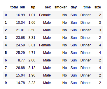
Before diving into these libraries, at first, we will need a database to plot the data. We will be using the tips database for this complete tutorial. Let’s discuss see a brief about this database.
Database Used
Tips Database
Tips database is the record of the tip given by the customers in a restaurant for two and a half months in the early 1990s. It contains 6 columns such as total_bill, tip, sex, smoker, day, time, size.
You can download the tips database from here.
Example:
Python3
import pandas as pd
data = pd.read_csv("tips.csv")
display(data.head(10))
|
Output:
Matplotlib
Matplotlib is an easy-to-use, low-level data visualization library that is built on NumPy arrays. It consists of various plots like scatter plot, line plot, histogram, etc. Matplotlib provides a lot of flexibility.
To install this type the below command in the terminal.
pip install matplotlib
Refer to the below articles to get more information setting up an environment with Matplotlib.
After installing Matplotlib, let’s see the most commonly used plots using this library.
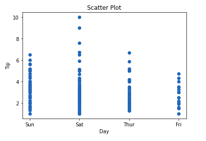
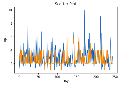
Scatter Plot
Scatter plots are used to observe relationships between variables and uses dots to represent the relationship between them. The scatter() method in the matplotlib library is used to draw a scatter plot.
Example:
Python3
import pandas as pd
import matplotlib.pyplot as plt
data = pd.read_csv("tips.csv")
plt.scatter(data['day'], data['tip'])
plt.title("Scatter Plot")
plt.xlabel('Day')
plt.ylabel('Tip')
plt.show()
|
Output:
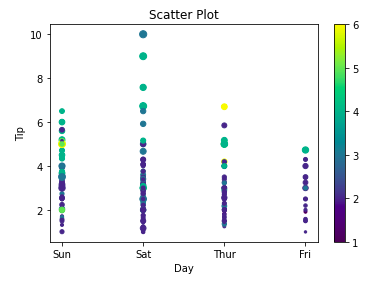
This graph can be more meaningful if we can add colors and also change the size of the points. We can do this by using the c and s parameter respectively of the scatter function. We can also show the color bar using the colorbar() method.
Example:
Python3
import pandas as pd
import matplotlib.pyplot as plt
data = pd.read_csv("tips.csv")
plt.scatter(data['day'], data['tip'], c=data['size'],
s=data['total_bill'])
plt.title("Scatter Plot")
plt.xlabel('Day')
plt.ylabel('Tip')
plt.colorbar()
plt.show()
|
Output:
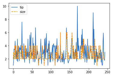
Line Chart
Line Chart is used to represent a relationship between two data X and Y on a different axis. It is plotted using the plot() function. Let’s see the below example.
Example:
Python3
import pandas as pd
import matplotlib.pyplot as plt
data = pd.read_csv("tips.csv")
plt.plot(data['tip'])
plt.plot(data['size'])
plt.title("Scatter Plot")
plt.xlabel('Day')
plt.ylabel('Tip')
plt.show()
|
Output:
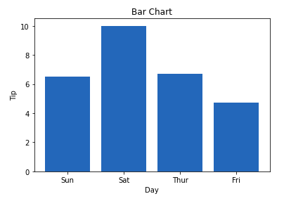
Bar Chart
A bar plot or bar chart is a graph that represents the category of data with rectangular bars with lengths and heights that is proportional to the values which they represent. It can be created using the bar() method.
Example:
Python3
import pandas as pd
import matplotlib.pyplot as plt
data = pd.read_csv("tips.csv")
plt.bar(data['day'], data['tip'])
plt.title("Bar Chart")
plt.xlabel('Day')
plt.ylabel('Tip')
plt.show()
|
Output:
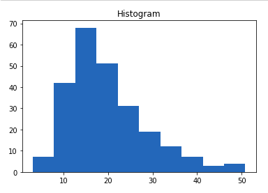
Histogram
A histogram is basically used to represent data in the form of some groups. It is a type of bar plot where the X-axis represents the bin ranges while the Y-axis gives information about frequency. The hist() function is used to compute and create a histogram. In histogram, if we pass categorical data then it will automatically compute the frequency of that data i.e. how often each value occurred.
Example:
Python3
import pandas as pd
import matplotlib.pyplot as plt
data = pd.read_csv("tips.csv")
plt.hist(data['total_bill'])
plt.title("Histogram")
plt.show()
|
Output:
Note: For complete Matplotlib Tutorial, refer Matplotlib Tutorial
Seaborn
Seaborn is a high-level interface built on top of the Matplotlib. It provides beautiful design styles and color palettes to make more attractive graphs.
To install seaborn type the below command in the terminal.
pip install seaborn
Seaborn is built on the top of Matplotlib, therefore it can be used with the Matplotlib as well. Using both Matplotlib and Seaborn together is a very simple process. We just have to invoke the Seaborn Plotting function as normal, and then we can use Matplotlib’s customization function.
Note: Seaborn comes loaded with dataset such as tips, iris, etc. but for the sake of this tutorial we will use Pandas for loading these datasets.
Example:
Python3
import seaborn as sns
import matplotlib.pyplot as plt
import pandas as pd
data = pd.read_csv("tips.csv")
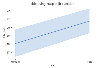
sns.lineplot(x="sex", y="total_bill", data=data)
plt.title('Title using Matplotlib Function')
plt.show()
|
Output:
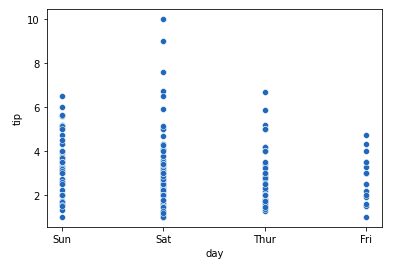
Scatter Plot
Scatter plot is plotted using the scatterplot() method. This is similar to Matplotlib, but additional argument data is required.
Example:
Python3
import seaborn as sns
import matplotlib.pyplot as plt
import pandas as pd
data = pd.read_csv("tips.csv")
sns.scatterplot(x='day', y='tip', data=data,)
plt.show()
|
Output:
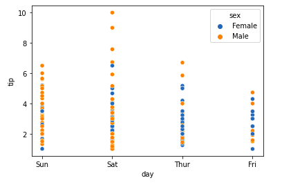
You will find that while using Matplotlib it will a lot difficult if you want to color each point of this plot according to the sex. But in scatter plot it can be done with the help of hue argument.
Example:
Python3
import seaborn as sns
import matplotlib.pyplot as plt
import pandas as pd
data = pd.read_csv("tips.csv")
sns.scatterplot(x='day', y='tip', data=data,
hue='sex')
plt.show()
|
Output:
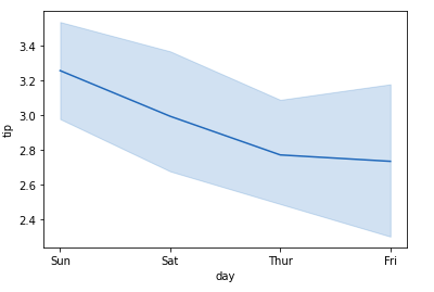
Line Plot
Line Plot in Seaborn plotted using the lineplot() method. In this, we can pass only the data argument also.
Example:
Python3
import seaborn as sns
import matplotlib.pyplot as plt
import pandas as pd
data = pd.read_csv("tips.csv")
sns.lineplot(x='day', y='tip', data=data)
plt.show()
|
Output:
Example 2:
Python3
import seaborn as sns
import matplotlib.pyplot as plt
import pandas as pd
data = pd.read_csv("tips.csv")
sns.lineplot(data=data.drop(['total_bill'], axis=1))
plt.show()
|
Output:
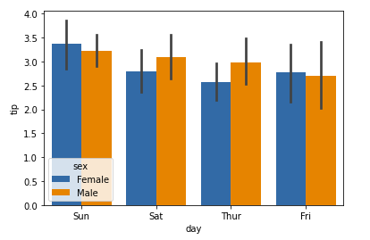
Bar Plot
Bar Plot in Seaborn can be created using the barplot() method.
Example:
Python3
import seaborn as sns
import matplotlib.pyplot as plt
import pandas as pd
data = pd.read_csv("tips.csv")
sns.barplot(x='day',y='tip', data=data,
hue='sex')
plt.show()
|
Output:
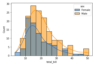
Histogram
The histogram in Seaborn can be plotted using the histplot() function.
Example:
Python3
import seaborn as sns
import matplotlib.pyplot as plt
import pandas as pd
data = pd.read_csv("tips.csv")
sns.histplot(x='total_bill', data=data, kde=True, hue='sex')
plt.show()
|
Output:
After going through all these plots you must have noticed that customizing plots using Seaborn is a lot more easier than using Matplotlib. And it is also built over matplotlib then we can also use matplotlib functions while using Seaborn.
Note: For complete Seaborn Tutorial, refer Python Seaborn Tutorial
Bokeh
Let’s move on to the third library of our list. Bokeh is mainly famous for its interactive charts visualization. Bokeh renders its plots using HTML and JavaScript that uses modern web browsers for presenting elegant, concise construction of novel graphics with high-level interactivity.
To install this type the below command in the terminal.
pip install bokeh
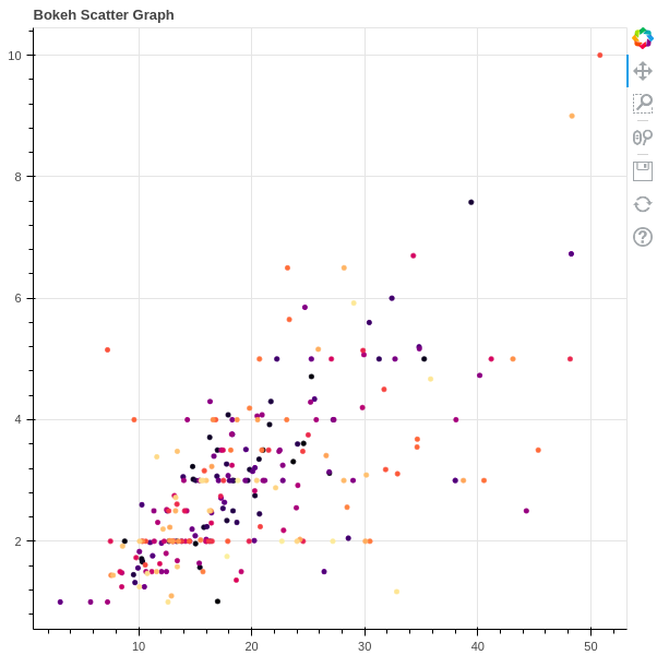
Scatter Plot
Scatter Plot in Bokeh can be plotted using the scatter() method of the plotting module. Here pass the x and y coordinates respectively.
Example:
Python3
from bokeh.plotting import figure, output_file, show
from bokeh.palettes import magma
import pandas as pd
graph = figure(title = "Bokeh Scatter Graph")
data = pd.read_csv("tips.csv")
color = magma(256)
graph.scatter(data['total_bill'], data['tip'], color=color)
show(graph)
|
Output:
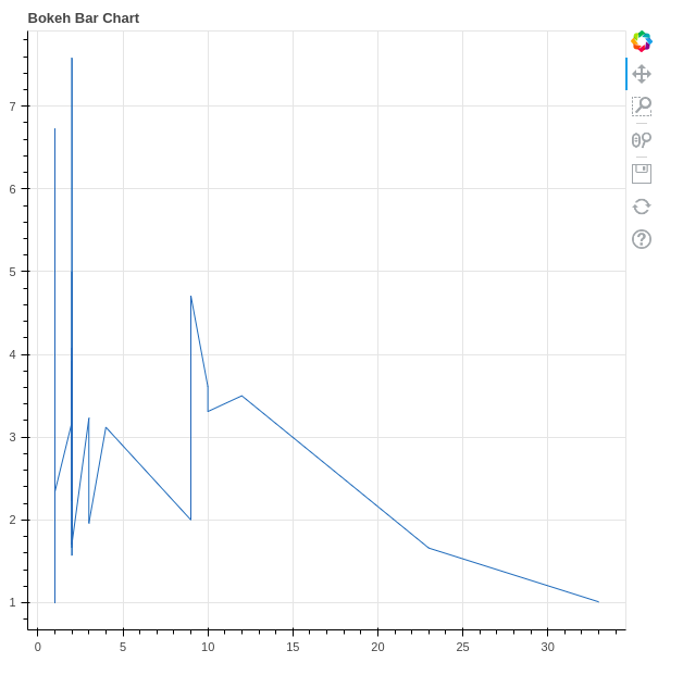
Line Chart
A line plot can be created using the line() method of the plotting module.
Example:
Python3
from bokeh.plotting import figure, output_file, show
import pandas as pd
graph = figure(title = "Bokeh Bar Chart")
data = pd.read_csv("tips.csv")
df = data['tip'].value_counts()
graph.line(df, data['tip'])
show(graph)
|
Output:
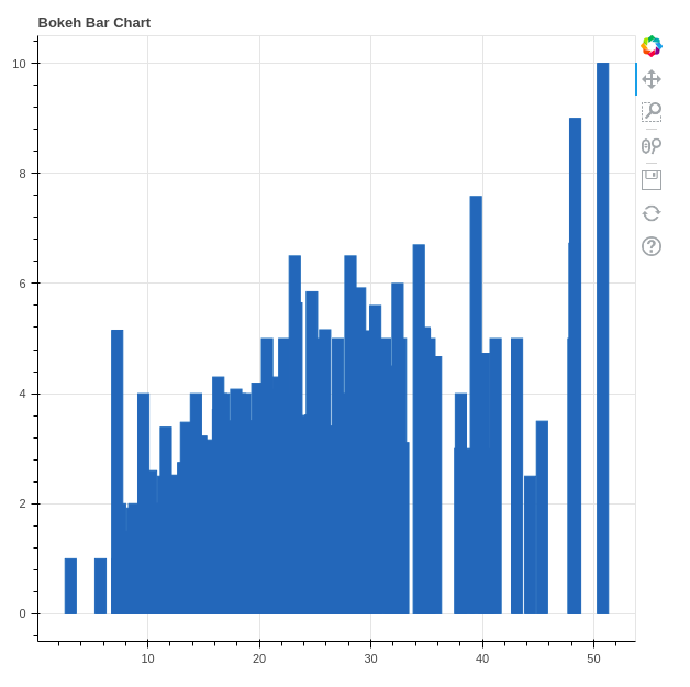
Bar Chart
Bar Chart can be of two types horizontal bars and vertical bars. Each can be created using the hbar() and vbar() functions of the plotting interface respectively.
Example:
Python3
from bokeh.plotting import figure, output_file, show
import pandas as pd
graph = figure(title = "Bokeh Bar Chart")
data = pd.read_csv("tips.csv")
graph.vbar(data['total_bill'], top=data['tip'])
show(graph)
|
Output:
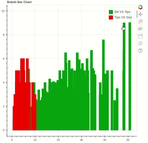
Interactive Data Visualization
One of the key features of Bokeh is to add interaction to the plots. Let’s see various interactions that can be added.
click_policy property makes the legend interactive. There are two types of interactivity –
- Hiding: Hides the Glyphs.
- Muting: Hiding the glyph makes it vanish completely, on the other hand, muting the glyph just de-emphasizes the glyph based on the parameters.
Example:
Python3
from bokeh.plotting import figure, output_file, show
import pandas as pd
graph = figure(title = "Bokeh Bar Chart")
data = pd.read_csv("tips.csv")
graph.vbar(data['total_bill'], top=data['tip'],
legend_label = "Bill VS Tips", color='green')
graph.vbar(data['tip'], top=data['size'],
legend_label = "Tips VS Size", color='red')
graph.legend.click_policy = "hide"
show(graph)
|
Output:
Adding Widgets
Bokeh provides GUI features similar to HTML forms like buttons, sliders, checkboxes, etc. These provide an interactive interface to the plot that allows changing the parameters of the plot, modifying plot data, etc. Let’s see how to use and add some commonly used widgets.
- Buttons: This widget adds a simple button widget to the plot. We have to pass a custom JavaScript function to the CustomJS() method of the models class.
- CheckboxGroup: Adds a standard check box to the plot. Similarly to buttons we have to pass the custom JavaScript function to the CustomJS() method of the models class.
- RadioGroup: Adds a simple radio button and accepts a custom JavaScript function.
Example:
Python3
from bokeh.io import show
from bokeh.models import Button, CheckboxGroup, RadioGroup, CustomJS
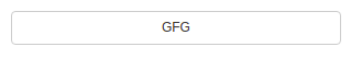
button = Button(label="GFG")
button.js_on_click(CustomJS(
code="console.log('button: click!', this.toString())"))
L = ["First", "Second", "Third"]
checkbox_group = CheckboxGroup(labels=L, active=[0, 2])
checkbox_group.js_on_click(CustomJS(code=
))
radio_group = RadioGroup(labels=L, active=1)
radio_group.js_on_click(CustomJS(code=
))
show(button)
show(checkbox_group)
show(radio_group)
|
Output:


Note: All these buttons will be opened on a new tab.
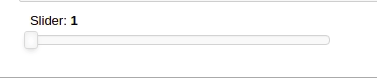
- Sliders: Adds a slider to the plot. It also needs a custom JavaScript function.
Example:
Python3
from bokeh.io import show
from bokeh.models import CustomJS, Slider
slider = Slider(start=1, end=20, value=1, step=2, title="Slider")
slider.js_on_change("value", CustomJS(code=
))
show(slider)
|
Output:
Similarly, much more widgets are available like a dropdown menu or tabs widgets can be added.
Note: For complete Bokeh tutorial, refer Python Bokeh tutorial – Interactive Data Visualization with Bokeh
Plotly
This is the last library of our list and you might be wondering why plotly. Here’s why –
- Plotly has hover tool capabilities that allow us to detect any outliers or anomalies in numerous data points.
- It allows more customization.
- It makes the graph visually more attractive.
To install it type the below command in the terminal.
pip install plotly
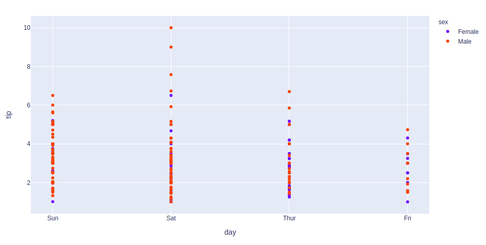
Scatter Plot
Scatter plot in Plotly can be created using the scatter() method of plotly.express. Like Seaborn, an extra data argument is also required here.
Example:
Python3
import plotly.express as px
import pandas as pd
data = pd.read_csv("tips.csv")
fig = px.scatter(data, x="day", y="tip", color='sex')
fig.show()
|
Output:
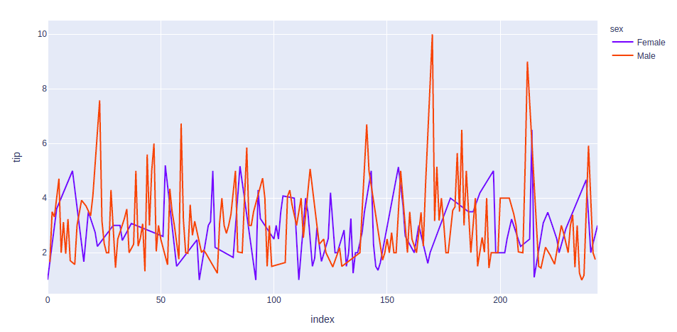
Line Chart
Line plot in Plotly is much accessible and illustrious annexation to plotly which manage a variety of types of data and assemble easy-to-style statistic. With px.line each data position is represented as a vertex
Example:
Python3
import plotly.express as px
import pandas as pd
data = pd.read_csv("tips.csv")
fig = px.line(data, y='tip', color='sex')
fig.show()
|
Output:
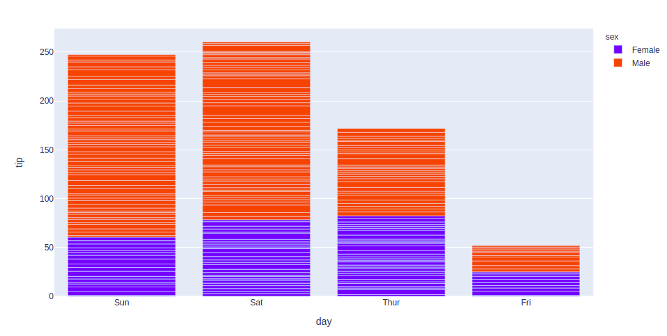
Bar Chart
Bar Chart in Plotly can be created using the bar() method of plotly.express class.
Example:
Python3
import plotly.express as px
import pandas as pd
data = pd.read_csv("tips.csv")
fig = px.bar(data, x='day', y='tip', color='sex')
fig.show()
|
Output:
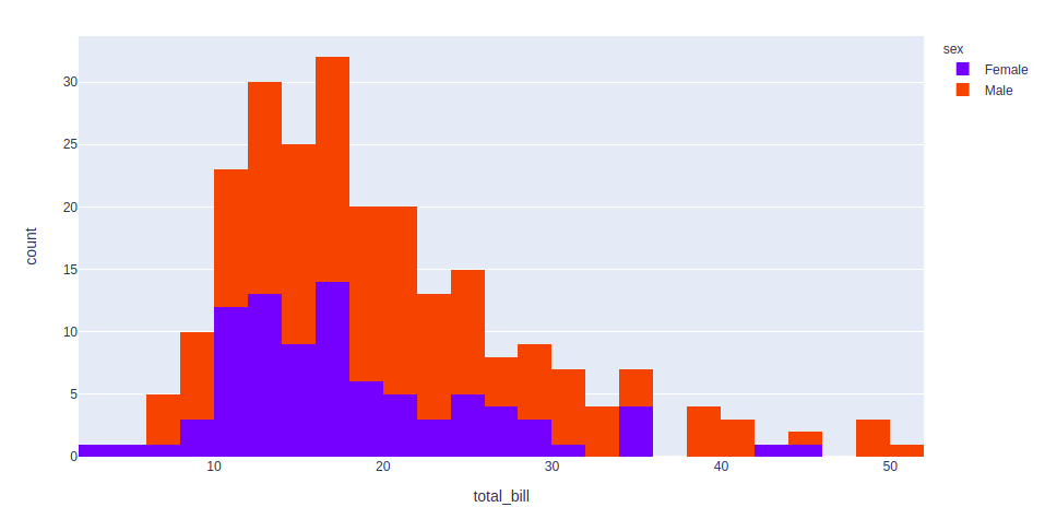
Histogram
In plotly, histograms can be created using the histogram() function of the plotly.express class.
Example:
Python3
import plotly.express as px
import pandas as pd
data = pd.read_csv("tips.csv")
fig = px.histogram(data, x='total_bill', color='sex')
fig.show()
|
Output:
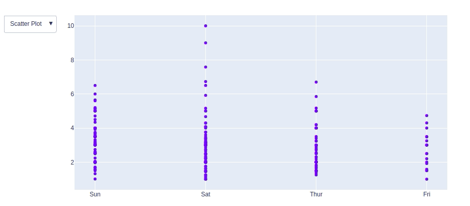
Adding interaction
Just like Bokeh, plotly also provides various interactions. Let’s discuss a few of them.
Creating Dropdown Menu: A drop-down menu is a part of the menu-button which is displayed on a screen all the time. Every menu button is associated with a Menu widget that can display the choices for that menu button when clicked on it. In plotly, there are 4 possible methods to modify the charts by using updatemenu method.
- restyle: modify data or data attributes
- relayout: modify layout attributes
- update: modify data and layout attributes
- animate: start or pause an animation
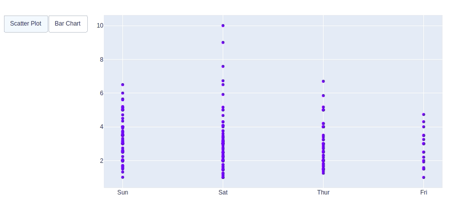
Example:
Python3
import plotly.graph_objects as px
import pandas as pd
data = pd.read_csv("tips.csv")
plot = px.Figure(data=[px.Scatter(
x=data['day'],
y=data['tip'],
mode='markers',)
])
plot.update_layout(
updatemenus=[
dict(
buttons=list([
dict(
args=["type", "scatter"],
label="Scatter Plot",
method="restyle"
),
dict(
args=["type", "bar"],
label="Bar Chart",
method="restyle"
)
]),
direction="down",
),
]
)
plot.show()
|
Output:
Adding Buttons: In plotly, actions custom Buttons are used to quickly make actions directly from a record. Custom Buttons can be added to page layouts in CRM, Marketing, and Custom Apps. There are also 4 possible methods that can be applied in custom buttons:
- restyle: modify data or data attributes
- relayout: modify layout attributes
- update: modify data and layout attributes
- animate: start or pause an animation
Example:
Python3
import plotly.graph_objects as px
import pandas as pd
data = pd.read_csv("tips.csv")
plot = px.Figure(data=[px.Scatter(
x=data['day'],
y=data['tip'],
mode='markers',)
])
plot.update_layout(
updatemenus=[
dict(
type="buttons",
direction="left",
buttons=list([
dict(
args=["type", "scatter"],
label="Scatter Plot",
method="restyle"
),
dict(
args=["type", "bar"],
label="Bar Chart",
method="restyle"
)
]),
),
]
)
plot.show()
|
Output:
Creating Sliders and Selectors:
In plotly, the range slider is a custom range-type input control. It allows selecting a value or a range of values between a specified minimum and maximum range. And the range selector is a tool for selecting ranges to display within the chart. It provides buttons to select pre-configured ranges in the chart. It also provides input boxes where the minimum and maximum dates can be manually input
Example:
Python3
import plotly.graph_objects as px
import pandas as pd
data = pd.read_csv("tips.csv")
plot = px.Figure(data=[px.Scatter(
y=data['tip'],
mode='lines',)
])
plot.update_layout(
xaxis=dict(
rangeselector=dict(
buttons=list([
dict(count=1,
step="day",
stepmode="backward"),
])
),
rangeslider=dict(
visible=True
),
)
)
plot.show()
|
Output:
Note: For complete Plotly tutorial, refer Python Plotly tutorial
Conclusion
In this tutorial, we have plotted the tips dataset with the help of the four different plotting modules of Python namely Matplotlib, Seaborn, Bokeh, and Plotly. Each module showed the plot in its own unique way and each one has its own set of features like Matplotlib provides more flexibility but at the cost of writing more code whereas Seaborn being a high-level language provides allows one to achieve the same goal with a small amount of code. Each module can be used depending on the task we want to do.
Like Article
Suggest improvement
Share your thoughts in the comments
Please Login to comment...