Calibration Curves
Last Updated :
14 Sep, 2021
Generally, for any classification problem, we predict the class value that has the highest probability of being the true class label. However, sometimes, we want to predict the probabilities of a data instance belonging to each class label. For example, say we are building a model to classify fruits and we have three class labels: apples, oranges, and bananas (each fruit is one of these). For any fruit, we want the probabilities of the fruit being an apple, an orange, or a banana.
This is very useful for the evaluation of a classification model. It can help us understand how ‘sure’ a model is while predicting a class label and may help us interpret how decisive a classification model is. Generally, classifiers that have a linear probability of predicting each class’s labels are called calibrated. The problem is, not all classification models are calibrated.
Some models can give poor estimates of class probabilities and some do not even support probability prediction.
Calibration Curves:
Calibration curves are used to evaluate how calibrated a classifier is i.e., how the probabilities of predicting each class label differ. The x-axis represents the average predicted probability in each bin. The y-axis is the ratio of positives (the proportion of positive predictions). The curve of the ideal calibrated model is a linear straight line from (0, 0) moving linearly.
Plotting Calibration Curves in Python3:
For this example, we will use a binary dataset. We will use the popular diabetes dataset. You can learn more about this dataset here.
Code: Implementing a Support Vector Machine’s calibration curve and compare it with a perfectly calibrated model’s curve.
Python3
from sklearn.datasets import load_breast_cancer
from sklearn.svm import SVC
from sklearn.model_selection import train_test_split
from sklearn.calibration import calibration_curve
import matplotlib.pyplot as plt
dataset = load_breast_cancer()
X = dataset.data
y = dataset.target
X_train, X_test, y_train, y_test = train_test_split(X, y,
test_size = 0.1, random_state = 13)
model = SVC()
model.fit(X_train, y_train)
prob = model.decision_function(X_test)
x, y = calibration_curve(y_test, prob, n_bins = 10, normalize = True)
plt.plot([0, 1], [0, 1], linestyle = '--', label = 'Ideally Calibrated')
plt.plot(y, x, marker = '.', label = 'Support Vector Classifier')
leg = plt.legend(loc = 'upper left')
plt.xlabel('Average Predicted Probability in each bin')
plt.ylabel('Ratio of positives')
plt.show()
|
Output:
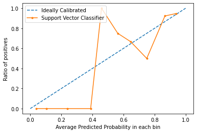
From the graph, we can clearly see that the Support Vector classifier is nor very well calibrated. The closes a model’s curve is to the perfect calibrated model’s curve (dotted curve), the better calibrated it is.
Conclusion:
Now that you know what calibration is in terms of Machine Learning and how to plot a calibration curve, next time you classifier gives unpredictable results and you can’t find the cause, try plotting the calibration curve and check if the model is well-calibrated.
Share your thoughts in the comments
Please Login to comment...