UI Design of a Tech Company Website
Last Updated :
16 Apr, 2024
UI Design of a Tech Company should design pages like Home Page, Products, Services, Stores and Service Centers, Careers, and About Us Pages that explain Principles of UI. Using Design Principles to select the color and theme of the brand helps in marketing the brand pretty well to the customers as it it a tech company website so, it should look and feel like a modern website with great UI.
Designing the Web UI for a Tech Company
Color Theory:
Picking colors is important. For big tech companies, using colors that show new ideas and trust is key. For example, using purple and blue can make people trust and innovation the website more.
Negative Spaces:
Leaving some space around important things on the page helps people see them better. For example, having space around pictures or buttons makes it easier for people to find them, also spaces around cards and images help us design a great UI.
Alignment:
Making sure everything on the page lines up nicely makes it look organized and professional. Specially the navbar and footer should be aligned perfectly for user’s ease of use. The alignment of forms, buttons and cards in the UI can make the UI look awesome.
Typography:
Picking the right font and words makes the website easier to read and makes the brand look good. For example, a Tech Company might use modern words for big headings and simple words for regular text to make everything look the same. Fonts are very crucial for a tech company as it is the way to show the brand’s style and understanding.
Grid System:
Splitting the page into a grid and designing it is something a good UI requires. Grid system help us design a perfectly aligned, smooth and visually great UI. It also helps make sure everything looks good on different screen sizes. This way, pictures and words can be put in neat rows and columns.
Effects:
Adding small changes called micro-interaction when people move their mouse over things on the page makes the website more fun. For example, when people move their mouse over pictures or buttons, they might see cool changes.
Buttons:
Buttons need to be visible and highlighted for example contact us button, Buy button and Stores button should be clearly visible and easy to find.
Footer:
Footer have useful links like products page, Stores, services, service centers, About us page, Services, , About us, Contact us and Careers page, Office Address and many other useful links.
Home Page Design
The following is the Home Page design of a Tech Company Website.

Home page of Tech Company UI
Products Page Design
The following is the Products Page Design of a Tech Company Website.

Products Page of a Tech Company
Services Page Design
The following is the Services Page Design of a Tech Company Website.
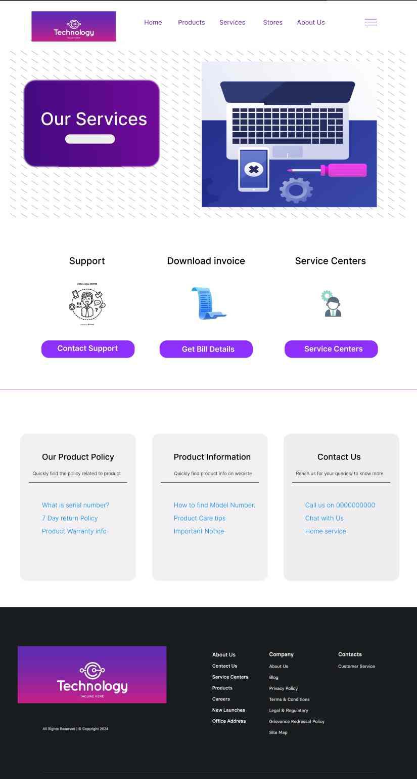
Services Page of a Tech Company
Stores and Service Center Page
The following is the Stores and Service Center Page of a Tech Company Website.

Stores and Service Centers Page
Careers Page
The following is the Careers Page Design of a Tech Company Website.

Careers Page of Tech Company
About Us
The following is the About Us Page Design of a Tech Company Website.

About Us of Tech Company
Conclusion
By using different design principles and concepts we can make out UI look better. UI design of the website according to user needs. If the design principles used and implemented in right way then we can get a modern and good UI. Selecting right colors, fonts and buttons can help us design great UI. For a Tech Company, the navigation bar and CTA buttons need to be clear and visible so that user may read about it.
Share your thoughts in the comments
Please Login to comment...