Importance of Alignment in UI Design
Last Updated :
05 Mar, 2024
Alignment is crucial, so crucial that now it is no longer considered a best practice rather it has become the de facto for most of the website. You will hardly find any website or application these days that does not follow alignment. Most people recognize Alignment as icons present in most of the word processing tools like Google Docs or Microsoft Word, the same icons are found in all design tools like Figma, Sketch, and Adobe. In this article, we will discuss about one of the most important things in layout design, alignment. We will discuss what Alignment actually is and what is the importance of alignment.
Importance of Alignment in UI Design
What is Alignment?
Alignment is most of the most important design principles and it refers to positioning various elements in a layout be it text, graphics, etc. in such a way that they are lined up properly and follow a visual pattern. This not only makes the content look structured but also helps with making it easy for the user to understand what’s happening on the screen. Alignments help you create a visual consistency throughout your layout. In case of alignment, designers need to make use of fictional guidelines in either a horizontal or vertical axis to align the elements in order, this is done in order to create a structure in the entire layout.
Proper alignment becomes really helpful when you have multiple elements within a group or a section, it helps in making a layout nice and clean. One thing that designers need to know is that misalignment is poor but randomly aligned content is even worse, so alignment must be done strategically and thoughtfully.
Types of Alignment
There are two types of alignment which then are divided into more subgroups, types of alignment are as mentioned below:
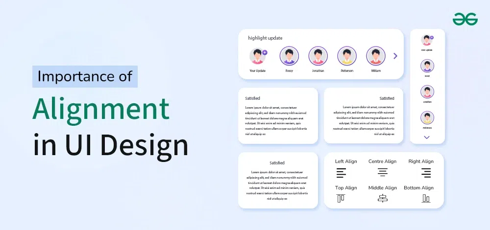
1. Horizontal alignment
Horizontal alignment is the type of alignment that is set on the horizontal X axis going from left to right. It can be further divided into three sub types:
- Left Alignment: Left alignments are the most commonly used horizontal alignment. For the human brain especially for text, knowing the exact starting point for each row of text makes it easier to read or scan text faster. This type of alignment is also a common starting point for alignment of other elements on a page or a screen. This is since we usually scan pages of content in a Z-like pattern that starts from the top left corner and ends in the bottom right corner.
- Right alignment: Right alignment is not as common as left however this is still often used in a lot of context like when you group data or actions inside of a component, on a social media post component. For example on Twitter, the ellipsis icon is right aligned, another example could be the floating action button in the bottom right corner.
- Center alignment: Center alignment in the horizontal axis is commonly used in components that contain an icon or a button but when it comes to text it is ideal to not Center align the text block if it exceeds three rows of text, this is due to poor legibility that it creates in large chunks of textual content.
2. Vertical alignment
A Vertical alignment is set on the vertical axis going from bottom to the top. It can be further divided into three sub types:
- Top alignment: Top alignment is very commonly used in designs and and texts and also is the default settings in most tools like Figma, whenever you create a new text layer you will see that Figma and most other tools automatically sets the vertical alignment of the text layer to top alignment. This is most intuitive to users because of the increase in findability since users commonly start at the top left corner and end at the bottom.
- Bottom Alignment: In Bottom Alignment, the elements stick to the bottom, this useful for instance if you have an image thumbnail element with a title placed on top of the image you may want to align the text element to the bottom, if you exceed one row of text the next row will fall all the way to the bottom making sure your text layer always aligns with the bottom edge of the thumbnail container.
- Center alignment: In this type of Vertical Alignment we have in both the horizontal and the vertical axis, so similar to the last example we center align vertically the content inside buttons and icons but this is also helpful in header elements as well in combination with a horizontal left alignment for instance.
Importance of Alignment in UI Design
Organization/Structure:
- Alignment is essential to any design since it makes the the content and other visuals on the screen structured. Other than this it also gives design the professionalism and a pleasing aesthetic to the eye. Organization appeals more to the human eye and this way alignment improves the aesthetics of the website or application.
Consistency:
- Consistency helps the reader scan the text easily because it sets a defined pattern in the brain of the reader. Alignment is essential for any website or application design for this same reason – When we apply alignment, it gives consistency, page to page and to the overall project.
Improves usability:
- It improves usability because it makes it easier for the user to navigate though the design. Alignment ensures that the text as well as visual elements on the screen are positioned linearly and this improves the readability of the website or application but it also improves the user experience and the usability since navigation becomes easier.
Improves Readability:
- For the human brain especially for text, knowing the exact starting point for each row of text makes it easier to read or scan text faster. Alignment in this way improves the readability of the text and we can also use alignment to set contrast between various blocks of text and highlight one block of text over other.
Reduces the Cognitive Load:
- Cognitive Load is the brain power required to complete an action or a task in an application, website or any other interface be it physical or digital. Whenever our user finds something really complex on the screen, his or her brain has to focus more in order to understand it and the cognitive load is increased. With proper alignment and spacing one can make sure that there is not much cognitive load on the user’s brain.
Tips for Alignment
Three very crucial tips that will help you align your text and other visual elements in your design are as following:
- Use alignment as a general rule unless for some exceptions like misaligning to create visual interest.
- Media objects are a very common UI pattern, but with variable width icons, it is easy to end up with misalignment. One tip for Media object alignment is to center align your icons and left align all of your text.
- Use Layout Grids in Sketch, Figma, Adobe XD, etc. in order to create perfect layout designs.
Conclusion
Alignment refers to positioning various elements in a layout be it text, graphics, etc. in such a way that they are lined up properly and follow a visual pattern. Alignment is no more considered to be a best practice, it is a default for designing any website or application and if your design is not properly aligned, this puts a really bad impression in the minds of the user. It also becomes really helpful when you have multiple elements within a group or a section, it helps in making a layout nice and clean. Make sure to follow the points we mentioned in the article in order to create a proper alignment for your next design.
Share your thoughts in the comments
Please Login to comment...