UI Design of OTT Platform Website
Last Updated :
20 Mar, 2024
This article covers basic designing principles and ways in which one can design a beautiful platform for OTT Films. An OTT Platform that consists of the following pages: Home Page, Movies Search Page, Individual Show Page & About Us.
Designing Principles
Color Theory:
Pick any two colors of your choice and style the remaining parts of the website accordingly. For eg. If the navigation bar has a red color the rest of the website can have a dark color not of the red family, but blue black, or violet. There needs to be less variation in colors because already the images of movies have a lot of colors, thus making the website colorful.
Negative Spaces:
Negative space is the area where none of the information or images or any content is displayed, it is a simple white space. Such spaces are necessary to provide space to the user while selecting movies and can be achieved using margin and padding. It helps in increasing the readability of the information available on the website.
Alignment:
A proper alignment is required to make the website look user interactive and keep it on point. The alignment becomes necessary when several options and images of movies are shown. This helps the user to look at every possible image. A disordered alignment of images would lead to missing out of some options and would look very clumsy too.
Grid System:
OTT Platforms required grid systems as there is a need to display several images and videos regarding movies and their options. A grid system allows a responsive and flexible system for all sorts of devices.
Effects:
Effects and animations help increase the interactivity of the website. One such option of adding effect is while opening the website.
Typography:
Typography is the arrangement of letters and fonts in the most simple fashion. An OTT platform requires the users to have a look at the images and videos of movies along with the title of the movie in a good typography. However most of the focus remains on images but still the font should be simple and elegant. Font selection can be simple like Sans Serif, or Poppins, Mont etc.
Use of Infographics:
Infographics is extremely important for the OTT Platform as the entire website ranges from showing images and videos only. Good and quality images must be used to increase the user interactivity of the website.
Home Page
The Home Page should consist of the logo a navigation with Sign In and Language Options along with an option to create a new account or log into the existing account. The Home Page should also consist of some FAQs that answer user’s most frequently asked questions.
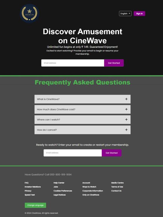
Home Page
Movies Search Page
This Page consists of a list of movies which are categorized based on their comedy, action and thrill in the movies. It consists of a search bar engine which allows one to search the kind of movies he or she wants.

Movie Page
Individual Show Page
In the Individual Show Page the first component consists of the image and a short description of the movie along with it’s age criteria, as in this movie is for which age group and more details regarding the cast and a recommendation section of more such movies like this.

Individual Show Page
About Us
The About Us page, as it sounds clear by it’s name tells about the website and about the OTT Platform, for eg., The Mission it aims to achieve, the goals and a basic introduction to the website.

About Us
Conclusion
Using the above designing principles and process of UI Formation one can easily achieve the goal of creating an OTT website which would definitely attract maximum number of users and increase it’s access to worldwide population.
Share your thoughts in the comments
Please Login to comment...