How to create Skeuomorphic Buttons?
Last Updated :
18 Dec, 2023
Skeuomorphism
Skeuomorphism design style is a design that mimics the real-world elements in the design interface. They are used to give users a sense of familiarity. They use images and effects that users usually see around them. Using these real-world makes interfaces easier to understand for the users. This builds an emotional connection with users which makes it easier for users to engage with the interface. This increases user engagement by a lot which helps the interface gain more popularity.
Skeuomorphic Buttons
Using real-world examples for Buttons is one of the ways to include Skeuomorphism in an interface. Using effects like shadows and press animations makes it look like the user is engaging with the interface and getting the response back. Using icons that show what the feature is like using a clock icon for a clock or a folder icon for opening files is a major example of Skeuomorphism. They help users to navigate through the interface easily as users can just look at the icon and understand what it is meant for. These icons provide hints and visual clues that help the user to easily interact with the interface.
Points to Include when Designing Skeuomorphic Buttons
- Using Shadows: Using shadows gives elements a sense of depth which gives them realism. This makes it look like the user is clicking a real button instead of one on the screen which helps with user engagement.
- Using Real Life Icons: Using Icons that mimics real life objects makes it easier for users to understand what the button is for. For Example using Home icon for navigating to Homepage, using Image icon for Gallery, using magnifying glass icon for search, etc.
- Effective Colors: Using Colors that depict a specific emotion that matches the element like using green color for ON, red for OFF gives realism effect to the interface.
- Using Animations: Using Animations for when the button is pressed or using Animations while hovering over certain content.
Examples of Skeuomorphic Buttons
Example 1: Example showing ON/OFF button with Skeuomorphic Design.
HTML
<!DOCTYPE html>
<html lang="en">
<head>
<meta charset="UTF-8">
<meta name="viewport" content="width=device-width, initial-scale=1.0">
<title>Skeuomorphism</title>
</head>
<body>
<div class="container">
<div style="text-align: center; margin: auto;">
<h1 style="color: green;">GeeksforGeeks</h1>
<h3>Skeuomorphic Button</h3>
</div >
<div class="buttons">
<div id="onBtn"
onclick="getElementById('onBtn').style.backgroundColor = 'green';
getElementById('offBtn').style.backgroundColor = 'black'">
ON</div>
<div id="offBtn"
onclick="getElementById('offBtn').style.backgroundColor = 'red';
getElementById('onBtn').style.backgroundColor = 'black'">
OFF</div>
</div>
</div>
</body>
</html>
|
CSS
.container {
box-shadow: inset -2px 4px 8px gray;
border-radius: 1em;
height: 250px;
width: 40em;
display: flex;
flex-direction: column;
justify-content: center;
align-items: center;
background-color: whitesmoke;
}
.buttons {
height: 120px;
width: 100%;
display: flex;
justify-content: center;
align-items: center;
}
#onBtn {
width: 15%;
height: 50%;
background-color: black;
color: white;
display: flex;
justify-content: center;
align-items: center;
border-top-left-radius: 10px;
border-bottom-left-radius: 10px;
transition: 0.4s;
font-size: large;
font-family: Arial, Helvetica, sans-serif;
box-shadow: inset 0.9em 0 0.9em black;
}
#offBtn {
width: 15%;
height: 50%;
background-color: black;
color: white;
display: flex;
justify-content: center;
align-items: center;
border-top-right-radius: 10px;
border-bottom-right-radius: 10px;
transition: 0.4s;
font-size: large;
font-family: Arial, Helvetica, sans-serif;
box-shadow: inset -0.9em 0 0.9em black;
}
#onBtn:hover {
background-color: rgb(110, 141, 102);
}
#offBtn:hover {
background-color: rgb(129, 93, 93);
}
|
Output:
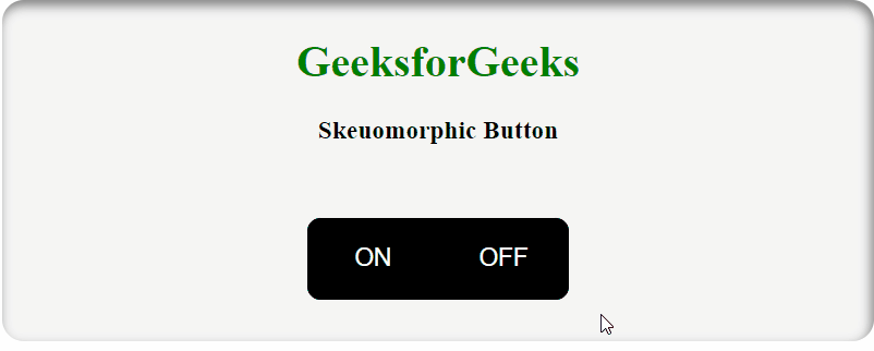
Skeuomorphic ON/OFF Button
Example 2: Example showing Skeuomorphic Icons.
HTML
<!DOCTYPE html>
<html lang="en">
<head>
<meta charset="UTF-8">
<meta name="viewport"
content="width=device-width, initial-scale=1.0">
<title>Skeuomorphic Buttons</title>
<style>
</style>
</head>
<body>
<h1 style="color: green; margin-top: 50px;">
GeeksforGeeks</h1>
<h3>Skeuomorphic Buttons</h3>
<div class="container">
<div class="buttons">
<img class="icons" src=
</div>
<div class="buttons">
<img class="icons" src=
</div>
<div class="buttons">
<img class="icons" src=
</div>
<div class="buttons">
<img class="icons" src=
</div>
<div class="buttons">
<img class="icons" src=
</div>
<div class="buttons">
<img class="icons" src=
</div>
<div class="buttons">
<img class="icons" src=
</div>
<div class="buttons">
<img class="icons" src=
</div>
<div class="buttons">
<img class="icons" src=
</div>
<div class="buttons">
<img class="icons" src=
</div>
<div class="buttons">
<img class="icons" src=
</div>
<div class="buttons">
<img class="icons" src=
</div>
</div>
</body>
</html>
|
CSS
*{
text-align: center;
margin: auto;
}
.container{
width: 20em;
height: 30em;
border: 1px solid black;
display: flex;
justify-content: space-around;
align-items: center;
background-color: blueviolet;
border-radius: 20px;
flex-wrap: wrap;
margin-top: 40px;
}
.icons{
height: 60%;
width: 60%;
}
.buttons{
width: 4em;
height: 4em;
background-color: white;
display: flex;
align-items: center;
justify-content: center;
border-radius: 10px;
color: white;
transition: 0.4s;
margin: 15px;
box-shadow: inset -0.1em 0 0.3em black;
}
.buttons:hover{
transform: scale(1.2);
}
|
Output:

Skeuomorphic Icons
Conclusion
Skeuomorphic Buttons are used to give navigation and using features a sense of realism. They should be used in a way that enhances the user experience and makes it easier for them to understand and use the interface. Giving Buttons depth and animations makes it look like that the interface is responding to the user which helps build and emotional connection with the user. Buttons should not be made in a way that they rather than helping the user becomes a problem for them. Giving colors to pressing a button like Green and Red for access right and wrong respectively also helps increase user engagement. Overall Skeuomorphic Buttons helps a lot with user engagement if used correctly and they also gives the interface a modern and sleek look.
Share your thoughts in the comments
Please Login to comment...