Implementing Global State Management with useContext
Last Updated :
22 Feb, 2024
The useContext hook is a powerful addition introduced in React 16.8. It allows you to share context (or some value) with all the child elements within a context provider. This is particularly useful when you want to access data or state in child components without manually passing props down to each nested component. In this article, you’ll learn about useContext in depth.
What is Global State Management?
Global state refers to data that needs to be accessible across different components in your React application. Instead of passing props down through multiple levels of components (a process known as “prop drilling”), you can use the global state to share data efficiently. It eliminates the need for prop drilling and provides a cleaner way to manage shared state across components. You can consider useContext as a simple state as we create using useState. The only thing context will do is to share this state and its changes across the app.
Approach to Manage Global State with useContext hook:
To create a context in any React app, you need to follow 4 simple steps –
- Create a context: A context in React is a way to share data between components without having to pass it through props. It acts as a global state container.
- Create a provider: The provider is responsible for making the context data available to all the components that need it. You wrap your app (or a specific part of your app) with the provider component. This is typically done in your top-level component (like App.js).
- Add provider to the app: You wrap your app components with the context provider. Any component within this provider’s scope can access the shared data using the useContext hook.
- UseContext: The useContext hook allows components to use the context data. Import the context you created and use it within a component.
In simple words when we are creating a context, we are creating a state. And when we create a provider, as its name says, we are creating a wrapper component to provide that state to all the components.
Steps to Create React Application:
Step 1: Create a React application using the following command:
npx create-react-app global-state
Step 2: Move to the folder using the following command:
cd global-state
Project Structure:
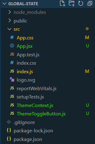
Folder Structure
The updated dependencies in package.json file will look like:
"dependencies": {
    "@testing-library/jest-dom": "^5.17.0",
    "@testing-library/react": "^13.4.0",
    "@testing-library/user-event": "^13.5.0",
    "react": "^18.2.0",
    "react-dom": "^18.2.0",
    "react-scripts": "5.0.1",
    "web-vitals": "^2.1.4"
 }
Example: Create the required files and add the following codes.
Javascript
import React from 'react';
import ReactDOM from 'react-dom';
import App from './App';
import { ThemeProvider } from './ThemeContext';
ReactDOM.render(
<React.StrictMode>
<ThemeProvider>
<App />
</ThemeProvider>
</React.StrictMode>,
document.getElementById('root')
);
|
Javascript
import React from 'react';
import ThemeToggleButton from './ThemeToggleButton';
import './App.css';
const App = () => {
return (
<div className="app-container">
<h1>GFG Theme</h1>
<ThemeToggleButton />
<p>Rest of the contents.</p>
</div>
);
};
export default App;
|
Javascript
import React, { createContext, useContext, useState } from 'react';
const ThemeContext = createContext();
export const useTheme = () => useContext(ThemeContext);
export const ThemeProvider = ({ children }) => {
const [darkMode, setDarkMode] = useState(false);
const toggleTheme = () => {
setDarkMode(prevMode => !prevMode);
};
return (
<ThemeContext.Provider value={{ darkMode, toggleTheme }}>
<div className={darkMode ? 'dark' : 'light'}>{children}</div>
</ThemeContext.Provider>
);
};
|
Javascript
import React from 'react';
import { useTheme } from './ThemeContext';
const ThemeToggleButton = () => {
const { darkMode, toggleTheme } = useTheme();
return (
<button className="theme-toggle-button" onClick={toggleTheme}>
{darkMode ? 'Switch to Light Theme' : 'Switch to Dark Theme'}
</button>
);
};
export default ThemeToggleButton;
|
CSS
.light {
background-color: #ffffff;
color: #000000;
}
.dark {
background-color: #222222;
color: #ffffff;
}
.theme-toggle-button {
padding: 10px 20px;
background-color: #007bff;
color: #ffffff;
border: none;
border-radius: 5px;
cursor: pointer;
}
.theme-toggle-button:hover {
background-color: #0056b3;
}
|
To start the application run the following command.
npm start
Output:
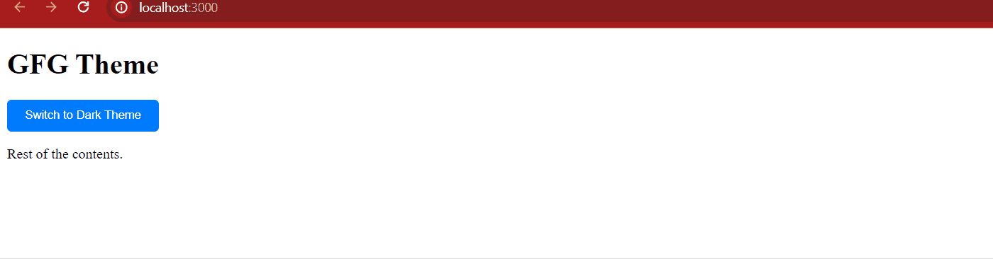
Output
Share your thoughts in the comments
Please Login to comment...