How to create a controlled input with useState?
Last Updated :
22 Feb, 2024
Controlled inputs is a frequently used technique to manage form inputs in React where the values are controlled by the state. This method guarantees that the UI and state are always in sync, allowing React to take care of the input’s value and any changes made to it.
Creating a Controlled Input with useState:
- State Initialization: Use the
useState hook to initialize a state variable that will hold the current value of the input field.
- Event Handler: Define an event handler function, such as
handleChange, that will be called whenever the input value changes. This function should update the state variable with the new value provided by the user.
- Attach Event Handler: Attach the event handler to the
onChange event of the input field. This ensures that the state variable is updated whenever the user types into the input field.
- Controlled Input: Set the
value attribute of the input field to the state variable. This makes the input a controlled component, meaning its value is always synchronized with the state.
- Display Current Value: Optionally, display the current value of the input field below it or elsewhere in the UI. This can help debug or provide feedback to the user.
Example: Below is an example to create a controlled input with useState.
Javascript
import React, {
useState
} from 'react';
import "./App.css"
const ControlledInput = () => {
const [inputValue, setInputValue] = useState('');
const handleChange = (event) => {
setInputValue(event.target.value);
};
return (
<div>
<input
className="controlled-input"
type="text"
value={inputValue}
onChange={handleChange}
/>
<p className="current-value">
Current value: {inputValue}
</p>
</div>
);
};
export default ControlledInput;
|
CSS
.controlled-input-container {
margin: 10px;
}
.controlled-input {
padding: 8px;
border: 1px solid #ccc;
border-radius: 4px;
font-size: 16px;
width: 200px;
}
.current-value {
font-size: 50px;
color: #4fb57d;
margin-top: 5px;
}
|
Output:
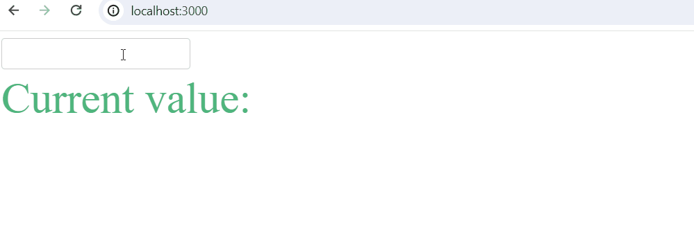
Output
Share your thoughts in the comments
Please Login to comment...