Responsive Design Mode in Mozilla Firefox Browser
Last Updated :
16 Oct, 2023
All web pages which are design for multiple devices having varying screen width must have a responsive design. These design can have relative layout and/or reflowing content. To inspect the responsive design of a web page Firefox provides a mode for simulating various screen sizes, throttling and touch.
Features of Responsive Design Mode
The various features of this mode are:
- Preloaded device sizes: There are various devices such as smartphones, tv and laptops sizes that are present by default in this mode. You also get a option to add your own custom device settings.
- Various Throttling options: You can use this mode to change the network speed and check the behaviour of the browser. This helps in debugging loading problems that occur in slow network.
- Touch Feature: You can also simulate touch based interaction using this mode. If the touch simulation is enable than all mouse events get translated to touch events.
- Orientation of the device: You can change the orientation of the device from portrait to landscape or vice versa. This helps to check is the web page is responsive for the change in the orientation.
- Modify Device Pixel Ratio (DPR): Allows you to test devices with varying pixel density by changing the DPR values. Web page can be changed for screens having higher density pixels.
Benefits of Responsive Design Mode
The various benefits of this mode are:
- Live Changes: The changes made using this mode can directly be previewed without any loading time. This make the mode very fast and efficient for developers for testing or debugging purposes.
- Very Easy to Use: The options provided are easy to understand and use there is no learning curve for using this mode. Straight forward options makes is easy for new user to work on.
- Supports variety of devices: You can simulate variety of devices in this mode with respect to screen sizes, pixel density, network speeds etc. You can also add custom device according to your requirement.
How to open the Responsive Design Mode?
There are two ways to use the Responsive Design Mode, first way is using the mode along with DevTools and second way is using the mode without DevTools.
With DevTools
Right-click in the web page and click Inspect from the context menu that appears. The DevTools will appear in the DevTools click the responsive design mode button present at the top-right corner of DevTools or just use the shortcut “Ctrl+Shift+M”.
Opening the mode along with DevTools
Without DevTools
Click the application menu option which appears as three bars and it’s present in the top-right corner of the browser. Then navigate to More tools > Responsive Design Mode. Alternatively you can directly open the mode using the shortcut “Ctrl+Shift+M”.
Opening the mode along without DevTools
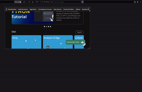
Various options of Responsive Design Mode
The mode provides various options relate to the simulation of the device.

Various options present in the mode
- Device Name: This is a drop-down list to select device or add a custom device.
- Screen size: Displays width and height of the selected device which can you can also edit. At the bottom-right corner of the preview there is three lines allowing dragging of the viewport according to your requirement but this change will make the device name to display Responsive.
- Device Orientation: You can click this button to change the orientation of the device from portrait to landscape or vice versa.
- DPR (Device Pixel Ratio): Used to increase or decrease the DPR for responsive mode, if some device is selected then this is greyed out which indicates that the value can’t be changed.
- Throttling: This is drop-down list used to simulate the network speeds such as 2G, 3G etc. This is used to emulated download and upload speeds.
- User Agent: Specifies the browser, device OS and device brand that you are simulating.
- Touch simulation: Click it to toggle touch simulation which will translate all you mouse interactions to touch.
- Screenshot: Use this button to take a screenshot of the webpage preview which automatically saves in the downloads folder.
- Settings: Provides various settings for the mode which are left-align viewport, show user agent, reload when touch simulation is toggled and reload when user agent is changed.
- Close: Use this button to close the mode.
Using the Responsive Design mode
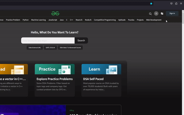
Lets visit GFG site and use this mode to check responsiveness of the webpage.
Step 1: Visit the GFG site using firefox and open the mode with or without DevTools according to you use.
Step 2: Change devices and various options and check for responsiveness.
Using the mode in GFG site
Conclusion
Most of the web pages need to be responsive to handle different device size. The developers can use this mode to test and debug the responsiveness of the site and drastically improve the user experience.
Share your thoughts in the comments
Please Login to comment...