How to use PropTypes in a Functional Component in React?
Last Updated :
22 Feb, 2024
PropTypes is a mechanism provided by React for type-checking props passed to components. It allows developers to specify the expected types of props (such as strings, numbers, arrays, objects, etc.) and whether they are required or optional. PropTypes helps catch bugs early by providing warnings in the browser console when incorrect prop types are passed to components, thus improving code reliability and maintainability.
Approach to use PropTypes in Functional Component:
- We’ve added the PropTypes definitions for name, age, and isAdmin.
- Component Structure:
MyComponent renders a basic structure with a heading and displays props, showcasing PropTypes usage for prop validation.
- In App.js, using MyComponent and passed in some sample props: name=”Geeks, age={25}, and isAdmin={true}.
- PropTypes Validation: PropTypes validate
name as a required string, age as a required number, and isAdmin as an optional boolean, enabling type checking for props.
Steps to Create React Application:
Step 1: Create a React application using the following command:
npx create-react-app react-app
Step 2: After creating your project folder i.e. react-app, move to it using the following command:
cd react-app
Example: Below is the code example of PropTypes using a functional component.
Javascript
import React from 'react';
import PropTypes from 'prop-types';
import './App.css'
const MyComponent = ({ name, age, isAdmin }) => {
return (
<div >
<h1 className='heading'>
GeeksForGeeks
</h1>
<div className='PropsType'>
<h1 className='main'>
PropsType Example
</h1>
<h2>Hello, {name}!</h2>
<h4>You are {age} years old.</h4>
{
isAdmin && <h4>You are an admin.</h4>
}
</div>
</div>
);
};
MyComponent.propTypes = {
name: PropTypes.string.isRequired,
age: PropTypes.number.isRequired,
isAdmin: PropTypes.bool
};
const App = () => {
return (
<div>
<MyComponent name="Geeks"
age={25} isAdmin={true} />
</div>
);
};
export default App;
|
CSS
body {
margin: 0;
padding: 0;
display: flex;
justify-content: center;
align-items: center;
text-align: center;
height: 100vh;
}
.heading {
color: green;
}
.main {
color: blue;
}
.PropsType {
border: 2px solid blue;
border-radius: 20px;
background-color: rgba(195, 240, 224, 0.904);
padding: auto;
width: 60vh;
height: 30vh;
padding-top: 10%;
}
|
Steps to Run Application:
npm start
Output: Type the following link in your browser http://localhost:3000/
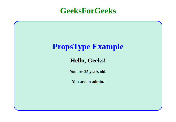
Output
Share your thoughts in the comments
Please Login to comment...