Pie Chart is a pictorial representation of the data. It uses a circle to represent the data and is hence also called a Circle Graph. In a Pie Chart, we present the data by dividing the whole circle into smaller slices or sectors, and each slice or sector represents specific data.
In this article, we will learn about Pie Charts, Steps to Create Pie Charts, Examples, and Others in detail. The image added below shows a pie chart.

What is Pie Chart?
A pie chart is a pictorial or graphical representation of data in chart format. A pie chart uses a circle or sphere to represent the data, where the circle represents the entire data, and the slices represent the data in parts.
Pie chart is one of the easiest ways to present and understand the given data, and pie charts are used very commonly. For example, pie charts are used in excel very often.
Pie Chart Definition
There are different ways of data representation. A pie chart is one of the types of charts in which the data is represented in a circular shape. The pie chart circle is further divided into multiple sectors/slices; those sectors show the different parts of the data from the whole.
Pie charts, also known as circle graphs or pie diagrams, are very useful in representing and interpreting data. The data can be compared easily with the help of a pie chart. Below is an example of a pie chart explained in detail.
Types of Pie Chart
There are various variation or types of pie chart, some of the common types include:
- 3D Pie Chart: A 3D pie chart adds depth to the traditional two-dimensional pie chart by rendering it in three dimensions.
- Doughnut Chart: A doughnut chart is similar to a pie chart but with a hole in the center.
- Exploded Pie Chart: In an exploded pie chart, one or more slices are separated from the rest of the pie to emphasize their importance or to make them stand out.
- Nested Pie Chart: Also known as a multi-level pie chart or hierarchical pie chart, this type of chart consists of multiple rings of pie charts, with each ring representing a different level of data hierarchy.
- Ring Chart: A ring chart is similar to a doughnut chart but consists of multiple rings instead of just one. Each ring represents a different category of data, with the size of each segment within the ring corresponding to its proportion of the whole.
Check: Pie Chart in MATLAB
Pie Chart Examples
Let’s take a look at an example for a better understanding of pie charts. In a class of 200 students, a survey was done to collect each student’s favorite sports. The pie chart of the data is given below:
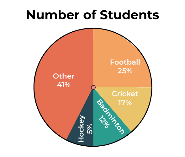
Since the pie chart is provided and the total number of students is given, we can easily take the original data out for each sport.
- Cricket = 17/100 × 200 = 34 students
- Football = 25/100 × 200 = 50 students
- Badminton = 12/100 × 200 = 24 students
- Hockey = 5/100 × 200 = 10 students
- Other = 41/100 × 200 = 82 students
The original data for the pie chart shown above is given below:
|
Sport
|
Number of Students
|
|
Cricket
|
34
|
|
Football
|
50
|
|
Badminton
|
24
|
|
Hockey
|
10
|
|
Other
|
82
|
The total value or percentage of the pie is 100% always. Here it contains different sectors and segments in which each sector or segment of the chart corresponds to a certain portion of the net or total percentage (or data). The total or sum of all the data can be summed up to 360 degrees.
- Converting the data into degrees on a pie chart. The formula for a pie chart can be summed up as:
(Given Data / Total Value of Data) × 360°
- Calculating the percentage of each sector from degrees in a pie chart.
To work out with degrees in a pie chart, we need to follow the following steps:
- First, we need to measure every slice of the chart.
- Then we need to divide it by 360°.
- Finally, multiply the obtained result by 100.
The pie chart formula is given below:
(Frequency)/(Total Frequency) × 100
Calculating Number of Sectors on a Pie Chart
To calculate the total number of slices or sectors on a pie chart, we need to multiply the sector’s percentage by the total value of the data and finally divide the result by 100.
How to Make Pie Chart
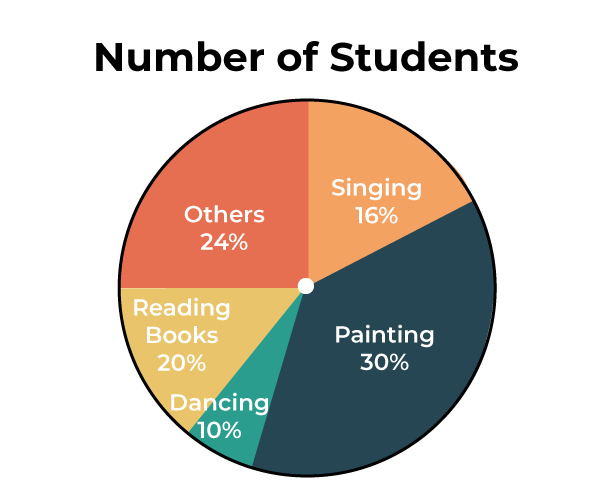
We will learn how to create a pie chart step by step with the help of an example. A teacher surveyed a group of students to see what their favorite hobby of each student is. Let’s take a look at the pie chart example with an explanation. The data collected is listed as follows:
|
Hobbies
|
Number of students
|
|
Singing
|
16
|
|
Reading books
|
20
|
|
Dancing
|
10
|
|
Painting
|
30
|
|
Others
|
24
|
Now we will see how to construct a pie chart step by step.
Step 1: The first step requires us to write down the available data in tabular form as follows:
|
Singing
|
Reading Books
|
Dancing
|
Painting
|
Others
|
|
16
|
20
|
10
|
30
|
24
|
Step 2: Now find the sum of all the given data. Here, the Sum of All Data = (16 + 20 + 10 + 30 + 24) = 100
Step 3: Now, calculate the percentage of each sector. We need to divide each sector value by the sum or total and then multiply it by 100.
|
Singing
|
Reading Books
|
Dancing
|
Painting
|
Others
|
|
(16/100) × 100
= 16%
|
(20/100) × 100
= 20%
|
(10/100) × 100
= 10%
|
(30/100) × 100
= 30%
|
(24/100) × 100
= 24%
|
Step 4: Next step is to calculate the degrees corresponding to each slice. The values can be calculated as:
Central Angle of Each Component = (Given Data / Total Value of Data) × 360
Hence, The values are as follows:
|
Singing
|
Reading Books
|
Dancing
|
Painting
|
Others
|
|
(16/100) × 360
= 57.6
|
(20/100) × 360
= 72
|
(10/100) × 360
= 36
|
(30/100) × 360
= 108
|
(24/100) × 360
= 86.4
|
Step 5: Now, with the help of a protractor, we will measure each angle from a single point or central point and draw the circle’s sectors. The resultant pie chart will be:
How to Read Pie Chart
In order to read a pie chart, the first thing to notice is the data presented in the pie chart. If the data is given in percentage, it should be converted accordingly in order to analyze and interpret the data. Let’s take a look at an example in order to learn how to interpret pie charts.
Example: In a survey done among 300 people, it was observed which type of genre each person prefers. The pie chart of the same is mentioned below. Analyze and interpret the pie chart accordingly to find the original data.
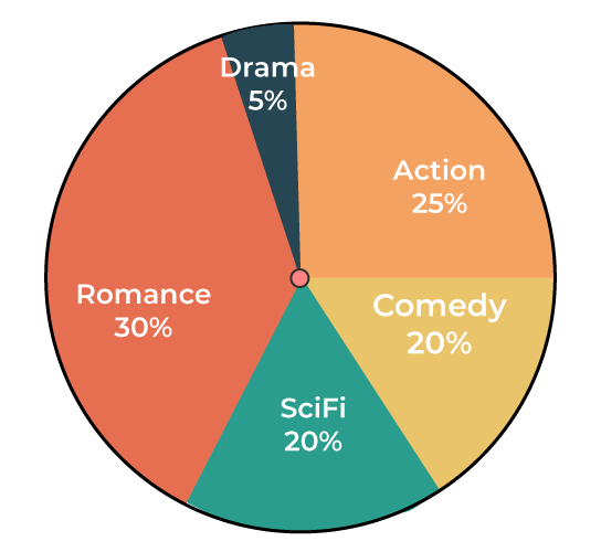
Solution:
While observing the pie chart, it came to notice that the data is present in percentage. Let’s convert the data to obtain the original value.
- Number of people who like comedy = 20/100 × 300 = 60 people.
- Number of people who like action = 25/100 × 300 = 75 people.
- Number of people who like romance = 30/100 × 300 = 90 people.
- Number of people who like drama = 5/100 × 300 = 15 people.
- Number of people who like sci-fi = 20/100 × 300 = 60 people.
Pie Chart Vs Bar Graph
The key difference between pie chart and bar graph are listed in the following table:
| Aspect |
Pie Chart |
Bar Graph |
| Representation |
Circular display of data |
rectangular display of data |
| Purpose |
Shows parts of a whole |
Compares discrete categories |
| Data presentation |
Depicts percentages or proportions |
Shows exact values or quantities. |
| Number of variables |
Typically one variable |
Can represent multiple variables. |
| Visualization |
Easily shows relative proportions |
Effective for comparing quantities. |
| Comparison |
Might be difficult to compare precise values |
Allows for easy comparison between categories. |
| Data complexity |
Works well with simple datasets |
Suitable for complex datasets |
| Interpretation |
Provides a holistic view |
Allows for detailed analysis. |
| Space efficiency |
Not efficient with large datasets |
Efficient for displaying large datasets |
Pie Chart Advantages
Pie Chart is very useful for finding and representing data. Various advantages of the pie chart are,
- Pie chart is easily understood and comprehended.
- Visual representation of data in a pie chart is done as a fractional part of a whole.
- Pie chart provides an effective mode of communication to all types of audiences.
- Pie chart provides a better comparison of data for the audience.
Pie Chart Disadvantages
There are some disadvantages also of using pie charts and some of them are added below,
- In the case of too much data, this presentation becomes less effective using a pie chart.
- For multiple data sets, we need a series to compare them.
- For analyzing and Assimilating the data in a pie chart, it is difficult for readers to comprehend.
Uses of Pie Chart
Whenever a fraction or fractions are represented as a part of the whole, pie charts are used. Pie charts are used to compare the data and to analyze which data is bigger or smaller. Hence, while dealing with discrete data, pie charts are preferred. Let’s take a look at the uses of the pie chart:
- Pie charts are used to compare the profit and loss in businesses.
- In schools, the grades can be easily compared using a pie chart.
- The relative sizes of data can be compared using a pie chart.
- The marketing and sales data can be compared using a pie chart.
Read More,
Pie Chart Examples
Example 1: The given pie chart shows the subject of interest of each student in a class.
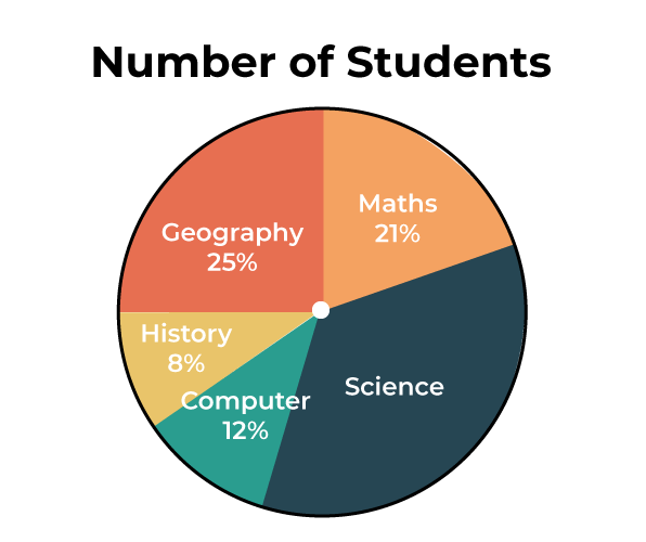
Answer the following question concerning the given pie diagram.
- If 30 students’ subjects of interest are history, how many total students were surveyed?
- Which subject is liked the most?
- Which subject is disliked the most?
Solution:
1. According to the given question, 8% of the total number of students is 30. i.e. (8/100) x Total = 30
Therefore, Total = 30 x (100/8) = 375
Hence 375 students were surveyed.
2. According to the given pie chart, science is liked the most.
3. According to the given pie chart, history is disliked the most.
Example 2: For a science camp, students from different states have enrolled. Construct a pie chart for the given table:
|
States
|
Number of students
|
|
West Bengal
|
10
|
|
Assam
|
5
|
|
Tamil Nadu
|
5
|
|
Gujarat
|
10
|
|
Karnataka
|
10
|
Solution:
Step 1: The first step requires us to jot down the available data into tabular form as follows:
|
West Bengal
|
Assam
|
Tamil Nadu
|
Gujarat
|
Karnataka
|
|
10
|
5
|
5
|
10
|
10
|
Step 2: The next task is to calculate the sum of all the given data.
Here, the Sum of All Data = (10 + 5 + 5 + 10 + 10) = 40
Step 3: Now, the next task is to calculate the percentage of each sector. We need to divide each sector value by the sum or total and then multiply it by 100.
|
West Bengal
|
Assam
|
Tamil Nadu
|
Gujarat
|
Karnataka
|
|
(10/40) × 100
= 25%
|
(5/40) × 100
= 12.5%
|
(5/40) × 100
= 12.5%
|
(10/40) × 100
= 25%
|
(10/40) × 100
= 25%
|
Step 4: Next step is to calculate the degrees corresponding to each slice. The values can be calculated as:
|
West Bengal
|
Assam
|
Tamil Nadu
|
Gujarat
|
Karnataka
|
|
(10/40) × 360
= 90
|
(5/40) × 360
= 45
|
(5/40) × 360
= 45
|
(10/40) × 360
= 90
|
(10/40) × 360
= 90
|
Step 5: Now, with a protractor’s help, we will measure each angle from a single point or central point and draw the circle’s sectors. The resultant pie chart will be:

Example 3: A pie chart is divided into four parts, and the values are given as x, 3x, 4x, and 4x. Find the value of x in degrees.
Solution:
As it is known that a pie chart has 360°. Therefore, if all the angles are added, it will give 360°.
x + 3x + 4x + 4x = 360°
12x = 360°
x = 30°
What is Population Pie chart?
The population pie chart is the pie chart that represent the population of any area and the population pie chart of the world is shown in the image added below,

Practice Questions on Pie Charts
Q1. Students selected for ISRO visit from various states are given in the table below. Represent them in a pie chart.
|
States
|
Number of students
|
|
West Bengal
|
7
|
|
Assam
|
6
|
|
Tamil Nadu
|
3
|
|
Gujarat
|
10
|
|
Karnataka
|
4
|
Q2. Marks scored by Kabir in an exam in various subject is shown in the table below show a pie chart representing the same.
|
Subjects
|
Marks
|
|
Mathematics
|
99
|
|
Physics
|
98
|
|
Chemistry
|
98
|
|
English
|
95
|
|
Computers
|
97
|
Conclusion of Pie Chart
Pie charts are useful graphical tools for showing data distribution in an understandable way. These are circular diagrams that have been segmented into sectors, each of which represents a percentage or fraction of the entire dataset. Pie charts help viewers rapidly understand distribution patterns by effectively communicating the relative sizes of various categories or components within a dataset. They are frequently used in publications, reports, and presentations in a variety of sectors, including business, finance, statistics, and education
Pie Chart – FAQs
Define Pie Chart.
Pie chart is the visual representation in which a circle graph is used to represent the values according to numbers, percentages, and degrees.
What is the Formula for Pie Chart?
To calculate the percentage of the given data, the formula used:
- (Frequency ÷ Total Frequency) × 100
Converting data into degrees:
- (Given Data ÷ Total Data) × 100
What are Examples of Pie Chart?
There are many examples of pie chart as pie chart is often used for visual representation. Following are some of the real-life examples:
- Representation of marks obtained by students.
- The marketing and sales data is obtained by using a pie chart.
- The profit and loss endured by a business can be represented by a pie chart.
What are the Uses of Pie Graph?
Pie charts are used for various purposes and various uses of pie chart are,
- It is used to represent various types of data.
- It is used to show data of various demographics.
- It is used to represent various objects of sales, marketing, and others, etc.
Share your thoughts in the comments
Please Login to comment...