React MUI Theming
Last Updated :
08 Jun, 2023
Material-UI is a user interface library that provides predefined and customizable React components for faster and easy web development. These Material-UI components are based on top of Material Design by Google. In this article let’s discuss the Theming in the Material-UI library.
The Theming in React MUI specifies the color of the components, the darkness of the surfaces, the level of shadow, the appropriate opacity of ink elements, etc. Themes let us apply a consistent tone to the React App, and customize all design aspects of the project.
Syntax:
const theme = createTheme({
      status: {
        danger: orange[500],
      },
});
Create React Application and required modules:
Step 1: Create a folder called theming-example.Run the code in the terminal.
npx create-react-app
Step 2: Create a folder called component inside the src folder. Inside that component, create a file called Main.js
cd src
mkdir component
touch Main.js
Step 3: Again, in the same folder, open the command prompt and type in the following command
npm install @mui/material @emotion/react @emotion/styled
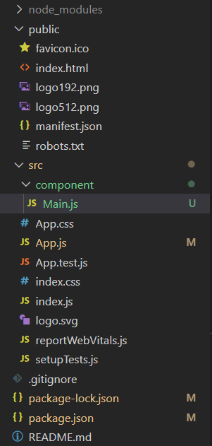
Project Structure: Once the installation is complete, you will have all the modules required. Your folder structure should look something like this.
React MUI Theming
Importing the Theme Components:
import { createTheme, ThemeProvider, useTheme } from '@mui/material/styles';
Example 1: In this example, we will see how to create a custom theme using the ‘createTheme()’ function from the ‘@mui/material/styles’ package and apply it to a Typography.
Javascript
import React from 'react';
import Main from './component/Main';
import { createTheme, ThemeProvider }
from '@mui/material/styles';
const theme = createTheme({
palette: {
primary: {
main: '#228B22',
},
secondary: {
main: '#f50057',
},
},
typography: {
fontFamily: 'Arial',
fontSize: 16,
fontWeight: 'bold',
},
});
function App() {
return (
<ThemeProvider theme={theme}>
<Main />
</ThemeProvider>
);
}
export default App;
|
Javascript
import React from "react";
import Typography from '@mui/material/Typography';
function Main() {
return (
<Typography variant="h3" color="primary">
Welcome to GeeksforGeeks!
</Typography>
);
};
export default Main;
|
Output:

React MUI Theming
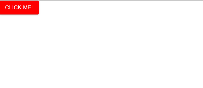
Example 2: In this example, we will see how to create a custom theme using the ‘createTheme()’ function from the ‘@mui/material/styles’ package and apply it to a Button.
Javascript
import React from 'react';
import { createTheme, ThemeProvider } from '@mui/material';
import { ThemeProvider as EmotionThemeProvider }
from '@emotion/react';
import Main from './component/Main';
const theme = createTheme({
palette: {
primary: {
main: '#ff0000',
},
},
});
function App() {
return (
<ThemeProvider theme={theme}>
<EmotionThemeProvider theme={theme}>
<Main />
</EmotionThemeProvider>
</ThemeProvider>
);
};
export default App;
|
Javascript
import React from "react";
import { Button } from "@mui/material";
function Main() {
return (
<Button variant="contained" color="primary">
Click me!
</Button>
);
};
export default Main;
|
Output:
React MUI Theming
Reference: https://www.geeksforgeeks.org/react-material-ui/
Share your thoughts in the comments
Please Login to comment...