React MUI CardActionArea API
Last Updated :
10 Jan, 2023
React MUI is a UI library that provides fully-loaded components, bringing our own design system to our production-ready components. MUI is a user interface library that provides predefined and customizable React components for faster and easy web development, these Material-UI components are based on top of Material Design by Google.
In this article, we’ll be discussing React MUI CardActionArea API. A card component contains content and actions about a single subject and is most commonly used in web applications.
Import CardActionArea API:
import CardActionArea from '@mui/material/CardActionArea';
import { CardActionArea } from '@mui/material';
Props list:
- children: It is used to denote the content of the card.
- classes: It is to override or extend the styles applied to the component.
- sx: It is used to add custom CSS styles to the card.
CSS Rules:
- root (MuiCardActionArea-root): It is the style applied to the root element.
- focusVisible (Mui-focusVisible): It applies styles to the ButtonBase root element if the action area is keyboard focused.
- focusHighlight (MuiCardActionArea-focusHighlight): It applies the styles to the overlay that covers the action area when it is keyboard focused.
Creating React Project:
Step 1: To create a react app, install react modules through npm command.
npm create-react-app project name
Step 2: After creating your react project, move into the folder to perform different operations.
cd project name
Step 3: After creating the ReactJS application, Install the required module using the following command:
npm install @mui/material @emotion/react @emotion/styled
Project Structure:
Step to Run Application: Open the terminal and type the following command.
npm start
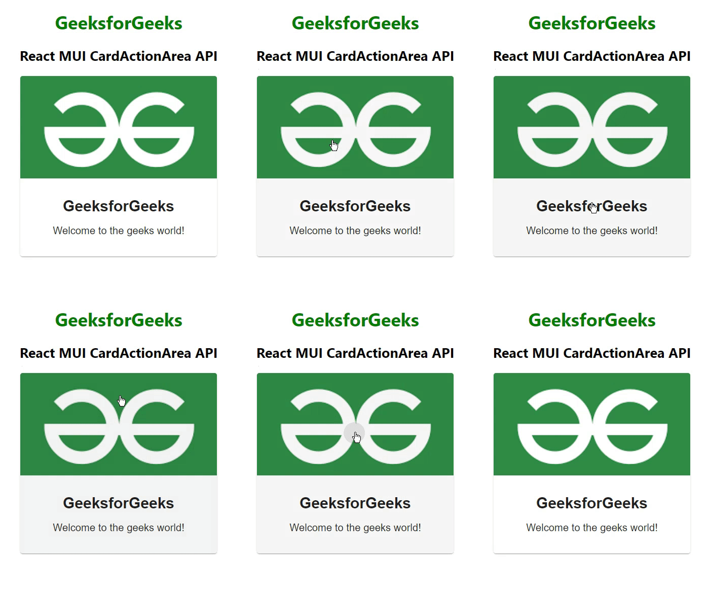
Example 1: Below example demonstrates the React MUI CardActionArea API.
The below example covers the entire card as the main card action area.
Javascript
import {
Card,
CardActionArea,
CardContent,
CardMedia,
} from "@mui/material";
import * as React from "react";
function App() {
return (
<center>
<div>
<h1 style={{ color: "green" }}>GeeksforGeeks</h1>
<h2>React MUI CardActionArea API</h2>
</div>
<div style={{ width: "50%" }}>
<Card sx={{ maxWidth: 345 }}>
<CardActionArea>
<CardMedia
component="img"
height="180"
image=
alt="gfg"
/>
<CardContent>
<h1>GeeksforGeeks</h1>
<p style={{ fontSize: 18 }}>Welcome to the geeks world!</p>
</CardContent>
</CardActionArea>
</Card>
</div>
</center>
);
}
export default App;
|
Output:

React MUI CardActionArea API
Example 2: Below example demonstrates the React MUI CardActionArea API.
The below example shows how the main action area stands apart from the supplement actions to avoid event overlap.
Javascript
import {
Button,
Card,
CardActionArea,
CardActions,
CardContent,
CardMedia,
} from "@mui/material";
import * as React from "react";
function App() {
return (
<center>
<div>
<h1 style={{ color: "green" }}>GeeksforGeeks</h1>
<h2>React MUI CardActionArea API</h2>
</div>
<div style={{ width: "50%" }}>
<Card sx={{ maxWidth: 345 }}>
<CardActionArea>
<CardMedia
component="img"
height="180"
image=
alt="gfg"
/>
<CardContent>
<h1>GeeksforGeeks</h1>
<p style={{ fontSize: 18 }}>
Welcome to the geeks world!
</p>
</CardContent>
</CardActionArea>
<CardActions>
<Button>Visit</Button>
</CardActions>
</Card>
</div>
</center>
);
}
export default App;
|
Output:

React MUI CardActionArea API
Reference: https://mui.com/material-ui/api/card-action-area/
Share your thoughts in the comments
Please Login to comment...