Theming and Dark Mode with React Hooks
Last Updated :
26 Mar, 2024
React Hooks are a feature introduced in React 16.8 that enable functional components to use state and other React features without writing classes. They provide a way to manage component state, perform side effects, access context, and more within functional components, offering a simpler and more intuitive approach to building React applications.
In this article, we will implement theming and dark mode functionality in a React application using React Hooks. We’ll manage the theme state with useState and persist it using useEffect and local storage.
Approach to implement Theming & Dark Mode:
- Setup: Start a new React project with Create React App.
- Theming: Use React Context and useState for global theme management.
- Styling: Utilize styled-components for CSS-in-JS styling.
- Functionality: Test the toggling between light and dark modes.
Steps to Setup project:
Step 1: Create a new React project
npx create-react-app theming-dark-mode
cd theming-dark-mode
Step 2: Install necessary dependencies
npm install styled-components
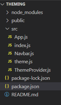
Folder Structure:
Step 3: Create a following component
- Create files called ThemeProvider.js ,Navbar.js and theme.js in the src directory:
- Replace content of App.js with following code
The updated dependencies in package.json file of backend will look like:
 "dependencies": {
    "@testing-library/jest-dom": "^5.17.0",
    "@testing-library/react": "^13.4.0",
    "@testing-library/user-event": "^13.5.0",
    "react": "^18.2.0",
    "react-dom": "^18.2.0",
    "react-scripts": "5.0.1",
    "styled-components": "^6.1.8",
    "web-vitals": "^2.1.4"
  },
Example: Write the following in the respective files
JavaScript
// ThemeProvider.js
import React, { useState, createContext, useContext } from 'react';

const ThemeContext = createContext();

export const useTheme = () => useContext(ThemeContext);

export const ThemeProvider = ({ children }) => {
  const [darkMode, setDarkMode] = useState(false);

  const toggleDarkMode = () => {
    setDarkMode(prevMode => !prevMode);
  };

  return (
    <ThemeContext.Provider value={{ darkMode, toggleDarkMode }}>
      {children}
    </ThemeContext.Provider>
  );
};
// theme.js
export const lightTheme = {
    body: '#fff',
    text: '#333',
    navbarBg: '#333', // Add navbar background color property
  };

  export const darkTheme = {
    body: '#333',
    text: '#fff',
    navbarBg: '#555', // Add navbar background color property
  };
// App.js
import React from 'react';
import { useTheme, ThemeProvider } from './ThemeProvider';
import { lightTheme, darkTheme } from './theme';
import styled, { ThemeProvider as StyledThemeProvider } from 'styled-components';
import Navbar from './Navbar'; // Import the Navbar component
const Wrapper = styled.div`
background-color: ${props => props.theme.body};
color: ${props => props.theme.text};
height: 100vh;
display: flex;
flex-direction: column;
align-items: center;
justify-content: center;
`;
const Button = styled.button`
padding: 10px 20px;
font-size: 1rem;
background-color: transparent;
color: ${props => props.theme.text};
border: 2px solid ${props => props.theme.text};
cursor: pointer;
outline: none;
`;
const App = () => {
const { darkMode, toggleDarkMode } = useTheme();
const currentTheme = darkMode ? darkTheme : lightTheme;
return (
<StyledThemeProvider theme={currentTheme}>
<Wrapper>
<Navbar /> {/* Include the Navbar component */}
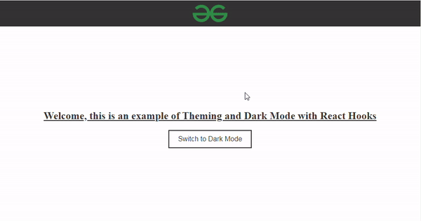
<h2><u>Welcome, this is an example of Theming and Dark Mode with React Hooks</u></h2>
<Button onClick={toggleDarkMode}>
{darkMode ? 'Switch to Light Mode' : 'Switch to Dark Mode'}
</Button>
</Wrapper>
</StyledThemeProvider>
);
};
const AppWrapper = () => (
<ThemeProvider>
<App />
</ThemeProvider>
);
export default AppWrapper;
// Navbar.js
import React from 'react';
import { useTheme } from './ThemeProvider';
import styled from 'styled-components';

const StyledNavbar = styled.nav`
  background-color: ${props => props.theme.navbarBg};
  padding: 10px 0;
  width: 100%;
  position: fixed;
  top: 0;
  left: 0;
  z-index: 1000; /* Ensure the navbar stays on top of other content */
`;

const LogoContainer = styled.div`
  display: flex;
  justify-content: center;
  align-items: center;
`;

const Logo = styled.img`
  width: 80px;
  height: auto;
`;

const Navbar = () => {
  const { darkMode } = useTheme();
  return (
    <StyledNavbar>
      <LogoContainer>
        <Logo src="https://media.geeksforgeeks.org/gfg-gg-logo.svg" alt="Logo" />
      </LogoContainer>
    </StyledNavbar>
  );
};

export default Navbar;
Start the Application with following command
npm start
Output:
Share your thoughts in the comments
Please Login to comment...