React MUI TabScrollButton API
Last Updated :
17 Feb, 2023
React MUI is a UI library that provides fully-loaded components, bringing our own design system to our production-ready components. MUI is a user interface library that provides predefined and customizable React components for faster and easy web development, these Material-UI components are based on top of Material Design by Google.
The TabScrollButton is a component in Material-UI that provides a button used to scroll the tabs in a Tabs component. The TabScrollButton component is part of the Tabs component and is used to scroll the tabs horizontally when there are too many tabs to fit on the screen.
Props List:
- direction: This is a prop that specifies the direction the button should indicate. The direction can be “left” or “right”.
- orientation: This prop specifies the orientation of the component. The orientation can be “vertical” or “horizontal”.
- children: This prop describes the content of the component. The type of this prop is a node.
- classes: This prop overrides or extends the styles applied to the component. The type of this prop is an object.
- disabled: This is a boolean prop. If this is set to true, the component is disabled. The default value of this prop is false.
- sx: This is a system prop that allows you to define system overrides as well as additional CSS styles. This prop can be an array of functions, objects, or boolean variables. And it can also be only function and only object.
CSS List:
- root: The root style class for the component. This class can be used to apply styles to the root container.
- vertical: This class can be used to apply styles to the component when the orientation prop is set to “vertical”.
- disabled: This class can be used to apply styles to the component when the disabled prop is set to true.
Syntax:
<Tabs variant="scrollable" scrollButtons="auto">
    <Tab label="Tab 1"/>
</Tabs>
This is the syntax of a tab that has scrollButtons.
Installing React App:
Step 1: Create React app using the following command.
npx create-react-app scrollbutton-example
Step 2: Now get into the project directory.
cd scrollbutton-example
Installing Material-UI: Installing Material-UI’s source files via npm/yarn, and they take care of injecting the CSS needed.
npm install @material-ui/core
OR
yarn add @material-ui/core
Project Structure:
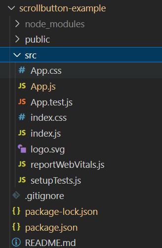
Project Structure
Importing TabScrollButton:
import TabScrollButton from '@mui/material/TabScrollButton';
OR
import { TabScrollButton } from '@mui/material';
Step to run React Application:
npm start
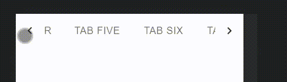
Example 1: By default, left and right scroll buttons are automatically presented on the desktop and hidden on mobile. (based on viewport width).
App.js
Javascript
import { TabScrollButton, Tab, Tabs } from "@mui/material";
function App() {
return (
<>
<Tabs
variant="scrollable"
scrollButtons="auto"
aria-label="scrollable auto tabs example"
>
<Tab label="Tab One" />
<Tab label="Tab Two" />
<Tab label="Tab Three" />
<Tab label="Tab Four" />
<Tab label="Tab Five" />
<Tab label="Tab Six" />
<Tab label="Tab Seven" />
<Tab label="Tab Eight" />
</Tabs>
</>
);
}
export default App;
|
Output:

Right and Left scrollable tabs
Example 2: We will now see about forces scroll buttons. Left and right scroll buttons are not present on mobile. But we can use left and right scroll buttons regardless of the viewport width by using scrollButtons={true} and allowScrollButtonsMobile
App.js
Javascript
import { TabScrollButton, Tab, Tabs } from "@mui/material";
function App() {
return (
<>
<Tabs
variant="scrollable"
scrollButtons
allowScrollButtonsMobile
aria-label="scrollable force tabs example"
>
<Tab label="Tab One" />
<Tab label="Tab Two" />
<Tab label="Tab Three" />
<Tab label="Tab Four" />
<Tab label="Tab Five" />
<Tab label="Tab Six" />
<Tab label="Tab Seven" />
<Tab label="Tab Eight" />
</Tabs>
</>
);
}
export default App;
|
Output:
Mobile View
Example 3: We will see about preventing scroll buttons. If we use scrollButtons={false} then the left and right scroll buttons will not be visible in any viewport.
App.js
Javascript
import { TabScrollButton, Tab, Tabs } from "@mui/material";
function App() {
return (
<>
<Tabs
variant="scrollable"
scrollButtons={false}
aria-label="scrollable prevent tabs example"
>
<Tab label="Tab One" />
<Tab label="Tab Two" />
<Tab label="Tab Three" />
<Tab label="Tab Four" />
<Tab label="Tab Five" />
<Tab label="Tab Six" />
<Tab label="Tab Seven" />
<Tab label="Tab Eight" />
</Tabs>
</>
);
}
export default App;
|
Output:
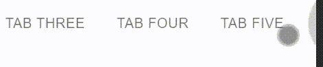
Prevent Scrollable tabs
Reference: https://mui.com/material-ui/api/tab-scroll-button/
Share your thoughts in the comments
Please Login to comment...