React MUI Hidden Layout
Last Updated :
12 Apr, 2023
Material-UI is a user interface library that provides predefined and customizable React components for faster and easy web development, these Material-UI components are based on top of Material Design by Google. In this article let’s discuss the Hidden component in the Material-UI library.
The Hidden Component in React MUI (Material-UI) allows you to conditionally hide or show content based on screen size breakpoints. This can be useful for creating responsive layouts where you want certain content to be visible only on certain devices on screen sizes.
Syntax:
<Hidden smDown>
    <p>This text will be hidden on small screens.</p>
</Hidden>
Installing React App:
Step 1: Create a React app using the following command.
npx create-react-app hidden-example
Step 2: Now get into the project directory
cd hidden-example
Installing Material-UI: Installing Material-UI’s source files via npm/yarn, and they take care of injecting the CSS needed.
npm install @material-ui/core
OR
yarn add @material-ui/core
Project Structure: It will look like the following.
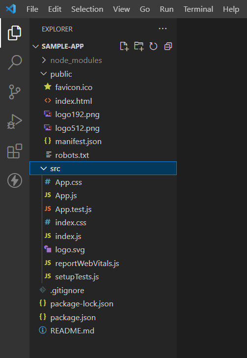
Project Structure
Importing the Hidden Component:
import Hidden from '@material-ui/core/Hidden';
Breakpoints: The Breakpoints (props) provide a simple way to conditionally hide content based on breakpoints.
- xsDown: Hide content on screens that are extra small (mobile) and down.
- xsUp: Hide content on screens that are extra small (mobile) and up.
- smDown: Hide content on screens that are small (tablet) and down.
- smUp: Hide content on screens that are small (tablet) and up.
- mdDown: Hide content on screens that are medium (small desktop) and down.
- mdUp: Hide content on screens that are medium (small desktop) and up.
- lgDown: Hide content on screens that are large (large desktop) and down.
- lgUp: Hide content on screens that are large (large desktop) and up.
- xlDown: Hide content on screens that are extra large (extra large desktop) and down.
- xlUp: Hide content on screens that are extra large (extra large desktop) and up.
- only: Hide content on all screens except the specified size or sizes.
- implementation: It specifies the CSS implementation used for the component. It is an optional prop that can be used to customize the behavior of the ‘Hidden’ component based on the specific use case.
Example 1: Write down the following code in the App.js file. Here, the App is our default component where we have written our code.
Javascript
import React from 'react';
import { Hidden } from '@mui/material';
function App() {
return (
<div>
<p>This content is always visible</p>
<Hidden smUp implementation="css">
<p>
This content is hidden on
small screens and up using
the CSS visibility property
</p>
</Hidden>
</div>
)
}
export default App
|
Step to Run Application: Run the application using the following command from the root directory of the project:
npm start
Output: Now open your browser and go to http://localhost:3000/, you will see the following output:
smDown: This value can be used in React to hide the content below a certain screen size. By default, this breakpoint is set to 600 pixels.
Example 2:
Javascript
import React from 'react';
import { Hidden, Paper } from '@mui/material';
import "./App.css";
function App() {
return (
<div className="App">
<Hidden smDown>
<Paper style={{ backgroundColor: "red",
width: 200, height: 200 }} />
</Hidden>
<Hidden mdUp>
<Paper style={{ backgroundColor: "blue",
width: 200, height: 200 }} />
</Hidden>
<Hidden only="md">
<Paper style={{ backgroundColor: "green",
width: 200, height: 200 }} />
</Hidden>
</div>
);
}
export default App;
|
Output:
Reference: https://mui.com/material-ui/react-hidden/
Share your thoughts in the comments
Please Login to comment...