Before we pass our data into the machine learning model, data is pre-processed so that it is compatible to pass inside the model. To pre-process this data, some operations are performed on the data which is collectively called Exploratory Data Analysis(EDA). In this article, we’ll be looking at how to perform Exploratory data analysis using jupyter notebooks.
What is Exploratory Data Analysis?
EDA stands for Exploratory Data Analysis. It is a crucial step in data analysis which involves examining and visualising data to summarize its main characteristics, identify patterns, and gain insights into the underlying structure of the dataset which cannot be understood from the formal modeling of the data. It is performed at the beginning of a data analysis project to get an insight into the data.
Jupyter Notebook?
Jupyter Notebook is an interactive environment for running and saving Python code in a step-by-step manner. It supports multiple languages such as Julia, Python, and R. It is used extensively in data science as it provides a flexible environment to work with code and data.
To install Jupyter Notebook on Windows, run the below command-
python -m pip install jupyter
For Linux
pip3 install --user jupyter
Now to run the server just run the below command, and it will open the server in your browser. We can create new notebooks from there and save them to the desired folder.
jupyter notebook
Getting started with Exploratory Data Analysis(EDA)
We’ll be using few python libraries for this which includes pandas, numpy, matplotlib and seaborn. First step is to import all the libraries. Pandas is an open-source library for data manipulation and processing, Numpy is the standard python library for numerical and mathematical operations, and matplotlib as well as seaborn are both data visualisation libraries.
Step-1: Import the Required libraries
Python3
import pandas as pd
import numpy as np
import seaborn as sns
import matplotlib.pyplot as plt
%matplotlib inline
import warnings
warnings.filterwarnings('ignore')
|
Step-2: Load the dataset
The dataset consists of multiple medical predictor variables and one target variable, Outcome. Predictor variables includes the patient’s number of pregnancies, BMI, insulin level, age, and more. DATASET LINK
Data contains
- Pregnancies: Number of times pregnant
- Glucose: Plasma glucose concentration a 2 hours in an oral glucose tolerance test
- BloodPressure: Diastolic blood pressure (mm Hg)
- SkinThickness: Triceps skin fold thickness (mm)
- Insulin: 2-Hour serum insulin (mu U/ml)
- BMI: Body mass index (weight in kg/(height in m)^2)
- DiabetesPedigreeFunction: Diabetes pedigree function
- Age: Age (years)
- Outcome: 1 if diabetes, 0 if no diabetes
Python3
diab_df= pd.read_csv('diabetes.csv')
|
Step-3: Data Analysis On Diabetes Dataset
This step involves getting familiar with the shape, dtypes, etc of the dataset. The main four things involved in this are –
- Head and Tail
- Shape
- Dtypes
- Describe
The code prints the dimensions (number of rows and columns) of a DataFrame, providing information about its size.
Output:
Pregnancies  Glucose  BloodPressure  SkinThickness  Insulin   BMI  \
0            6      148             72             35        0  33.6
1            1       85             66             29        0  26.6
2            8      183             64              0        0  23.3
3            1       89             66             23       94  28.1
4            0      137             40             35      168  43.1

   DiabetesPedigreeFunction  Age  Outcome
0                     0.627   50        1
1                     0.351   31        0
2                     0.672   32        1
3                     0.167   21        0
4                     2.288   33        1
Checking first 5 and last 5 records from the datasets
Output:
Pregnancies  Glucose  BloodPressure  SkinThickness  Insulin   BMI  \
763           10      101             76             48      180  32.9
764            2      122             70             27        0  36.8
765            5      121             72             23      112  26.2
766            1      126             60              0        0  30.1
767            1       93             70             31        0  30.4

     DiabetesPedigreeFunction  Age  Outcome
763                     0.171   63        0
764                     0.340   27        0
765                     0.245   30        0
766                     0.349   47        1
767                     0.315   23        0
Let’s check the duplicate data in dataset
Python3
diab_df.duplicated().sum()
|
Output:
0
The code checks the shape of the DataFrame in dataset
Output:
(768, 9)
The code provides information about the data types of the columns, the number of non-null values in each column, and the memory usage of the DataFrame.
Output:
RangeIndex: 768 entries, 0 to 767
Data columns (total 9 columns):
 #   Column                    Non-Null Count  Dtype
---  ------                    --------------  -----
 0   Pregnancies               768 non-null    int64
 1   Glucose                   768 non-null    int64
 2   BloodPressure             768 non-null    int64
 3   SkinThickness             768 non-null    int64
 4   Insulin                   768 non-null    int64
 5   BMI                       768 non-null    float64
 6   DiabetesPedigreeFunction  768 non-null    float64
 7   Age                       768 non-null    int64
 8   Outcome                   768 non-null    int64
dtypes: float64(2), int64(7)
Step-3: Data Preparation
This involves performing operations on the dataset to make it look more clean, removing outliers, etc.
- Dropping irrelevant rows and columns
- Renaming columns(if needed)
- Dropping Null values
- Identifying duplicated columns
Output:
Pregnancies                 0
Glucose                     0
BloodPressure               0
SkinThickness               0
Insulin                     0
BMI                         0
DiabetesPedigreeFunction    0
Age                         0
Outcome                     0
dtype: int64
So, there 768 records in 9 columns. Also, there are no null records as well as duplicate values.
The code ensures that any zeros in the specified columns are treated as missing values rather than actual values. This can be important for data analysis and machine learning tasks where missing values need to be handled appropriately.
Python3
diab_df[['Glucose', 'BloodPressure', 'SkinThickness', 'Insulin', 'BMI']] = diab_df[[
'Glucose', 'BloodPressure', 'SkinThickness', 'Insulin', 'BMI']].replace(0, np.NaN)
|
The code diab_df.isnull().sum() provides a quick way to identify and quantify missing values in each column of a DataFrame.
Output:
Pregnancies                   0
Glucose                       5
BloodPressure                35
SkinThickness               227
Insulin                     374
BMI                          11
DiabetesPedigreeFunction      0
Age                           0
Outcome                       0
dtype: int64
We can see here that, there were lot of 0s present in the above mentioned columns.
To fill these 0s with Nan values the let’s see the data distribution.
Python3
diab_df.hist(figsize = (11,11), color="#800080")
|
Output:
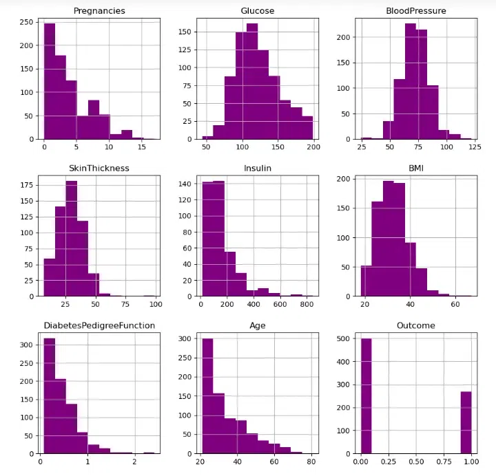
Let’s aim to replace NaN values for the columns in accordance with their distribution.
Python3
diab_df['Glucose'].fillna(diab_df['Glucose'].mean(), inplace = True)
diab_df['BloodPressure'].fillna(diab_df['BloodPressure'].mean(), inplace = True)
diab_df['SkinThickness'].fillna(diab_df['SkinThickness'].median(), inplace = True)
diab_df['Insulin'].fillna(diab_df['Insulin'].median(), inplace = True)
diab_df['BMI'].fillna(diab_df['BMI'].median(), inplace = True)
diab_df.isnull().sum()
|
Output:
Pregnancies                 0
Glucose                     0
BloodPressure               0
SkinThickness               0
Insulin                     0
BMI                         0
DiabetesPedigreeFunction    0
Age                         0
Outcome                     0
dtype: int64
After replacing NaN Values, the dataset is almost clean now. We can move ahead with our EDA.
Output:
RangeIndex: 768 entries, 0 to 767
Data columns (total 9 columns):
 #   Column                    Non-Null Count  Dtype
---  ------                    --------------  -----
 0   Pregnancies               768 non-null    int64
 1   Glucose                   768 non-null    float64
 2   BloodPressure             768 non-null    float64
 3   SkinThickness             768 non-null    float64
 4   Insulin                   768 non-null    float64
 5   BMI                       768 non-null    float64
 6   DiabetesPedigreeFunction  768 non-null    float64
 7   Age                       768 non-null    int64
 8   Outcome                   768 non-null    int64
dtypes: float64(6), int64(3)
Step-4: Exploratory Data Analysis
Data Visualisation- Data visualisation refers to graphical representation of data to communicate complex information in concise, and understandable manner. There are mainly three types of data visualisation i.e. univariate analysis, bivariate analysis and multivariate analysis.
- Univariate analysis is the most straightforward method which involves examining only one variable at a time using descriptive statistics like mean, median, mode, standard deviation, and range. The purpose of this analysis is to summarize the data and identify any patterns or trends.
- Bivariate analysis is the study of the relationship between two variables, which can be determined by using correlation analysis, scatter plots, and other statistical methods. The main goal of this analysis is to establish whether there is a connection between the two variables and to comprehend the strength and direction of that connection.
- Multivariate analysis, on the other hand, is a more intricate type of analysis that involves examining the relationships between three or more variables. It is commonly used in fields like finance, marketing, and social science to identify patterns, trends, and relationships not apparent from univariate or bivariate analysis.
Below, we’ll look into some of the graphs between various columns to draw relations between them.
Bar chart
A bar chart is a graphical representation of data that uses bars with lengths proportional to the values they represent. Bars can be plotted vertically or horizontally.
Here the code creates a bar chart to visualize the distribution of the “Outcome” variable in the DataFrame diab_df. The “Outcome” variable indicates whether a patient has diabetes (1) or not (0).
Python3
plt.figure(figsize=(10,5))
plt.title('Diabetes Plot Yes/No', fontsize=14)
sns.countplot(x="Outcome", data=diab_df, palette=('#FFFF00','#800080'))
plt.xlabel("Diabetes (0 = No, 1= Yes)", fontsize=12)
plt.ylabel("Count", fontsize=12)
plt.xticks(fontsize=12)
plt.yticks(fontsize=12)
plt.show()
|
Output:
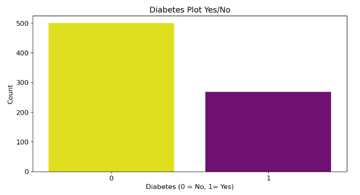
From above plot, we can say that there are less number of diabetic patients in the data set.
BoxPlots
A boxplot is a graphical representation of a set of data that summarizes its five-number summary: minimum, first quartile (Q1), median, third quartile (Q3), and maximum. It provides a quick and easy way to visualize the distribution of a dataset and identify potential outliers.
Here the code creates a set of boxplots that compare the distribution of each independent variable (Pregnancies, Glucose, BloodPressure, SkinThickness, Insulin, BMI, DiabetesPedigreeFunction, Age) in the DataFrame diab_df for patients with and without diabetes (Outcome).
Python3
fig, axes = plt.subplots(2, 4, figsize=(18, 12))
fig.suptitle(
'Diabetes Outcome Distribution WRT All Independent Variables', fontsize=16)
sns.boxplot(ax=axes[0, 0], x=diab_df['Outcome'], y=diab_df['Pregnancies'],
hue=diab_df['Outcome'], palette=('#FFFF00', '#800080'))
axes[0, 0].set_title("Diabetes Outcome vs Pregnancies", fontsize=12)
sns.boxplot(ax=axes[0, 1], x=diab_df['Outcome'], y=diab_df['Glucose'],
hue=diab_df['Outcome'], palette=('#FFFF00', '#800080'))
axes[0, 1].set_title("Diabetes Outcome vs Glucose", fontsize=12)
sns.boxplot(ax=axes[0, 2], x=diab_df['Outcome'], y=diab_df['BloodPressure'],
hue=diab_df['Outcome'], palette=('#FFFF00', '#800080'))
axes[0, 2].set_title("Diabetes Outcome vs BloodPressure", fontsize=12)
sns.boxplot(ax=axes[0, 3], x=diab_df['Outcome'], y=diab_df['SkinThickness'],
hue=diab_df['Outcome'], palette=('#FFFF00', '#800080'))
axes[0, 3].set_title("Diabetes Outcome vs SkinThickness", fontsize=12)
sns.boxplot(ax=axes[1, 0], x=diab_df['Outcome'], y=diab_df['Insulin'],
hue=diab_df['Outcome'], palette=('#FFFF00', '#800080'))
axes[1, 0].set_title("Diabetes Outcome vs Insulin", fontsize=12)
sns.boxplot(ax=axes[1, 1], x=diab_df['Outcome'], y=diab_df['BMI'],
hue=diab_df['Outcome'], palette=('#FFFF00', '#800080'))
axes[1, 1].set_title("Diabetes Outcome vs BMI", fontsize=12)
sns.boxplot(ax=axes[1, 2], x=diab_df['Outcome'], y=diab_df['DiabetesPedigreeFunction'],
hue=diab_df['Outcome'], palette=('#FFFF00', '#800080'))
axes[1, 2].set_title(
"Diabetes Outcome vs DiabetesPedigreeFunction", fontsize=12)
sns.boxplot(ax=axes[1, 3], x=diab_df['Outcome'], y=diab_df['Age'],
hue=diab_df['Outcome'], palette=('#FFFF00', '#800080'))
axes[1, 3].set_title("Diabetes Outcome vs Age", fontsize=12)
|
Output:
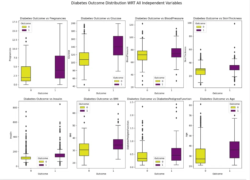
From above Boxplot, we can see that those who are diabetic tends to have higher Glucose levels, Age, BMI, Pregnancies and Insulin measures.
Pairplot
A pairplot is a type of statistical visualization that explores the relationships between multiple variables in a dataset. It creates a matrix of scatterplots, where each scatterplot represents the relationship between a pair of variables. Pairplots are often used to identify patterns, correlations, and potential outliers in a dataset.
Here the code creates a pairplot to visualize the relationships between all numerical variables in the DataFrame diab_df, coloring the points by the “Outcome” variable (0 for no diabetes and 1 for diabetes). A pairplot is a visualization that shows a scatterplot matrix of all possible pairs of variables in a dataset.
Python3
sns.pairplot(diab_df, hue='Outcome', palette=('#FFFF00', '#800080'))
|
Output:
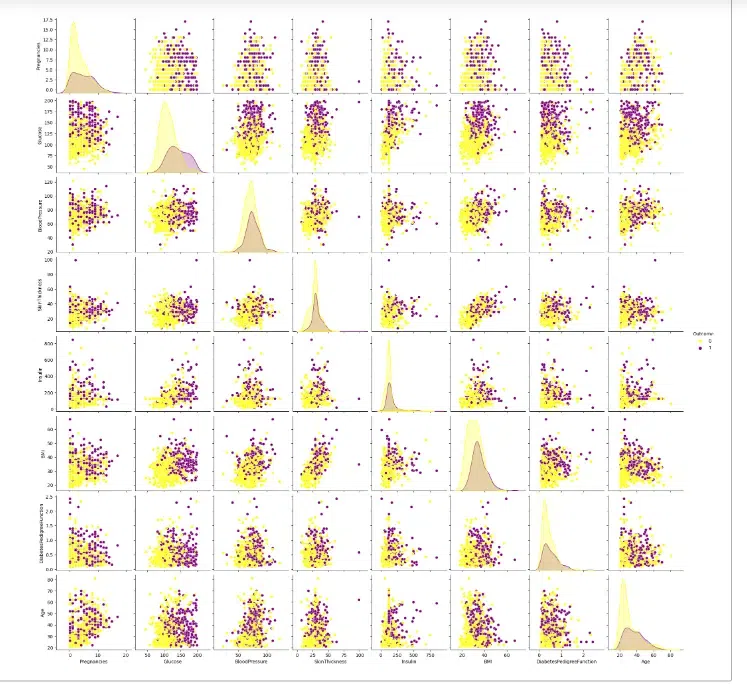
From the above pairplot, we can see that it provides a comprehensive visual representation of the relationships between all numerical variables in the diab_df dataset, highlighting the differences between patients with and without diabetes.
Heatmap
A heatmap is a graphical representation of data where the values are represented by colors. Heatmaps are used to visualize and analyze data that has two dimensions, such as the values of a variable across different categories or the correlation between different variables.
A correlation matrix is a table that shows the correlation coefficients between all pairs of variables in a dataset. The correlation coefficient is a measure of the strength and direction of the linear relationship between two variables.
Here the code creates a heatmap to visualize the correlation matrix of the DataFrame diab_df.
Python3
plt.figure(figsize=(12,10))
sns.heatmap(diab_df.corr(), annot=True, cmap='PiYG')
plt.title("Feature Correlation Matrix",fontsize=20)
plt.show()
|
Output:
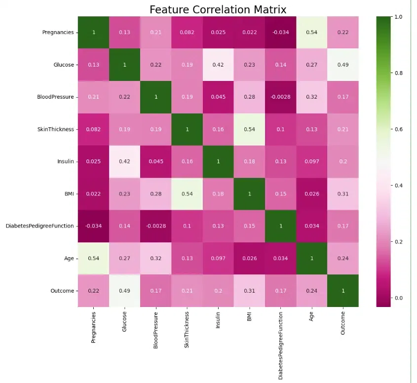
We can see that a few of the features are moderately correlated – Age and number of Pregnancies, Insulin and Glucose levels, Skin Thickness and BMI – but not so much as to cause concern.
Step-5: Modelling Building
Model building creates a representation of a system for prediction or understanding.
The code is used to get descriptive statistics of the diab_df DataFrame. Descriptive statistics provide a summary of the central tendency, dispersion, and shape of a dataset.
Python3
print(diab_df.describe())
|
Output:
Pregnancies     Glucose  BloodPressure  SkinThickness     Insulin  \
count   768.000000  763.000000     733.000000     541.000000  394.000000
mean      3.845052  121.686763      72.405184      29.153420  155.548223
std       3.369578   30.535641      12.382158      10.476982  118.775855
min       0.000000   44.000000      24.000000       7.000000   14.000000
25%       1.000000   99.000000      64.000000      22.000000   76.250000
50%       3.000000  117.000000      72.000000      29.000000  125.000000
75%       6.000000  141.000000      80.000000      36.000000  190.000000
max      17.000000  199.000000     122.000000      99.000000  846.000000

              BMI  DiabetesPedigreeFunction         Age     Outcome
count  757.000000                768.000000  768.000000  768.000000
mean    32.457464                  0.471876   33.240885    0.348958
std      6.924988                  0.331329   11.760232    0.476951
min     18.200000                  0.078000   21.000000    0.000000
25%     27.500000                  0.243750   24.000000    0.000000
50%     32.300000                  0.372500   29.000000    0.000000
75%     36.600000                  0.626250   41.000000    1.000000
max     67.100000                  2.420000   81.000000    1.000000
The code counts the number of occurrences of each unique value in the ‘Outcome’ column of the DataFrame diab_df. The value_counts() method is a convenient way to summarize categorical data in a DataFrame.
Python3
diab_df['Outcome'].value_counts()
|
Output:
0    500
1    268
Name: Outcome, dtype: int64
Here we have just checked the distribution.
Step-6: Train the model
The code is splitting the data in the diab_df DataFrame into training and testing sets for model building
First Let’s split the data in to x and y.
Python3
from sklearn.model_selection import train_test_split
x = diab_df.drop(['Outcome'],axis=1)
y = diab_df['Outcome']
|
Then we use the standard scaler to scale the data.
Python3
from sklearn.preprocessing import StandardScaler
sc= StandardScaler()
x_scaled= sc.fit_transform(x)
|
First Let’s split the data into train and test.
Python3
x_train, x_test, y_train, y_test = train_test_split(
x_scaled, y, test_size=0.3, random_state=0)
|
The code will show the shapes of the training data.
Python3
x_train.shape, y_train.shape
|
Output:
((537, 8), (537,))
The code will show the shapes of the testing data.
Python3
x_test.shape, y_test.shape
|
Output:
((231, 8), (231,))
Applying Logistic Regression
Logistic Regression is a statistical method used to predict the probability of a binary outcome (yes or no, 1 or 0) based on a set of independent variables.
The code is used to train and evaluate a logistic regression model using the training data and then uses the trained model to make predictions on the test data.
Python3
from sklearn.linear_model import LogisticRegression
logreg = LogisticRegression()
logreg.fit(x_train, y_train)
y_pred = logreg.predict(x_test)
|
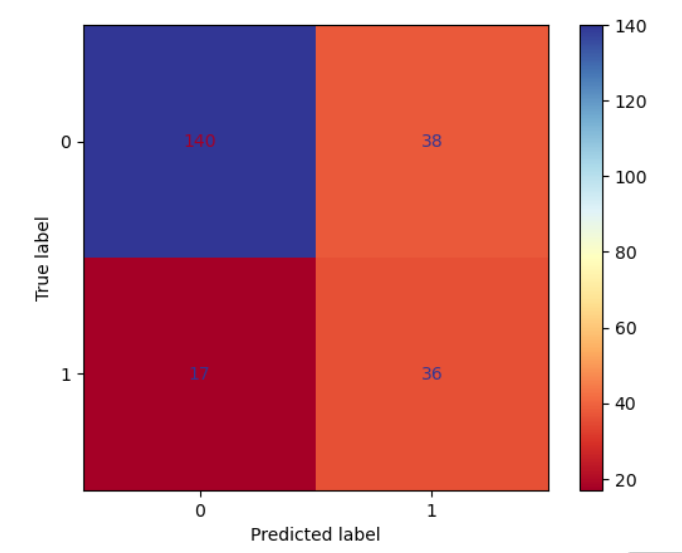
Computing Confusion Matrix
A confusion matrix is a table that summarizes the performance of a binary classification model. It shows the number of correct and incorrect predictions made by the model for each class
Here the code calculates and displays the confusion matrix for the predictions made by the logistic regression model.
Python3
from sklearn.metrics import confusion_matrix, accuracy_score
confmat = confusion_matrix(y_pred, y_test)
confmat
|
Output:
array([[140,  38],
       [ 17,  36]], dtype=int64)
A confusion matrix plot is a graphical representation of a confusion matrix, making it easier to interpret the model’s performance.
Here the code creates a confusion matrix plot to visualize the performance of the logistic regression model.
Python3
from sklearn import metrics
cm = metrics.ConfusionMatrixDisplay(confusion_matrix=metrics.confusion_matrix(y_pred, y_test, labels=logreg.classes_),
display_labels=logreg.classes_)
cm.plot(cmap="RdYlBu")
|
Output:
The accuracy score is a measure of the model’s ability to correctly predict the target variable for the test data. It is calculated as the percentage of correct predictions out of the total number of predictions.
Here the code calculates the accuracy score of a classification model.
Python3
accuracy_score(y_pred, y_test)
|
Output:
0.7619047619047619
Model Accuracy with Logistic Regression: 76.19%
Conclusion
As a result, data analysts and scientists will find this Quick Guide to Exploratory Data Analysis using Jupyter Notebook to be a useful tool. It shows how Jupyter Notebook may be a useful tool for exploring and comprehending datasets using a variety of data visualization and statistical techniques. Users can get insights into data trends, correlations, and anomalies by following the instructions in this tutorial. These insights are essential for making decisions in data-driven projects. This article can be used as a useful resource by analysts at all levels who want to use Jupyter Notebook for exploratory data analysis (EDA), which is a crucial phase in the data analysis process.
Share your thoughts in the comments
Please Login to comment...