Jupyter Notebook is an interactive interface where you can execute chunks of programming code, each chunk at a time. Jupyter Notebooks are widely used for data analysis and data visualization as you can visualize the output without leaving the environment. In this article, we will go deep down to discuss data analysis and data visualization. We’ll be learning data analysis techniques including Data loading and Preparation and data visualization. At the end of this tutorial, we will be able to use Jupyter Notebook efficiently for data preprocessing, data analysis, and data visualization.
Installation
To install the Jupyter Notebook on your system, follow the below steps:
Install Python
We should have Python installed on your system in order to download and run Jupyter Notebook. Download and install the latest version of Python from the official website
Open a Terminal
- On Windows, open a terminal-like program called cmd (“the command prompt”).
- On macOS or Linux, you can simply open a terminal window.
Install Jupyter Notebook:
To install Jpuyter Notebook run the below command in the terminal:
pip install notebook
To check the version of the jupyter notebook installed, use the below command:
jupyter --version
 Creating a notebook
To launch a jupyter notebook go to the terminal and run the below command :
jupyter notebook
After launching Jupyter Notebook, you will be redirected to the Jupyter Notebook web interface. Now, create a new notebook using the interface. The notebook that is created will have an .ipynb extension. This .ipynb file is used to define a single notebook. We can write code in each cell of the notebook as shown below:
Importing Libraries
We’ll be using following python libraries:
- seaborn: To install the seaborn python library you can write the below command in your jupyter notebook:
!pip install seaborn
- matplotlib: To install the matplotlib python library you can write the below command in your jupyter notebook:
!pip install matplotlib
Now import the python libraries that we installed in your Jupyter Notebook as shown below:
Python
import numpy as np
from sklearn.preprocessing import MinMaxScaler
import seaborn as sns
import matplotlib.pyplot as plt
from sklearn.model_selection import cross_val_score, train_test_split
from sklearn.metrics import mean_squared_error
from sklearn.linear_model import LinearRegression
|
Data loading and Preparation
There are many ways to import/load a dataset, either you can download a dataset or you can directly import it using Python library such as Seaborn, Scikit-learn (sklearn), NLTK, etc. The datasets that we are going to use is a Black Friday Sales dataset from Kaggle.
First, you need to download the dataset from the above-given websites and place it in the same directory as your .ipynb file. Then, use the following code to import these datasets into your Jupyter Notebook and to display the first five columns :
Python
df_black_friday_sales = pd.read_csv('./train.csv')
print(df_black_friday_sales.head())
|
Output:
    User_ID Product_ID Gender   Age  Occupation City_Category  \
0  1000001  P00069042      F  0-17          10             A
1  1000001  P00248942      F  0-17          10             A
2  1000001  P00087842      F  0-17          10             A
3  1000001  P00085442      F  0-17          10             A
4  1000002  P00285442      M   55+          16             C
  Stay_In_Current_City_Years  Marital_Status  Product_Category_1  \
0                          2               0                   3
1                          2               0                   1
2                          2               0                  12
3                          2               0                  12
4                         4+               0                   8
   Product_Category_2  Product_Category_3  Purchase
0                 NaN                 NaN      8370
1                 6.0                14.0     15200
2                 NaN                 NaN      1422
3                14.0                 NaN      1057
4                 NaN                 NaN      7969
As we have now imported the dataset and now we’ll work on preprocessing. Preprocessing in data science refers to the process or steps that we’ll take to prepare raw data for data analysis. Preprocessing is a must step before data analysis and model training .We’ll be taking some basic steps to preprocess our data :
Handling missing value
We have to find whether there are missing values in our dataset, if there are then we’ll follow some steps to handle the missing values. some common steps to handle missing values are , 1. Removal of Rows or Columns that has missing value, Imputation(filling missing vlaue with mean or medain or mode) , Using K-Nearest Neighbors, etc. Lets handle some missing values of our dataset.
Python
print( df_black_friday_sales.isna().any() )
|
Output:
User_ID                       False
Product_ID                    False
Gender                        False
Age                           False
Occupation                    False
City_Category                 False
Stay_In_Current_City_Years    False
Marital_Status                False
Product_Category_1            False
Product_Category_2             True
Product_Category_3             True
Purchase                      False
dtype: bool
The code checks for null values in each column of the DataFrame.
Python
df_black_friday_sales.isnull().sum()
|
Output:
User_ID                            0
Product_ID                         0
Gender                             0
Age                                0
Occupation                         0
City_Category                      0
Stay_In_Current_City_Years         0
Marital_Status                     0
Product_Category_1                 0
Product_Category_2            173638
Product_Category_3            383247
Purchase                           0
dtype: int64
Since there are some null value and we can handle the null value simply by dropping the rows that contain null values but this method only works when the number of null values are very high we use different method rather than dropping the rows that contain null values. Her we’ll fill the null values with mean of the column rather than dropping them.
Python
df_black_friday_sales['Product_Category_2'] = df_black_friday_sales['Product_Category_2'].fillna(-2.0).astype("float32")
df_black_friday_sales['Product_Category_3'] = df_black_friday_sales['Product_Category_3'].fillna(-2.0).astype("float32")
df_black_friday_sales.fillna(df_black_friday_sales.mean(),inplace=True)
print( df_black_friday_sales.head() )
|
Output:
    User_ID Product_ID Gender    Age  Occupation City_Category  \
1   1000001  P00248942      F   0-17          10             A
6   1000004  P00184942      M  46-50           7             B
13  1000005  P00145042      M  26-35          20             A
14  1000006  P00231342      F  51-55           9             A
16  1000006   P0096642      F  51-55           9             A
   Stay_In_Current_City_Years  Marital_Status  Product_Category_1  \
1                           2               0                   1
6                           2               1                   1
13                          1               1                   1
14                          1               0                   5
16                          1               0                   2
    Product_Category_2  Product_Category_3  Purchase
1                  6.0                14.0  0.631572
6                  8.0                17.0  0.800454
13                 2.0                 5.0  0.651131
14                 8.0                14.0  0.218432
16                 3.0                 4.0  0.541348
Dealing with duplicates
This involves finding the duplicates and removing the duplicates, Since there are no duplicates in the datest as shown below:
Python
df_black_friday_sales[df_black_friday_sales.duplicated()].count().sum()
|
0
but if there were we would do something like below to handle this:
Python
df_cleaned = df.drop_duplicates()
df_cleaned = df_cleaned.reset_index(drop=True)
|
Feature Scaling
Sometimes, there can be huge difference between the values of the different features which badly affects hte output. To address this issue, we have to perform data transformation and scaling to ensure that all the values of features of a dataset lie within a similar range. Here we are going to use Normalisation, as it scales the data to a specific range, typically [0, 1]. This can be done as shown below:
Python
from sklearn.preprocessing import MinMaxScaler
scaler = MinMaxScaler()
df_black_friday_sales['Purchase'] = scaler.fit_transform(df_black_friday_sales[['Purchase']])
print( df_black_friday_sales.head() )
|
Output:
    User_ID Product_ID Gender    Age  Occupation City_Category  \
1   1000001  P00248942      F   0-17          10             A
6   1000004  P00184942      M  46-50           7             B
13  1000005  P00145042      M  26-35          20             A
14  1000006  P00231342      F  51-55           9             A
16  1000006   P0096642      F  51-55           9             A
   Stay_In_Current_City_Years  Marital_Status  Product_Category_1  \
1                           2               0                   1
6                           2               1                   1
13                          1               1                   1
14                          1               0                   5
16                          1               0                   2
    Product_Category_2  Product_Category_3  Purchase
1                  6.0                         14.0                                0.631572
6                  8.0                        17.0                                 0.800454
13                 2.0                        5.0                                  0.651131
14                 8.0                       14.0                                 0.218432
16                 3.0                       4.0                                   0.541348
you can see in the above output that how the values of the “Purchase” column changed into the range of [0,1] , as we performed Normalisation.
Label Encoding
Label Encoding is a technique by which we can handle categorical variables of our column.We have performed label encoding in our dataset as shown below:
Python
age_mapping = {
'0-17': 'toddler',
'18-25': 'young_adult',
'26-35': 'adult',
'36-45': 'middle_age',
'46-50': 'mid_age',
'51-55': 'older_adult',
'55+': 'elderly'
}
df_black_friday_sales['Age_new'] = df['Age'].map(age_mapping)
df_black_friday_sales = pd.get_dummies(df_black_friday_sales, columns=['Age_new'], drop_first=True)
cols = ['City_Category', 'Stay_In_Current_City_Years']
from sklearn.preprocessing import LabelEncoder
le = LabelEncoder()
for col in cols:
df_black_friday_sales[col] = le.fit_transform(df_black_friday_sales[col])
df_black_friday_sales.head()
|
Output:
   User_ID Product_ID  Gender    Age  Occupation  City_Category  \
1   1000001  P00248942       1   0-17          10              0
6   1000004  P00184942       0  46-50           7              1
13  1000005  P00145042       0  26-35          20              0
14  1000006  P00231342       1  51-55           9              0
16  1000006   P0096642       1  51-55           9              0
    Stay_In_Current_City_Years  Marital_Status  Product_Category_1  \
1                            2               0                   1
6                            2               1                   1
13                           1               1                   1
14                           1               0                   5
16                           1               0                   2
    Product_Category_2  ...  Age_new_middle_age  Age_new_older_adult  \
1                  6.0  ...                   0                    0
6                  8.0  ...                   0                    0
13                 2.0  ...                   0                    0
14                 8.0  ...                   0                    1
16                 3.0  ...                   0                    1
    Age_new_toddler  Age_new_young_adult  Age_new_elderly  Age_new_mid_age  \
1                 1                    0                0                0
6                 0                    0                0                1
13                0                    0                0                0
14                0                    0                0                0
16                0                    0                0                0
    Age_new_middle_age  Age_new_older_adult  Age_new_toddler  \
1                    0                    0                1
6                    0                    0                0
13                   0                    0                0
14                   0                    1                0
16                   0                    1                0
    Age_new_young_adult
1                     0
6                     0
13                    0
14                    0
16                    0
Data Analysis and Visualization
Data analysis means exploring, examining and interpreting the dataset to find the links that support decision-making. Data analysis involves the analysis of both the quantitative and qualitative data and the relationships between them. In this section we’ll deep dive into the analysis of our “tips” dataset.
Descriptive analysis
It is also an important step as it gives the distribution of our dataset and helps in finding similarities among features. Let’s start by looking at the shape od our dataset and concise summary of our dataset , using the below code:
Python
print("Dimensions of the dataset: ", df_black_friday_sales.shape, "\n\n")
print("Summary of dataset: " , df_black_friday_sales.info() )
|
Output:
Dimensions of the dataset:  (166821, 12)
<class 'pandas.core.frame.DataFrame'>
Int64Index: 166821 entries, 1 to 545914
Data columns (total 12 columns):
 #   Column                      Non-Null Count   Dtype
---  ------                      --------------   -----
 0   User_ID                     166821 non-null  int64
 1   Product_ID                  166821 non-null  object
 2   Gender                      166821 non-null  int64
 3   Age                         166821 non-null  object
 4   Occupation                  166821 non-null  int64
 5   City_Category               166821 non-null  object
 6   Stay_In_Current_City_Years  166821 non-null  object
 7   Marital_Status              166821 non-null  int64
 8   Product_Category_1          166821 non-null  int64
 9   Product_Category_2          166821 non-null  float64
 10  Product_Category_3          166821 non-null  float64
 11  Purchase                    166821 non-null  float64
dtypes: float64(3), int64(5), object(4)
memory usage: 16.5+ MB
Summary of dataset:  None
Now to get the unique values of our features , we can also do that :
Python
unique_values_gender = df_black_friday_sales['Gender'].unique()
unique_values_age = df_black_friday_sales['Age'].unique()
unique_values_city_category = df_black_friday_sales['City_Category'].unique()
print("\nUnique values for 'Gender':", unique_values_gender)
print("\nUnique values for 'Age':", unique_values_age)
print("\nUnique values for 'City_Category':", unique_values_city_category)
|
Output:
Unique values for 'Gender': ['F' 'M']
Unique values for 'Age': ['0-17' '55+' '26-35' '46-50' '51-55' '36-45' '18-25']
Unique values for 'City_Category': ['A' 'C' 'B']
As in the above result we noticed that the values of “Gender” column are not in integers , lets now convert teh values into numerical data:
Python
df_black_friday_sales['Gender'].replace(['M','F'],[0,1],inplace=True)
print(df['Gender'].head() )
|
Output:
1     1
6     0
13    0
14    1
16    1
Name: Gender, dtype: int64
EDA analysis
EDA stands for Exploratory Data Analysis. EDA refers to understand the data and find the relationships between different features so that the dataset is prepared for model building.By performing EDA , one can gain the deep understanding of dataset . There are mainly four types of EDA: Univariate non-graphical, Univariate graphical , Multivariate nongraphical and Multivariate graphical.
Lets start with the descriptive statistics of our dataset. We’ll use the pandas library of Python as shown below :
Python
print( df_black_friday_sales.describe() )
|
Output:
            User_ID     Occupation  Marital_Status  Product_Category_1  \
count  1.668210e+05  166821.000000   166821.000000       166821.000000
mean   1.003037e+06       8.178886        0.402839            2.742766
std    1.732907e+03       6.487522        0.490470            2.573969
min    1.000001e+06       0.000000        0.000000            1.000000
25%    1.001523e+06       2.000000        0.000000            1.000000
50%    1.003101e+06       7.000000        0.000000            1.000000
75%    1.004480e+06      14.000000        1.000000            4.000000
max    1.006040e+06      20.000000        1.000000           15.000000
       Product_Category_2  Product_Category_3       Purchase
count       166821.000000       166821.000000  166821.000000
mean             6.896871           12.668243       0.482591
std              4.500288            4.125338       0.213775
min              2.000000            3.000000       0.000000
25%              2.000000            9.000000       0.323210
50%              6.000000           14.000000       0.486708
75%             10.000000           16.000000       0.649491
To get the datatypes of each of the column and number of unique values in “City_Category” column, we’ll use the below method :
Python
print("Data Types:\n")
print(df_black_friday_sales.dtypes)
unique_values = df_black_friday_sales['City_Category'].unique()
print("\nUnique Values in 'City_Category':")
print(unique_values)
|
Output:
Data Types:
User_ID                         int64
Product_ID                     object
Gender                         object
Age                            object
Occupation                      int64
City_Category                  object
Stay_In_Current_City_Years     object
Marital_Status                  int64
Product_Category_1              int64
Product_Category_2            float64
Product_Category_3            float64
Purchase                      float64
dtype: object
Unique Values in 'City_Category':
['A' 'B' 'C']
Data Visualization
As we know that the large and complex datasets are very difficult to understand but they can be easily understood with the help of graphs. Graphs/Plots can help in determining relationships between different entities and helps in comparing variables/features. Data Visulaisation means presenting the large and complex data in the form of graphs so that they are easily understandable. We’ll use a Python Library called Matplotlib for data visualisation with Jupyter Notebook. Now let’s begin by creating a bar plot that compares the percentage ratio of tips given by each gender , along with that we’ll make another graph to compare the average tips given by individuals of each gender.
Python
sns.barplot(data=df_black_friday_sales,x='Gender',y="Purchase",)
plt.title("Gender VS Purchase Distribution Plot")
plt.show()
|
Output:
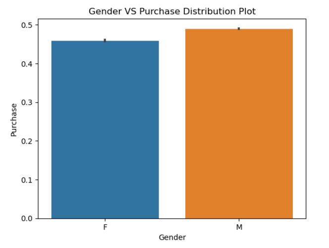
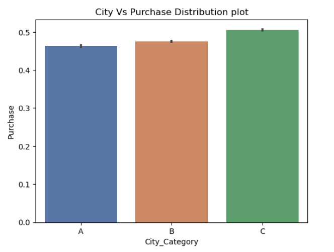
This code creates a bar plot using Seaborn to visualize the distribution of purchases (‘Purchase’) across different city categories (‘City_Category’) in the DataFrame ‘df_black_friday_sales’.
Python
sns.barplot(x='City_Category',y='Purchase',data=df_black_friday_sales,palette="deep")
plt.title("City Vs Purchase Distribution plot")
plt.show()
|
Output:
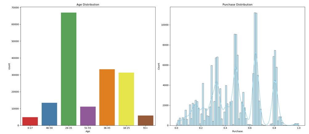
Here code creates a figure with two subplots side by side. The first subplot displays a count plot of the ‘Age’ column from the ‘df_black_friday_sales’ DataFrame, while the second subplot shows a histogram and kernel density estimate (KDE) of the ‘Purchase’ column.
Python
fig, axes = plt.subplots(1, 2, figsize=(18, 8))
sns.countplot(x='Age', data=df_black_friday_sales, palette='Set1', ax=axes[0])
axes[0].set_title('Age Distribution')
sns.histplot(df_black_friday_sales['Purchase'], kde=True, color='skyblue', ax=axes[1])
axes[1].set_title('Purchase Distribution')
plt.tight_layout()
plt.show()
|
Output:
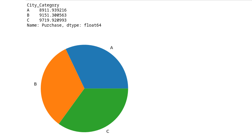
Here code calculates the average purchase (‘Purchase’) for each city category (‘City_Category’) using a groupby operation and then prints the resulting purchase comparison.
Python
purchase_comp=df_black_friday_sales.groupby('City_Category')['Purchase'].mean()
print(purchase_comp)
plt.pie(purchase_city,labels=['A','B','C'])
plt.show()
|
Output:
Model Building
As we are going to build a model , we have to split our data to test and train , and we’ll use the train data to train our model and will use the test data to test the accuracy of our model.
Python
X = df_black_friday_sales.drop(columns=['User_ID', 'Product_ID', 'Purchase','Age'])
y = df_black_friday_sales['Purchase']
|
Now lets write a create a function to train our model. We’ll be using Linear Regrssion model from sklearn library
Python
from sklearn.model_selection import cross_val_score, train_test_split
from sklearn.metrics import mean_squared_error
from sklearn.linear_model import LinearRegression
def train(model, X, y):
x_train, x_test, y_train, y_test = train_test_split(X, y, random_state=42, test_size=0.25)
model.fit(x_train, y_train)
pred = model.predict(x_test)
cv_score = cross_val_score(model, X, y, scoring='neg_mean_squared_error', cv=5)
cv_score = np.abs(np.mean(cv_score))
print("Results")
print("MSE:", np.sqrt(mean_squared_error(y_test, pred)))
print("CV Score:", np.sqrt(cv_score))
model = LinearRegression()
train(model, X, y)
coef = pd.Series(model.coef_, X.columns).sort_values()
coef.plot(kind='bar', title='Model Coefficients')
|
Output:
Results
MSE: 0.19519540420193265
CV Score: 0.19484857870770803
Jupyter Notebook comes with a friendly environment for coding, allowing you to execute code in individual cells and view the output immediately within the same interface, without leaving the environment .It is a highly productive tool for data analysis and visualisation. Jupyter Notebook has become one of the most powerful tool among data scientists.
Share your thoughts in the comments
Please Login to comment...