Data Visualization in jupyter notebook
Last Updated :
26 Sep, 2023
In this article, we will learn how to visualize data in Jupyter Notebook there are different libraries available in Python for data visualization like Matplotlib, seaborn, Plotly, GGPlot, Bokeh, etc. But in this article, we will use different libraries like Matplotlib, searborn, and Plotly which are widely used for data visualization. We will generate different graphs and plots in Jupyter Notebook using these libraries such as bar graphs, pie charts, line charts, scatter graphs, histograms, and box plots. We will also discuss how to install these libraries and use examples to understand each graph.
Jupyter Notebook
The Jupyter Notebook is the original web application for creating and sharing computational documents that contain live code, equations, visualizations, and narrative text. It offers a simple, streamlined, document-centric experience. Jupyter has support for over 40 different programming languages and Python is one of them.
Prerequisites
In this article, we will use different libraries to create graphs and plots and you have to install the library to function the below example you can use the following code snippetes to install the dependencies.
Install matplotlib
pip install matplotlib
Install Seaborn
pip install seaborn
Install Plotly
pip install plotly
Data Visualization
Data visualization is the graphical representation of information and data in a pictorial or graphical format like line chart, bar graph, pie chart etc. Data visualization helps to gain insights from the data to understand the underlying trends in the data helps the organization to make data-driven decisions. Reasons why data visulization is important:
- Pattern Recognition: Visual representation of data helps to identify the patterns and trends in the data
- Data Analysis: Visual representation of data allows users to filter information, and gain deeper insights.
- Decision Making: Improves the decision making of an organization by identifying the opportunities and potential risks in a pictorial view.
- Memory Retention: People tends to remember more graphical information rather than numerical or text.
- Efficieny: Allows user to quickly identify key insights, trends, and outliers and saves alot of time.
Types of Data Visualizations
- Bar Chart- Rectangular bars or columns are used in bar charts to depict data.They can be used to highlight discrete categories or show changes over time. Horizontal bar charts and vertical bar charts are examples of different types.
- Line Chart- Data is shown in line charts as a collection of data points connected by lines. They are perfect for displaying trends and patterns along an ongoing axis, like time.
- Pie Chart- Pie charts show data as slices of a circle, each slice representing the percentage of each category. They are useful for showing parts of a whole or contrasting relative sizes.
- Scatter Plot- Individual data points are displayed as dots on a two-dimensional grid in scatter plots. They are used to identify correlations and illustrate the link between two variables.
- Histogram- The frequency or distribution of the data within each bin is shown by a histogram, which groups the data into bins. For displaying the distribution of continuous data, they work well.
- Heatmap- In a matrix or table format, data values are represented by color intensity in heatmaps. They help show the connections between two category variables.
- Bubble Chart- Similar to scatter plots, bubble charts also include a size dimension to indicate a third variable. They are useful for showing three dimensional data in a two dimensional plot.
- Box Plot (Box-and-Whisker Plot)- Box plots use quartiles, outliers, and a box to represent the data distribution. They are useful for illustrating the skewness and distribution of data.
- Tree Map- Tree maps separate the data into nested rectangles, each of which stands for a different category.They are helpful for displaying proportions within categories and for hierarchical data.
- Choropleth Map- Color-coded regions are used in choropleth maps to display the data values for various geographic locations.They are excellent for displaying data variances by area.
- Word Cloud- The size of each word in a word cloud indicates its frequency or significance. Word clouds are used to show words or phrases.They are frequently employed in sentiment analysis and text data.
- Radar Chart- Data points are shown on spokes radiating from a central location on radar charts.They are helpful in comparing numerous factors between various groups.
- Network Diagram- Network diagrams show the links and connections between nodes.They work well for showing intricate relationships in networks or social networks.
- Some other types of data visualization- Donut Chart, Half Donut Chart, Multi-Layer Pie Chart, Flowchart, Table, Geographic Map, Icon Array, Percentage Bar, Timeline, Venn Diagram, Funnel Chart, Polar Graph
Data Prepration: It is also known as data preprocessing it is a method to convert the raw data into meaninful data it is a multi-level process it includes data collection, data cleaning, data transformation.
Data Visualization using Matplotlib
Bar graph in Jupyter Notebook
Bar Graph represents data using rectangular bars of variable length and the length of bar corresponds the value it represents. It is effective for comparing categories or discrete data points.
Follow the below steps to use bar graph in you Jupyter Notebook:
- import the matplotlib module
- Take the x-axis input in an array.
- Take the y-axis input in an array.
- Plot the Bar Graph using bar() functions. We can set other options like color, width to customize the bar graph see the below example
- Set the title of your graph by using title() function
- Show the graph using show() method
Example:
Python3
import matplotlib.pyplot as plt
x = [10, 20, 30, 40, 50, 60]
y = [13, 45, 23, 34, 96, 76]
plt.title('Bar Graph')
plt.bar(x, y, color='dodgerblue', width=5)
plt.show()
|
Output:

Bar Graph
Pie Chart in Jupyter Notebook
A pie chart displays data as circular graph divided into slices, and each slice represents a proportion or percentage of the whole.
Follow the below steps to use pie chart in you Jupyter Notebook:
- import the matplotlib module
- Take the labels of your data in an array, e.g label = [‘apples’ , ‘bananna’, ‘orange’]
- Take the values in an array, e.g. values = [13, 45, 23, 34, 96, 76]
- Plot the Pie Chart using pie() method. We can set other options like explode, autopct, pctdistance, startangle to customize the pie chart
- Set the title of your graph by using title() function
- Show the graph using show() method.
Example:
Python3
import matplotlib.pyplot as plt
x = [35, 20, 30, 40, 50, 30]
y = ['Apple', 'Bananna', 'Grapes', 'Orange', 'PineApple', 'Dragon Fruit']
plt.title('Pie Chart')
plt.pie(x, labels=y)
plt.show()
|
Output:

Data Visualization using Seaborn
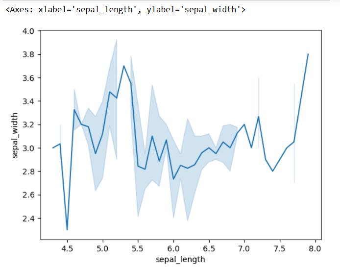
Line Plot in Jupyter Notebook
A line plot shows data points connected by lines, it helps visualize changes, patterns, and fluctuations in data, line plot is useful for tracing patterns in data. We will use seaborn library to plot the line chart or line plot.
Follow the below steps to use line chart in you Jupyter Notebook:
- import the seaborn module
- Load the data set using load_dataset() method
- Use lineplot() method to plot the graph line chart
Example:
Python3
import seaborn as sns
data = sns.load_dataset("iris")
sns.lineplot(x="sepal_length", y="sepal_width", data=data)
|
Output:
Scatter Graph in Jupyter Notebook
A scatter graph represents data points as individual dots on a 2D plane. It’s used to show the relationship or correlation between two variables. We will use seaborn library to plot scatter graph.
Follow the below steps to use scatter graph in you Jupyter Notebook:
- import the seaborn module
- Load the data set using load_dataset() method
- Use scatterplot() method to plot the scatter graph
Example:
Python3
import seaborn
data = seaborn.load_dataset("iris")
seaborn.scatterplot(data=data)
|
Output:
.webp)
Data Visualization using Plotly
Box Plot in Jupyter Notebook
Box plot is a graphical represntation of dataset and is usally used to find the outliers in the dataset. Box are much beneficial for comparing the groups of data. To plot a box plot we will use plotly library.
Follow the below steps to use scatter graph in you Jupyter Notebook:
- import the plotly module
- Load the data set using px.data.dataset_name() method
- Use box() method to plot the box plot
- use show() method to show the figure
Example:
Python3
import plotly.express as px
df = px.data.iris()
fig = px.box(df, x="sepal_width", y="sepal_length")
fig.show()
|
Output:

Histogram in Jupyter Notebook
Histogram is used to graphically represent the data and typically used in statistics to compare the historical data. To plot a histogram we will use Plotly library.
Follow the below steps to use scatter graph in you Jupyter Notebook:
- import the plotly module
- Load the data set using px.data.dataset_name() method
- Use histogram() method to plot the box plot
- use show() method to show the figure
Example:
Python3
import plotly.express as px
df = px.data.tips()
fig = px.histogram(df.total_bill)
fig.show()
|
Output:
 Conclusion
In the article we discussed the widely used graphs and charts in the data visualization there are other graphs also available which you can checkout here.
Share your thoughts in the comments
Please Login to comment...