SweetViz | Automated Exploratory Data Analysis (EDA)
Last Updated :
30 Jun, 2023
SweetViz is an open-source Python library, this is used for automated exploratory data analysis (EDA), it helps data analysts/scientists quickly generate beautiful & highly detailed visualizations. The output, we get is a fully self-contained HTML application. The system built reports around quickly visualizing the target values & comparing datasets.
Exploratory data analysis (EDA) is the process of analyzing and summarizing the main characteristics of a dataset, often with the goal of understanding the underlying patterns, relationships, and trends in the data.
Features of SweetViz Library
- Target analysis: This shows how a target value relates to other features.
- Mixed-type associations: Sweetviz integrates associations for categorical (uncertainty coefficient), numerical (Pearson’s correlation) & categorical-numerical (correlation ratio) datatypes smoothly, to deliver maximum information for all the data types.
- Visualize and compare: Distinct datasets (e.g. training vs test data).
- Type inference: It automatically detects numerical, categorical & text features, with optional manual overrides.
- Summary information:
- Type, missing values, unique values, duplicate rows, & most frequent values.
- Numerical analysis like sum, min/max/range, quartiles, mean, mode, standard deviation, median absolute deviation, coefficient of variation, kurtosis, and skewness.
Installation
First, we will install the SweetViz Library by using the pip install command given below:
#installing the library
pip install sweetviz
Import the necessary Libraries
Python3
import sweetviz as sv
from sklearn.datasets import fetch_california_housing
from sklearn.model_selection import train_test_split
print("SweetViz Version : {}".format(sv.__version__))
|
Load the dataset
Python3
housing = fetch_california_housing(as_frame = True)
df = housing.frame
df.info()
|
Output:
<class 'pandas.core.frame.DataFrame'>
RangeIndex: 20640 entries, 0 to 20639
Data columns (total 9 columns):
 #   Column       Non-Null Count  Dtype
---  ------       --------------  -----
 0   MedInc       20640 non-null  float64
 1   HouseAge     20640 non-null  float64
 2   AveRooms     20640 non-null  float64
 3   AveBedrms    20640 non-null  float64
 4   Population   20640 non-null  float64
 5   AveOccup     20640 non-null  float64
 6   Latitude     20640 non-null  float64
 7   Longitude    20640 non-null  float64
 8   MedHouseVal  20640 non-null  float64
dtypes: float64(9)
memory usage: 1.4 MB
Create the report
for creating the report we have 3 functions:
- analyze() for a single dataset
- compare() for compare 2 datasets (e.g. Test versus Train)
- compare_intra() for comparing 2 sub-populations within the same dataset
Here, we have a single dataset, so at this time we will use analyze() function;
Python3
report = sv.analyze([df, 'Train'], target_feat='MedHouseVal')
|
Generate output
Once we have created our report object, then simply pass it to one of the two ‘show’ functions:
show_html() or show_ notebook()
show_html() function will create & save an HTML report (HTML page) at the given file path, &
show_notebook() function will embed the report inside a Notebook.
Python3
report.show_html('Report.html')
|
Output:
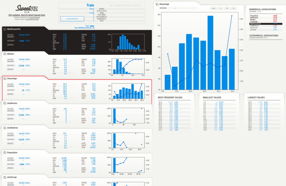
SweetViz Housing Dataset Analysis
Compare the train and test dataset
Python3
train_df, test_df = train_test_split(df, train_size=0.75)
compare = sv.compare(source=train_df, compare=test_df, target_feat="MedHouseVal")
compare.show_html('Compare.html')
|
Output:
.png)
SweetViz : Compararision between two dataset
Associations
Hovering over the “Associations” button in the navigation bar on the left-hand side of the report will display the Associations graph on the left-hand side of the report. The Associations graph shows the pairwise relationships between all pairs of features in the dataset, with each dot representing a unique combination of two features. The size and color of the dot indicate the strength and direction of the association between the two features, with larger and darker dots indicating stronger positive associations and smaller and lighter dots indicating weaker or negative associations.
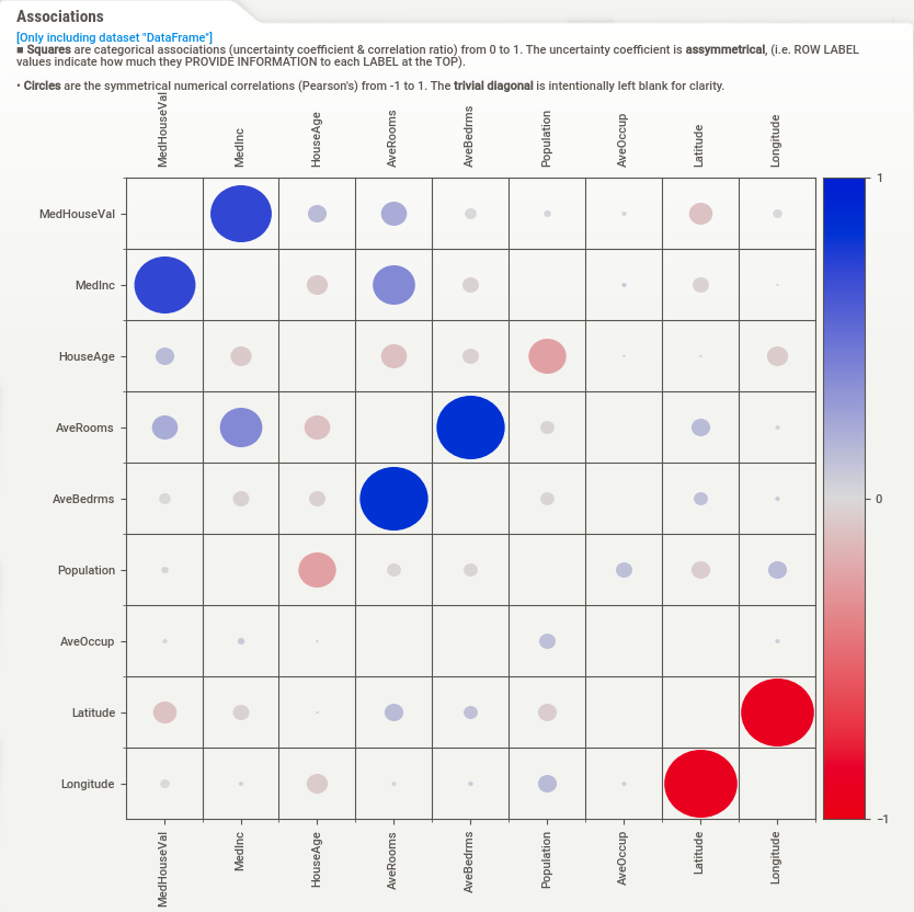
Associations
comparing 2 sub-populations within the same dataset
Steps
- Import the necessary libraries
- Load the dataset
- Define the FeatureConfig object to force the target feature to be numerical
- Create a boolean array to use as the grouping condition
- Analyze the dataset with the specified FeatureConfig object and grouping condition
- Generate and display the report
Python3
import sweetviz as sv
from sklearn.datasets import load_breast_cancer
cancer = load_breast_cancer(as_frame=True)
df = cancer.frame
my_feature_config = sv.FeatureConfig(force_num=['target'])
condition_series = df['target'] == 0
my_report = sv.compare_intra(df,
condition_series,
['malignant', 'benign'],
feat_cfg=my_feature_config,
target_feat='target')
my_report.show_html()
|
Output:
.png)
Sweetviz Comparision
Share your thoughts in the comments
Please Login to comment...