HTML Responsive Web Design is a dynamic approach to web design that ensures web pages look good on all devices. It involves the automatic adjustment of HTML elements such as resizing, hiding, showing, shrinking, and expanding, depending on the device and screen size used. This means that the web pages will automatically adapt to the screen size of the device in use, providing an optimal viewing experience.
We will demonstrate different examples of how we can create an HTML responsive web design so that it will adjust according to the screen size of the device used.
Examples of HTML Responsive Web Design
HTML Viewport represents the area of display or screen visible to the user. It varies from device to device. This approach sets the available screen width as the 100% width of the web pages and adjusts content accordingly to make it responsive.
Syntax
<meta name="viewport" content= "width=device-width, initial-scale=1.0">
Example: Use of the HTML viewport meta tag for responsive pages.
HTML
<!DOCTYPE html>
<html>
<head>
<title>GeeksforGeeks</title>
<meta charset="utf-8"
name="viewport"
content="width=device-width,
initial-scale=1.0" />
<style>
.gfg {
font-size: 40px;
font-weight: bold;
color: green;
text-align: center;
}
.geeks {
font-size: 17px;
text-align: center;
}
p {
text-align: justify;
}
</style>
</head>
<body>
<div class="gfg">GeeksforGeeks</div>
<div class="geeks">HTML Introduction</div>
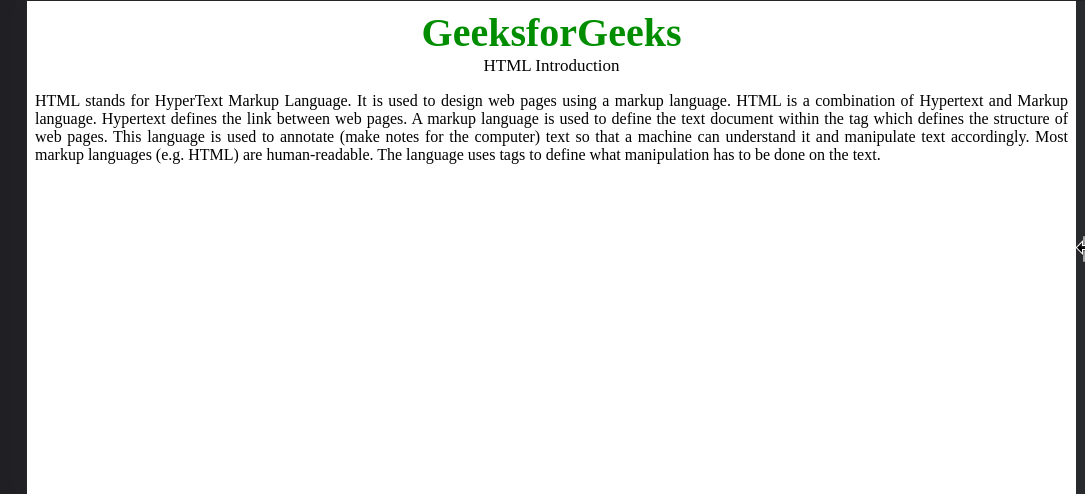
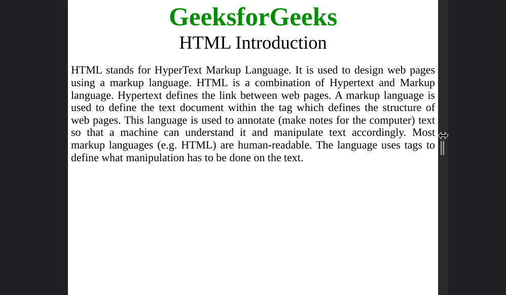
<p>
HTML stands for HyperText Markup Language. It is
used to design web pages using a markup
language. HTML is a combination of Hypertext and
Markup language. Hypertext defines the link
between web pages. A markup language is used to
define the text document within the tag which
defines the structure of web pages. This
language is used to annotate (make notes for the
computer) text so that a machine can understand
it and manipulate text accordingly. Most markup
languages (e.g. HTML) are human-readable. The
language uses tags to define what manipulation
has to be done on the text.
</p>
</body>
</html>
Output:
2. Responsive Images
Responsive images are just a part of responsive websites. Images that can change their dimensions, scaling them up or down, according to the browser width, are responsive images. Images should be responsive to improve users’ experience on various devices of different sizes. The following are the techniques to use the responsive images:
2.1 Using width Property:
The image can be responsive & scale up & down with the help of CSS width property by setting its value as 100%.
Syntax:
<img src="..." style="width:100%;">
Example: In this example, we will use the image width property to occupy 100% of the screen width.
HTML
<!DOCTYPE html>
<html>
<head>
<meta name="viewport" content=
"width=device-width, initial-scale=1.0" />
</head>
<body>
<img class=".img-fluid" src=
"https://media.geeksforgeeks.org/wp-content/uploads/20220201191443/logo-200x32.png"
style="width: 100%" />
<h2>Responsive Images</h2>
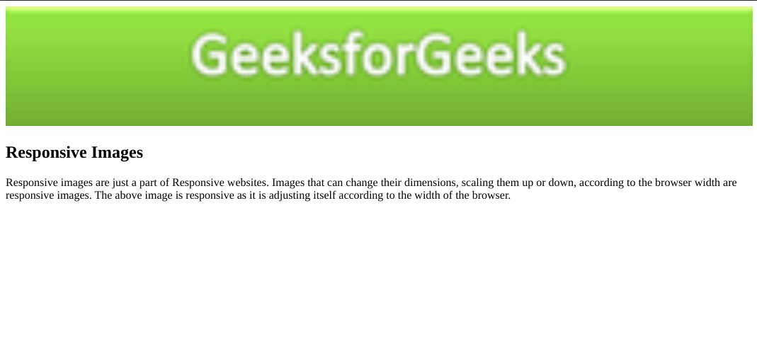
<p>
Responsive images are just a part of Responsive
websites. Images that can change their
dimensions, scaling them up or down, according
to the browser width are responsive images. The
above image is responsive as it is adjusting
itself according to the width of the browser.
</p>
</body>
</html>
Output:
2.2 Using the max-width Property:
The max-width property define the maximum width of an element. The value of the width cannot be larger than the value by max-width. If the content is larger than the max-width then it will go to the next line and if the content is smaller than the max-width then it has no effect. If the content has the larger size than its original size, then, in that case, the it will never scale up.
Syntax
<img src="..." style="max-width:100%; height:auto;">
Example: Implementation of the max-width Property for making the Responsive Images
HTML
<!DOCTYPE html>
<html>
<head>
<meta name="viewport"
content="width=device-width,
initial-scale=1.0" />
</head>
<body>
<img class=".img-fluid"
src=
"https://media.geeksforgeeks.org/wp-content/uploads/20220201191443/logo-200x32.png"
style="max-width:100%;
height:auto;" />
<h2>Responsive Images</h2>
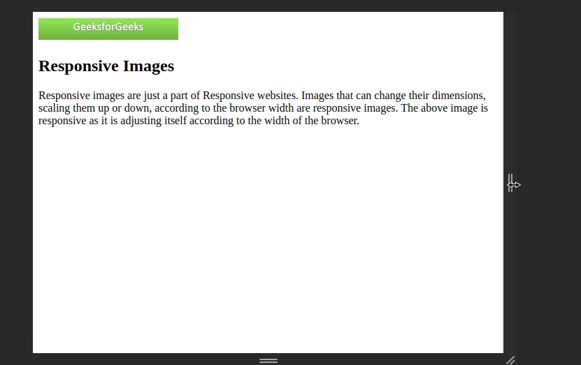
<p>
Responsive images are just a part of Responsive
websites. Images that can change their
dimensions, scaling them up or down, according
to the browser width are responsive images. The
above image is responsive as it is adjusting
itself according to the width of the browser.
</p>
</body>
</html>
Output:
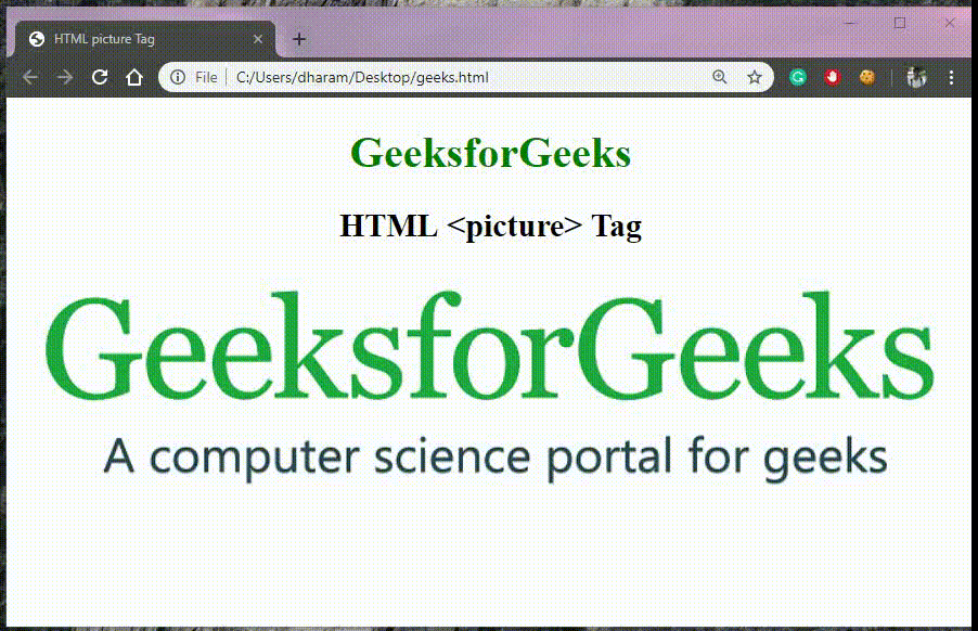
2.3 Responsive Image for different Browser Width:
Depending on the different Browser window size, the images can be responsive with the help of HTML <picture> element. The <picture> tag in HTML is used to give flexibility to the web-developers to specify image resources.
Example
HTML
<!DOCTYPE html>
<html>

<head>
    <title>HTML Responsive Web Design</title>
</head>

<body style="text-align: center;">
    <h1 style="color: green;">GeeksforGeeks</h1>

    <h2>HTML picture Tag</h2>

    <picture>
        <source media="(min-width: 700px)"
                srcset=
"https://media.geeksforgeeks.org/wp-content/uploads/20190825000042/geeks-221.png">

        <source media="(min-width: 450px)"
                srcset=
"https://media.geeksforgeeks.org/wp-content/uploads/20190802021607/geeks14.png">

        <img src=
"https://media.geeksforgeeks.org/wp-content/uploads/20190808102629/geeks15.png"
             alt="GFG">
    </picture>
</body>

</html>
Output:
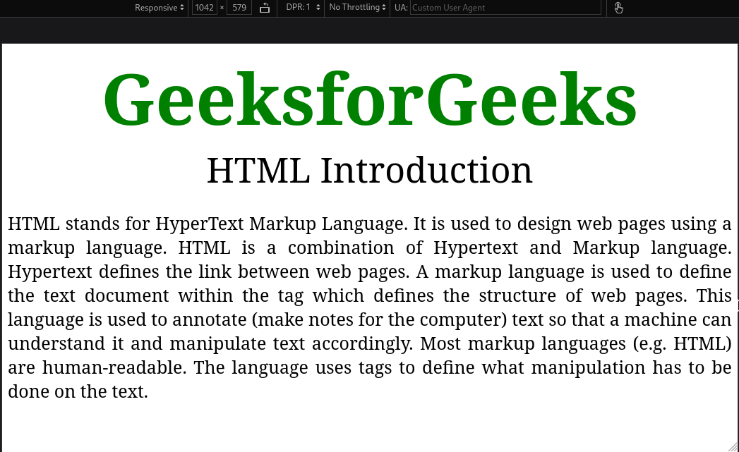
3. Responsive Texts
In this approach, we will define font sizes in terms of %, vw, vh, etc to get the responsive size of texts. This approach will auto-adjust the text size up to a certain limit and when the limit is reached it will start justifying the content to set it within the available width.
Example: This example demonstrates Responsive Web Design by making Responsive Texts.
HTML
<!DOCTYPE html>
<html>

<head>
    <style>
        body {
            max-width: 100%;
        }

        .gfg {
            font-size: 7vw;
            font-weight: bold;
            color: green;
            text-align: center;
        }

        .geeks {
            font-size: 5vw;
            text-align: center;
        }

        p {
            font-size: 3vw;
            text-align: justify;
        }
    </style>
</head>

<body>
    <div class="gfg">GeeksforGeeks</div>
    <div class="geeks">HTML Introduction</div>

    <p>
        HTML stands for HyperText Markup Language. It is
        used to design web pages using a markup
        language. HTML is a combination of Hypertext and
        Markup language. Hypertext defines the link
        between web pages. A markup language is used to
        define the text document within the tag which
        defines the structure of web pages. This
        language is used to annotate (make notes for the
        computer) text so that a machine can understand
        it and manipulate text accordingly. Most markup
        languages (e.g. HTML) are human-readable. The
        language uses tags to define what manipulation
        has to be done on the text.
    </p>
</body>

</html>
Output:
The Media query in CSS is used to create a responsive web design. It means that the view of a web page differs from system to system based on screen or media types. The breakpoint specifies for what device-width size, the content is just starting to break or deform.
Media queries can be used to check many things:
- width and height of the viewport
- width and height of the device
- Orientation
- Resolution
Syntax:
@media not | only mediatype and (expression) {
    // Code content
}
Example: In this example, we will use screen size in a media query to make the webpage responsive according to different breakpoints.
HTML
<!DOCTYPE html>
<html>

<head>
    <title>GeeksforGeeks</title>
    <style>
        .gfg {
            font-size: 100px;
            font-weight: bold;
            color: green;
            text-align: center;
        }

        .geeks {
            font-size: 50px;
            text-align: center;
        }

        p {
            font-size: 25px;
            text-align: justify;
        }

        /* styling for screen width less than 800 */
        @media screen and (max-width: 800px) {
            body {
                background-color: aqua;
            }

            .gfg {
                font-size: 50px;
            }

            .geeks {
                font-size: 25px;
            }

            p {
                font-size: 12px;
            }
        }
    </style>
</head>

<body>
    <div class="gfg">GeeksforGeeks</div>
    <div class="geeks">HTML Introduction</div>

    <p>
        HTML stands for HyperText Markup Language. It is
        used to design web pages using a markup
        language. HTML is a combination of Hypertext and
        Markup language. Hypertext defines the link
        between web pages. A markup language is used to
        define the text document within the tag which
        defines the structure of web pages. This
        language is used to annotate (make notes for the
        computer) text so that a machine can understand
        it and manipulate text accordingly. Most markup
        languages (e.g. HTML) are human-readable. The
        language uses tags to define what manipulation
        has to be done on the text.
    </p>
</body>

</html>
Output: Background color and font size transition for width less than 800px.
Note: Sometimes, this method doesn’t show the correct output on Google Chrome.
5. Responsive Layouts
The responsive layout module of CSS includes the following properties.
5.1 Using flexbox property:
In this approach, we will use CSS display property to make the page responsive. Display layouts like flexbox, inline, blocks, and grids can be used to make the design responsive. CSS flexbox property auto adjusts the content (no. of columns in a row) according to the screen width as shown in the output gif.
Syntax:
.container{
    display: flexbox;
}
Example: In this example, we will use display type flexbox to show adjust items automatically according to the screen size.
HTML
<!DOCTYPE html>
<html>

<head>
    <title>GeeksforGeeks</title>
    <style>
        body {
            background-color: aqua;
        }
        .gfg {
            font-size: 5vw;
            font-weight: bold;
            color: green;
            text-align: center;
        }
        button {
            width: 300px;
            font-size: larger;
        }
        .container {
            display: flexbox;
        }
    </style>
</head>

<body>
    <div class="gfg">GeeksforGeeks</div>
    <div class="container">
        <button>HTML</button>
        <button>CSS</button>
        <button>JavaScript</button>
    </div>
</body>

</html>
Output:
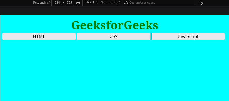
Note: Sometimes, this method doesn’t show the correct output on Google Chrome.
5.2 Using CSS Grids:
This approach uses a CSS display grid to create a 2D layout along with other grid options. It allows us to decide the number of columns we want to keep and instead of rearranging the columns like Flexbox, it adjusts the content within individual column elements.
Syntax:
.container{
    display: grid;
     /* To define colums*/
    grid-template-columns: 1fr 1fr;
}
Example: In this example, CSS Grid layout is used to arrange contents in 2D form, i.e., rows and columns.
HTML
<!DOCTYPE html>
<html>

<head>
    <title>GeeksforGeeks</title>
    <style>
        body {
            background-color: aqua;
        }
        .gfg {
            font-size: 5vw;
            font-weight: bold;
            color: green;
            text-align: center;
        }

        .container {
            font-size: x-large;
            text-align: center;
            display: grid;
            grid-template-columns: 1fr 1fr;
        }
        .grid-item {
            background-color: rgb(220, 208, 232);
            border: 2px solid rgb(70, 54, 84);
        }
    </style>
</head>

<body>
    <div class="gfg">GeeksforGeeks</div>
    <div class="container">
        <div class="grid-item">HTML</div>
        <div class="grid-item">CSS</div>
        <div class="grid-item">JavaScript</div>
        <div class="grid-item">Bootstrap</div>
    </div>
</body>

</html>
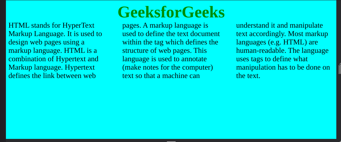
Output: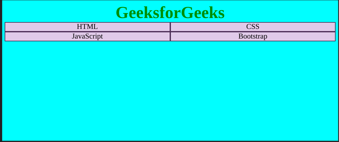
Note: Sometimes, this method doesn’t show the correct output on Google Chrome.
5.3 Using CSS MultiColumn:
It is similar to grids. CSS MulotiColumn allows developers to choose the properties like no. of columns, width, gap, etc. for each column. These values remain unchanged but the content inside the columns adjusts.
Syntax:
.container{
    column-count: 3;                          /* Number of columns*/
    column-gap: 20px;                      /* Gap between columns*/
    column-width: 200px;                 /* Width of each column*/
    /* Other column properties*/
}
Example: This example uses CSS MultiColumn for content division into a specific number of columns.
HTML
<!DOCTYPE html>
<html>

<head>
    <title>GeeksforGeeks</title>
    <style>
        body {
            background-color: aqua;
        }
        .gfg {
            font-size: 5vw;
            font-weight: bold;
            color: green;
            text-align: center;
        }

        .container {
            font-size: x-large;
            text-align: left;
            column-count: 3;
            column-gap: 5%;
        }
    </style>
</head>

<body>
    <div class="gfg">GeeksforGeeks</div>
    <div class="container">
        <div>
            HTML stands for HyperText Markup Language.
            It is used to design web pages using a
            markup language. HTML is a combination of
            Hypertext and Markup language. Hypertext
            defines the link between web pages. A markup
            language is used to define the text document
            within the tag which defines the structure
            of web pages. This language is used to
            annotate (make notes for the computer) text
            so that a machine can understand it and
            manipulate text accordingly. Most markup
            languages (e.g. HTML) are human-readable.
            The language uses tags to define what
            manipulation has to be done on the text.
        </div>
    </div>
</body>

</html>
Output:
Share your thoughts in the comments
Please Login to comment...