How to make div not larger than its contents using CSS?
Last Updated :
16 Apr, 2020
There are three ways to achieve this problem:
- By default case
- Using inline-block property
- Using fit-content property in width and height
Default Case:
In HTML div is by default fit to content inside it. The example goes like this:
Example 1:
<!DOCTYPE html>
<html lang = "en" dir = "ltr">
<head>
<meta charset = "utf-8">
<title>Geeks for Geeks Example</title>
<style media = "screen">
body {
background: orange;
overflow: hidden;
color: white;
}
.GeeksForGeeks {
background: dodgerblue;
position: absolute;
top: 50%;
left: 1%;
right: 1%;
}
</style>
</head>
<body>
<center><h1 style = "color:forestgreen ; top:35% ; left: 35% ;
position:absolute; ">Geeks For Geeks</h1></center>
<center>
<div class = "GeeksForGeeks">
Lorem ipsum dolor sit amet, consectetur adipisicing elit, sed do eiusmod
tempor incididunt ut labore et dolore magna aliqua. Ut enim ad minim
veniam, quis nostrud exercitation ullamco laboris nisi ut aliquip ex ea
commodo consequat. Duis aute irure dolor in reprehenderit in voluptate
velit esse cillum dolore eu fugiat nulla pariatur. Excepteur sint
occaecat cupidatat non proident, sunt in culpa qui officia deserunt
mollit anim id est laborum.
</div>
</center>
</body>
</html>
|
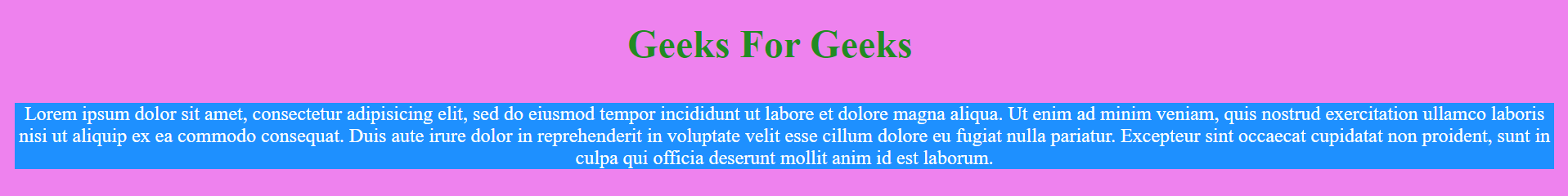
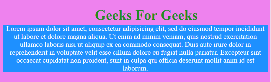
Output:
The output of two different screen width is shown which proves that it fits with content inside it.
Screen 1:

Screen 2:

Using inline-block property:
Use display: inline-block property to set a div size according to its content.
Example 2:
<!DOCTYPE html>
<html lang = "en" dir = "ltr">
<head>
<meta charset = "utf-8">
<title>Geeks for Geeks Example</title>
<style media = "screen">
body {
background: violet;
overflow: auto;
color: white;
}
.GeeksForGeeks {
background: dodgerblue;
position: absolute;
display: inline-block;
left: 1%;
right: 1%;
top: 50%;
}
</style>
</head>
<body>
<center><h1 style="color: forestgreen; top: 35%; left: 35%;
position: absolute;">Geeks For Geeks</h1></center>
<center>
<div class="GeeksForGeeks">
Lorem ipsum dolor sit amet, consectetur adipisicing elit, sed do eiusmod
tempor incididunt ut labore et dolore magna aliqua. Ut enim ad minim
veniam, quis nostrud exercitation ullamco laboris nisi ut aliquip ex ea
commodo consequat. Duis aute irure dolor in reprehenderit in voluptate
velit esse cillum dolore eu fugiat nulla pariatur. Excepteur sint
occaecat cupidatat non proident, sunt in culpa qui officia deserunt
mollit anim id est laborum.
</div>
</center>
</body>
</html>
|
Output:
The output of two different screen width is shown which proves that it fits with content inside it.
Screen 1:
Screen 2:
Using fit-content property in width and height:
In this method we set the width and height property to fit-content value.
Example 3:
<!DOCTYPE html>
<html lang = "en" dir = "ltr">
<head>
<meta charset = "utf-8">
<title>Geeks for Geeks Example</title>
<style media = "screen">
body {
background: tomato;
overflow: hidden;
color: white;
}
.GeeksForGeeks {
background: crimson;
position: absolute;
width:fit-content;
height:fit-content;
left: 0;
top: 50%;
}
</style>
</head>
<body>
<center><h1 style = "color: lime; top: 35%; left: 35%;
position: absolute;">Geeks For Geeks</h1></center>
<center>
<div class = "GeeksForGeeks">
Lorem ipsum dolor sit amet, consectetur adipisicing elit, sed do eiusmod
tempor incididunt ut labore et dolore magna aliqua. Ut enim ad minim
veniam, quis nostrud exercitation ullamco laboris nisi ut aliquip ex ea
commodo consequat. Duis aute irure dolor in reprehenderit in voluptate
velit esse cillum dolore eu fugiat nulla pariatur. Excepteur sint
occaecat cupidatat non proident, sunt in culpa qui officia deserunt
mollit anim id est laborum.
</div>
</center>
</body>
</html>
|
Output:
The output of two different screen width is shown which proves that it fits with content inside it.
Screen 1:

Screen 2:

Share your thoughts in the comments
Please Login to comment...