How to draw 2D Heatmap using Matplotlib in python?
Last Updated :
21 Mar, 2024
In this article, we will explain about plotting heatmaps using the matplotlib library. A heatmap is a great tool for visualizing data across the surface. It highlights data that have a higher or lower concentration in the data distribution.
Heatmap
A 2-D Heatmap is a data visualization tool that helps to represent the magnitude of the matrix in form of a colored table. In Python, we can plot 2-D Heatmaps using the Matplotlib and Seaborn packages. There are different methods to plot 2-D Heatmaps, some of which are discussed below.
Use Cases For Heatmaps
As we know the Heatmap is just a colored representation of a matrix. However, heatmap has a very large use case. We can use heatmaps for the following purpose.
- It is used to see the correlation between columns of a dataset where we can use a darker color for columns having a high correlation.
- We can also use heatmaps for plotting various time series and finance-related data where the Y-axis will be the month and X-axis will be the year and the element of the heatmap will be our data.
Basic Heatmap Using Python Matplotlib Library
Create a 12×12 Heatmap with Random data using Matplotlib
Here we will plot the heatmap using matplotlib.pyplot.imshow() function.
Syntax: matplotlib.pyplot.imshow(X, cmap=None, alpha=None)
- X :- this is input data matrix which is to be displayed
- cmap :- Colormap we use t dispay the heatmap
- alpha :- it specifies the opacity or transpiracy of the heatmap
Python3
import numpy as np
import matplotlib.pyplot as plt
data = np.random.random(( 12 , 12 ))
plt.imshow( data )
plt.title( "2-D Heat Map" )
plt.show()
|
Output:
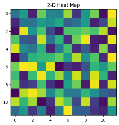
Hetamap of random 12×12 matrix
Choosing Different Colormaps in Heatmap Using Matplotlib
We can choose different colors for Heatmap using the cmap parameter. cmap can help us in making our heatmap more informative.
Python3
import numpy as np
import matplotlib.pyplot as plt
data = np.random.random((12, 12))
plt.imshow(data, cmap='autumn')
plt.title("Heatmap with different color")
plt.show()
|
Output:
.png)
heatmap with camp parameter
Adding Colorbar to Heatmap Using Matplotlib
we can add a colorbar to the heatmap using plt.colorbar(). colorbar shows the weight of color relatively between a certain range.
Python3
data = np.random.random((12, 12))
plt.imshow(data, cmap='autumn', interpolation='nearest')
plt.colorbar()
plt.title("Heatmap with color bar")
plt.show()
|
Output:
.png)
Heatmap with colorbar scale
Customized Heatmap Using Matplotlib Library
we can customize this heatmap using different functions and parameters to make it more informative and beautiful. we will use plt.annotate() to annotate values in the heatmap. Also, we will use colors library to customize the color of the heatmap.
Python3
import matplotlib.colors as colors
data = np.random.randint(0, 100, size=(8, 8))
colors_list = ['#0099ff', '#33cc33']
cmap = colors.ListedColormap(colors_list)
plt.imshow(data, cmap=cmap, vmin=0,\
vmax=100, extent=[0, 8, 0, 8])
for i in range(8):
for j in range(8):
plt.annotate(str(data[i][j]), xy=(j+0.5, i+0.5),
ha='center', va='center', color='white')
cbar = plt.colorbar(ticks=[0, 50, 100])
cbar.ax.set_yticklabels(['Low', 'Medium', 'High'])
plt.title("Customized heatmap with annotations")
plt.xlabel("X-axis")
plt.ylabel("Y-axis")
plt.show()
|
Output:
.png)
advance customized heatmap using matplotlib library
Plotting Correlation Matrix of a Dataset Using Heatmap
Next, we will use a heatmap to plot the correlation between columns of the dataset. We will use correlation to find the relation between columns of the dataset.
Python3
import pandas as pd
import matplotlib.pyplot as plt
from matplotlib import colors
df = pd.read_csv("gold_price_data.csv")
corr_matrix = df.corr()
colors_list = ['#FF5733', '#FFC300']
cmap = colors.ListedColormap(colors_list)
plt.imshow(corr_matrix, cmap=cmap, vmin=0\
, vmax=1, extent=[0, 5, 0, 5])
for i in range(5):
for j in range(5):
plt.annotate(str(round(corr_matrix.values[i][j], 2)),\
xy=(j+0.25, i+0.7),
ha='center', va='center', color='white')
cbar = plt.colorbar(ticks=[0, 0.5, 1])
cbar.ax.set_yticklabels(['Low', 'Medium', 'High'])
plt.title("Correlation Matrix Of The Dataset")
plt.xlabel("Features")
plt.ylabel("Features")
plt.xticks(range(len(corr_matrix.columns)),\
corr_matrix.columns, rotation=90)
plt.yticks(range(len(corr_matrix.columns)),
corr_matrix.columns)
plt.show()
|
output:
.png)
Correlation Matrix of the Dataset
Heatmap Using Seaborn Library
We can also use the Seaborn library to plot heatmaps even plotting heatmaps using Seaborn is comparatively easier than the matplotlib library. To plot the heatmap using Seaborn we will use sns.heatmap() function from the Seaborn library.
Python3
import numpy as np
import seaborn as sns
import matplotlib.pyplot as plt
data = np.random.randint(low=1,
high=100,
size=(10, 10))
hm = sns.heatmap(data=data,
annot=True)
plt.show()
|
Output:
.png)
Heatmap using seaborn
Share your thoughts in the comments
Please Login to comment...