How to Change Chart Colors in Google Sheets
Last Updated :
20 Aug, 2023
Google sheets is one of the most popular cloud based spreadsheet application developed by Google as a part of Google Workspace. It is very similar to MS Excel as it enables us to create and edit our data on spreadsheets and also enables us to share our spreadsheets with our co-workers or peers online.
Apart from creating , editing and sharing spreadsheets, it also provides tons of features for data analysis, automation using formulas and charting . Charting is one of the common usage of Google Spreadsheets. Charting in Google sheets means visually representing the data in a more interactive and user-friendly way using line-charts, bar-charts , pie-charts and more. These charts helps us better understand the trends, patterns within our data. Google Sheets provides us built-in tools for charting which allows us to create, customise, embed charts in our spreadsheets easily and present our data in a clear and visually appealing manner. However to make a chart more visual appealing and stand out , we often have to customise it like change its colors according to the theme of our presentation. With a few simple steps , we can easily customise the colors of our chart.
Change Chart Color in Google Sheets
STEP-1. Open your Google Sheets document
Go to your web browser and open Google sheets , login in to your Google account.
STEP-2. Select the Chart
Select the Chart you want to edit by double clicking on it.
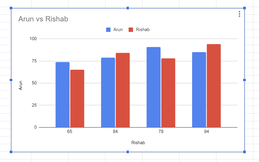
How to Change Chart Color in Google Sheets
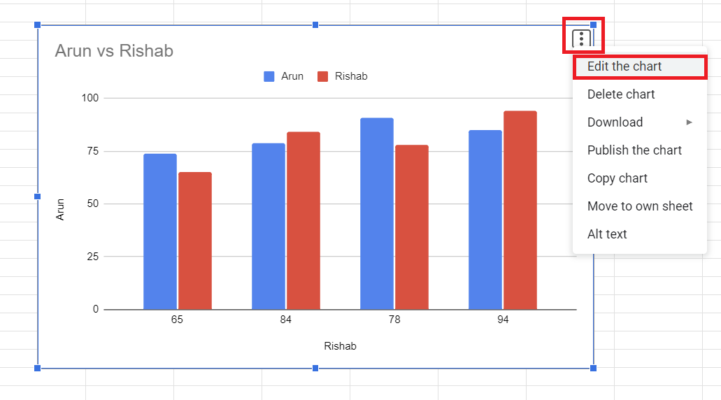
STEP-3. Open the Chart Editor
In order to change the color of our Chart we first have to open the Chart Editor.To open Chart Editor – Double click on the chart to see the Chart Editor section in the right corner or Click on the chart ->Click on the 3 dots on the top right corner of the chart-> Click on Edit the Chart.
You’ll see a Chart Editor in the right side of the screen. Chart Editor is a tool in Google Sheets which is used to customise the appearance and setting of the chart you create within your spreadsheets. Chart Editor provided a user-friendly interface where we can modify the – design, layout, colours, labels and more.
How to Change Color in Google Sheets
How to Change Chart Color in Google Sheets
STEP.-4. Customise the Chart colours
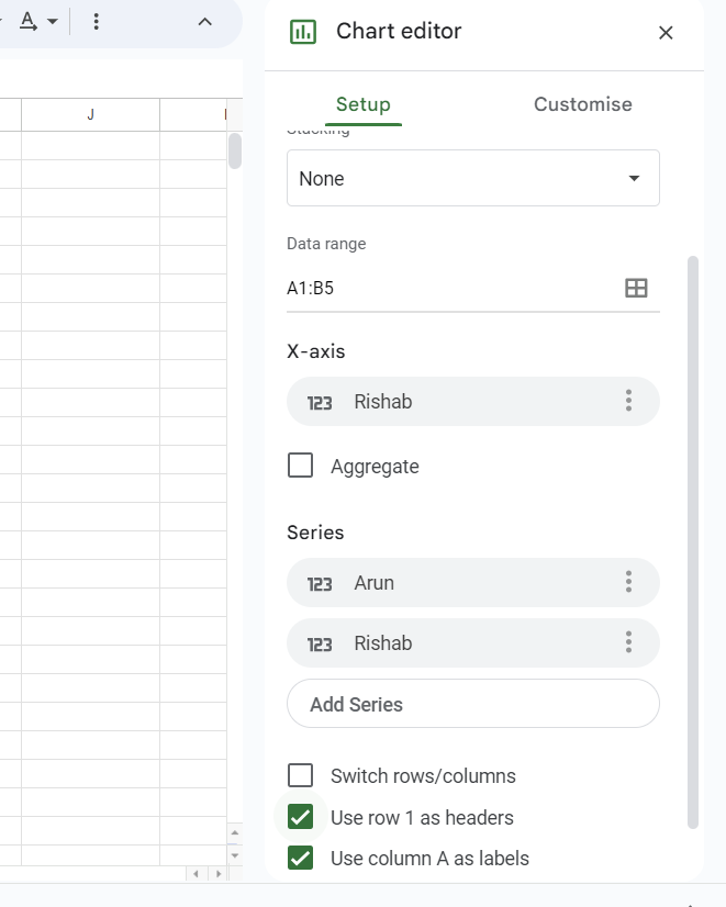
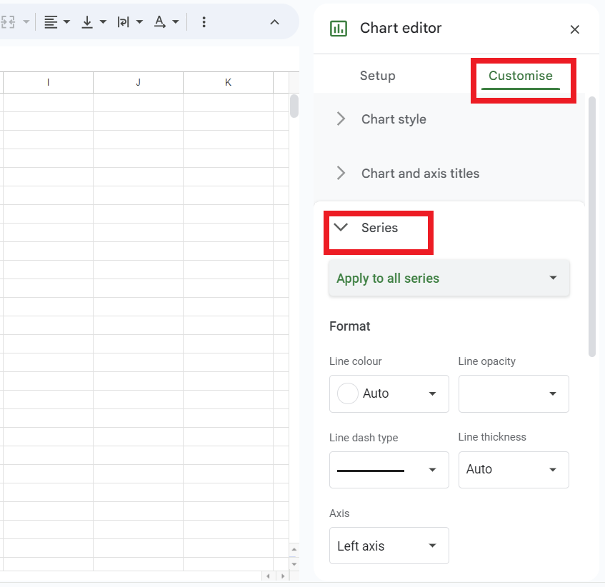
After opening the Chart Editor we’ll have to open the customise tab in chart Editor. Click on Customise Tab -> Click on Series.
How to Change Chart Color in Google Sheets
STEP-5. Select the Series
Series refers to the group of related data that are graphically represented in a chart. Each series represents a set of data that we want to compare or analyse. for example if we are creating a bar graph representing the amount of sales in different years then the amount of sales in each separate year will be a separate series in the graph. To select the Series-Click on Apply to all Series and select the series whose color you want to change (In my case I have selected the Rishab Sales)
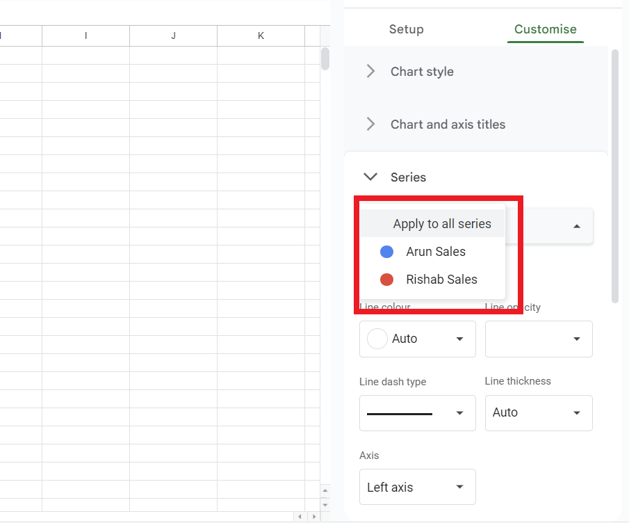
How to Change Chart Color in Google Sheets
STEP-6. Choose a Color
Below the Select bar you will see a Format section -> Click on Fill Color and Select the color for your series, You can either choose from the color palettes or use a custom color.
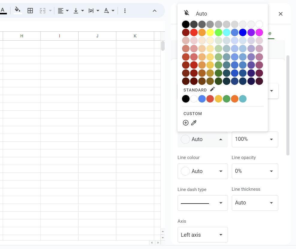
How to Change Chart Color in Google Sheets
STEP-7. Apply and Save the Changes
After adjusting the color you will see the colours of the graph will automatically change ,now you use the same steps to change the color of all the Series in your graph accordingly.
How to Change Chart Color in Google Sheets
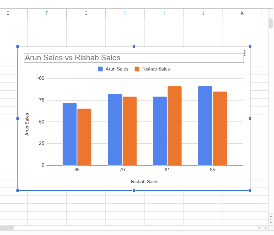
STEP-8. Review your chart.
The Chart will now reflect a new color scheme which you choose and if you’re satisfied with the color scheme of the chart you can close the Chart Editor.
Conclusion:
Google sheets is one of the popular tool for creating and editing spreadsheets and provided many features for data analysis, charting and more. We used Chart Editor for modifying our chart, Chart Editor provided a user-interface for modifying the design , colours, setting, layout of the chart to make it look more visually appealing. Do remember that the steps in this article may slightly differ depending on the version of the Google Sheet you are using but the overall and general process of opening the Chart Editor and customising the color of the chart in customise tab will be same.
FAQ’s
1. What is Charting?
Answer. Charting in Google Sheets means visually representing the data in our spreadsheets in a more interactive and visually appealing using line-charts, bar-charts , pie-chart and more. These charts in our spreadsheets helps us understand the trends and pattern in our data. Google Sheets provides us built-in tools for charting which allows us to create, customise, embed charts in our spreadsheets easily and present our data in a clear and visually appealing manner.
2. What are Series in Charts?
Answer. Series refers to the group of related data that is graphically representing our data in a chart. Each series represents a set of data that we want to compare or analyse in our data. For example if we want to create a bar graph representing amount of sales of different products , then amount of sales of each separate products will be a separate series in the graph.
What is Chart Editor ?
Answer. Chart Editor is a tool in Google Sheets which provides a interactive and user-friendly interface where we can modify the – design , layout, colors of our charts to make it look more visually appealing.
Share your thoughts in the comments
Please Login to comment...