Charts and Graphs for Data Visualization
Last Updated :
10 Apr, 2024
As companies and groups deal with more and more data, it’s crucial to present it visually. Data is everywhere these days, and it can be overwhelming.
This article is your guide to Data Visualization, which is turning all that data into pictures and charts that are easy to understand. Whether you work in business, marketing, or anything else, these charts can help you explain ideas, track how things are going, and make smart choices.
What is Data Visualization?
Data visualization is taking a bunch of numbers and information and turning it into pictures or any kind of charts that are easier to understand. It takes a big pile of information and sorts it into pictures (like bar charts, line graphs, or pie charts) that make it easier to understand or see patterns and trends. Here are some of the things data visualization can help you see:
- How things are changing over time
- How things compare to each other
- Relationships between things
Different Types of Graphs for Data Visualization
Data can be a jumble of numbers and facts. Charts and graphs turn that jumble into pictures that make sense. 10 prime super useful chart types are:
Bar Graphs
Bar graphs are one of the most commonly used types of graphs for data visualization. They represent data using rectangular bars where the length of each bar corresponds to the value it represents. Bar graphs are effective for comparing data across different categories or groups.
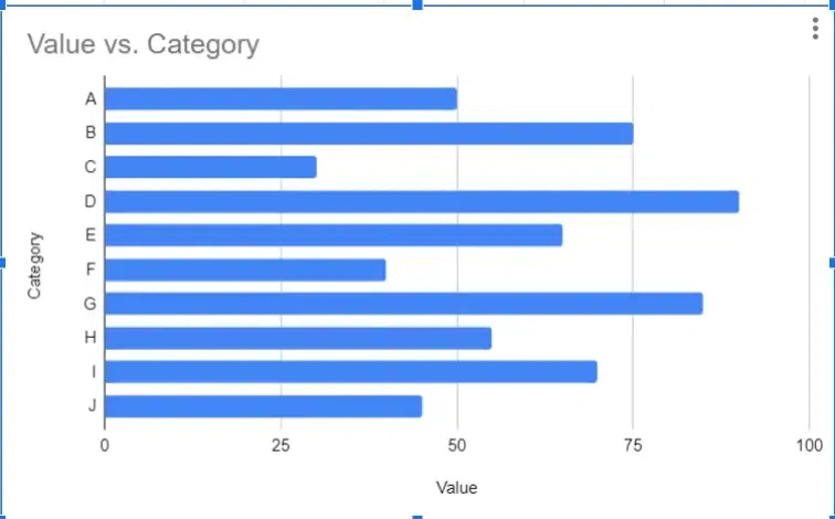
Bar Graph Example
Advantages of Bar Graphs
- Highlighting Trends: Bar graphs are effective at highlighting trends and patterns in data, making it easy for viewers to identify relationships and comparisons between different categories or groups.
- Customizations: Bar graphs can be easily customized to suit specific visualization needs, such as adjusting colors, labels, and styles to enhance clarity and aesthetics.
- Space Efficiency: Bar graphs can efficiently represent large datasets in a compact space, allowing for the visualization of multiple variables or categories without overwhelming the viewer.
Disadvantages of Bar Graphs
- Limited Details: Bar graphs may not provide detailed information about individual data points within each category, limiting the depth of analysis compared to other visualization methods.
- Misleading Scaling: If the scale of the y-axis is manipulated or misrepresented, bar graphs can potentially distort the perception of data and lead to misinterpretation.
- Overcrowding: When too many categories or variables are included in a single bar graph, it can become overcrowded and difficult to read, reducing its effectiveness in conveying clear insights.
Line Graphs
Line graphs are used to display data over time or continuous intervals. They consist of points connected by lines, with each point representing a specific value at a particular time or interval. Line graphs are useful for showing trends and patterns in data. Perfect for showing trends over time, like tracking website traffic or how something changes.
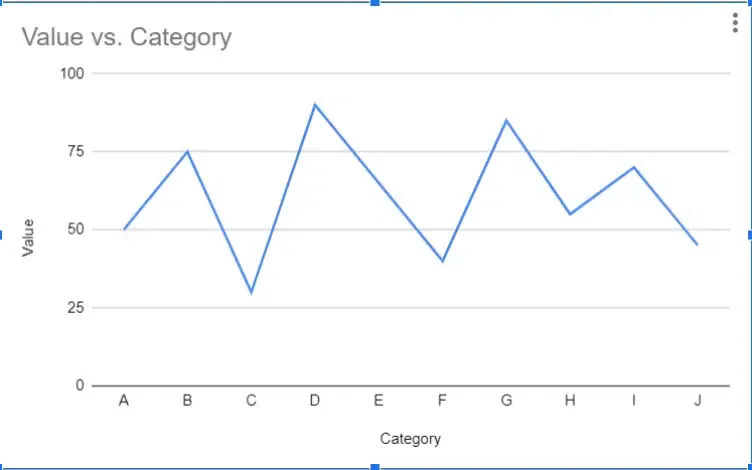
Line Graph Example
Advantages of Line Graphs
- Clarity: Line graphs provide a clear representation of trends and patterns over time or across continuous intervals.
- Visual Appeal: The simplicity and elegance of line graphs make them visually appealing and easy to interpret.
- Comparison: Line graphs allow for easy comparison of multiple data series on the same graph, enabling quick insights into relationships and trends.
Disadvantages of Line Graphs
- Data Simplification: Line graphs may oversimplify complex data sets, potentially obscuring nuances or outliers.
- Limited Representation: Line graphs are most effective for representing continuous data over time or intervals and may not be suitable for all types of data, such as categorical or discrete data.
Different Types of Charts for Data Visualization
Pie Charts
Pie charts are circular graphs divided into sectors, where each sector represents a proportion of the whole. The size of each sector corresponds to the percentage or proportion of the total data it represents. Pie charts are effective for showing the composition of a whole and comparing different categories as parts of a whole.
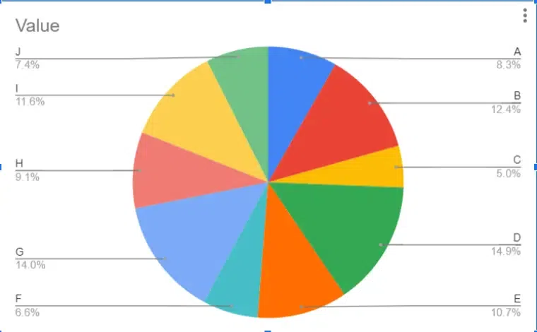
Pie Chart Example
Advantages of Pie Charts
- Easy to create: Pie charts can be quickly generated using various software tools or even by hand, making them accessible for visualizing data without specialized knowledge or skills.
- Visually appealing: The circular shape and vibrant colors of pie charts make them visually appealing, attracting the viewer’s attention and making the data more engaging.
- Simple and easy to understand: Pie charts present data in a straightforward manner, making it easy for viewers to grasp the relative proportions of different categories at a glance.
Disadvantages of Using a Pie Chart
- Limited trend analysis: Pie charts are not ideal for showing trends or changes over time since they represent static snapshots of data at a single point in time.
- Limited data slice: Pie charts become less effective when too many categories are included, as smaller slices can be difficult to distinguish and interpret accurately. They are best suited for representing a few categories with distinct differences in proportions.
Scatter Plots
Scatter plots are used to visualize the relationship between two variables. Each data point in a scatter plot represents a value for both variables, and the position of the point on the graph indicates the values of the variables. Scatter plots are useful for identifying patterns and relationships between variables, such as correlation or trends.
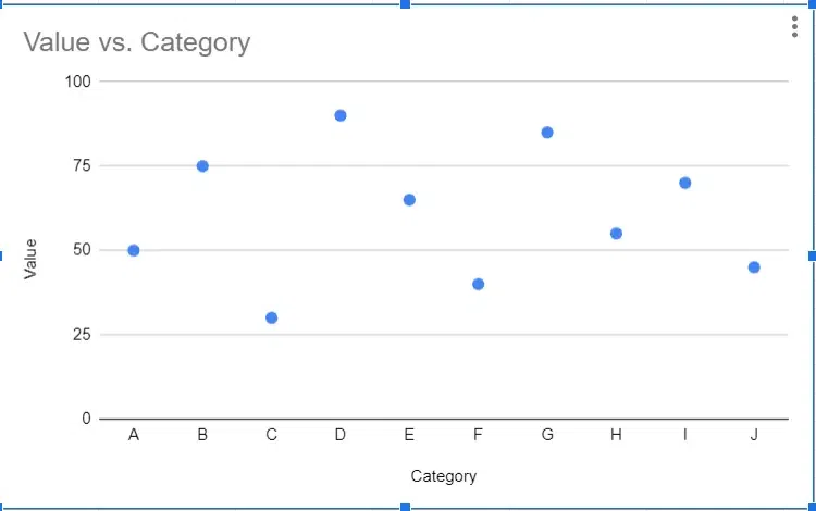
Scatter Chart Example
Advantages of Using Scatter Plots
- Revealing Trends and Relationships: Scatter plots are excellent for visually identifying patterns, trends, and relationships between two variables. They allow for the exploration of correlations and dependencies within the data.
- Easy to Understand: Scatter plots provide a straightforward visual representation of data points, making them easy for viewers to interpret and understand without requiring complex statistical knowledge.
- Highlight Outliers: Scatter plots make it easy to identify outliers or anomalous data points that deviate significantly from the overall pattern. This can be crucial for detecting unusual behavior or data errors within the dataset.
Disadvantages of Using Scatter Plot Charts
- Limited to Two Variables: Scatter plots are limited to visualizing relationships between two variables. While this simplicity can be advantageous for focused analysis, it also means they cannot represent interactions between more than two variables simultaneously.
- Not Ideal for Precise Comparisons: While scatter plots are excellent for identifying trends and relationships, they may not be ideal for making precise comparisons between data points. Other types of graphs, such as bar charts or box plots, may be better suited for comparing specific values or distributions within the data.
Area Charts
Area charts are similar to line graphs but with the area below the line filled in with color. They are used to represent cumulative totals or stacked data over time. Area charts are effective for showing changes in composition over time and comparing the contributions of different categories to the total.
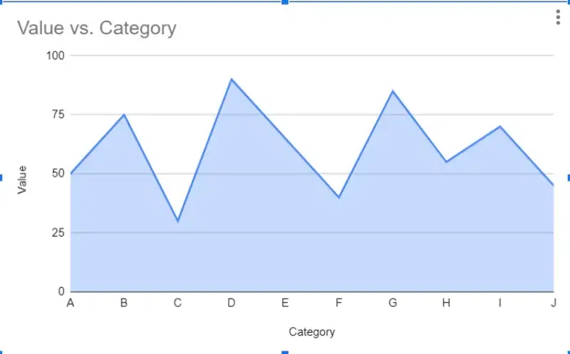
Area Chart Example
Advantages of Using Area Charts
- Visually Appealing: Area charts are aesthetically pleasing and can effectively capture the audience’s attention due to their colorful and filled-in nature.
- Great for Trends: They are excellent for visualizing trends over time, as the filled area under the line emphasizes the magnitude of change, making it easy to identify patterns and fluctuations.
- Compares Well: Area charts allow for easy comparison between different categories or datasets, especially when multiple areas are displayed on the same chart. This comparative aspect aids in highlighting relative changes and proportions.
Disadvantages of Using Area Charts
- Limited Data Sets: Area charts may not be suitable for displaying large or complex datasets, as the filled areas can overlap and obscure details, making it challenging to interpret the data accurately.
- Not for Precise Values: Area charts are less effective for conveying precise numerical values, as the emphasis is on trends and proportions rather than exact measurements. This can be a limitation when precise data accuracy is crucial for analysis or decision-making.
Radar Charts
A radar chart, also known as a spider chart or a web chart, is a graphical method of displaying multivariate data in the form of a two-dimensional chart. It is particularly useful for visualizing the relative values of multiple quantitative variables across several categories. Radar charts compare things across many aspects, like how different employees perform in various skills.
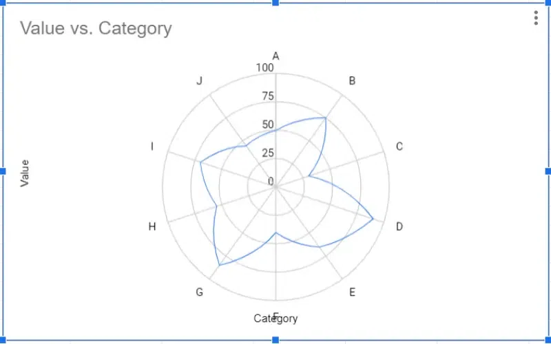
Radar Chart Example
Advantages of Using Radar Chart
- Highlighting Strengths and Weaknesses: Radar charts allow for the clear visualization of strengths and weaknesses across multiple variables, making it easy to identify areas of excellence and areas for improvement.
- Easy Comparisons: The radial nature of radar charts facilitates easy comparison of different variables or categories, as each axis represents a different dimension of the data, enabling quick visual assessment.
- Handling Many Variables: Radar charts are particularly useful for handling datasets with many variables, as each variable can be represented by a separate axis, allowing for comprehensive visualization of multidimensional data.
Disadvantages of Using Radar Chart
- Scaling Issues: Radar charts can present scaling issues, especially when variables have different units or scales. Inaccurate scaling can distort the representation of data, leading to misinterpretation or misunderstanding.
- Misleading Comparisons: Due to the circular nature of radar charts, the area enclosed by each shape can be misleading when comparing variables. Small differences in values can result in disproportionately large visual differences, potentially leading to misinterpretation of data.
Histograms
Histograms are similar to bar graphs but are used specifically to represent the distribution of continuous data. In histograms, the data is divided into intervals, or bins, and the height of each bar represents the frequency or count of data points within that interval.
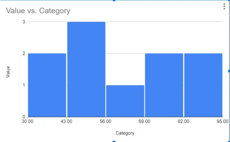
Example of Histogram
Advantages of using Histogram
- Easy to understand: Histograms provide a visual representation of the distribution of data, making it easy for viewers to grasp the overall pattern.
- Identify Patterns: Histograms allow for the identification of patterns and trends within the data, such as skewness, peaks, or gaps.
- Compare Data Sets: Histograms enable comparisons between different datasets, helping to identify similarities or differences in their distributions.
Disadvantages of using Histogram
- Not for small datasets: Histograms may not be suitable for very small datasets as they require a sufficient amount of data to accurately represent the distribution.
- Limited details: Histograms provide a summary of the data distribution but may lack detailed information about individual data points, such as specific values or outliers.
Treemap Charts
Treemap charts are a type of data visualization that represent hierarchical data as a set of nested rectangles. Each rectangle, or “tile,” in the treemap represents a category or subcategory of the data, and the size of the rectangle corresponds to a quantitative value, such as the proportion or absolute value of that category within the dataset.
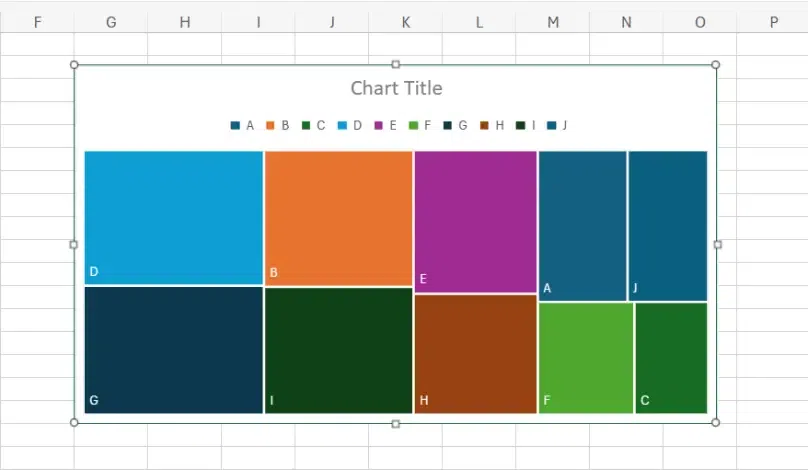
Treemap Charts >>
Advantages of using a Treemap Chart
- Identifying patterns and trends: Treemap charts help in visually identifying patterns and trends within hierarchical data structures by representing data in nested rectangles, making it easier to see how smaller components contribute to the whole.
- Highlighting Proportions: Treemaps effectively highlight proportions by using varying sizes and colors of rectangles to represent different values or categories, making it easy to understand the relative significance of each component.
- Efficient use of space: Treemap charts efficiently utilize space by packing rectangles within larger rectangles, allowing for the visualization of large datasets in a compact and organized manner.
Disadvantages of using a Treemap Chart
- Difficulty comparing exact values: Due to the varying sizes and shapes of the rectangles in a treemap, it can be challenging to accurately compare exact values between different categories or components, especially when the differences are subtle.
- Order dependence: The arrangement of rectangles within a treemap can significantly impact perception. Small changes in sorting or hierarchical structure can lead to different visual interpretations, making it important to carefully consider the ordering of data elements.
Pareto Charts
A Pareto chart is a specific type of chart that combines both bar and line graphs. It’s named after Vilfredo Pareto, an Italian economist who first noted the 80/20 principle, which states that roughly 80% of effects come from 20% of causes. Pareto charts are used to highlight the most significant factors among a set of many factors.
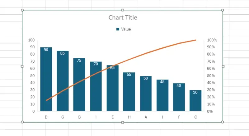
Pareto Chart Example
Advantages of using a Pareto Chart
- Simple to understand: Pareto charts present data in a straightforward manner, making it easy for viewers to grasp the most significant factors at a glance.
- Visually identify key factors: By arranging data in descending order of importance, Pareto charts allow users to quickly identify the most critical factors contributing to a problem or outcome.
- Focus resources effectively: With the ability to prioritize factors based on their impact, Pareto charts help organizations allocate resources efficiently by addressing the most significant issues first.
Disadvantages of Using a Pareto Chart
- Limited Data Exploration: Pareto charts primarily focus on identifying the most critical factors, which may lead to overlooking nuances or subtle trends present in the data.
- Assumes 80/20 rule applies: The Pareto principle, which suggests that roughly 80% of effects come from 20% of causes, is a foundational concept behind Pareto charts. However, this assumption may not always hold true in every situation, potentially leading to misinterpretation or oversimplification of complex data relationships.
Waterfall Charts
Waterfall charts are a type of data visualization tool that display the cumulative effect of sequentially introduced positive or negative values. They are particularly useful for understanding the cumulative impact of different factors contributing to a total or final value.
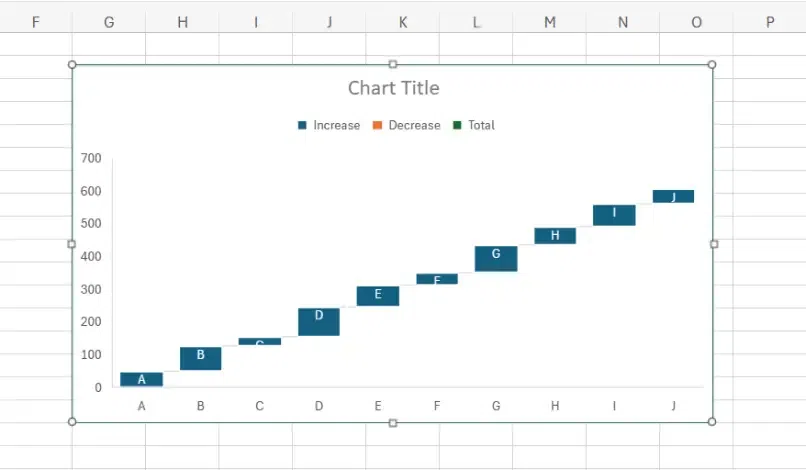
Waterfall Charts Example
Advantages of Using a Waterfall Chart
- Clear Breakdown of Changes: Waterfall charts provide a clear and visual breakdown of changes in data over a series of categories or stages, making it easy to understand the cumulative effect of each change.
- Easy to Identify the Impact: By displaying the incremental additions or subtractions of values, waterfall charts make it easy to identify the impact of each component on the overall total.
- Focus on the Journey: Waterfall charts emphasize the journey of data transformation, showing how values evolve from one stage to another, which can help in understanding the flow of data changes.
Disadvantages of Using a Waterfall Chart
- Complexity with Too Many Categories: Waterfall charts can become complex and cluttered when there are too many categories or stages involved, potentially leading to confusion and difficulty in interpreting the data.
- Not Ideal for Comparisons: While waterfall charts are effective for illustrating changes over a sequence of categories, they may not be suitable for direct comparisons between different datasets or groups, as they primarily focus on showing the cumulative effect of changes rather than individual values.
How to Choose Right Charts or Graphs for Data Visualization?
Choosing the right chart for your data visualization depends on what you want to communicate with your data. Here are some questions provided below to ask yourself before doing Data Visualization,
- How much Data do you have?
- What type of Data are you working with?
- What is the goal of your Visualization?
Also, you can check the general guidelines below to help you pick the right chart type for your reference,
- Distribution of Data
- Relationship between variables
- Comparisons between groups
- Trends over time
- Audience familiarity with different types of Charts and Graphs
Conclusion
The right choice of chart or graph depends on your specific data and the information you want to convey to others. Whether you’re motivating your team, impressing stakeholders, or showcasing your business values, thoughtful data visualization builds trust and drives informed decision-making.
Remember, the key to impactful data visualization lies in choosing the right tool to transform complex data into clear, understanding actionable insights for your audience.
FAQs- Best Types of Charts and Graphs For Data Visualization
Which type of graph is best for data visualization?
The best type of graph depends on the nature of the data. Line graphs are ideal for showing trends over time, bar graphs for comparisons, scatter plots for correlations, and pie charts for proportions.
What type of chart would be best for this visualization?
If you’re comparing categories or groups, a bar chart is often best. It offers a clear visual representation of comparisons between discrete data points.
What are the 4 types of graphs and charts?
- Bar Graph
- Line Graph
- Pie Chart, and
- Area Chart
What are the 4 main visualization types?
Spatial, Temporal, Hierarchical, and Network are the 4 main types of visualizations.
Share your thoughts in the comments
Please Login to comment...