Sometimes while dealing with hierarchical data we need to combine two or more various chart types into a single chart for better visualization and analysis. These are known as “Combination charts”.
In this article, we are going to see how to combine a stacked column chart and a line chart in Power BI. We will also look into Bubble and Waterfall charts. In these types of combination charts, multiple variables are handled. The combination charts are implemented for better visualizations and detailed analysis.
Stacked Column-Line charts show more than two metric values aggregated across a group dimension. They are mostly used for showing 2 quantities alongside with respect to changes over time. The first Y-axis displays as a column, and the second as a line.
Uses and benefits of Line and Stacked column charts
- Quicker comparison of data on 2 measure
- We use it when we have a Line and column chart on the same x-axis.
- We use it whenever we need to correlate and compare two (or more measures) with different value ranges or scales.
- We use it to save space and do easy comparisons with multiple measures.
Bubble Chart
This chart shows the intersections of two numeric values with a bubble, the third dimension is the size of the bubble which is useful for the final evaluation.
When to use bubble Chart:
- Whenever we want to create a relationship between two numeric values with their size.
- The third metric (size) helps in determining the value differences of various intersections.
- It also helps in analyzing financial data.
- To display data with quadrants.
Let’s see the implementation of Stacked column charts first.
The dataset in use: Loan vs Interest rates
The dataset used is DataSet1 and Dataset2. Upload the dataset in Power BI and refer to the dataset to follow along with the below-given sections of the article.
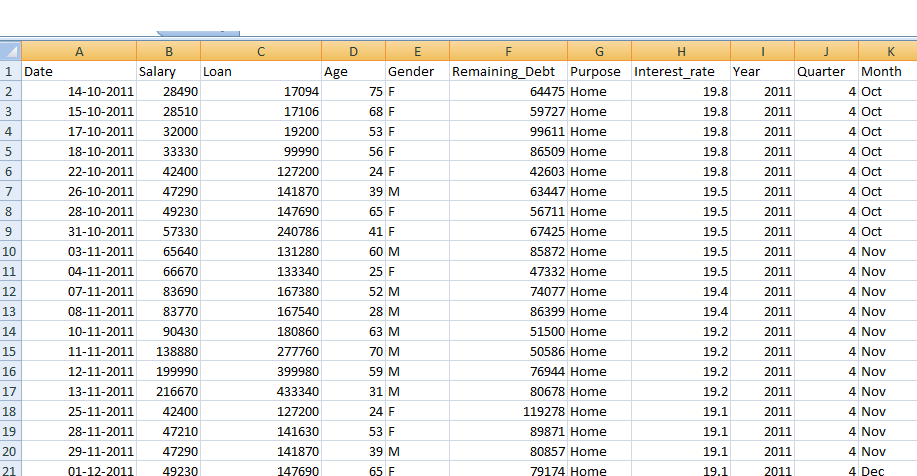
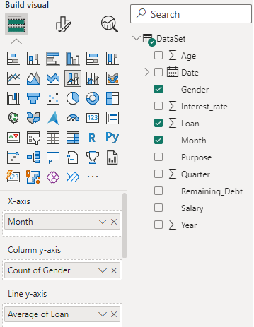
Data: We will be working with “DataSet” data with data fields as shown in the above image. The major variables used to show the charts are as follows. These will be used for Visualization arguments later on.
- Loan: This variable will be used for column values.
- Interest_rate: This variable will be used for line option values. The line values actually hold the average of interest_rate as shown below in the article.
- Date: This variable will be used for the common shared axis. This can be represented in any form like daily date, weekly, monthly, or quarterly as per the preference.
This selection will mean that the loan and the interest rate will be plotted as column and line charts, respectively.
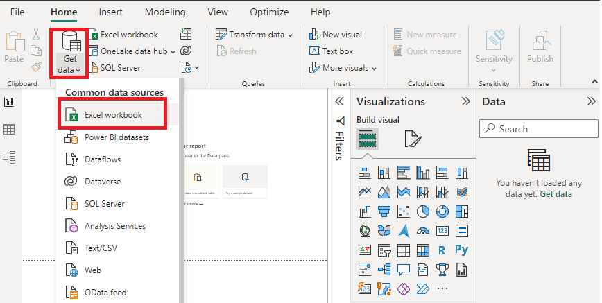
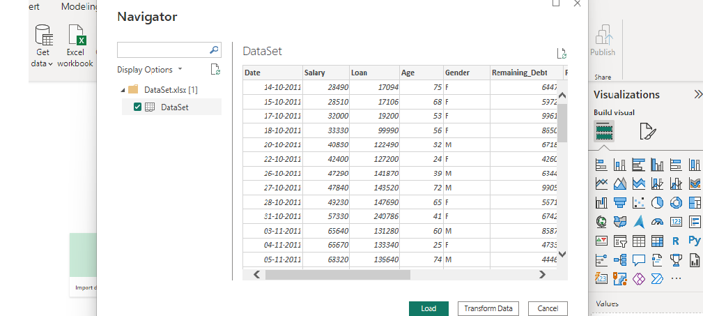
Load Data in Power BI Desktop:
- Click the “Get Data” option and select “Excel” for data source selection and extraction.
- Select the relevant desired file from the folder for data load. In this case, the file is “DataSet.xls”. click the “Load” button once the preview is shown for the Excel data file.
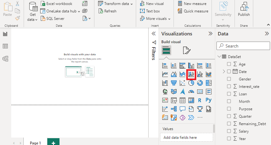
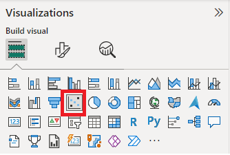
- The dashboard is seen once the file is loaded with the “Visualizations” Pane and “Data fields” Pane which stores the different variables of the data file. Select the red colored box and drag in the main canvas. The red-colored square represents the “Stacked column line” chart.
Click on the format option displayed in the small box in the visualization pane and you will see different options. To show data values in the chart, enable “Data labels”. After setting the options as mentioned in the “Data” section earlier, we get the following output.
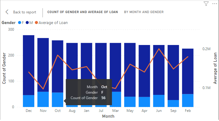
Example 1: The two measures are “Sum of Loan” and “Average of Interest rate” by “Year” and “Gender”. The “Male” and “Female” act as column legends as “Gender” is in the y-axis.
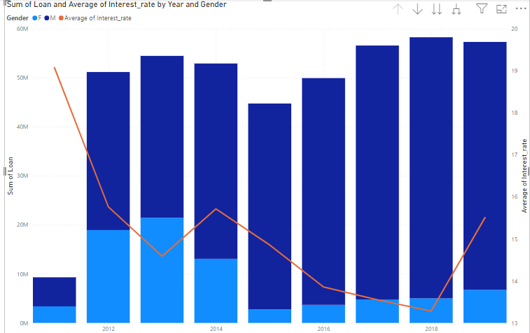
Output:
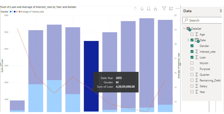
The month of “October” shows 15 female candidates for loans.
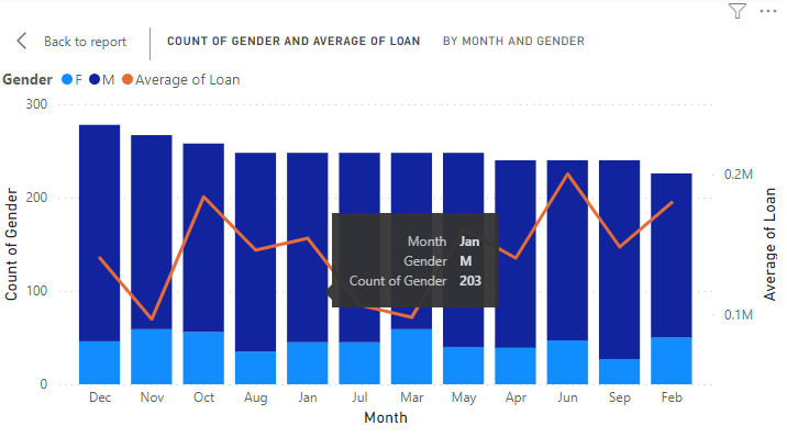
The month of “January” shows 203 male candidates for loans.
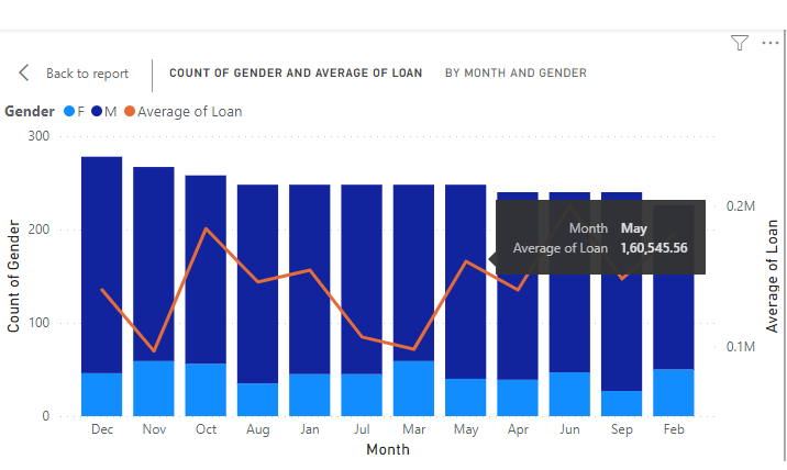
The following shows the “Average of loan” in the month of “May” by using the Line y-axis.
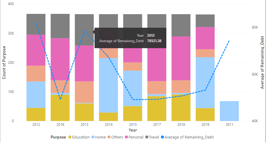
Example 2: The same dataset is used to show another Line and Stacked Column chart with some changes in the x-axis, y-axis, line y-axis, and column legend for a better understanding. Set the Visualization pane as shown below.
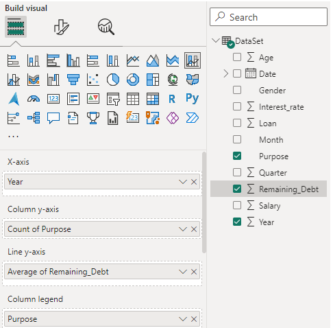
After setting the visual build, we get the following combination chart of Line and Stacked columns. The different colors of the stack represent loans taken for various purposes like “Education”, “home”, “Personal”, “Travel” and “others”. The y-axis shows the total number (count) of purposes in a year. The line in the y-axis shows the average of the remaining debt in different years.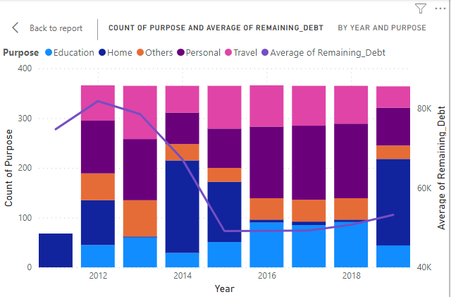
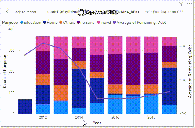
Final Output:
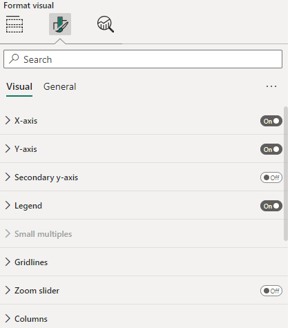
Format your visual:
This chart shows the intersections of two numeric values with a bubble, the third dimension is the size of the bubble which is useful for the final evaluation.
The user or developer can change as per the application report’s need or requirement.
One of the results after formatting the visual is as follows. You can notice the column legends appearing on the bottom center of the page.
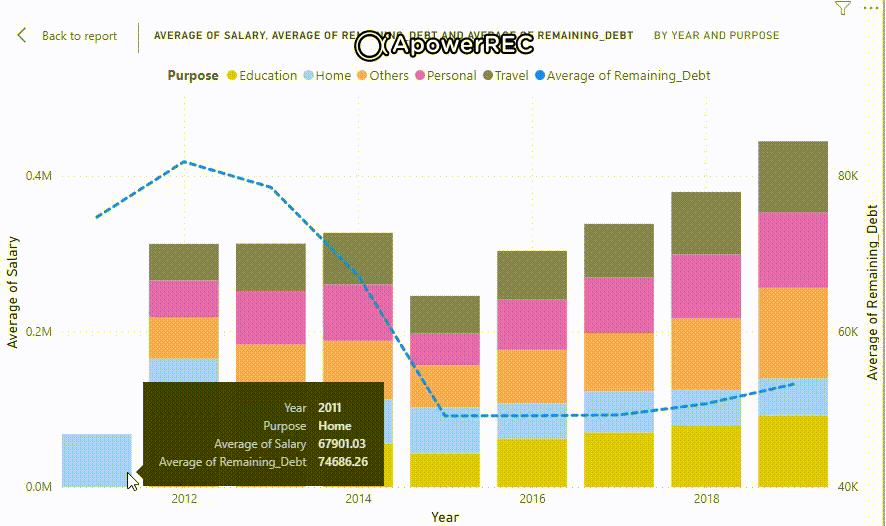
The same chart is shown with different measures like “Average of salary” and “Average of remaining Debt” on the y-axis for different purposes (“Home”, “Education”…) in the form of stacked columns.
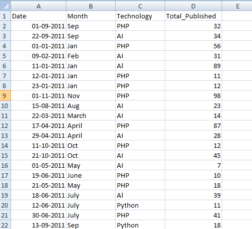
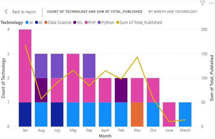
Example 3: The following also demonstrates another Line and Stacked column chart for Total Articles published (for different technologies ) for all the months in a year. The x-axis shows the count of different technologies, the y-axis shows the months, the column legends are technology names stacked on one another and the line shows the total articles published in a month.
Dataset used: “techDataSet.xlsx“
Set Visualization Pane:
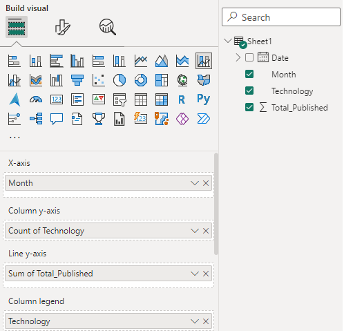
The result shows stacked technologies (legend columns) and their number of articles (line y-axis) published in any month (x-axis). The y-axis shows the “count of technology” as it shows the count for any one technology namely “AI”, “Data Science”, “PHP” and so on.
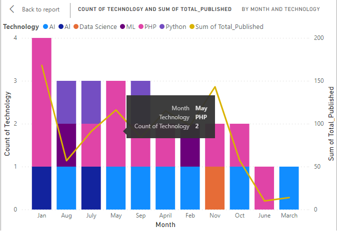
On hovering on the month “May”, the count for “PHP” technology is 2 which means 2 dates show articles submission based on “PHP”.
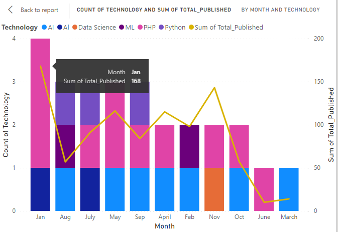
On hovering on the month “Jan”, the sum of total_published articles (based on PHP and AI) is 168.
Example 4: We will demonstrate a bubble chart for the following dataset.
DataSet Used:
The dataset used is “SaleData“. Upload the dataset in Power BI and refer to the dataset to follow along with the below-given sections of the article.
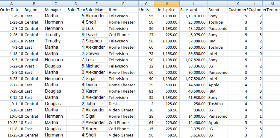
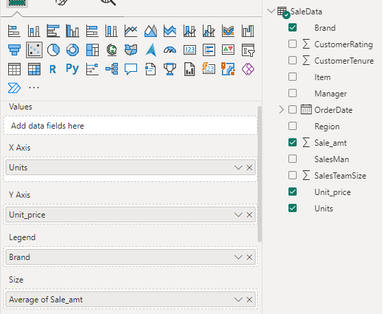
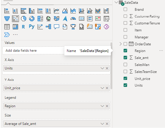
Data: We will be working with “SaleData” data with data fields as shown in the above image. The major variables used to show the charts are as follows.
- Units: This is the data field used in the x-axis for showing the number of units taken.
- Unit_price: This is the data field used in the y-axis for showing the price of one unit of any item.
- Brand: This is the parameter used for showing colorful legends representing various item brands.
- Sale_amt: This is the data field used for the size of the bubble. The average of Sale_amt is taken for this metric.
The dashboard is seen once the file is loaded with the “Visualizations” Pane and “Data fields” Pane which stores the different variables of the data file. The red icon is used for bubble or scatter charts. Drag the icon to the main canvas for showing or building the visuals.
As mentioned earlier, the different axis is set by dragging the data fields.
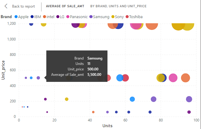
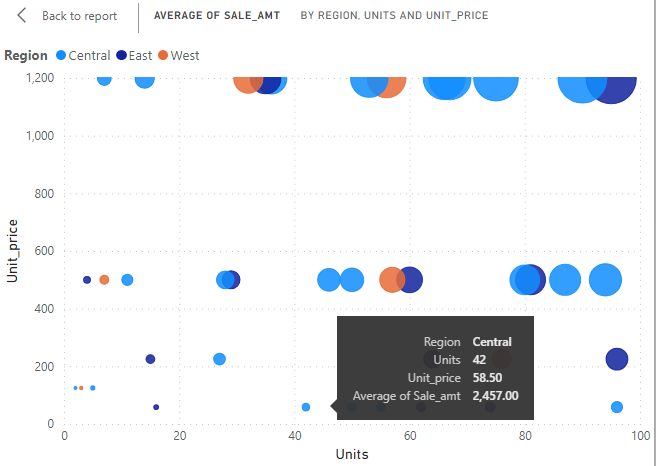
Bubble Chart in Power BI: The following shows the Average of Sale_amt for different item brands by units and their prices. The size of a bubble is directly proportional to the average Sale_amt.
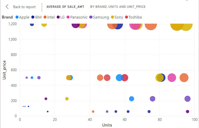
On hovering over any bubble, it displays all the needed metrics for analysis.
All of the above steps are applied to “Region” as well. The “Visualizations” pane is set with the same x-axis, y-axis, and Size. This time the “Legend” is set to “Region” so as to build a visual based on different regions namely “Central”, “East” and “West”.
Output:
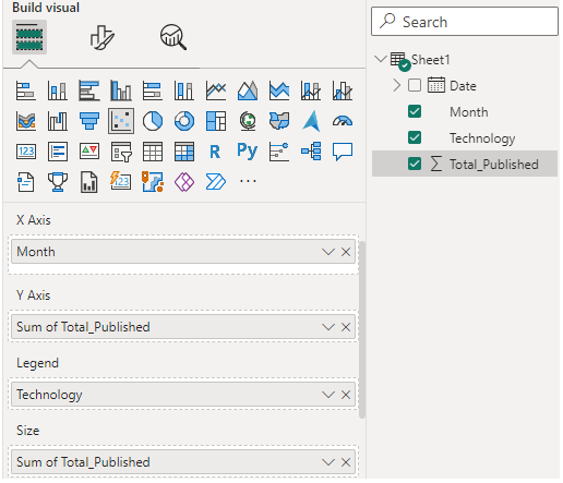
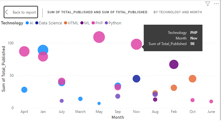
Example 5: The following also demonstrates another bubble chart for Total Articles published (for different technologies shown with different colors ) for all the months in a year. The x-axis shows the months, the y-axis shows the total articles published in a month and the size of the bubble shows the total articles published based on both.
Set Visualization Pane:
The result shows colored bubbles (legend) and the number of articles (line y-axis) published in any month (x-axis). The y-axis shows the “Total_Published” as it shows the count for any one technology namely “AI”, “Data Science”, HTML”, “ML”, “PHP”, or “Python” published in any particular month.
The following shows the total number of articles published in the month of “March” is 14 which is based on “AI” technology.
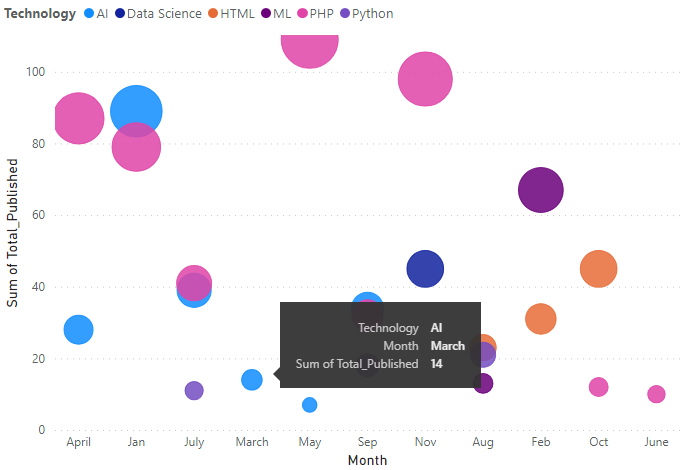
The following shows the total number of articles published in the month of November is 98 which were based on the “PHP” technology.
Waterfall Chart
These are also called Bridge charts showing the running total of a set of added and subtracted values. The waterfall charts have color-coded columns to represent the increase or decrease of values in an easy manner. It shows how an initial value is affected by changes in the chart denoted by a column or vertical bar. The intermediate values can fluctuate between initial and final values.
When to use Waterfall charts:
- To show changes in data across time or some different categories.
- To show major incremental or decremental changes that contribute to a total value.
- To analyze data based on profit or loss scenarios like the annual profit of a company.
- To represent the beginning and end of some count scenarios.
- When we want to analyze actual values and targeted ones over time.
Common Examples:
- Monthly spending or Savings of a household.
- Annual Profit or Total Revenue generated in a company.
Note: The same steps are to be taken as shown earlier in the “Bubble chart” section for opening the Power BI desktop and navigating the data source before loading it.
When the “Visualizations” pane is opened, use the following icon for implementing the waterfall chart into the Power BI canvas.
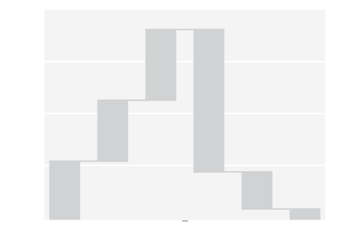
Initial Canvas:
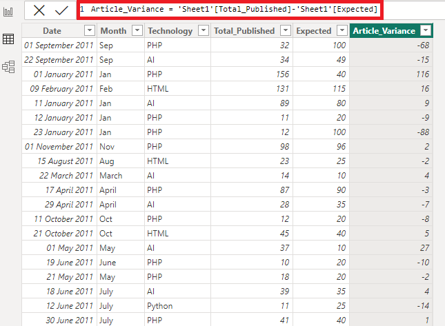
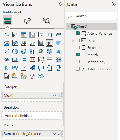
DataSet used: We will be working with “techPublishedDataSet” data with data fields as shown in the image. The major variables used to show the charts are as follows.
- Month: This is the data field used in the x-axis for showing the months of a year.
- Article_variance: This is the parameter used for showing the y-axis. Article_variance is the new column created that shows the value of (Total_Published – Expected) articles.
Dataview in Power BI desktop: ‘Sheet1’ is the sheet of the “techPublishedDataSet.xlsx” file.
Set the Visualization Pane: “Sum of Article_variance” is taken in the y-axis as we are taking the summation of total published articles including all different technologies in any given month.
Output:
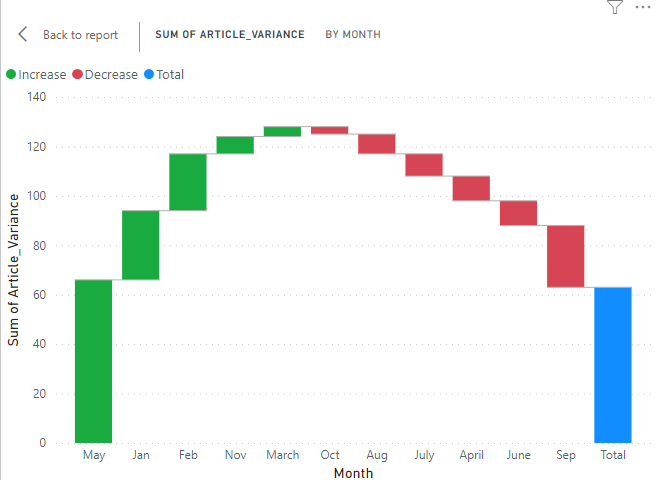
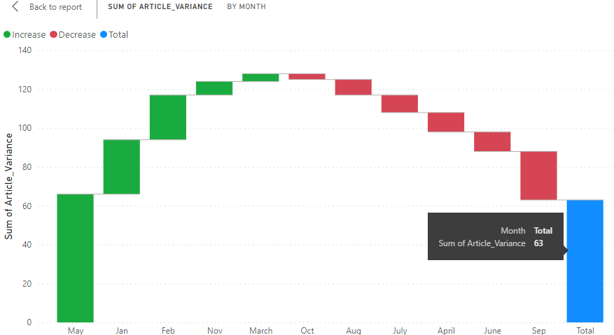
On hovering on any column:
Conclusion: This type of chart represents multivariate insights in the form of a Report view. The user or developer can visualize measures that belong to different scales in e-commerce, retail, manufacturing, and almost every industry for better monitoring of business.
Share your thoughts in the comments
Please Login to comment...