Power BI – Ribbon Charts and Multi-Row Card Visualization
Last Updated :
25 Sep, 2023
In this article, we will learn to implement basic ribbon charts and multi-row card visualization using Power BI. This discusses some important concepts used to create the very common bar and column charts so as to make large business intelligence decisions. We will be discussing the following topics and their implementation in the Power BI desktop.
Ribbon Chart: The Ribbon chart shows multiple categories (ribbons) showing increases or decreases of values in a single visualization. It discovers which category has the highest value or rank. A ribbon illustrates how the value of a category changes over a time period.
Data Ribbon charts are effective at showing how rank can change. The ribbon for the highest value rank is always shown on top of the other categorical ribbons for each time period.
Pre-requisite: You can refer to Power BI interactive dashboards for easy implementation of the following charts.
DataSet used: We will be using “SaleData.xlsx” for the following demonstration. Upload the dataset in Power BI and refer to the dataset to follow along with the below-given sections of the article.
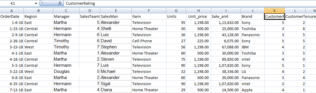
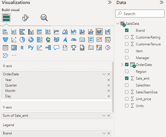
Data: We will be working with “SaleData” data with data fields as shown in the above image. The major variables used to show the charts are as follows.
SaleData: It will show how a brand ranks throughout the time period or timeline.
- OrderDate: This is the category of the date that is shown in the x-axis initially. This is the variable for which the sale is shown in the form of ribbons.
- SaleAmt: This is the total sale amount (shown in the y-axis) for any particular item, brand, or region.
- Brand: This is one of the fields for which the total sale amount is shown. Represented in the form of colorful legends. Legends are the property used to sub-categorize or sub-group the data for better analytics
- Item: This is another field for which the total sale amount is shown. It represents the different items like “Television”, “Home theatre”, and “Cell Phone” for which the sale data is shown.
- Region: Whether the sale is in the “East”, “West” or “Central” region.
Load Data in Power BI Desktop:
Step 1: Open Power BI Desktop
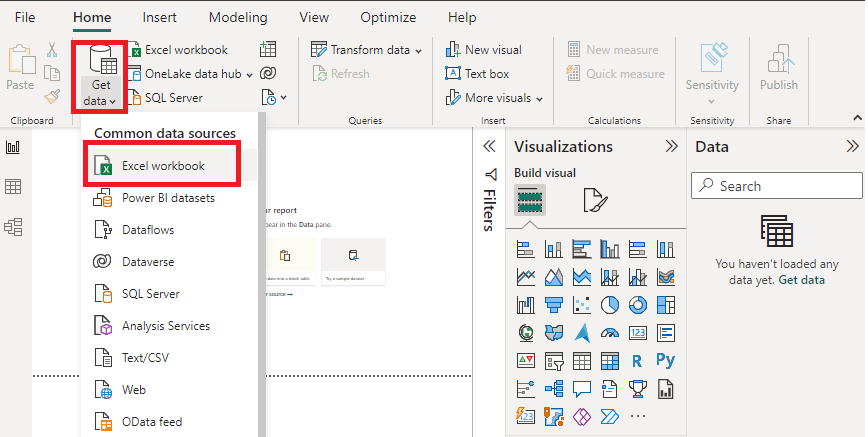
Step 2: Click the “Get Data” option and select “Excel” for data source selection and extraction.
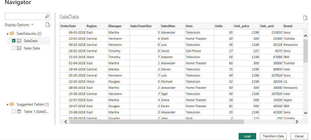
Select the relevant desired file from the folder for data load. In this case, the file is “SaleData.xls”. click the “Load” button once the preview is shown for the Excel data file.
The dashboard is seen once the file is loaded with the “Visualizations” Pane and “Data fields” Pane which stores the different variables of the data file.
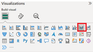
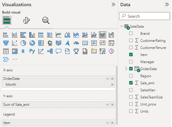
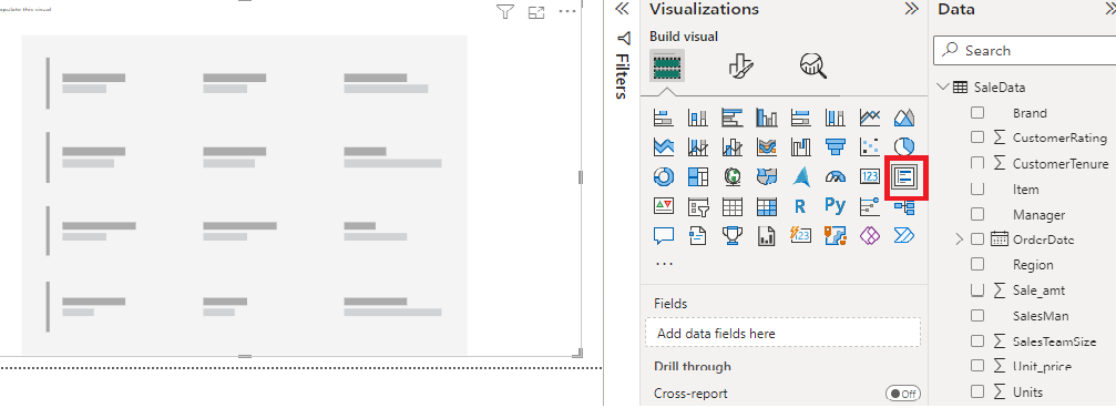
In the “Visualizations” pane, we can select the chart type needed for our visual representation of business data. In the following image, the red-colored square represents the “ribbon” chart that can be dragged for the “Report” view for further process.
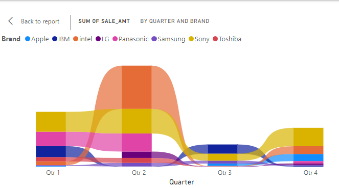
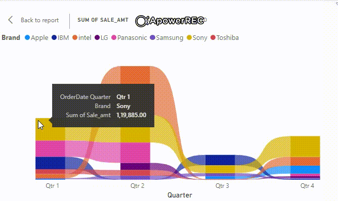
The following image shows the total sale amount of different brands for each quarter. The different colors show different item brands as legends.
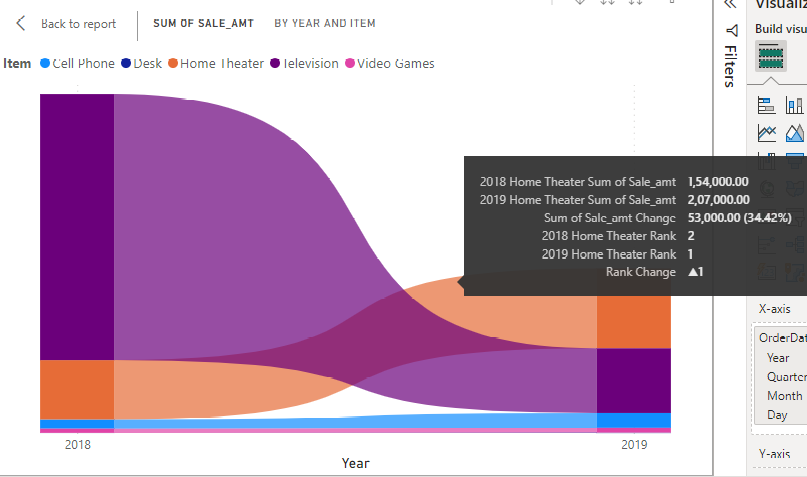
This image shows the same for both the years 2018 and 2019, the user can change the visualization pane and its setting as per the need and get results according to it.
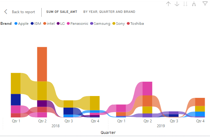
Output: You can see the change in the rank as the sale amount increases or decreases.
The following settings are changed to get the output based on different items.
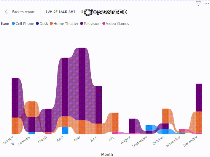
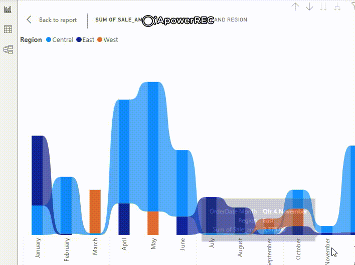
The following shows the ribbon chart for the total Sale amount by month and item. We can format ribbon charts by using the link.
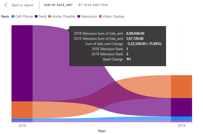
The image shows the change in rank for the “Home Theatre” item and its total sale amount in both years.
The image shows the change in rank for the “Television” item and its total sale amount in both years.
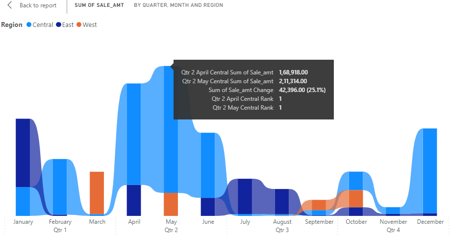
The following shows the same result for different regions. The highest sale amount is in the second quarter (“April”, “May”) in the “Central” region.
Output:
Multi-Row Card Visualization: These are card visualization of data grouped in multiple rows. The multi-row card visuals are commonly used to track total sales, total opportunities, and market shares. For a single category or field, multiple metrics or KPIs are displayed side by side.
DataSet Used: We will be using the same dataset used in the “Ribbon Chart” section. The same steps can be followed for setting the visualization pane and loading the Excel data file using the navigator.
Initial Canvas: The red-colored icon is used for multi-row card visuals.
When we drag the Sale_amt, Unit_price, and units to the fields of the visualization pane, we get the following result. We can see multi-row cards for different items showing the total reports for sale_amt, units sold, and prices.
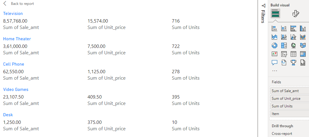
The following shows different items with details like the price of one unit (For any item displayed in separate rows), total units sold ( Sum of Units ), and total sale amount (Sum of Sale_amt) for the item (displayed in light blue).
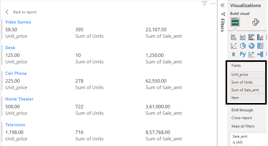
The user can set different fields in the visual pane to get different results for analysis.
Share your thoughts in the comments
Please Login to comment...