Radar Chart or Spider Chart in Excel
Last Updated :
24 May, 2021
Radar Chart is a pictorial representation of multivariate data. Multivariate data analysis in statistics is nothing but dealing with more than one outcome or observations. Radar graphs can be of two dimensions, three dimensions, or more on the basis of the multiple comparable variables used. The variables are represented on the axis starting from the same points with equal intervals on the axes. The number of axes in a radar graph solely depends on the number of variables used.
The Radar Chart has various other names like spider chart, web chart, spider web chart, cobweb chart, irregular polygon, star chart, Kiviat Diagram, etc. The data from the observations in the form of tables are plotted on each axis and by joining all these points in the axes a polygon type structure is formed. So, the number of polygons is dependent on the number of observations.
In this article, we will see how to plot a Radar Chart in Microsoft Excel for a given data set using two examples.
Example 1 : Consider the table shown below which consists of the data of two Geek students who enrolled in our various courses. Our mentors have rated them on the basis of the student’s performance in the individual course. The rating is on a scale of 0 to 5. The demonstration is done in Microsoft Excel Version 2010.
|
Students Performance in GeeksforGeeks
(Scale 0-5, 5 is the maximum rating)
|
| Courses |
Parvez |
Sonia |
| 1. Data Structures Algorithms |
4 |
3 |
| 2. C++ |
5 |
5 |
| 3. JAVA |
3 |
4 |
| 4. Python |
4 |
3 |
| 5. Web Design |
3 |
3 |
| 6. Machine Learning Basics |
2 |
3 |
Implementation :
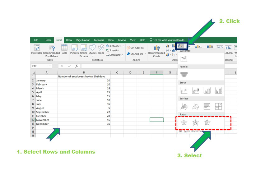
Step 1: Make the above dataset in MS Excel. There should be three columns and six rows. Now select all the rows and columns and click on the “Insert” button as shown below. Then click on the “Other Charts” followed by Radar.
Select -> Insert -> Other Charts -> Radar
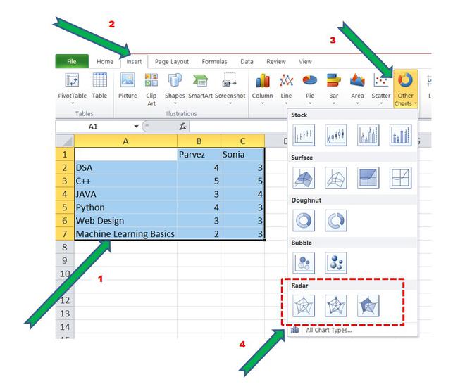
Creating a Radar Chart
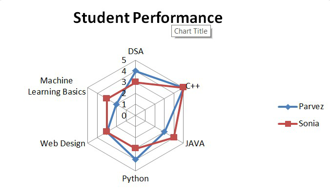
Step 2: There are basically three types of Radar Charts in SQL. They are “Radar”, “Radar with Markers”, “Filled Radar”. Let’s select normal radar and observe the chart for the given dataset.
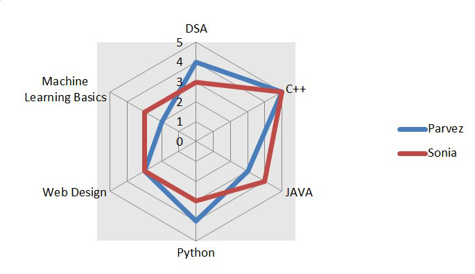
Radar Chart
We can observe that two polygons are formed by joining all the data points in the axes. The blue polygon depicts the performance of Parvez in the courses and similarly, the dark red polygon is about Sonia’s performance.
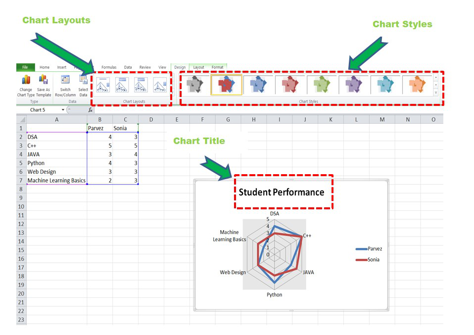
Step 3: Now, we can perform various format operations and make the chart more informative and beautiful by adding titles and changing color. We can select from various chart layouts and styles according to our requirements. To add Title, select the first option from the “Chart Layout” option as highlighted in the image below and add a suitable title.
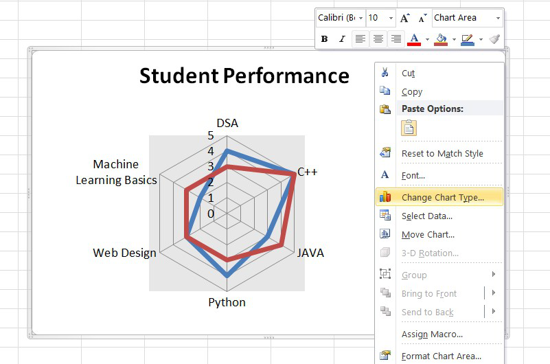
Unlike Excel Version 2016 or higher, there is no direct drop-down menu to format the graph. So, just right-click on the point in the chart which needs to be formatted.
To perform more operations like changing the color, increasing the font, etc. simply right-click and do the formatting.
Formatting the Radar Chart
Step 4: Now to change the Radar type, right-click on the chart and select the “Change Chart Type” option and then select the Radar with marker chart or Filled Radar Chart.
Radar Chart with Marker
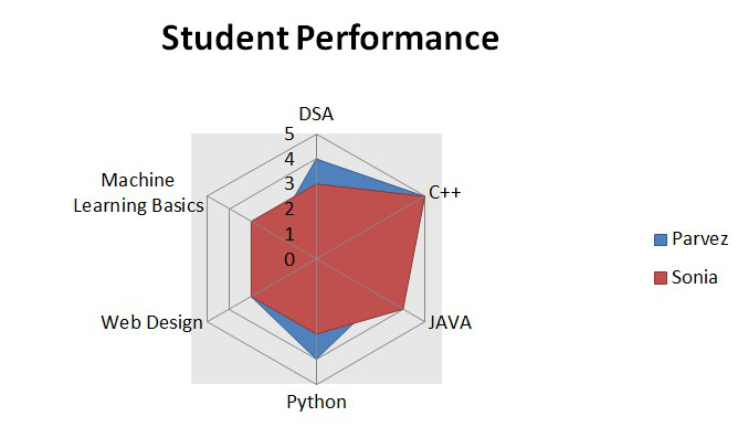
Filled Radar Chart
The above two polygons are equally likely. Their size and shape almost the same which infer that both have similar performance in the courses. Geek Parvez got better ratings in DSA and Python courses and in Java Geek Sonia got better ratings than Parvez. Similarly, we can do comparative analysis on the basis of the polygons formed.
Now let’s take a second example and see how we can make a Radar Chart in Excel 2016 version or higher.
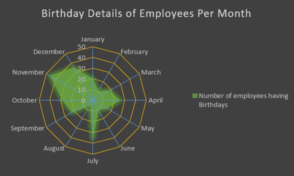
Example 2: Consider the table shown below which consists of the data about the count of the number of employees having birthdays per month.
| Birthday Details of Employees in an organization every month |
| Month |
Number of Employees |
| January |
20 |
| February |
10 |
| March |
18 |
| April |
25 |
| May |
15 |
| June |
10 |
| July |
35 |
| August |
5 |
| September |
22 |
| October |
28 |
| November |
46 |
| December |
35 |
Implementation :
Step 1: It is exactly the same as above. The only difference would be the change of icon for adding the Radar Chart as shown below :
Creating Radar Chart
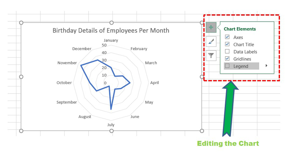
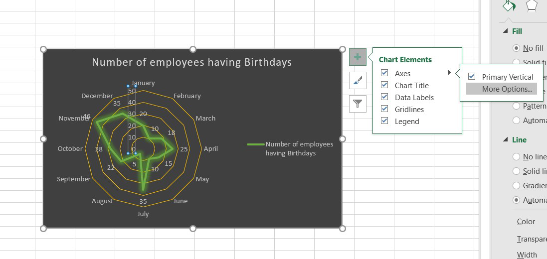
Step 2: The chart will be formed and now various formatting operations can be done as shown. Click on the ” [+] ” symbol in the top right corner for adding titles, legends, formatting, etc.
For formatting, select the chart and then click on the chart elements needed to be formatted and then click on More Options.
Select Chart -> Click on Plus Button -> Click on Chart Elements ->
Click on the Black arrow beside the Chart element to be edited   -> Click More Options -> Format Window Opens
Radar Chart
Step 3: A suitable Chart Style can be selected from the menu in the top right corner of the chart.

Step 4: Axis can be modified using the format window as discussed above. The gridlines on the axes can be added by clicking on Radar (Value) Axis in the Format Axis window and then make the line “Solid Line”.
Opening the Format Window
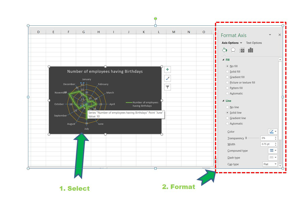
Formatting the Axis
Step 5: Some other modifications can be done in the above chart according to one’s requirements. Now, we can also change the Radar Type as discussed in Example 1.
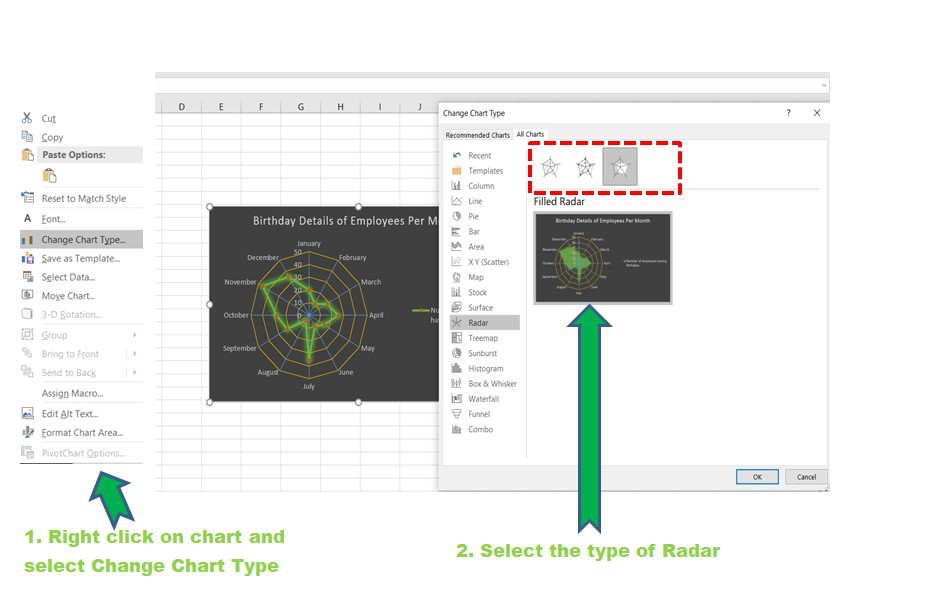
Radar Type
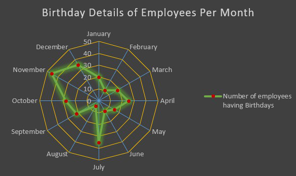
Finally, after all the modifications and addition of legends, titles, type the chart looks like :
Marked Radar Chart
Filled Radar Chart
From the polygon, we can infer that the maximum employees birthdays fall in the month of November and the minimum in the month of August.
Disadvantage of Radar Chart :
The major flaw is when the number of axes and variables increases the number of polygons also increases. So, the spider chart becomes confusing and crowded with data as shown below. There is a high chance that a lot of polygons will overlap with each other. This will prohibit doing correct comparative analysis. It is recommended to keep few variables for forming polygons and few axes for better inferences from the chart.
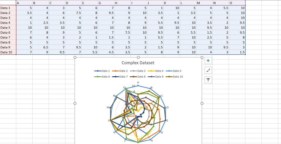
Complex Radar Chart
Share your thoughts in the comments
Please Login to comment...