Bootstrap 4 | Grid System
Last Updated :
28 Apr, 2022
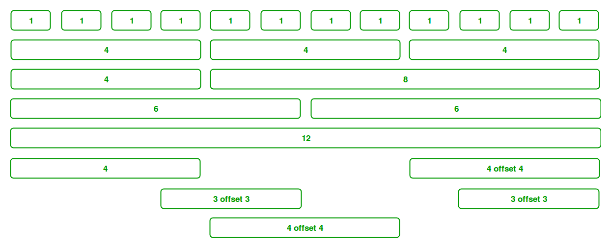
Bootstrap Grid System allows up to 12 columns across the page. You can use each of them individually or merge them together for wider columns. All combinations of values summing up to 12 can be used.
Grid Classes: Bootstrap grid system contains five classes which are listed below:
- .col- It is used for extra small screen devices (screen width less than 576px).
- .col-sm- It is used for small screen devices (screen width greater than or equal to 576px).
- .col-md- It is used for medium screen size devices (screen width greater than or equal to 768px).
- .col-lg- It is used for large screen size devices (screen width greater than or equal to 992px).
- .col-xl- It is used for xlarge screen size devices (screen width equal to or greater than 1200px).
Components of Grid System:
- Containers: Bootstrap requires a containing element to wrap site contents in a grid system. The word container is used to contain the row elements and row elements containing the column elements.
- Rows: Rows must be placed within the container or container-fluid for proper alignment and padding. Rows are used to create horizontal groups of columns.
- Columns: Grid columns are created by specifying the number of twelve available columns you wish to span. For example, three equal columns would use three col-lg-4.
Example 1: This example uses bootstrap to create an equal width column grid on all devices and screen widths.
HTML
<!DOCTYPE html>
<html lang="en">
<head>
<title>Bootstrap Grid System</title>
<meta charset="utf-8">
<meta name="viewport"
content="width=device-width, initial-scale=1">
<link rel="stylesheet" href=
<script src=
</script>
<script src=
</script>
<script src=
</script>
<style>
.col {
text-align: center;
border: 1px solid black;
}
</style>
</head>
<body>
<div class="container">
<div class="row">
<div class="col">
column 1
</div>
<div class="col">
column 2
</div>
<div class="col">
column 3
</div>
</div>
</div>
</body>
</html>
|
Output:

Example 2: This example uses bootstrap to create equal width responsive column grid. When the screen size is less than 576px the column automatically stack to each other.
HTML
<!DOCTYPE html>
<html lang="en">
<head>
<title>Bootstrap Grid System</title>
<meta charset="utf-8">
<meta name="viewport"
content="width=device-width, initial-scale=1">
<link rel="stylesheet" href=
<script src=
</script>
<script src=
</script>
<script src=
</script>
</head>
<body>
<div class="container"><br>
<div class="row">
<div class="col-sm-4"
style="background-color:green;">
column 1
</div>
<div class="col-sm-4"
style="background-color:yellow;">
column 2
</div>
<div class="col-sm-4"
style="background-color:red;">
column 3
</div>
</div>
</div>
</body>
</html>
|
Output:
- Run-on large screen (Desktop, tablets):

- Run-on small screen (mobile):

Example 3: This example uses bootstrap to create unequal width responsive column grid. When the screen size is less than 576px the column automatically stack to each other.
HTML
<!DOCTYPE html>
<html lang="en">
<head>
<title>Bootstrap Grid System</title>
<meta charset="utf-8">
<meta name="viewport"
content="width=device-width, initial-scale=1">
<link rel="stylesheet" href=
<script src=
</script>
<script src=
</script>
<script src=
</script>
</head>
<body>
<div class="container"><br>
<div class="row">
<div class="col-sm-4"
style="background-color:green;">
column 1
</div>
<div class="col-sm-8"
style="background-color:yellow;">
column 2
</div>
</div>
</div>
</body>
</html>
|
Output:
- Run-on large screen (Desktop, tablets):

- Run-on small screen (mobile):

Supported Browser:
- Google Chrome
- Internet Explorer
- Firefox
- Opera
- Safari
Share your thoughts in the comments
Please Login to comment...