Visualizing Google Forms Data with Matplotlib
Last Updated :
03 Jan, 2023
In this article, we will see how can we visualize the data of google forms with the Matplotlib library. Matplotlib is a comprehensive library for creating static, animated, and interactive visualizations in Python. It is a plotting library for the Python programming language and its numerical mathematics extension NumPy. For this article, you must have basic knowledge of the Matplotlib library to plot your custom graphs and charts according to your data.
Visualizing Google Forms Data with Matplotlib
If you had not installed the Matplotlib library you can install it using the pip command as follows:
pip install matplotlib
Download the data from your google form.
- Go to your forms response section.
- Click on the three dots.
Click on the Download Responses button.
After that, your form data will be downloaded as a zip file. The form data downloaded is in a zip file use a built-in application or any third-party application to extract the data from the file. Import Matplotlib and pandas modules to visualize data and read the CSV file of forms data respectively.
This step of data visualization totally depends on you and the type of your data, you can plot any graph or chart according to your data and requirements, but you must have basic knowledge of the Matplotlib library to plot your own graphs check out this article if you are a neophyte else you can proceed and plot your data according to your requirement. In this article, we have multiple column values and different types of data which you can see below image you can download the below dataset along with the source code from here.
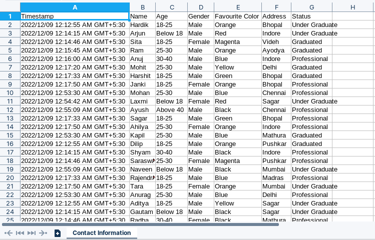
Data collected by Google Forms
Plotting a Bar Graph
We will plot a bar graph by using two variables through which we visualize the age distribution according to the gender in our dataset.
Python3
import matplotlib.pyplot as plt
import pandas as pd
import numpy as np
df = pd.read_csv('Contact Information.csv')
BoysAge = [0]*5
GirlsAge = [0]*5
for gender, age in zip(df['Gender'], df['Age']):
if gender == 'Male':
if age == 'Below 18':
BoysAge[0] += 1
elif age == '18-25':
BoysAge[1] += 1
elif age == '25-30':
BoysAge[2] += 1
elif age == '30-40':
BoysAge[3] += 1
else:
BoysAge[4] += 1
else:
if age == 'Below 18':
GirlsAge[0] += 1
elif age == '18-25':
GirlsAge[1] += 1
elif age == '25-30':
GirlsAge[2] += 1
elif age == '30-40':
GirlsAge[3] += 1
else:
GirlsAge[4] += 1
AgeCategory = ['Below 18', '18-25', '25-30', '30-40', '40+']
width = 0.4
values = np.arange(len(AgeCategory))
fig, axis = plt.subplots()
axis.bar(values, BoysAge, label='Boys', width=width)
axis.bar(values+width, GirlsAge, label='Girls', width=width)
axis.set_title('Age distribution according to gender')
axis.legend(loc='upper right')
axis.set_xlabel('Age Distribution')
axis.set_ylabel('Number of persons')
plt.sca(axis)
plt.xticks(values+0.2, AgeCategory)
plt.show()
|
Output:
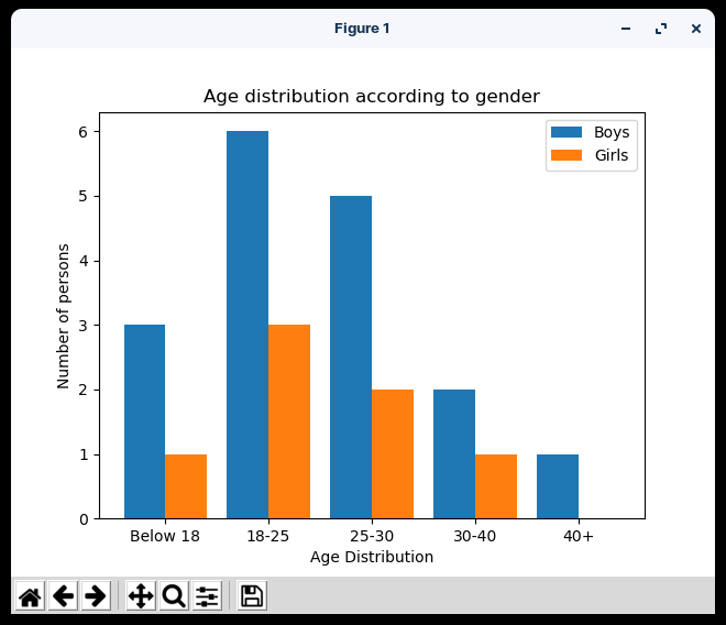
Bar Chart to show the Age Distribution
In the above code, we have imported the required modules Matplotlib, pandas, and NumPy, then fetch the age distribution of boys and girls separately and stored them in a separate list then stored the age category in a separate list and finally plotted the graph on the same plot and set some additional parameters like title, x-axis label, y-axis label, legends and at last show the graph using show() method.
Plotting Line Chart
We will plot a line chart by using multiple variables through which we visualize the status of a person in the city whether it’s Professional, Graduate, or Under Graduate.
Python3
fig, axis = plt.subplots()
cities = sorted(list(set(df['Address'])))
underGrad = [0]*len(cities)
grad = [0]*len(cities)
prof = [0]*len(cities)
for status, city in zip(df['Status'], df['Address']):
if status == 'Under Graduate':
if city == cities[0]:
underGrad[0] += 1
elif city == cities[1]:
underGrad[1] += 1
elif city == cities[2]:
underGrad[2] += 1
elif city == cities[3]:
underGrad[3] += 1
elif city == cities[4]:
underGrad[4] += 1
elif city == cities[5]:
underGrad[5] += 1
elif city == cities[6]:
underGrad[6] += 1
elif city == cities[7]:
underGrad[7] += 1
elif city == cities[8]:
underGrad[8] += 1
elif city == cities[9]:
underGrad[9] += 1
else:
underGrad[10] += 1
elif status == 'Graduated':
if city == cities[0]:
grad[0] += 1
elif city == cities[1]:
grad[1] += 1
elif city == cities[2]:
grad[2] += 1
elif city == cities[3]:
grad[3] += 1
elif city == cities[4]:
grad[4] += 1
elif city == cities[5]:
grad[5] += 1
elif city == cities[6]:
grad[6] += 1
elif city == cities[7]:
grad[7] += 1
elif city == cities[8]:
grad[8] += 1
elif city == cities[9]:
grad[9] += 1
else:
grad[10] += 1
else:
if city == cities[0]:
prof[0] += 1
elif city == cities[1]:
prof[1] += 1
elif city == cities[2]:
prof[2] += 1
elif city == cities[3]:
prof[3] += 1
elif city == cities[4]:
prof[4] += 1
elif city == cities[5]:
prof[5] += 1
elif city == cities[6]:
prof[6] += 1
elif city == cities[7]:
prof[7] += 1
elif city == cities[8]:
prof[8] += 1
elif city == cities[9]:
prof[9] += 1
else:
prof[10] += 1
axis.plot(cities, underGrad, label='UnderGrad')
axis.plot(cities, grad, label='Graduated')
axis.plot(cities, prof, label='Professional')
axis.legend(loc='upper right')
axis.set_title('Status distribution of people according to cities')
axis.set_xlabel('Cities')
axis.set_ylabel('Number of persons')
plt.show()
|
Output:
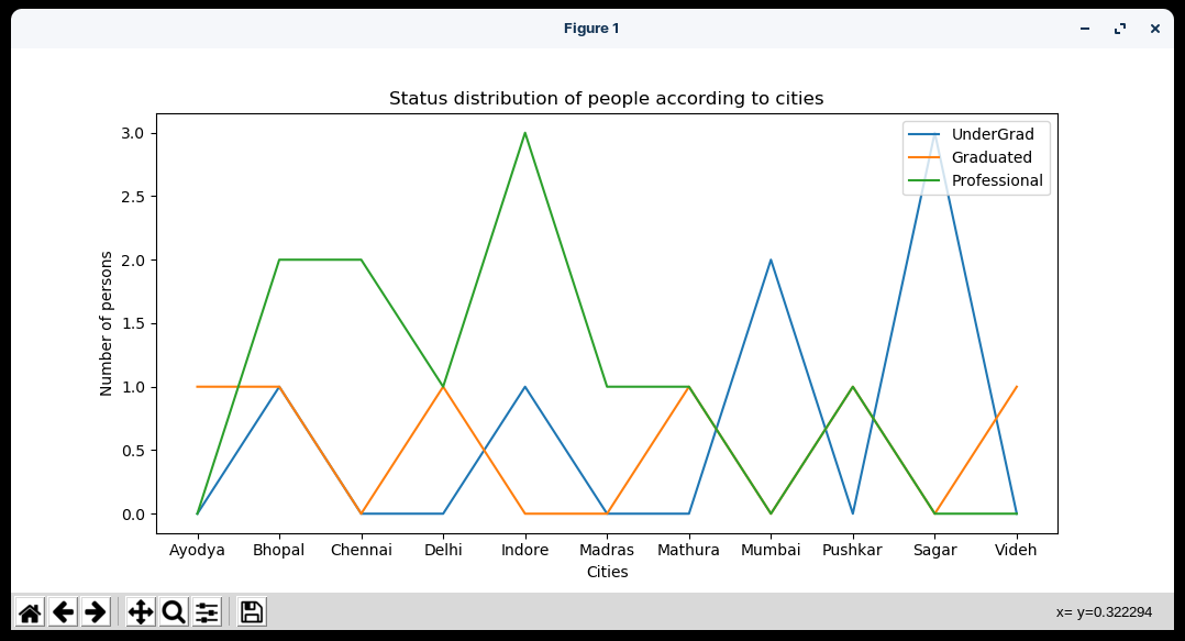
Line Chart to show the Cities v/s number of the person
In the above code, we have imported the required modules Matplotlib and pandas, then fetch the graduated, undergraduate, and professional persons separately from different cities and stored them in separate lists then plotted the three different graphs of professionals, graduates, and undergraduates on the same plot and set some additional parameters like title, x-axis label, y-axis label, legends and at last show the graph using show() method.
Plotting Pie Chart
We will plot a Pie chart which will show the population density of the cities.
Python3
from collections import Counter
fig, axis = plt.subplots()
hMap = Counter(df['Address'])
theme = plt.get_cmap('jet')
exp = [0.1]*11
axis.set_prop_cycle("color",
[theme(2. * i / len(df['Address']))
for i in range(len(df['Address']))])
axis.pie(hMap.values(), labels=hMap.keys(),
explode=exp, autopct='%1.0f%%',
pctdistance=0.8, startangle=180)
axis.set_title('Population density of Cities')
plt.show()
|
Output:
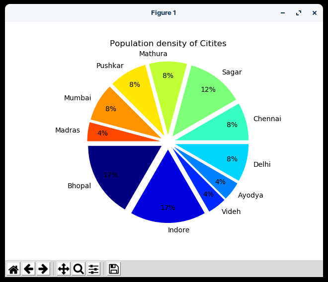
Pie Chart to show the percentage of population City wise
In the above code, we have imported the required modules Matplotlib, pandas, and collections.Counter, then fetch the population of different cities and counted the frequency by using the Counter function and set theme to jet declare and list to define the explode attribute of a pie chart and then plotted the pie chart and set some additional parameters like title and label, and at last show the graph using show() method.
Plotting Scatter Graph
We will plot a Scatter Graph by using two variables through which we visualize which is the favorite color of a person according to the gender in our dataset.
Python3
fig, axis = plt.subplots()
colors = sorted(list(set(df['Favourite Color'])))
maleClr = [0]*len(colors)
femaleClr = [0]*len(colors)
for gender, clr in zip(df['Gender'], df['Favourite Color']):
if gender == 'Male':
if clr == colors[0]:
maleClr[0] += 1
elif clr == colors[1]:
maleClr[1] += 1
elif clr == colors[2]:
maleClr[2] += 1
elif clr == colors[3]:
maleClr[3] += 1
elif clr == colors[4]:
maleClr[4] += 1
elif clr == colors[5]:
maleClr[5] += 1
else:
maleClr[6] += 1
else:
if clr == colors[0]:
femaleClr[0] += 1
elif clr == colors[1]:
femaleClr[1] += 1
elif clr == colors[2]:
femaleClr[2] += 1
elif clr == colors[3]:
femaleClr[3] += 1
elif clr == colors[4]:
femaleClr[4] += 1
elif clr == colors[5]:
femaleClr[5] += 1
else:
femaleClr[6] += 1
axis.scatter(colors, maleClr, label='Male')
axis.scatter(colors, femaleClr, label='Female')
axis.legend(loc='upper right')
axis.set_title('Favourite color people according to gender')
axis.set_xlabel('Colors')
axis.set_ylabel('Number of persons')
plt.show()
|
Output:
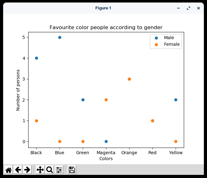
Scatter Chart to show the Favorite color of People as per Gender
In the above code, we have imported the required modules Matplotlib and pandas, then fetch the favorite colors of boys and girls separately and stored them in the separate lists then stored the totals colors available in the dataset in a separate list and finally plotted the graph of boys and girls on the same plot and set some additional parameters like title, x-axis label, y-axis label, legends and at last show the graph using show() method.
Share your thoughts in the comments
Please Login to comment...