UI Design of Government Website
Last Updated :
27 Feb, 2024
Designing UI for a Government Portal is an easy task. It involves the usage of UI/UX principles and other basic designing principles to create an easily accessible and accountable website where the citizens can easily hover around the important ministries of the government, gain insights about the ongoing causes and their responses, and have a look at recent changes. A Government Portal is often an interactive website and needs to be light and with good amounts of content to connect to the citizens. This article covers the design principles used to design a Government Portal and the pages that have been covered are the Home Page, Government Schemes, Media Page, Recruitment Page & About Us.
Designing Concepts & Principles
Color Theory:
The selection of colors should be appropriate for a government portal as it involves the usage by crores of users every day. It should have the potential to attract each kind of user. The national portal uses an overall white and light bluish color that suits well for websites to be visited on a regular purpose.
Negative Spaces:
The use of white spaces is extremely important for a cleaner look. Given the fact that the National Portal has a shorter website with a compact and concise look, the use of white spaces in between grids, and boxes improves the readability of the information being displayed on the website.
Alignment:
A uniform sense of alignment is important to make the design look visually appealing. In the footer components, all the ministries are aligned in the same format, one above the other, which makes it easier to access every topic.
Typography:
Typography is the process of designing text, and writing it in different fonts and styles. The use of different types of fonts is not recommended as it makes the government portals look cluttered. The portal uses Regular Sans Serif font and only one font is used in the entire website.
Grid System:
The government portals usually consists of sub topics within topics in the form of a grid to present the information in the most clearer possible way. The website uses a grid system, where in every information is displayed side by side, such as : News highlights, Most requested information and forms, activities and initiatives etc. These improve readability and enhance the credibility of the website.
Textures:
The texture of the govt portal always remains uniform, likewise it might look very messy and unclean. However, when any recent information, or a fact needs to be displayed on the website, it takes over a texture of light sand like with a blue color to easily attract the users attention to the most recent fact.
Infographics:
The use of infographics for a government portal is of utmost efficiency for the website as it takes into account, the ongoing developments, the recent initiatives taken by Government and other activities.
Home Page
The home page of a government portal must consist of all the links that would lead to several other ministries. It should also have an option to search over the website with basic news highlights and other resourceful information. It should have contact links and must serve the copyright of the facts. A light colored UI might be fruitful for a government portal.
.jpg)
Home
About Us
The navigation bar and search options along with the footer must remain intact with every page. The about us section should consist of a basic introduction to the website along with the objective & mission it wants to achieve. A simple image would suffice for the about us page and the content should not be too large, or decorative, rather keep it simple so as in to maintain the overall theme of the portal.
.jpg)
About
Government Schemes Page
Along with the footer and navigation, the government schemes page must consist of an image with an option to search for different ongoing schemes. Since the number of schemes would be very large for a vast country like India, a page number container box would go well with the UI with simple and light colored background and normal font. The starting can be covered with recent schemes that have been launched.
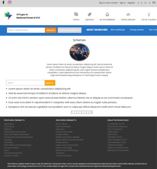
Govt Schemes
Recruitment Page
This page should consist of bold fonts as it focuses on the availability of the posts in the country. Every post must start with a heading of the post and along with it must be listed in 2-3 lines in normal paragraphs what all the occupation would be about.
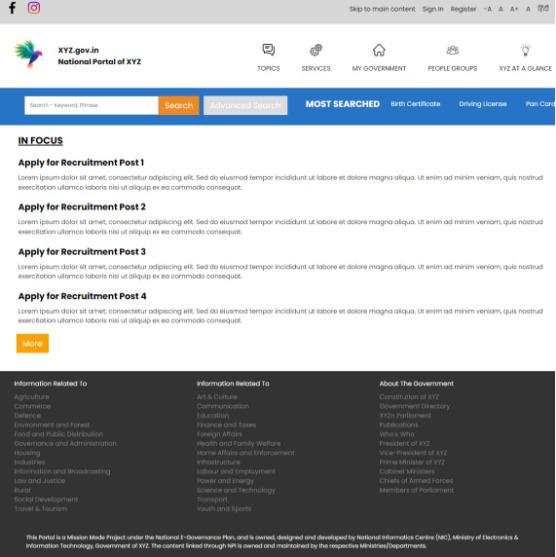
Recruitment
Conclusion
The UI of a government portal must be highly attractive so that it can attract maximum users from all over the country. A good UI for a government portal would be a simple and subtle colored page with not too decorative fonts and normal typography and visually appealing infographics.
Share your thoughts in the comments
Please Login to comment...